In this project we create a dashboard using Excel to gain insights into performance of different post types on Duo’s Instagram Account.
Table of contents
- 00. Project Overview
- 01. Concept Overview
- 02. Data Overview & Preparation
- 03. Applying Data Cleaning & EDA
- 04. Creation Of Dashboard
- 05. Extracting Observations
- 06. Recommendations Based On Analysis
- 07. Growth & Next Steps
Project Overview
Context
Data Analyst Duo is an instagram community (@𝒅𝒂𝒕𝒂𝒂𝒏𝒂𝒍𝒚𝒔𝒕𝒅𝒖𝒐) of ~104𝐤 data enthusiasts founded by two individuals Aditi & Kalpesh. They share content around statistics, data science & analytics with budding data aspirants.
The goal is to design a data-driven Instagram engagement analysis dashboard to gain insights into the performance of different post types on Data Analyst Duo’s Instagram account and provide recommendations to the duo.
Actions
We collected the data from the instagram page @𝒅𝒂𝒕𝒂𝒂𝒏𝒂𝒍𝒚𝒔𝒕𝒅𝒖𝒐. We have seven separate spreadsheets of data. We firstly needed to compile the necessary data from sevaral spreadsheets in the excel to a single worksheet. We joined all the necessary columns using VLOOKUP & INDEX-MATCH functions. We replaced the values which are missing aka “#N/A” as zero using IFERROR function.
Data is available from “01-Jan-2022” till “19th-Aug-2023”.The range of date values varies for few columns while the other columns have similar range of date values. So, in order to have everything in one particular scale we have started our analysis from 1st December 2022.
We calculated new metrics such as cumulative_followers which defines cumulative growth of followers each day starting from 1st December 2022 till 19th August 2023. Similarly, engagement_rate which defines how people are engaging with the content i.e. by liking, commenting, saving & sharing the posts. If the engagement_rate of the post is high, there are high chances that growth of followers increases, and it reaches to wider audience.
We compared the metric 3S_view which tells how many people watched IG_Reel for atleast 3 seconds with the metric Impressions which says how many people have watched the reels multiple times and calculated the average 3S_View/Impressions. It is found that more than 50% of the people skipped the content i.e. IG_Reels within 3 seconds. We identified the possible reasons behind it.
Computed the average* (reach, impressions, shares, likes, comments and saves) vs different post_types(IG_Reel, IG_Carousel, IG_Image) using pivot_table and we found the average reach and impression for IG_Reels was high. So, we checked for outliers in reach and impressions column because there could be some posts which would have outperformed others and removed those rows of data because it will inflate our observations.
We determined the average engagement metric(reach, impressions, shares, likes, comments and saves) based on the duration of the reel using pivot_table and found if the duration is less, there are high chances of reaching higher average engagement metrics which will be helpful in attracting wider audience.Lastly, we calculated the % of followers based on age-group,city and country to understand the audience.
Finally we estimated the metrics such as Total Followers, Total Post, Max of Cumulative Followers, Growth_Rate, Total Reach using pivot tables and along with the above calculated metrics we created pivot charts. Using bar chart, we have shown the % of followers based on age-group, city and country and also the average engagements metrics vs the duration of the reel. At last, using line chart we have shown the cumulative growth of followers and cumulative reach per month.
We re-arranged and adjusted the font size and color of all the text boxes, pivot bar/line charts to create a final dashboard. Then, we extracted insights and provided few recommendations.
Results
Based on the observations from the dashboard, below are the recommendations suggested to the duo.
- Focus on Strengthening the hook i.e making it attractive or engaging the IG-Video reels at the start and also give weightage on the topics/content for the reels such as “Python”, “Data Analytics”, “SQl”, “Statistics”, “Interview preparation & questions for SQL/Python/Analyst roles” because as per the observations of the data, it is found that 58% of the people skip the content within 3 seconds.
- Post IG-Videos consistently because it is found that it is performing well interms of engagement and also wider reach can be attained compared to IG Images & IG Carousel. With respect to Reach and Impressions, New followers can be gained if they put IG Videos but inorder to engage the existing audience of the page, the duo should post IG carousel because of high number of Comments and Saves. So go with IG Videos followed by IG Carousel by posting consistently.
You can find the full report of the observations in this section Analysing The Results.
Growth/Next Steps
Social media feeds (specifically what people/posts you see when you log on) are driven by an algorithm but these can change from time to time. For example, on LinkedIn, there was a time when polls got a huge amount of reach, then it became sharing PDF documents. The algorithm was being changed behind the scenes to up-weight or down-weight certain types of post type.
As of now IG videos/reels, act as better engagement widely in general.
In future, there might be possibilities that they may change the algorithm to favor image posts or some newly discovered post type which can act as better engagement for the users
So keeping this analysis up to date would help the duo keep close to what was working now rather than what worked several months ago.
Concept Overview
Why Excel is important for Data Analysis?
-
Excel is a crucial tool for data analysis for several reasons, especially in roles like yours as a data analytics professional.
-
Excel provides a quick and simple way to explore and visualize data. You can easily import, sort, filter, and manipulate data, allowing for rapid insights and initial data exploration before more in-depth analysis.
-
Excel offers a range of built-in functions for basic statistical analysis, such as calculating means, medians, standard deviations, and performing hypothesis tests.
-
You can identify and handle missing values, duplicate entries, and inconsistencies, ensuring data quality before analysis.
-
Excel’s charting and graphing tools enable you to create compelling visualizations to communicate findings effectively.
-
Pivot tables are a powerful feature in Excel that allow you to summarize and analyze large datasets quickly. They enable you to group, filter, and aggregate data dynamically, providing insights into data patterns.
Sheets: Tabs at the bottom of the window, representing individual worksheets.
Cells: Individual rectangular boxes where data is entered.
Tabs: Sections of the ribbon containing related commands (e.g., Home, Insert, Formulas).
Ribbons: Organized collections of buttons and controls for various tasks.
Basic Functions
- SUM - Adds a range of numbers.
- AVERAGE - Calculates the average of a range of numbers.
- COUNT - Counts the number of cells with numbers.
- COUNTA - Counts the number of non-empty cells.
- MAX - Finds the maximum value in a range.
- MIN - Finds the minimum value in a range.
Conditional Functions
- SUMIF - Adds values based on a condition.
- AVERAGEIF - Averages values based on a condition.
- COUNTIF - Counts cells based on a condition.
- IF - Returns one value if true, another if false.
- SUMIFS - Adds values based on multiple conditions.
- COUNTIFS - Counts cells based on multiple conditions.
Lookup and Reference Functions
- VLOOKUP - Searches for a value and returns a corresponding value from a table. Lookup value should always be on the left side when you want any information to fetch which is on the right side of look-up value.
- HLOOKUP - Similar to VLOOKUP but searches horizontally.
- XLOOKUP - Searches for a value and returns a corresponding value from a table or array. This can be used when the data you want to fetch is prior to the lookup value.
- INDEX-MATCH - Searches for a value using MATCH and retrieves corresponding data using INDEX.
Text Functions
- CONCATENATE - Combines text from multiple cells.
- TEXT - Converts a value to text with a specific format.
- LEFT - Extracts a specified number of characters from the left.
- RIGHT - Extracts a specified number of characters from the right.
- LEN - Counts the number of characters in a text.
- TRIM: Removes extra spaces from text.
Date and Time Functions
- DATE - Creates a date using year, month, and day values.
- DAY - Extracts the day from a date.
- MONTH - Extracts the month from a date.
- YEAR - Extracts the year from a date.
Statistical Functions
- STDEV - Calculates the standard deviation of a dataset.
- MEDIAN - Finds the middle value in a dataset.
- MODE - Identifies the most frequent value in a dataset.
- QUARTILE - Finds a specified quartile of a dataset.
- PERCENTILE - Calculates a specified percentile of a dataset.
- RANK - Assigns a rank to a value in a dataset.
Logical Functions
- AND - Returns true if all arguments are true.
- OR - Returns true if at least one argument is true.
- NOT - Reverses the logical value of an argument. Example: Use AND, OR and NOT functions to evaluate logical conditions
Fill or Drag
Fill or drag is a technique to copy formulas or values across a range of cells.
Data Manipulation
Text To Columns
- Converts data in a single column to multiple columns using a delimiter.
Remove Duplicates
- Eliminates duplicate records from a dataset.
Flash Fill
- Automatically fills values based on patterns.
Data Validation
- Sets rules for data entry in cells.
Data Analysis
Sorting & Filtering
- Sorts data based on specified criteria.
Pivot Table
- Summarizes and analyzes data in a flexible table format.
Conditional Formatting
- Applies visual formatting to cells based on conditions.
Data Visualization
Bar Chart
- If you want to represent data based using one or two variables, then the simple bar diagram can be used.
- Represents data using vertical/horizontal bars.
- It is used when there are both categorical variables and numerical variables in the data. We use it when we want to see the aggregate measures of the numerical variable with respect to different categories.
- Bar Chart gives the visualized comparison between the discrete categories. It is a really effective chart where the categories in the data are less.
Pie Chart
- A pie diagram/chart is used when the requirement of the situation is to know the relationship between whole of a thing and its parts.
- While making comparisons, pie diagrams should be used on a percentage basis and not on absolute basis. Displays data as a circle divided into segments.
- Pie chars are useful to understand the share of each category to the total.
- In Statistics, this is known as relative frequency. All relative frequencies should add upto 100%. Pie charts are useful to understand the share of each category of total.
Multiple Bar Chart
- Multiple Bar Diagram is used for comparing two or more sets of data. Bars are constructed side by side to represent the set of values for comparison.
Sub-Divided Bar Chart
- Divides each bar into segments based on subcategories.
- if various components of a variable are to be represented in a single diagram, then subdivided bar diagrams are made in this situation.
Line Chart
- Displays data as points connected by lines.
- A line chart is used to show information over time.
- It tracks changes over short and long periods of time.
Histogram
- Represents frequency distribution of data.
- A Histrogram is a bar chart or graph showing the frequency of occurance of each value of the variable being analysed.
- In a histogram, data are plotted as series of rectangles. Class intervals are shown on the “X-axis” and the frequencies on “Y-axis”.
- The height of each rectangle represents the frequency of the class interval. Each rectangle is formed with the other to give a continuous picture.
Box Plot
- A box plot is a method for graphically depicting groups of numerical data through quartiles and outliers.
- Boxplots are a standardized way of displaying the distribution of data based on a five-number summary(“minimum”,”first quartile(Q1)”, “median”, “third quartile (Q3)”, “maximum”).
Scatter Plot
- A scatter plot uses dots to represent values for two different numeric variables.
- The dots in a scatter plot not only report the values of individual data points but also patterns when the data are taken as a whole.
Pareto Chart
- A Pareto Chart is a special type of bar chart, where the categories are shown in descending order of frequency.
- The pareto principle, also known as the 80/20 Rule, states that 80% of the outcomes comes from 20% of the actions.
Sparklines
- A sparkline is a tiny graph that resides in a single cell. The idea is to place a visual near the original data without taking too much space.
Data Overview & Preparation
There are 7 separate spreadsheets of data which contains stats about the channel @𝒅𝒂𝒕𝒂𝒂𝒏𝒂𝒍𝒚𝒔𝒕𝒅𝒖𝒐
Reach
click the column header or use "CTRL+A". The status bar, in the lower-right corner of your Excel window, will tell you the row count
>> 588
A sample of this data (the first 5 rows) can be seen below:
Data Dictionary:
- Reach - It shows how many people did our account (@𝒅𝒂𝒕𝒂𝒂𝒏𝒂𝒍𝒚𝒔𝒕𝒅𝒖𝒐) reached in that particular day.
- Date - It shows the date starting from September 1st 2022 till August 19th 2023.
Profile Visits
click the column header or use "CTRL+A". The status bar, in the lower-right corner of your Excel window, will tell you the row count
>> 588
A sample of this data (the first 5 rows) can be seen below:
Data Dictionary:
- Instagram Followers Visit - It shows how many people visited or checked our account (@𝒅𝒂𝒕𝒂𝒂𝒏𝒂𝒍𝒚𝒔𝒕𝒅𝒖𝒐) in that particular day.
- Date - It shows the date starting from September 1st 2022 till August 19th 2023.
New Followers
click the column header or use "CTRL+A". The status bar, in the lower-right corner of your Excel window, will tell you the row count
>> 272
A sample of this data (the first 5 rows) can be seen below:
Data Dictionary:
- New Instagram Followers - It shows how many followers that we gained on this particular day.
- Date - This starts from 21st November 2022 till August 19th 2023.
Content
click the column header or use "CTRL+A". The status bar, in the lower-right corner of your Excel window, will tell you the row count
>> 142
A sample of this data (the first 5 rows) can be seen below:
Data Dictionary:
- Post_ID - It shows unique post ID for each instagram post.
- Account_ID - Shows the common ID of the account @𝒅𝒂𝒕𝒂𝒂𝒏𝒂𝒍𝒚𝒔𝒕𝒅𝒖𝒐.
- Account_Username - Shows the Account Name.
- Description - Shows the description of the post. It is basically the caption.
- Duration - Refers to the time in seconds of the post(Instagram Reels).
- Publish_Time - Shows the time when the post is published.
- PermaLink - Refers the Link to the instagram posts.
- Post_type - Refers to the type of the post. We have three types such as IG Carousel, IG Image, IG Reel.
- DATE - Refers to the validity of the post.
- COMMENT - This column is empty.
- Impressions - The number of times your post was viewed. It includes multiple views of your posts by the same accounts.
- Reach - The number of unique accounts that saw any of your posts or stories at least once.
- Shares - The number of times the post was shared.
- Follows - The number of new accounts that started following your Instagram account or the new followers we gained from that particular post.
- 3S Views - How many people watched atleast 3 seconds of the IG reels post. This is a new metric that has been introducted becasue it is a study on instagram that it takes 3 seconds for people to decide whether they want to watch the video completely or not.
- Likes - The number of likes on the post.
- Comments - The number of comments on the post.
- Saves - How many people saved the post.
Age_Gender
click the column header or use "CTRL+A". The status bar, in the lower-right corner of your Excel window, will tell you the row count
>> 6
The output can be seen below:
Data Dictionary:
- Age - Shows the Age of the people.
- Women - Number of Females who follow the instagram page @𝒅𝒂𝒕𝒂𝒂𝒏𝒂𝒍𝒚𝒔𝒕𝒅𝒖𝒐.
- Men - Number of Males who follow the instagram page @𝒅𝒂𝒕𝒂𝒂𝒏𝒂𝒍𝒚𝒔𝒕𝒅𝒖𝒐.
Top_City
click the column header or use "CTRL+A". The status bar, in the lower-right corner of your Excel window, will tell you the row count
>> 7
The output can be seen below:
Data Dictionary:
- Top towns/cities - Shows the cities/towns where the followers are from.
- Value - Displays the total number of followers for each city.
Top_Countries
click the column header or use "CTRL+A". The status bar, in the lower-right corner of your Excel window, will tell you the row count
>> 7
The output can be seen below:
Data Dictionary:
- Top Countries - Shows the country where the followers are from.
- Value - Displays the total number of followers from each country.
Applying Data Cleaning & EDA
Data Cleaning
Since we have seven separate sheets of data, let’s create a consolidated worksheet where it contains all the data in a single sheet.
Profile_Visits
We created a separate sheet named Data.
- We copied the data from “Reach” spreadsheet where it contains columns such as “Date” & “Instagram reach”. This acts as a starting point.
- To gather the data from other spreadsheets we used “VLOOKUP” function.
- We first copied the column name “Instagram_Followers_Visit”.
- By using the formula “=VLOOKUP(lookup_value, table_array, col_index_num, range_lookup)”, we got the first value of “Instagram_Followers_Visit”.
- We drag the cell down to copy the formula/values to the remaining cells of “Instagram_Followers_Visit” using CTRL+D.
The output can be seen below:
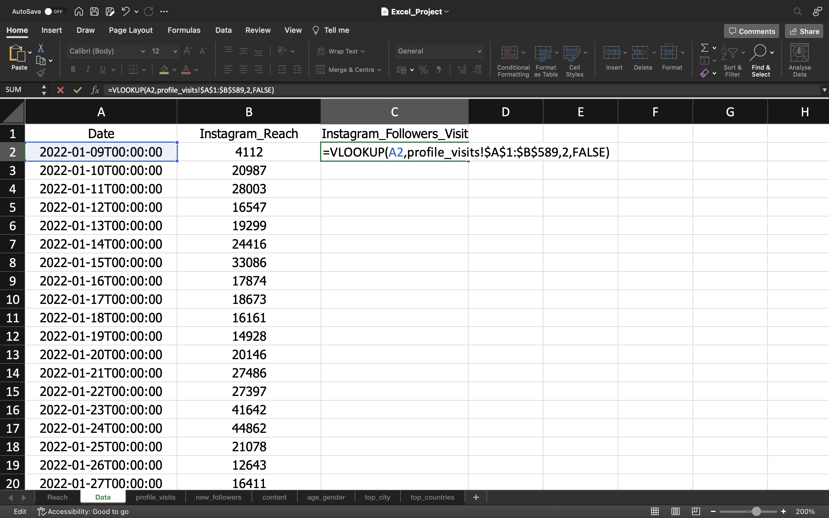
Note:
- A2 - Refers to the Lookup value which is the “Date”.
- A1:B589 - Refers to the table array which means we are selecting all the values from A1 cell till B589 Cell to locate the lookup value. We add $ symbol to avoid the lookup value getting shifted each time when we drag the cell down to copy the remaining values in other cells.
- 2 - Refers to the second column which is “Instagram_Followers_Visit” present in “profile_visits” tab.
- FALSE - Represents the Exact match i.e to match the exact value present in the “Instagram_Followers_Visit”
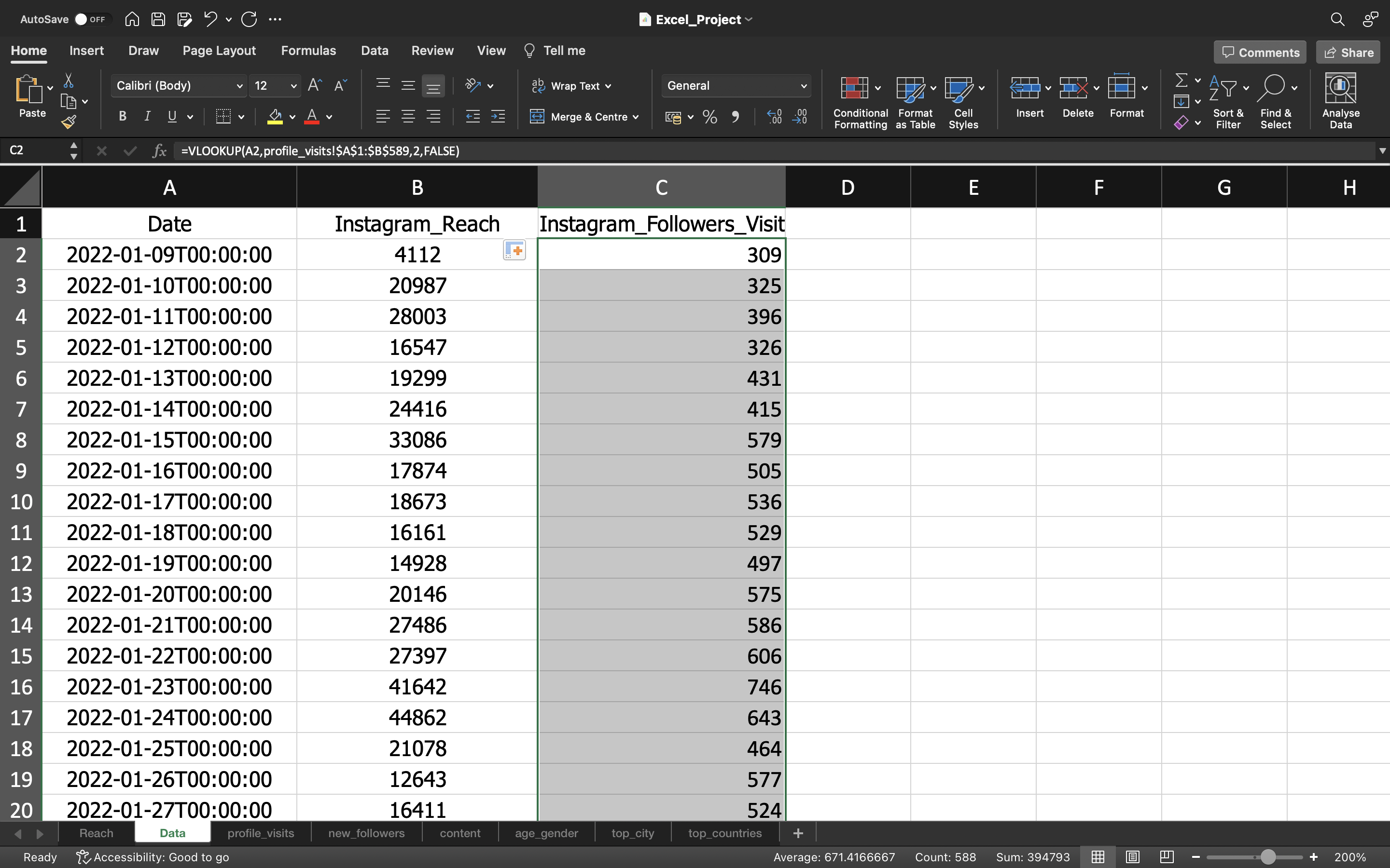
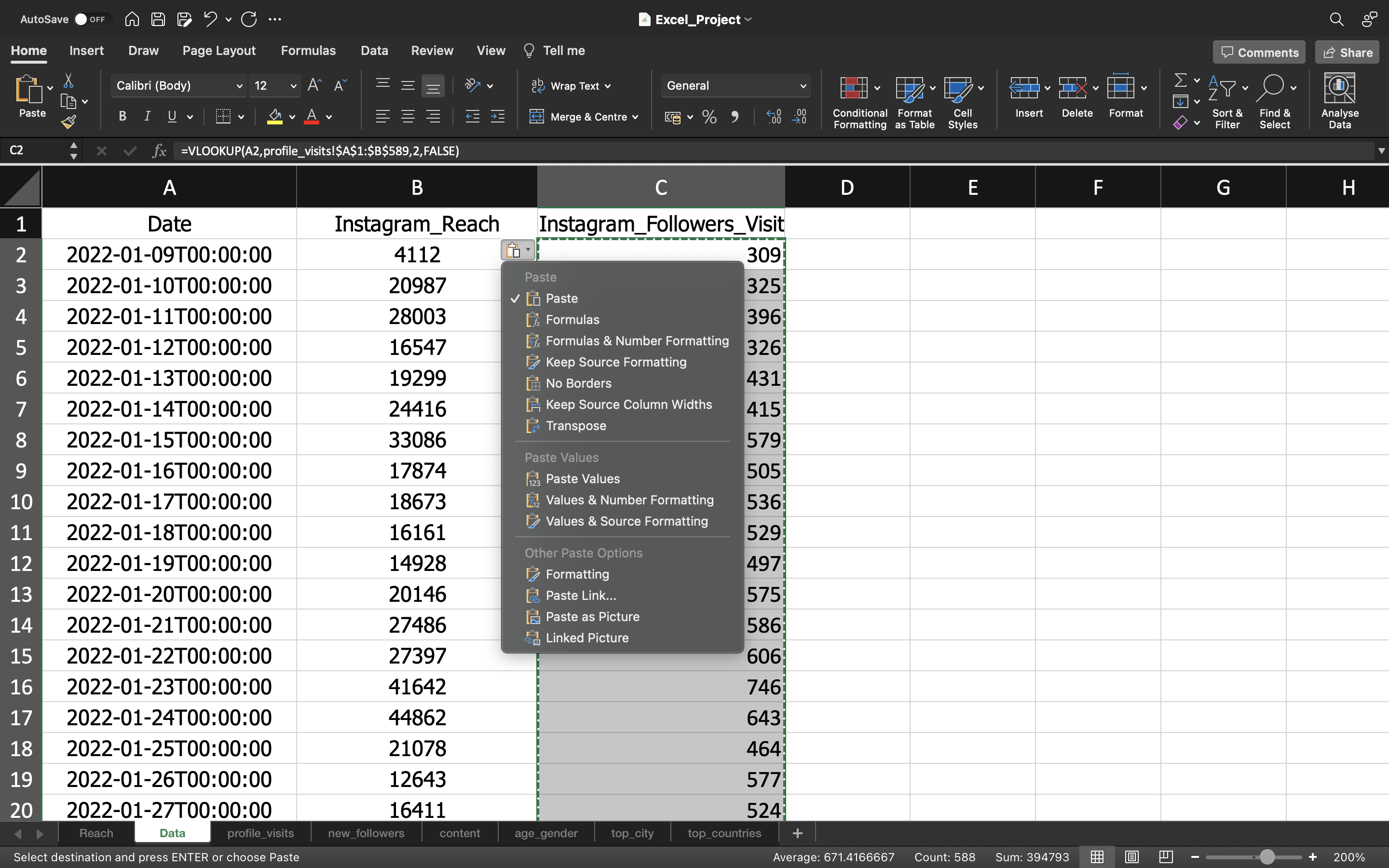
Inorder to remove the formula which is present in the cell, we are gonna use paste values.
This can be done by :
- Copying all the values in the column “Instagram_Followers_Visit” using CTRL+C and pasting it again using CTRL+V
- Click on the “CTRL” icon and select “paste values”.
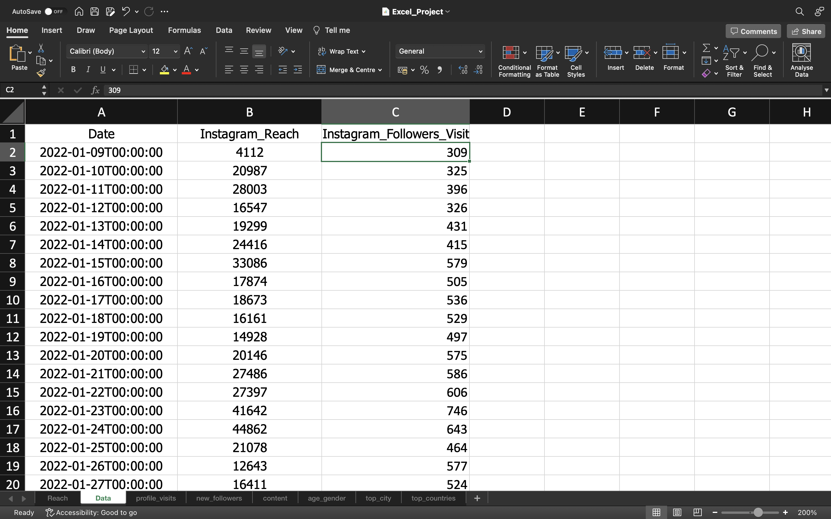
The output can be seen below:
You can see the below output where the formula is removed and it is replaced with values.
New_Instagram_Followers
Let’s do the same process to grab the “New_Instagram_Followers” data from “new_followers” spreadsheet.
You can see the output:
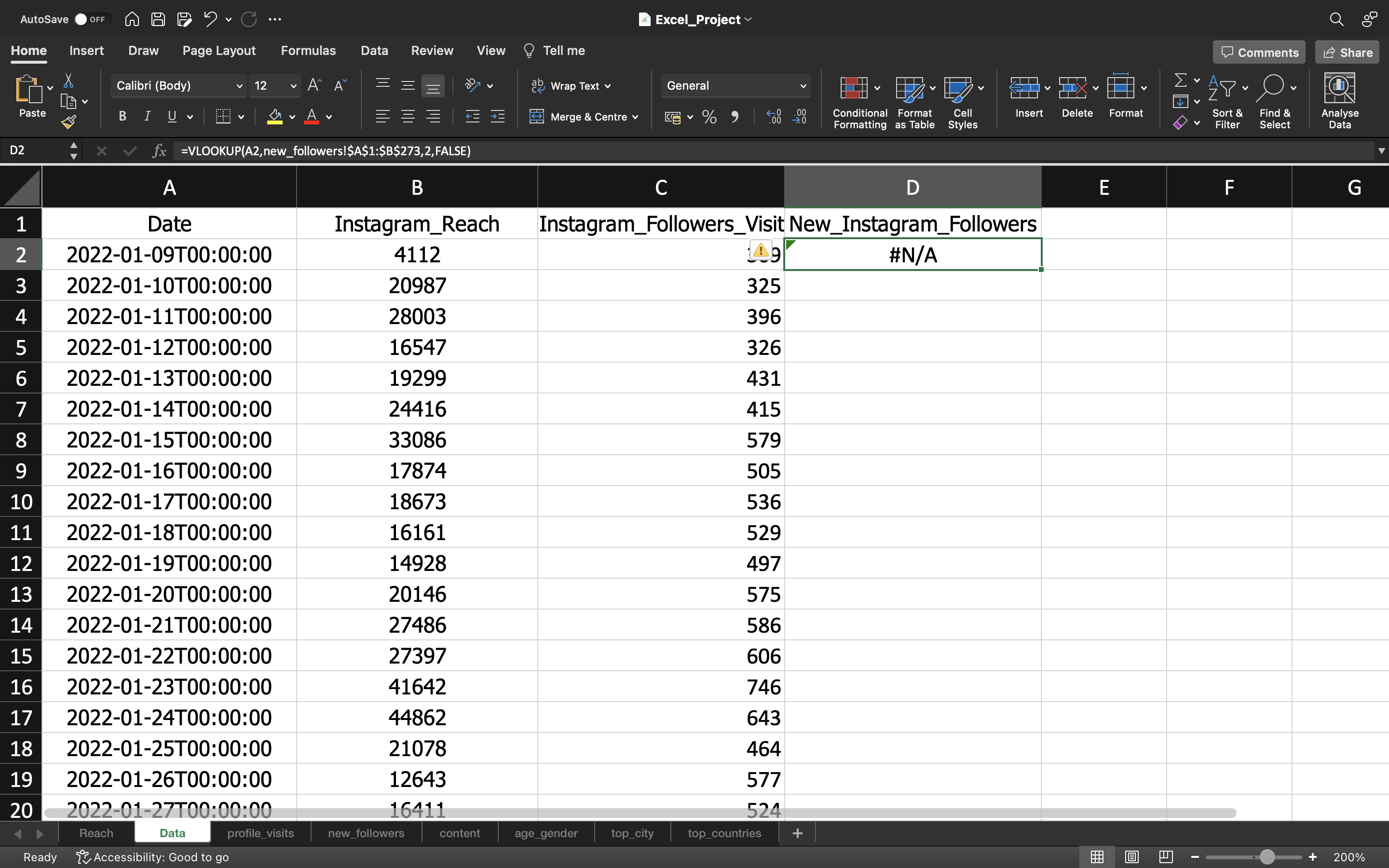
From the above output, we can see it is displayed as #N/A. This is because if we see the DATE column of “new_followers” spreadsheet it starts from 21st November 2022. So this is why it is displayed as “#N/A”.
We can remove this using IFERROR function by using the formula “=IFERROR(VLOOKUP(lookup_value, table_array, col_index_num, range_lookup),0)”.
Note
- IFERROR - If you are calculating something and if the output does not have a value we can just input it with a value. In this case we input the value as Zero.
You can see the output:
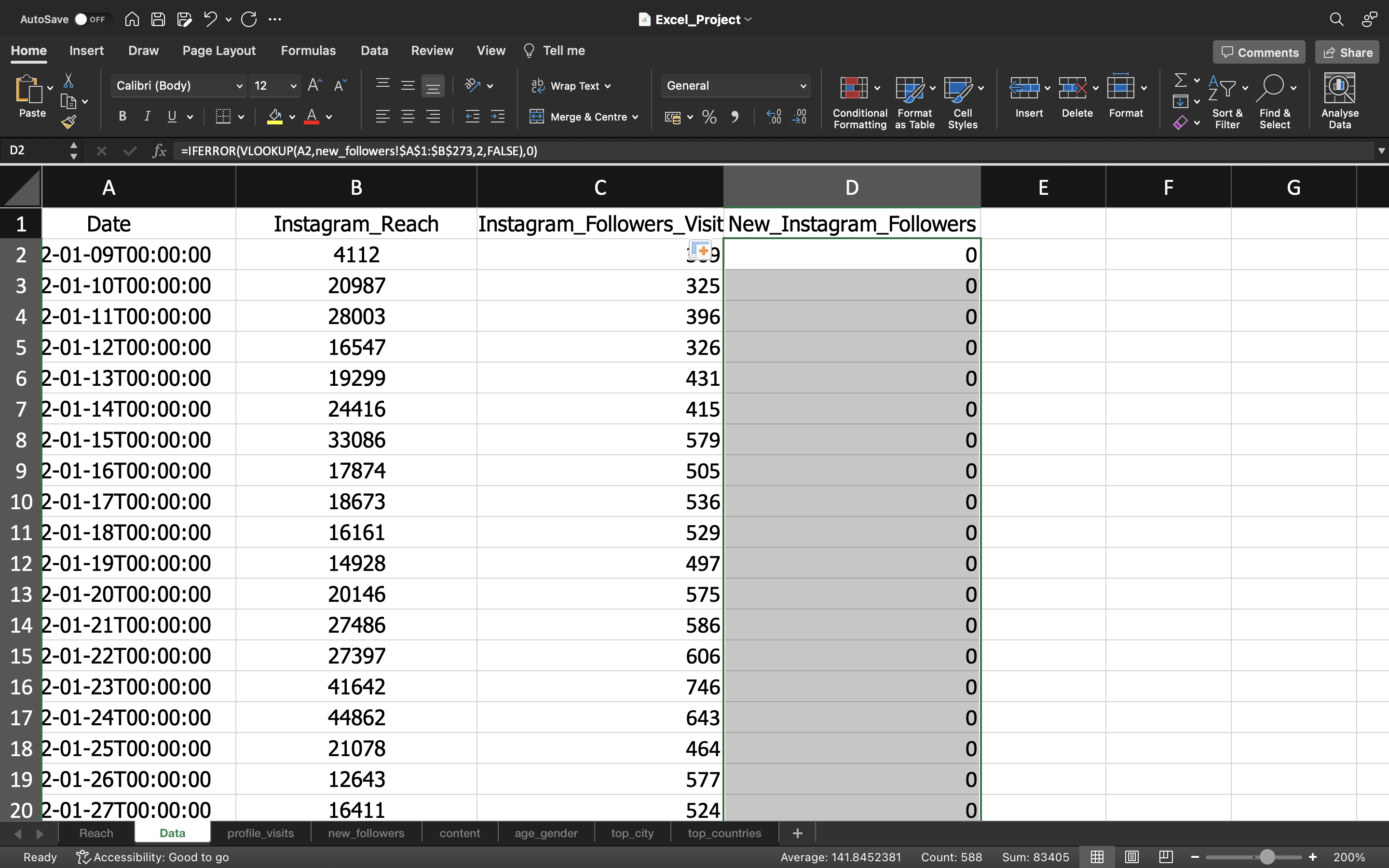
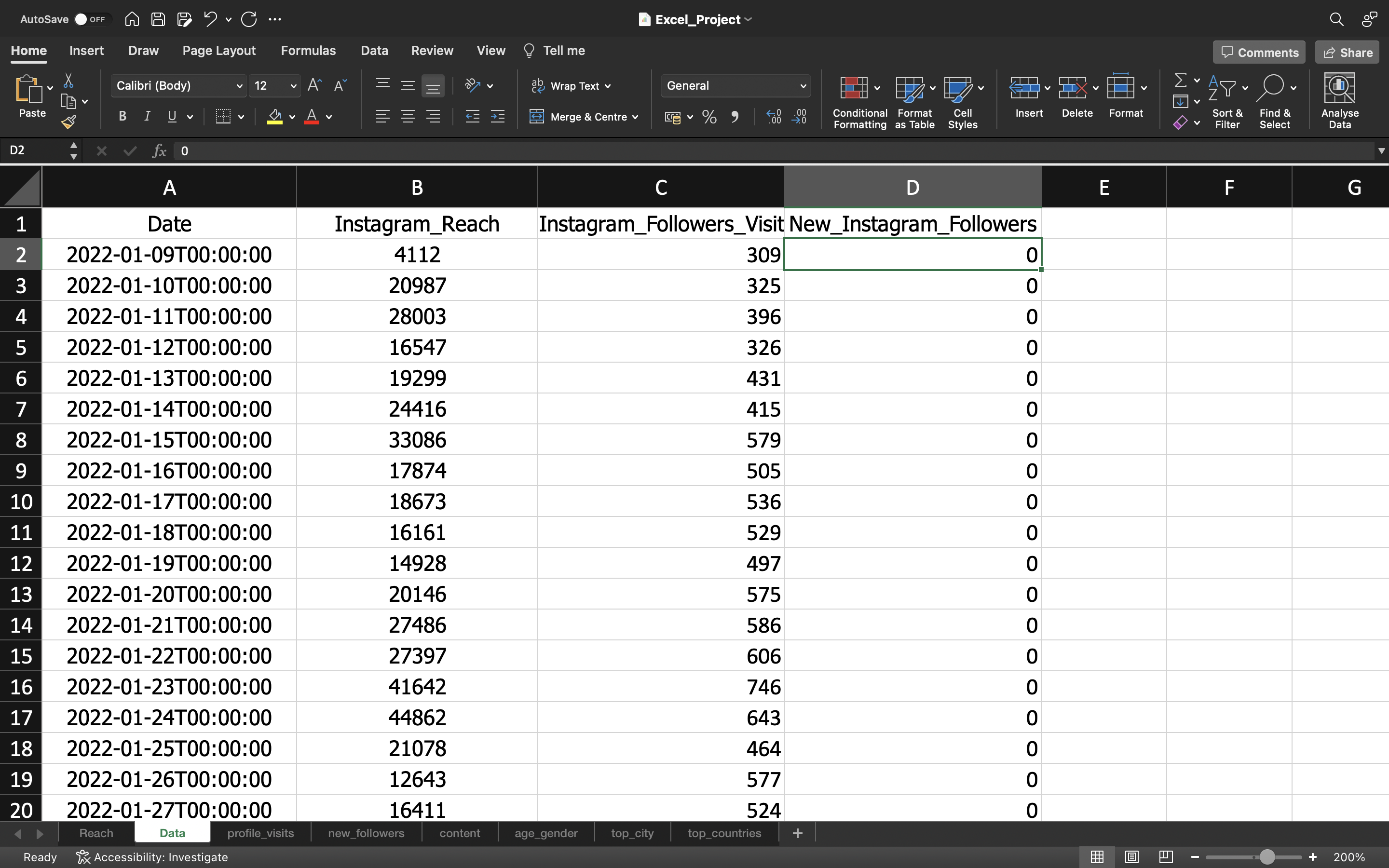
Inorder to remove the formula which is present in the cell, we are gonna use paste values.
This can be done by :
- Copying all the values in the column “Instagram_Followers_Visit” using CTRL+C and pasting it again using CTRL+V.
- Click on the “CTRL” icon and select paste values.
The output can be seen below:
Content
We have removed the columns such as Post_ID, Account_ID, Account_UserName, Account_Name & Description as these are irrelevant to our analysis.
You can see the below output:
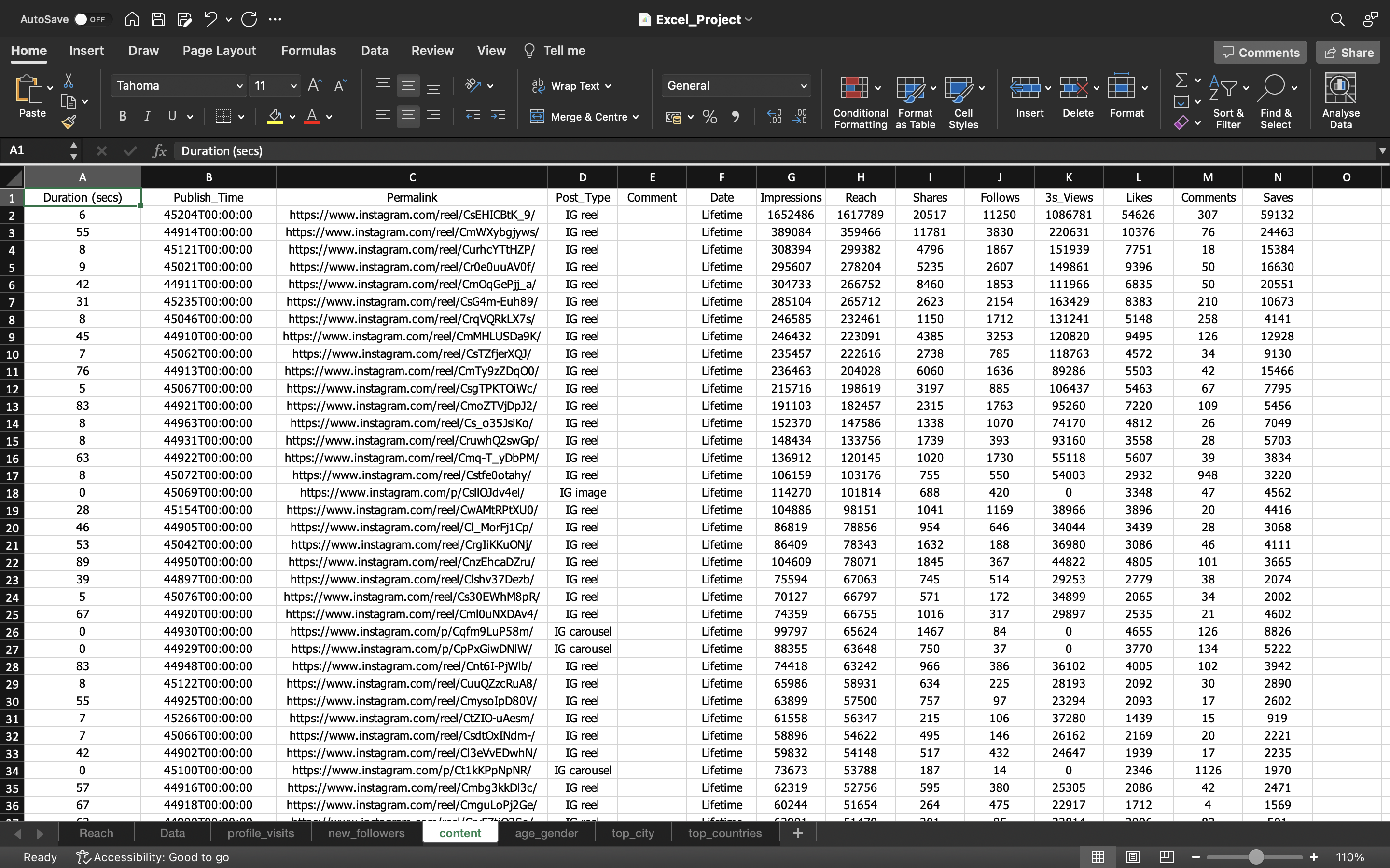
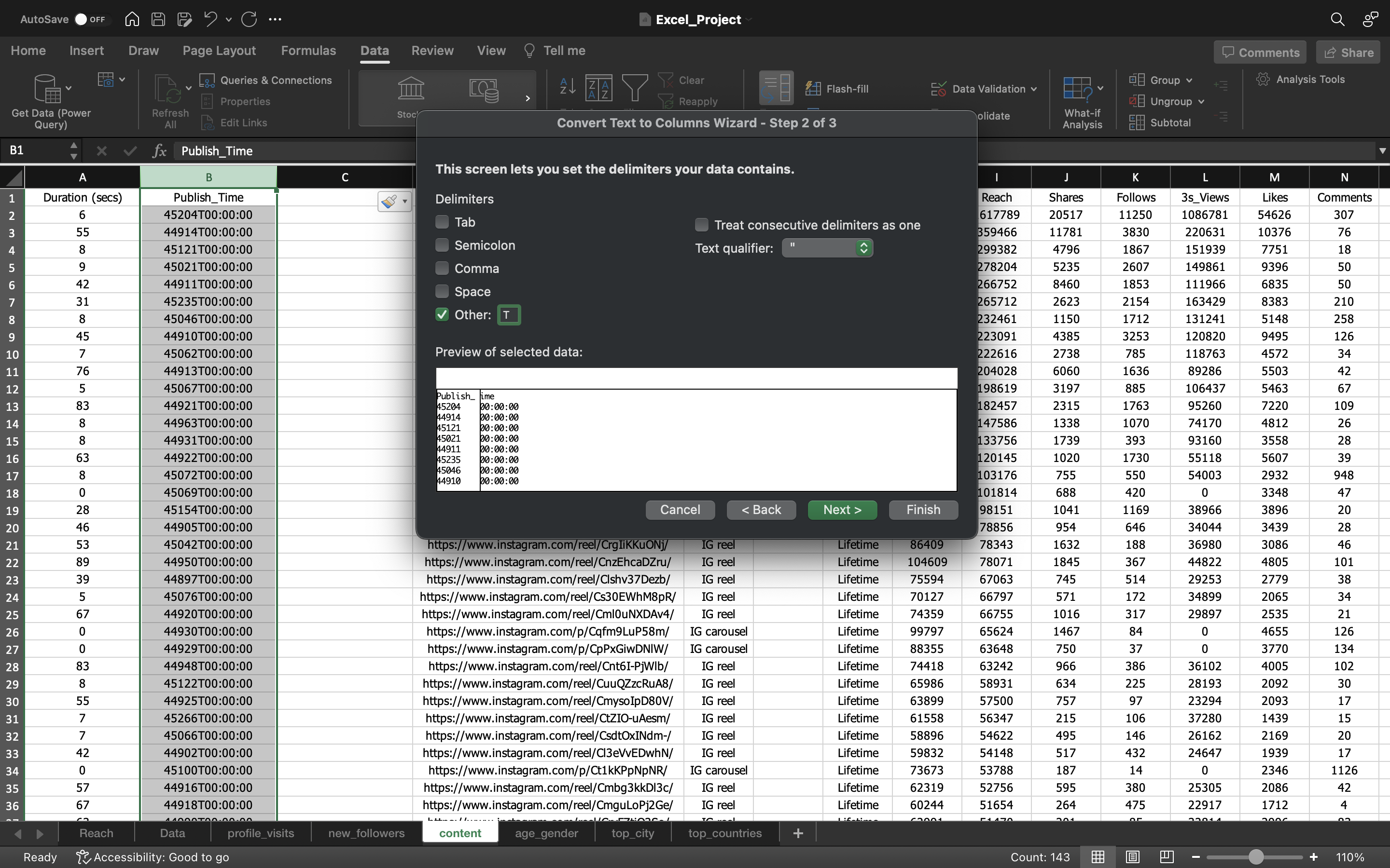
From the above output, we can see the column Publish_Time which needs to be fixed. So let’s do that
We do this by:
- Selecting the column and go to the “Data” Tab and click on “Text To Columns”.
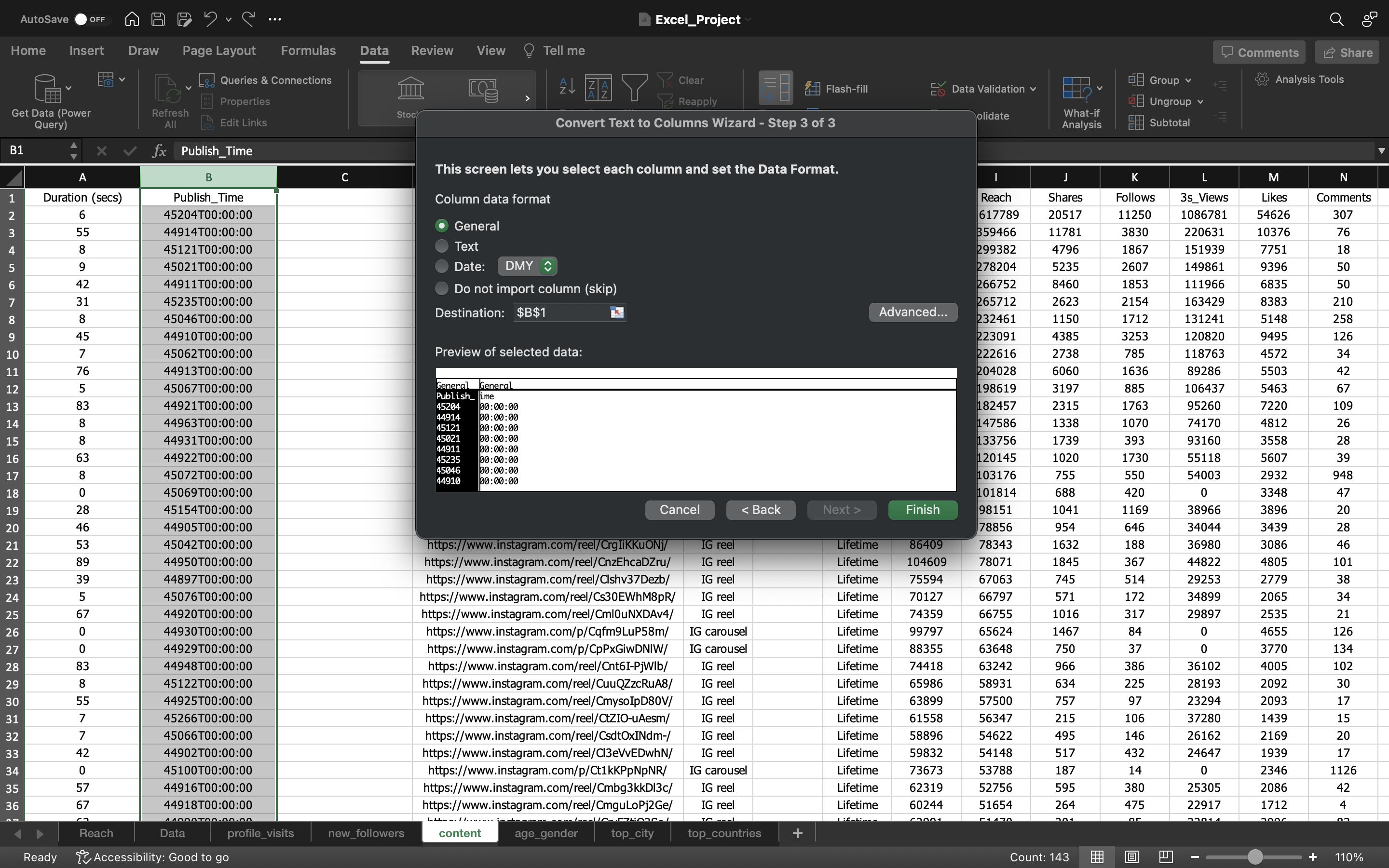
- We choose “delimited” option to separate the date value using characters such as commas or tabs. In our case we separate it by using T character as you can see the publish_time value “45204T00:00::00”, T acts as separator.
- Keep the column Date format as General & click Finish.
The output can be seen below:
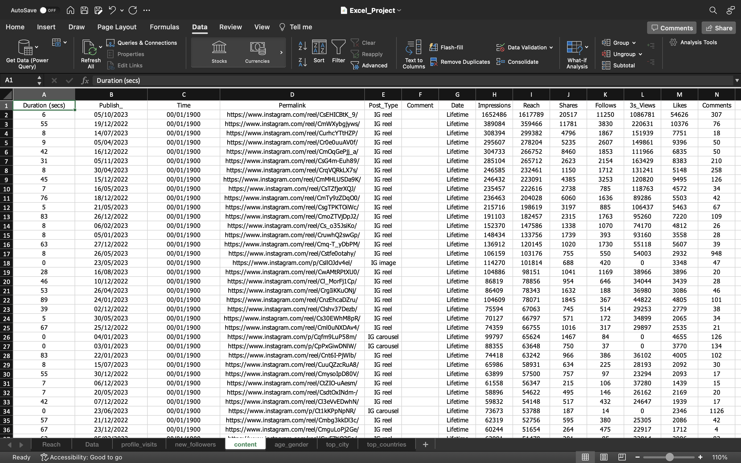
From the above output we can just remove Time column as it is not needed for our analysis.
You can see the below output:
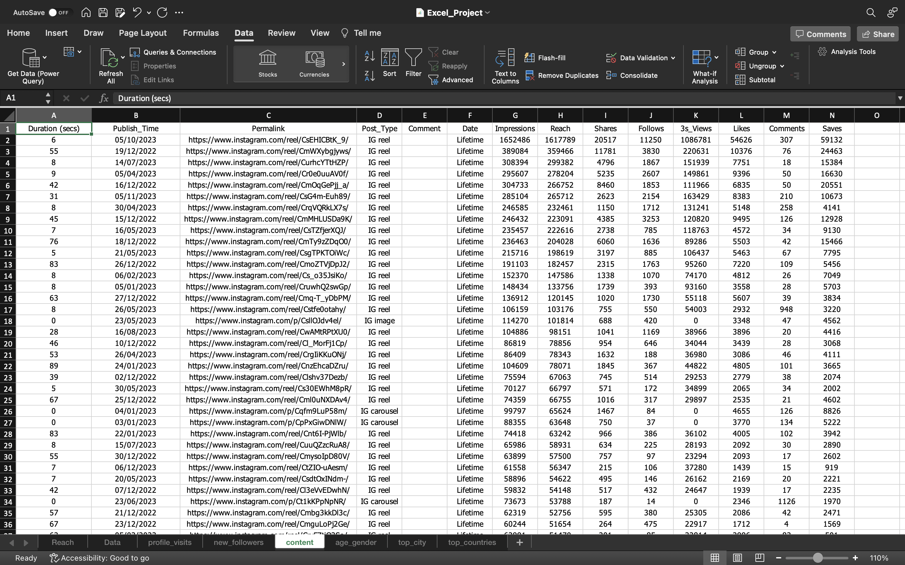
Now if we filter the “Publish_Time” Column, we can see dates in September, October, November & December which is not possible because the data is available starting from September 1st 2022 till August 19th 2023. Let’s try to fix this
The output can be seen below:
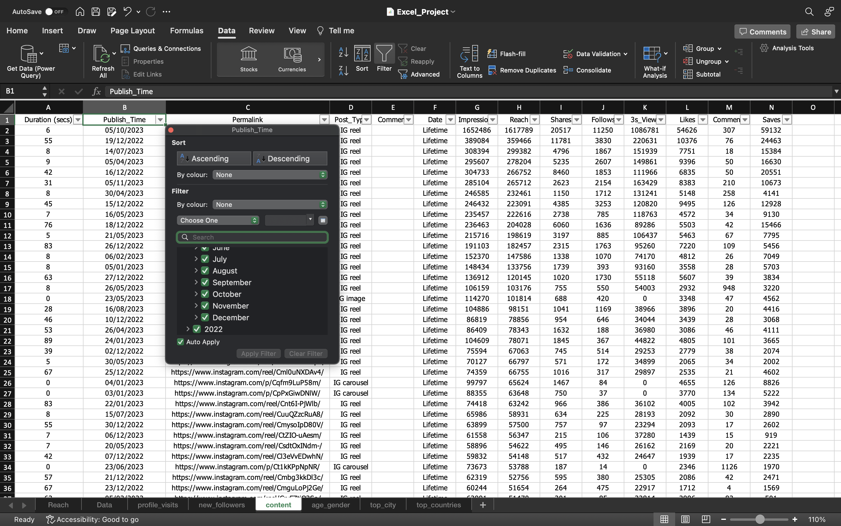
After we sort the “Publish_Time” column in descending order, we can see the first 14 values needs to be fixed. These can be done manually.
The output can be seen below:
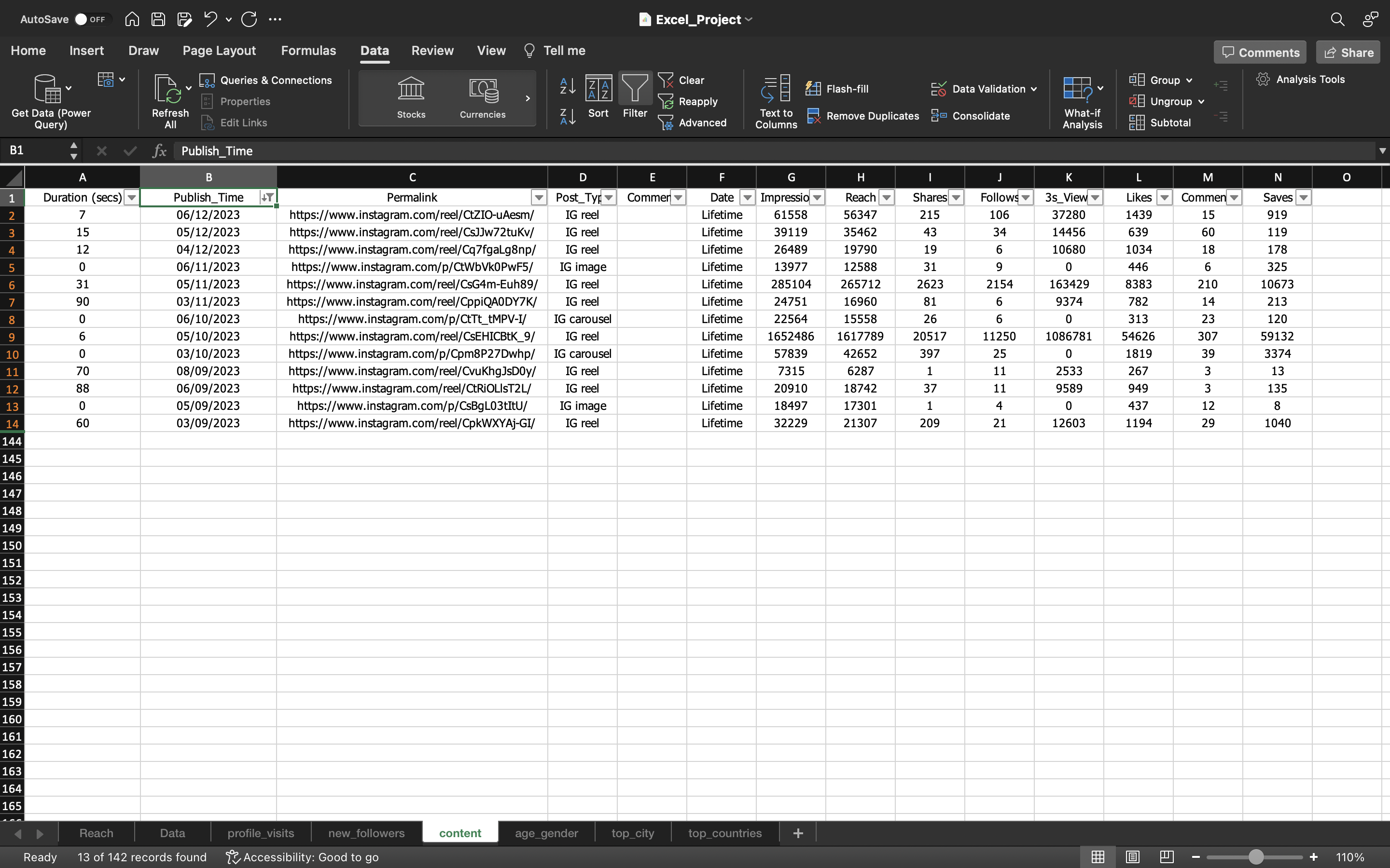
Now we copy these 14 values in a separate sheet and we can use Flash Fill which learns the previous values we applied and based on that it will fill the remaining values and then we paste the values in new column named Publish_Time_New which is created.
Why separate sheet?
We know our data is correct except those 14 values. Sometimes what will happen is it will try to fix the other data values and mess it up. So that’s why we perform the operation in a separate sheet.
The output can be seen below:
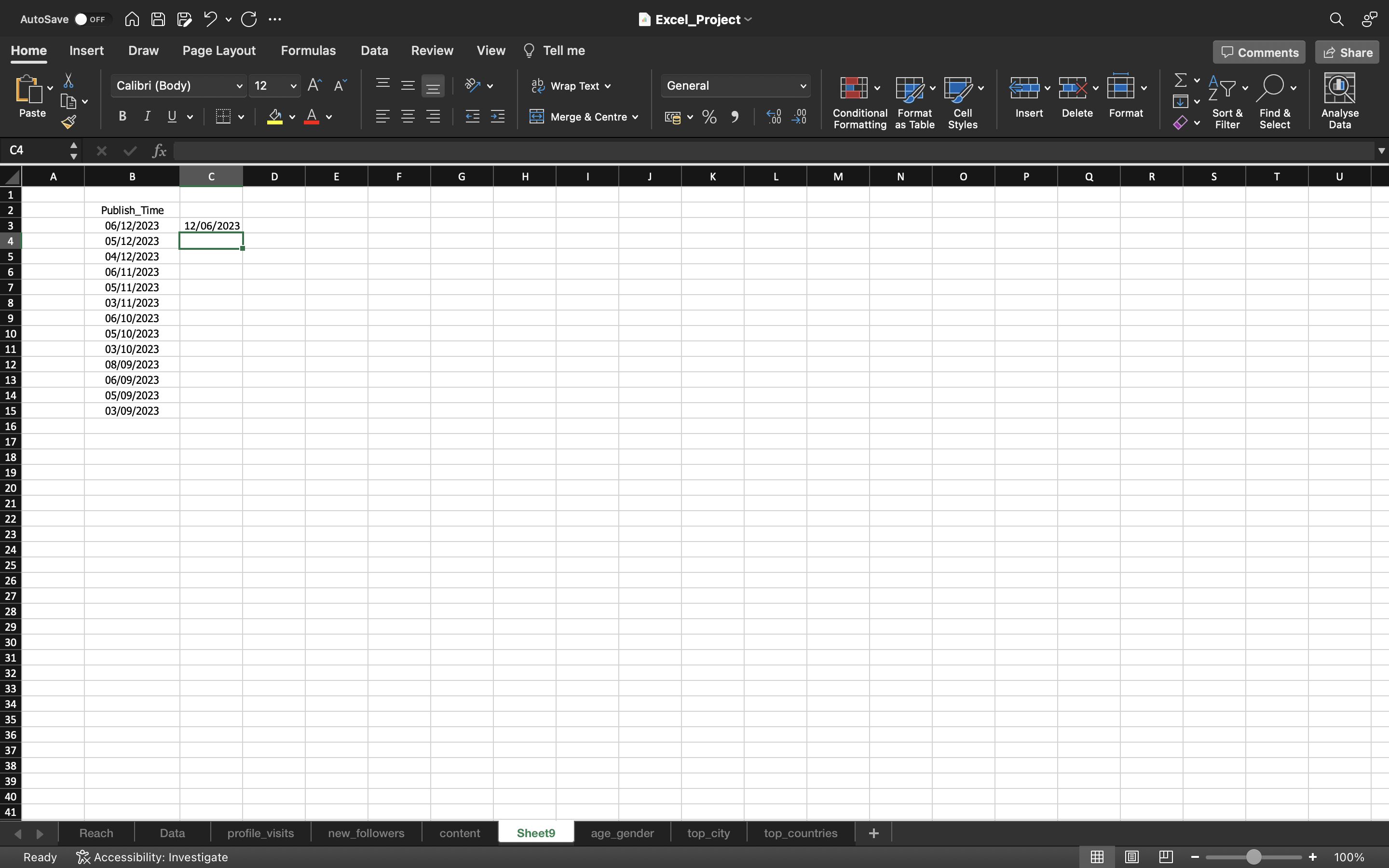
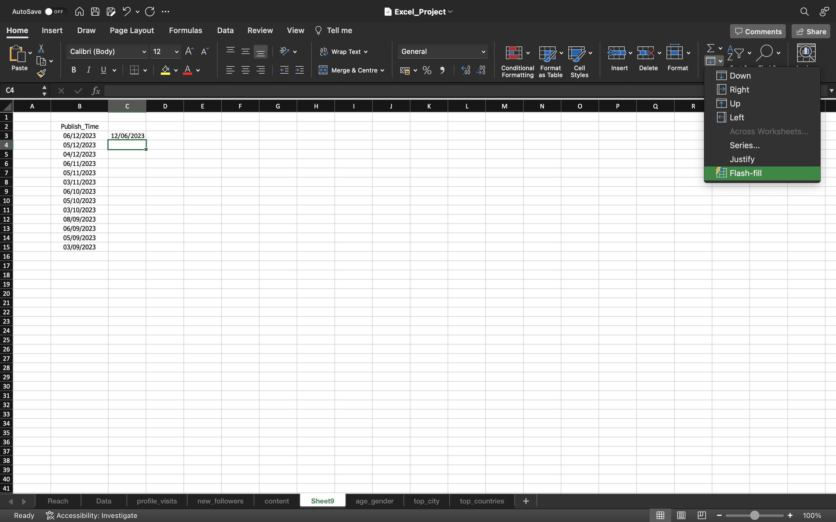
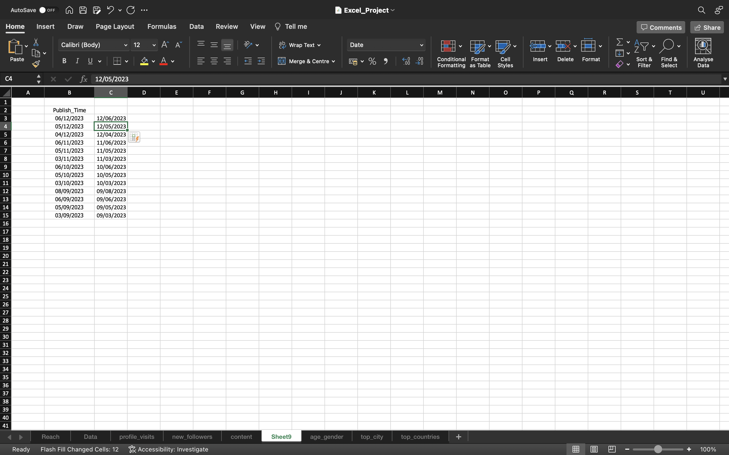
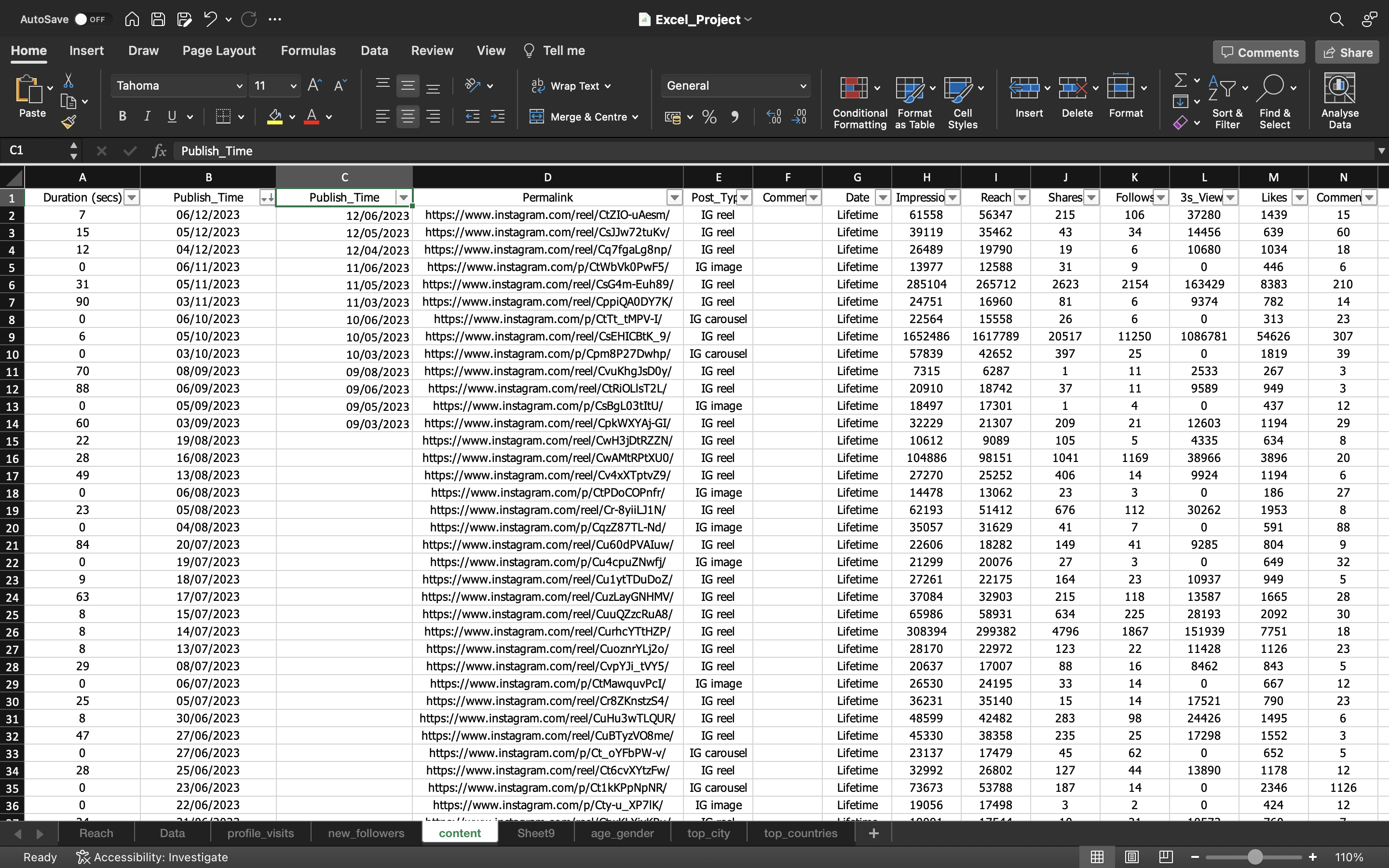
We can just copy the remaining values and paste it again in the Publish_Time_New Column.
The output can be seen below:
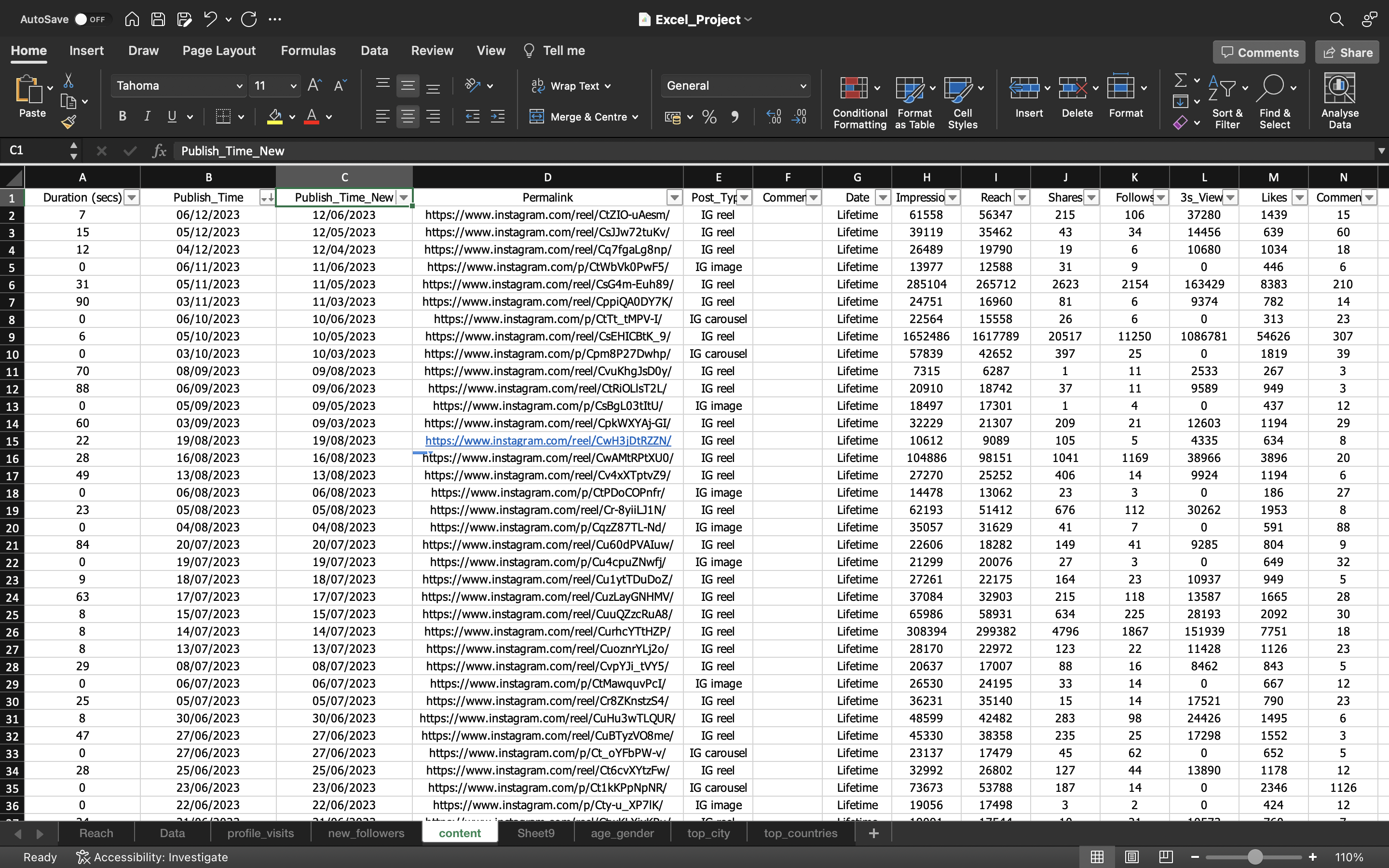
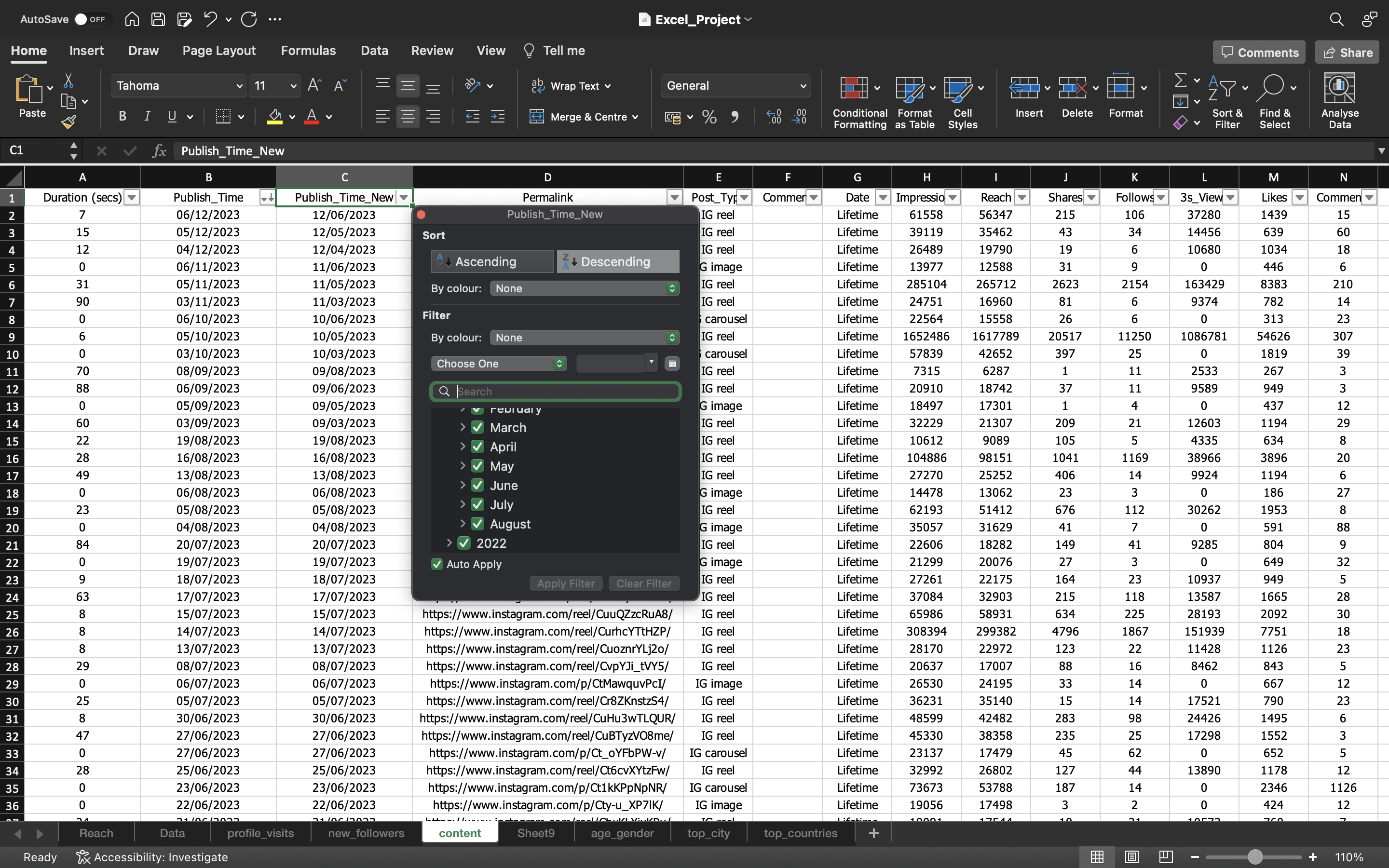
From the above output, we can see we have fixed the Publish_Time Column.
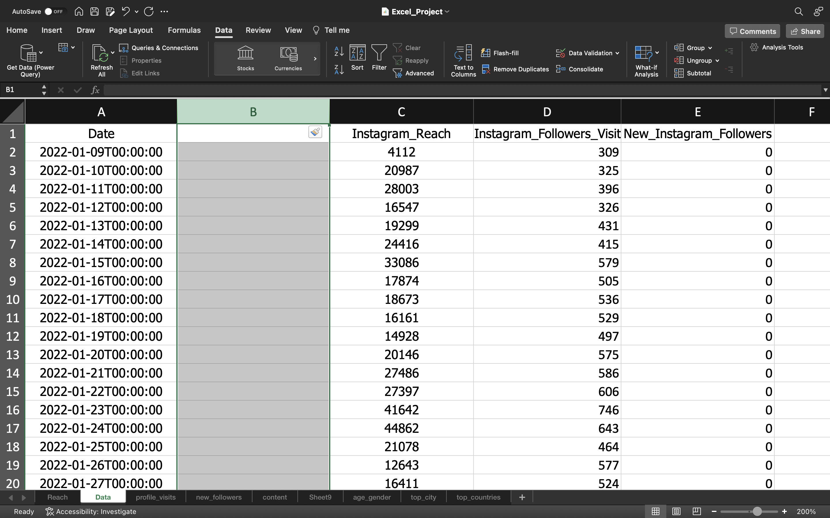
Now let’s go back to the Data Spreadsheet and fix the “Date” column so that we can map the columns of the Content Spreadsheet.
Before doing this, let’s create a new column. It can be done by:
- Select the column by using the keyword CTRL+SPACEBAR.
- Then use CTRL + SHIFT + ‘+’ to create a new column. It adds a column to the left.
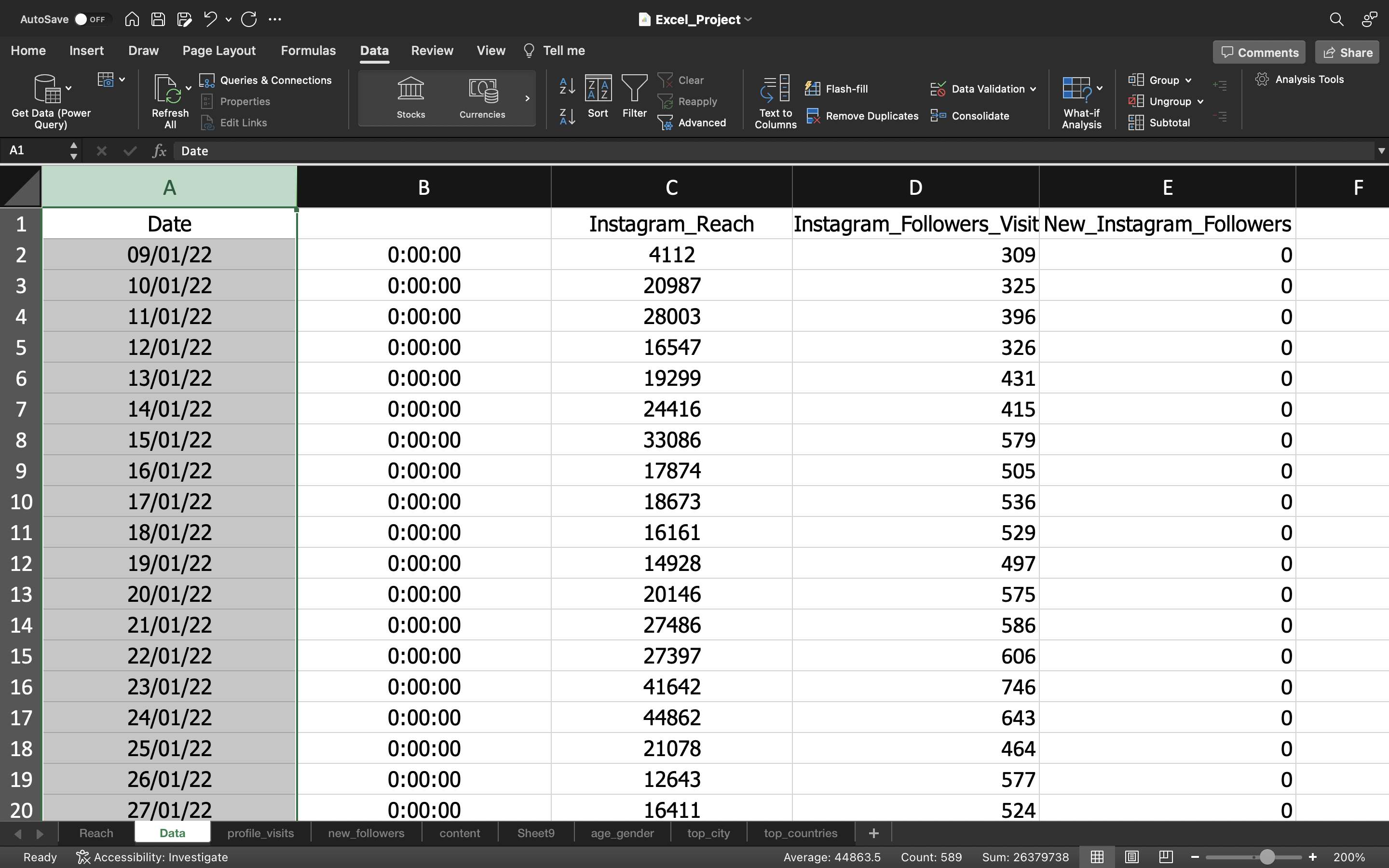
We again perform the delimiter process by:
- Selecting the column and go to the “Data” Tab and click on “Text To Columns”.
- We choose “delimited” option to separate the date value using characters such as commas or tabs. In our case we separate it by using T character as you can see the publish_time value “2022-01-09T00:00:00”, T acts as separator.
- Keep the column Date format as General & click Finish.
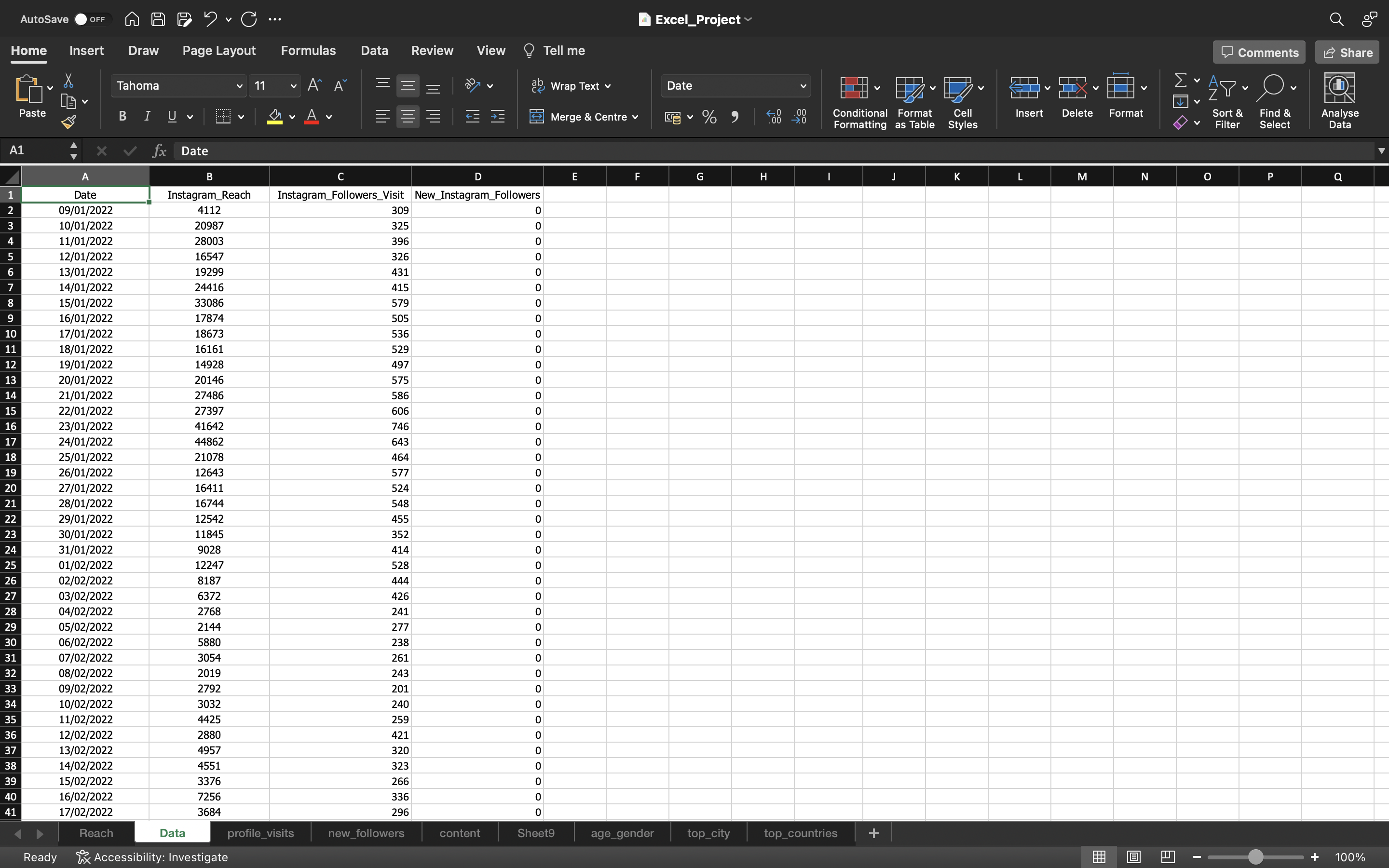
- Finally Let’s remove the column with values 0:00:00.
The output can be seen below:
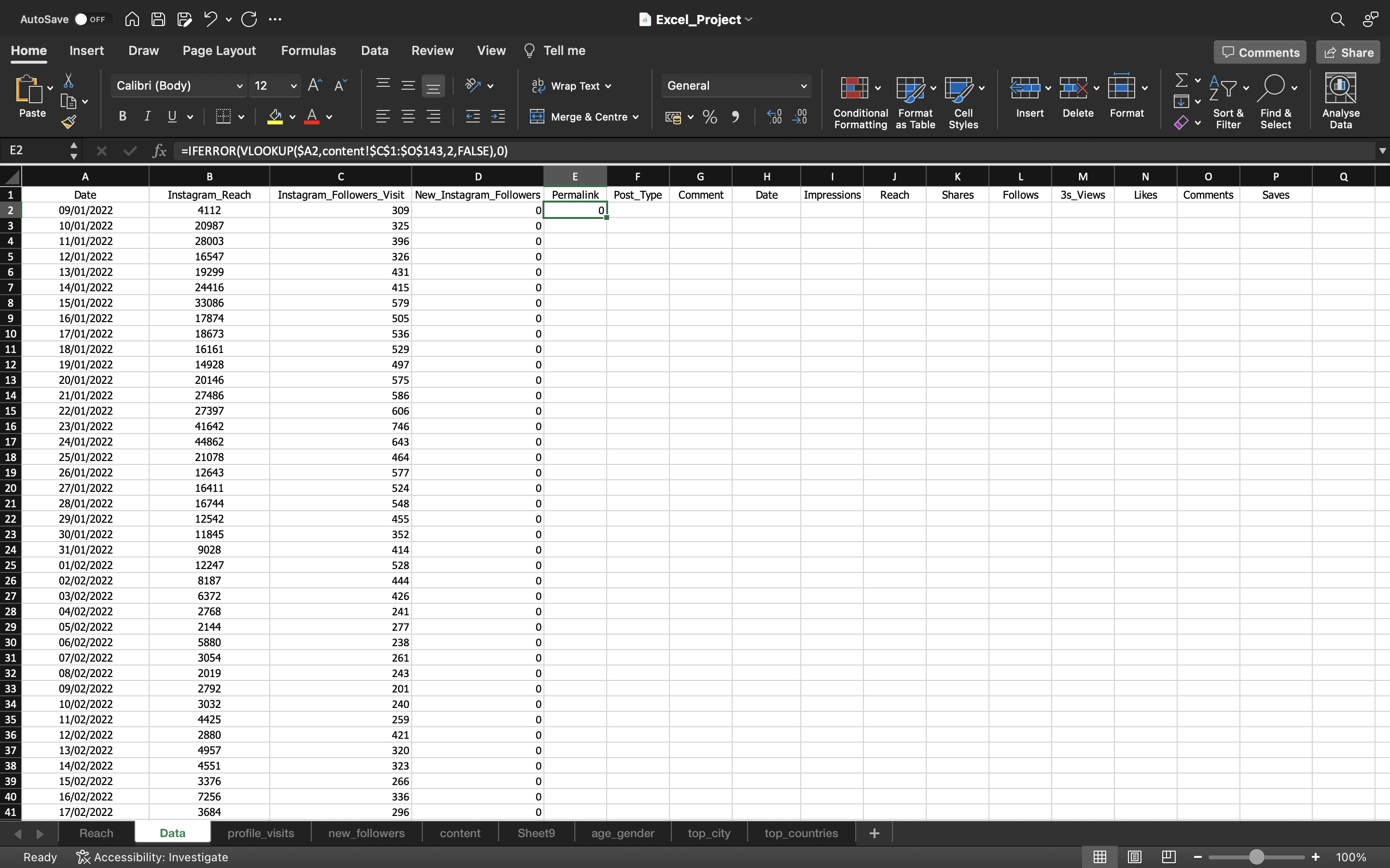
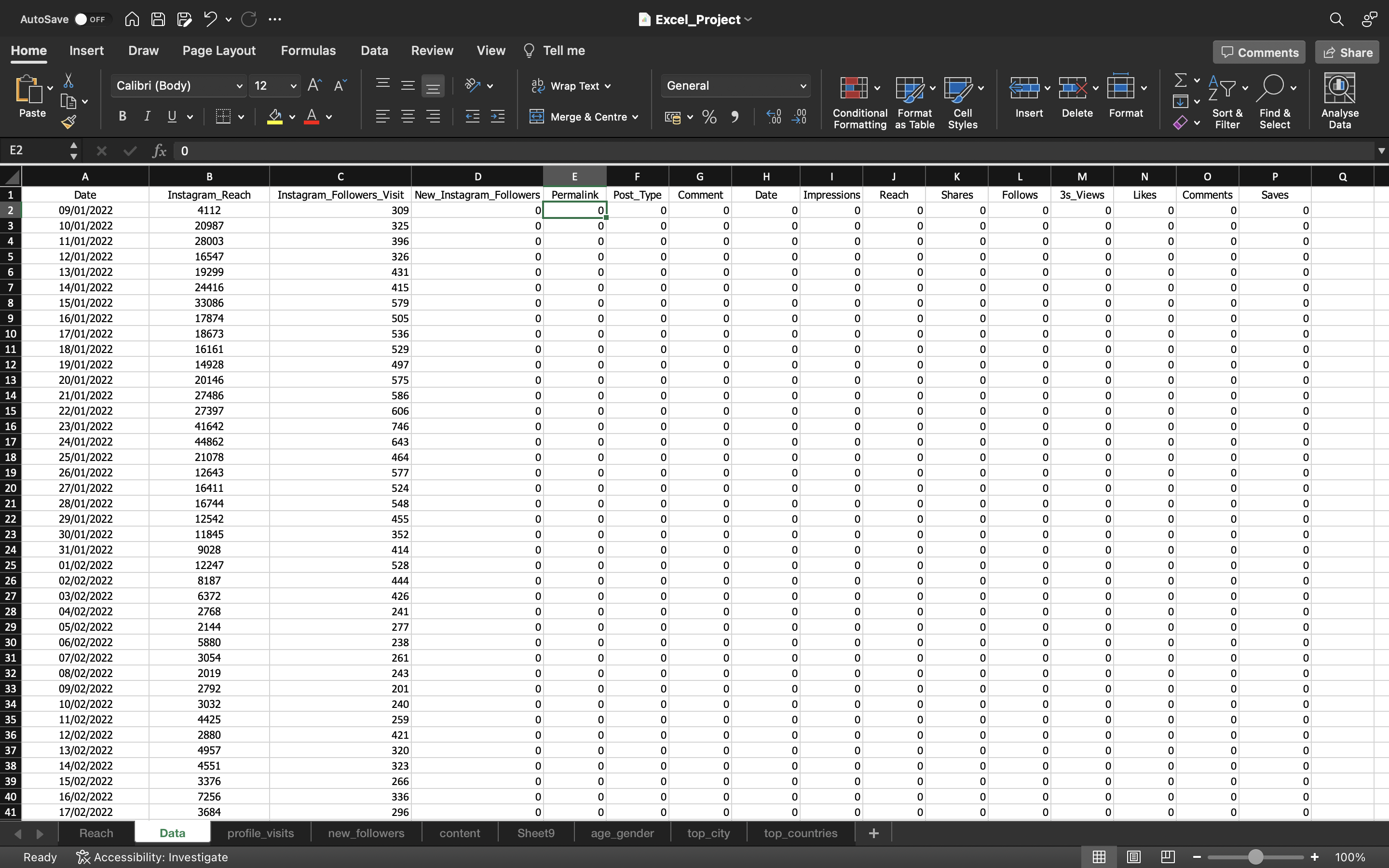
Now let’s gather the data from Content Spreadsheet. We copy the column names such as “Permalink”, “Post_Type”, “Comment”, “Date”, “Impressions”, “Reach”, “Shares”, “Follows”, “3s_Views”, “Likes”, “Comments” & “Saves” and paste it in the “Data” Spreadsheet.
We use VLOOKUP along with IFERROR function by using the formula “=IFERROR(VLOOKUP(lookup_value,table_array,col_index_num,[range_lookup]),0)” to grab the values.
The output can be seen below:
We fill the remaining values by copying the formula/value of the cell to the other cells by using FILL option or using CTRL+D.
Note
- We used $ symbol in lookup_value i.e A2 because when we drag sideways to fill the remaining values, the lookup_value gets shifted. For example, it can be B2 or C2 etc when we drag sideways. We want our look_up value to always be A2 i.e “Date” values because it is the matching column to grab the data from other spreadsheets.
The output can be seen below:
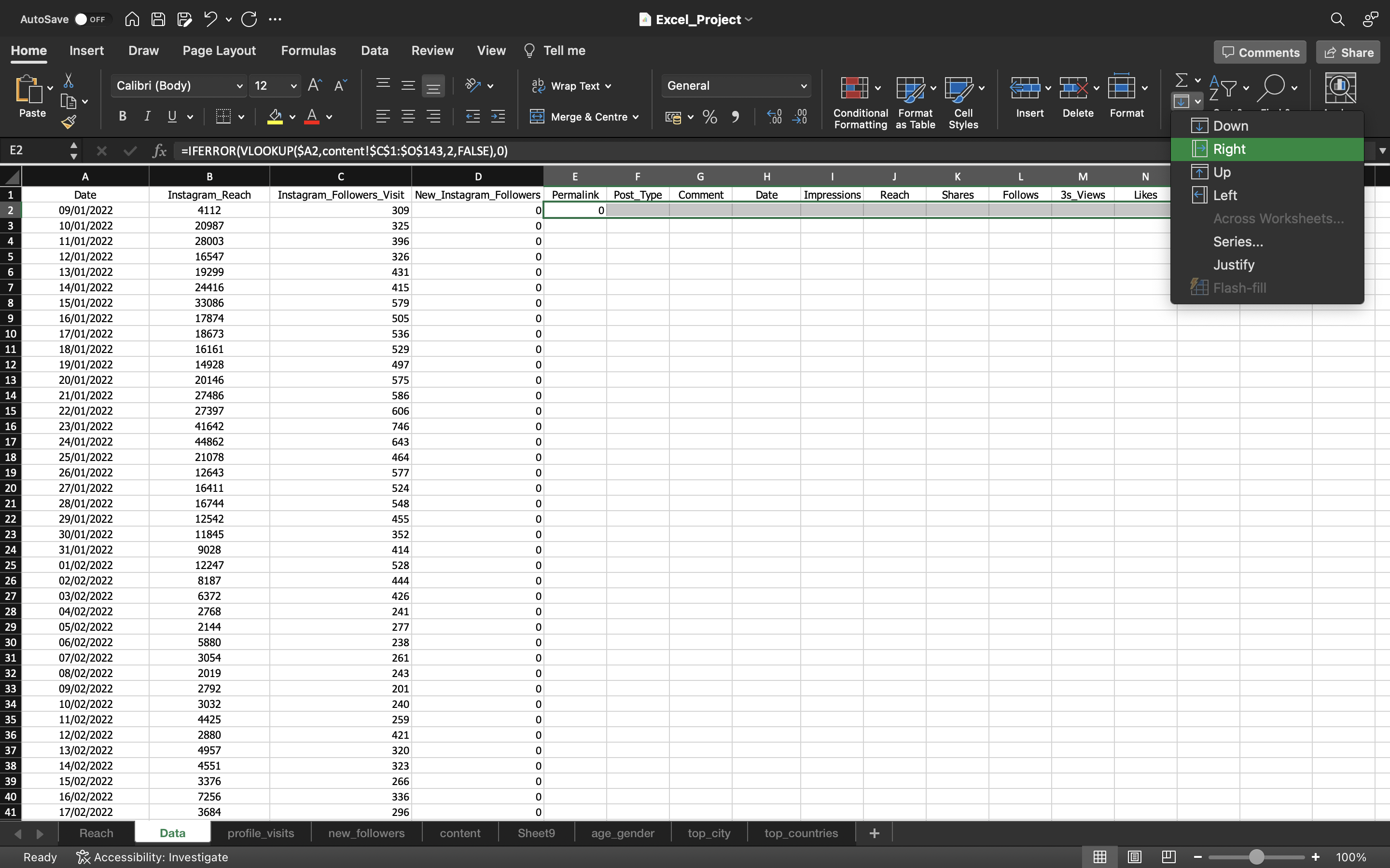
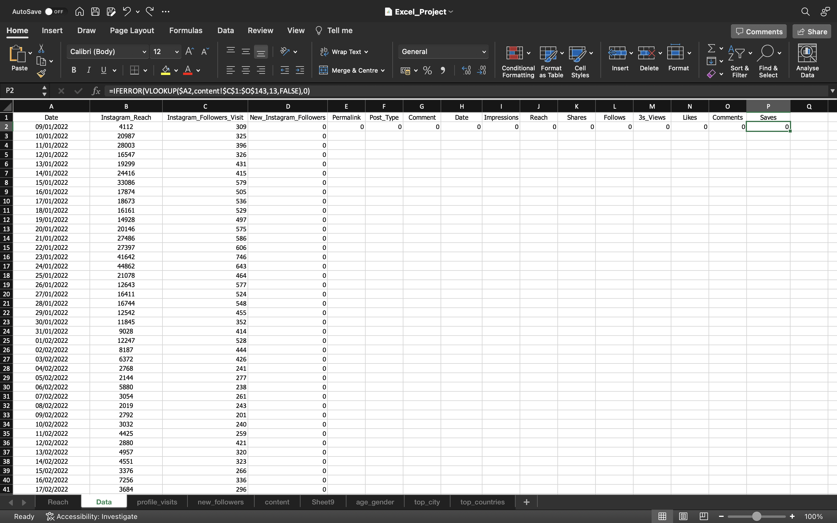
From the above output, we can see we drag towards right to fill the formula/values to the remaining cells.
- We have changed col_index_num values of VLOOKUP function based on the position of the columns in the content spreadsheet.
- For example, We can see for the Saves column, the value 2 of col_index_num is replaced with 13(you can see in the formula bar).
Lastly, we selected the columns Permalink, Post_Type, Comment, Date, Impressions, Reach, Shares, Follows, 3s_Views, Likes, Comments, Saves and dragged the formula/values downwards using Fill option or by using CTRL+D.
You can see the below output:
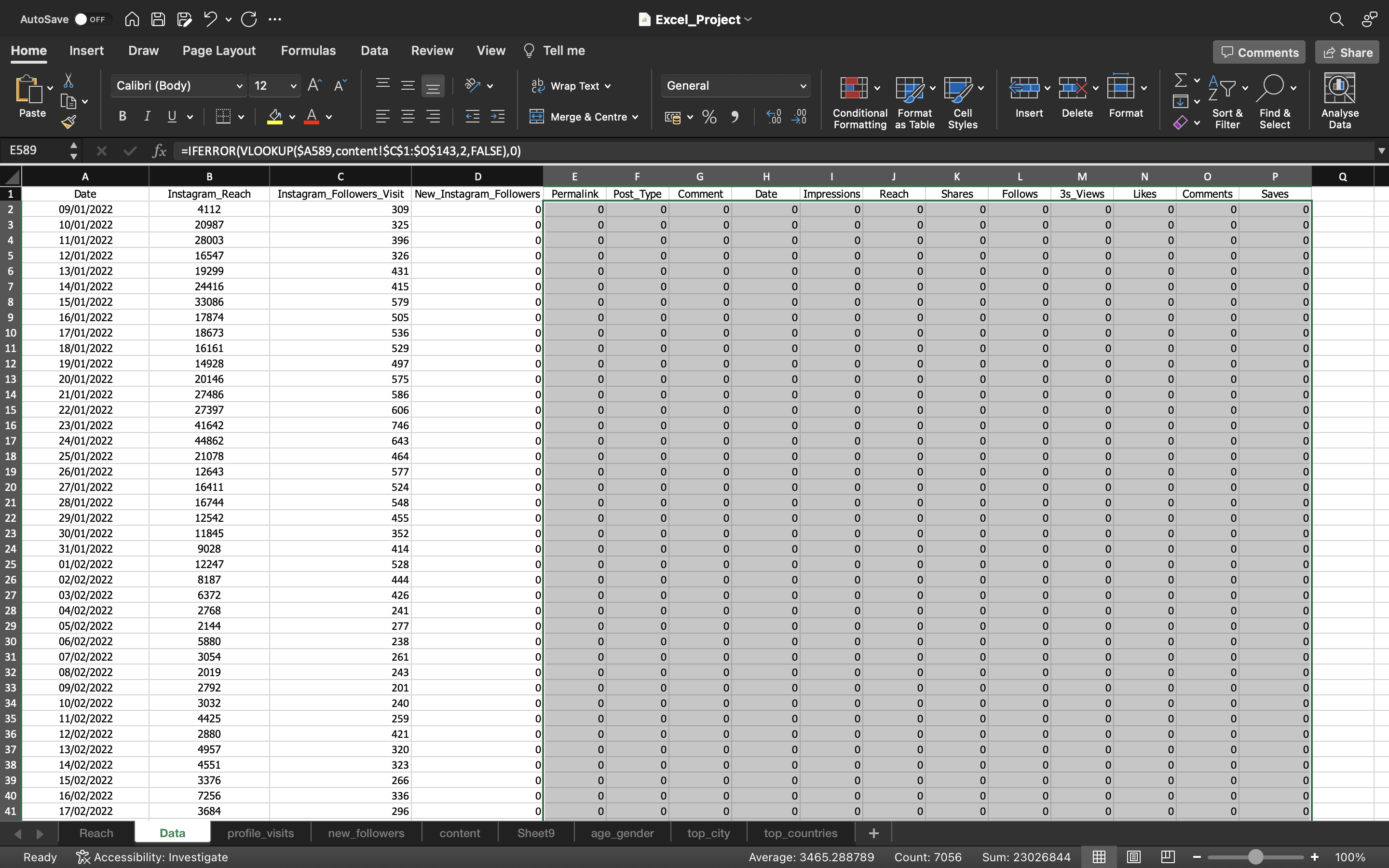
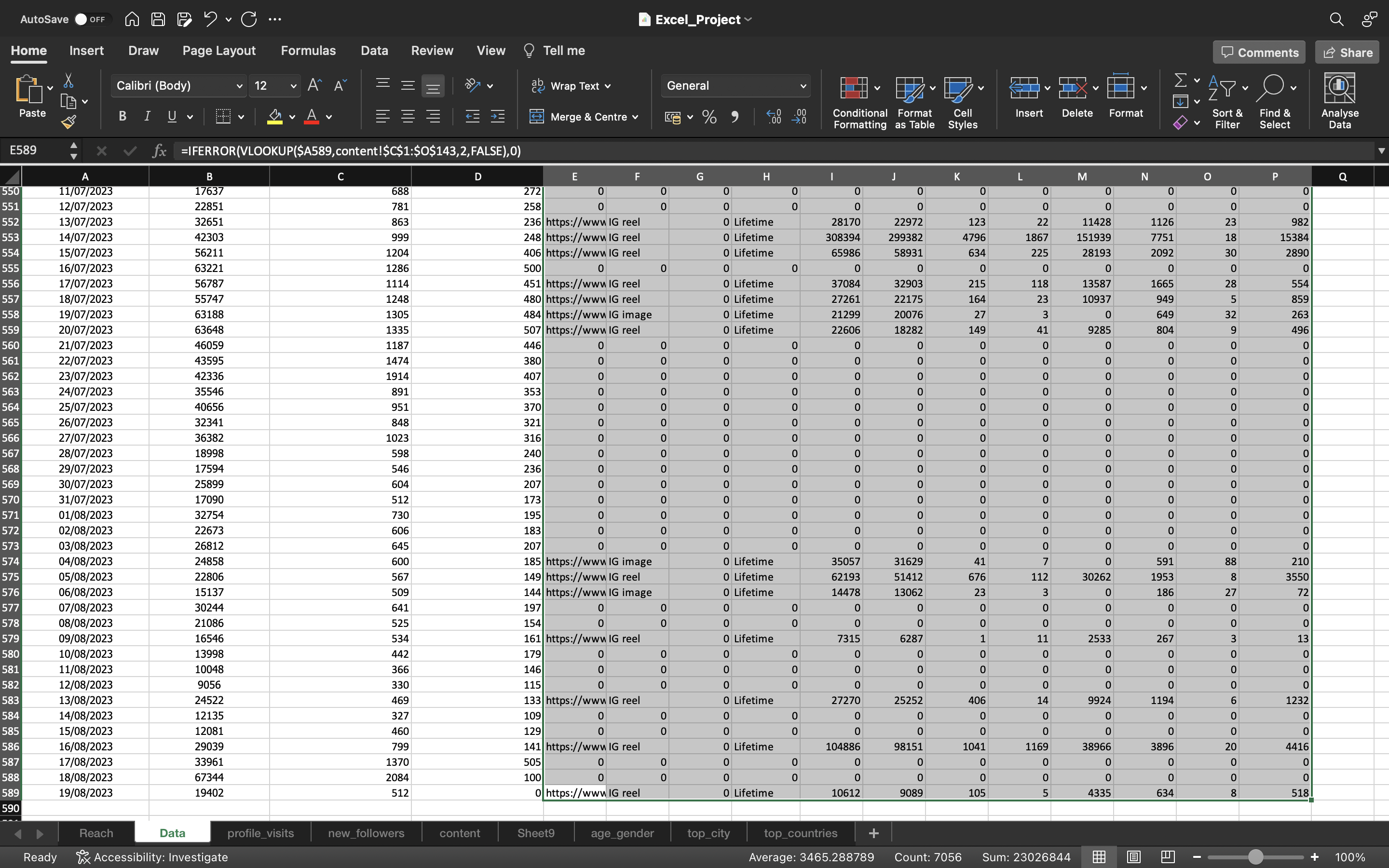
We need to remove the formula which is present in the cell.
This can be done by :
- Copying all the values in the column “Instagram_Followers_Visit” using CTRL+C and pasting it again using CTRL+V.
- Click on the “CTRL” icon and select “paste values”.
So we have converted the formula into values.
The output can be seen below:
Duration (Secs)
Now we will grab the Duration(In Secs) data from content spreadsheet.
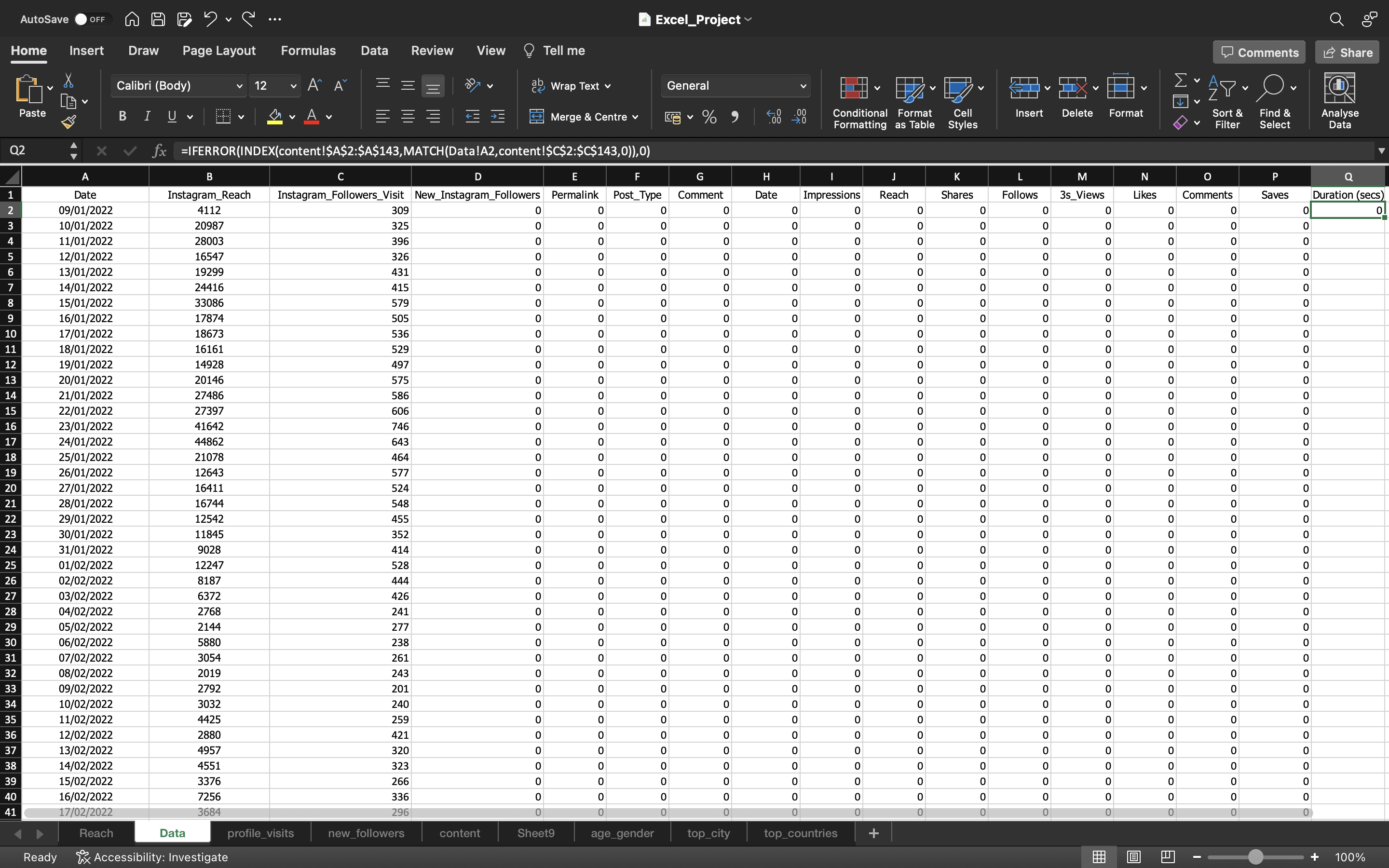
This can be done using INDEX-MATCH using the formula “=IFERROR(INDEX(Reference,MATCH(lookup_value, lookup_array, [match_type]),0)”. This gives us the first value of Duration.
How this formula works?
- Here we want information of Duration column. The Index function asks what is the reference?. So for this we specified the range of Duration column which is in content spreadsheet which is written as INDEX(content!$A$2:$A$143)(You can see this in the formula bar).
- The Index functions wants to know the position of the Duration column. So for this we use MATCH function. MATCH function wants to know the search value which is the Date column in Data Spreadsheet. So we specify the search value which is Data!A2 and it asks where you want me search, so for this we specify the range of Publish_Time_New which is in content spreadsheet which is written as content!$C$2:$C$143). Inorder to get the exact value which is present in the Publish_Time_New column, we specify the value as zero. When we get the exact value, then the corresponding value aka position of Duration column is retreived using the Index. So this is how INDEX-MATCH works.
Note:
- The MATCH function is used to find the position of the Date automatically. With this position, we would be able to identify the duration value without specifying the position manually when we use only the Index function.
- For example : Let’s say the Date is 19/08/2022 and we have used the MATCH function i.e MATCH(Data!A2,content!$C$2:$C$143,0). This gives the output value as 2 as it is in 2nd position(2nd row/ 2nd index) in the DATE column of content spreadsheet. With this position, we can identify the duration value automatically when we use INDEX function by specifying the range of Duration values in content spreadsheet along with MATCH function.
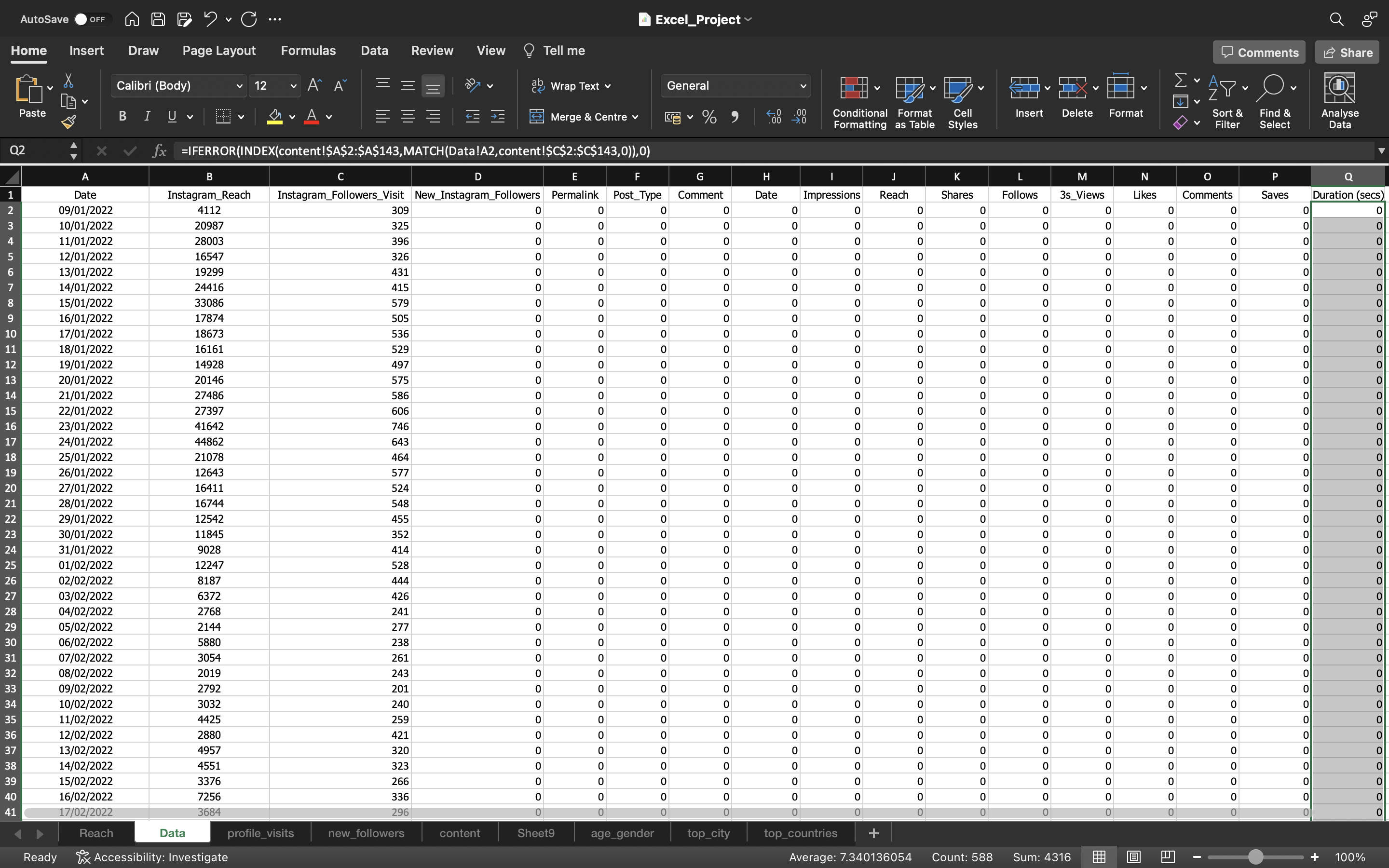
We have selected the whole column and used CTRL+D to drag the values to the remaining cells.
The output can be seen below:
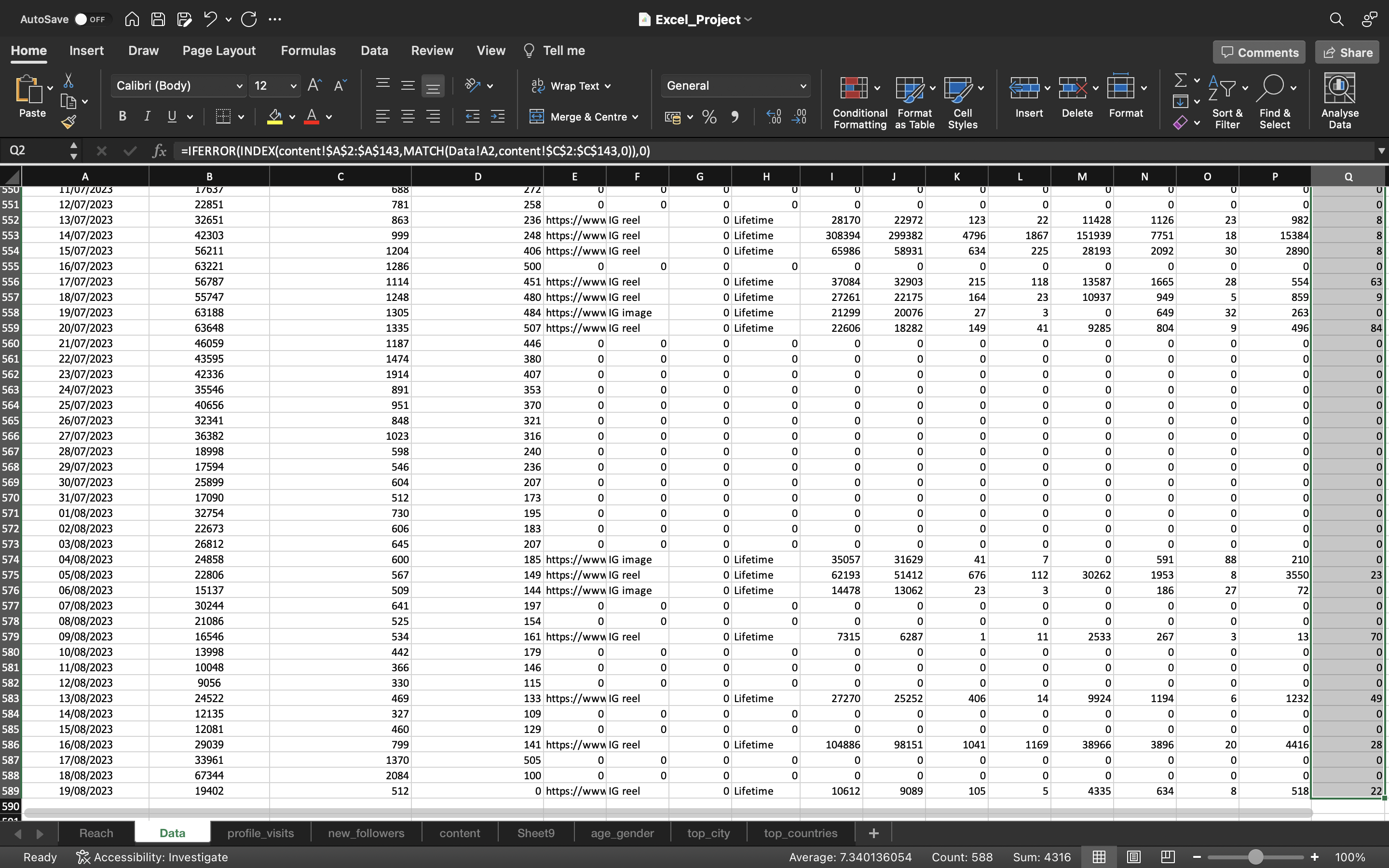
We need to remove the formula which is present in the cell
This can be done by :
- Copying all the values in the column “Instagram_Followers_Visit” using CTRL+C and pasting it again using CTRL+V.
- Click on the “CTRL” icon and select paste values.
The output can be seen below:
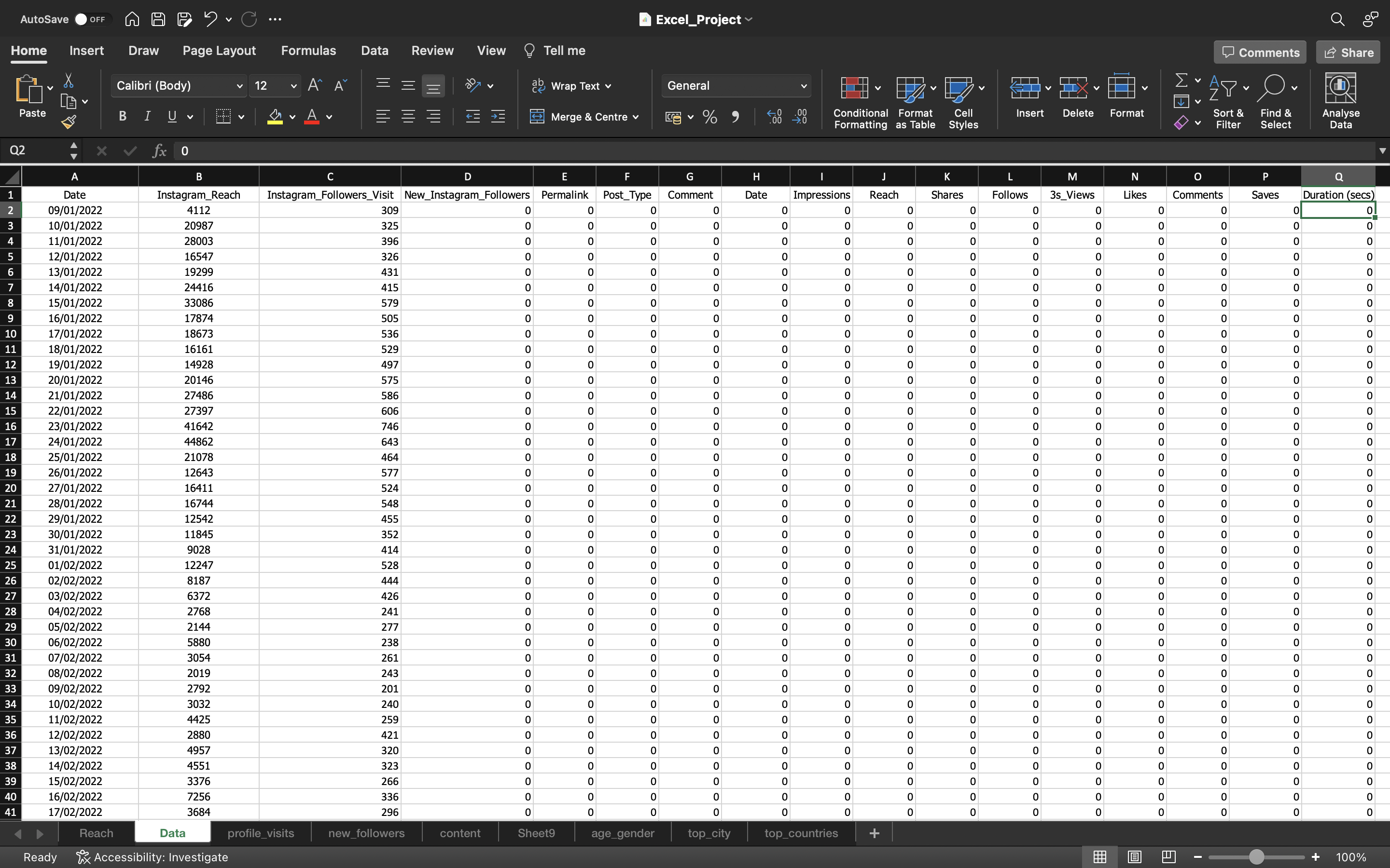
Now looking at the above output, we can see permalink, comment & Date are not important for our analysis.
- The Date column has only one value which is LifeTime . The instagram would have added some sort of Timeline to the content and they must be testing that. Maybe some content will be available till this period etc. So it is not useful for us.
- The comment column is empty
- The permalink consists of link to the instagram posts which is again not helpful for us.
So let’s remove these columns. This can be done by:
- Selecting the column by using CTRL+SPACEBAR.
- Then we use CTRL+’-‘ to remove the column.
The output can be seen below after removing those columns:
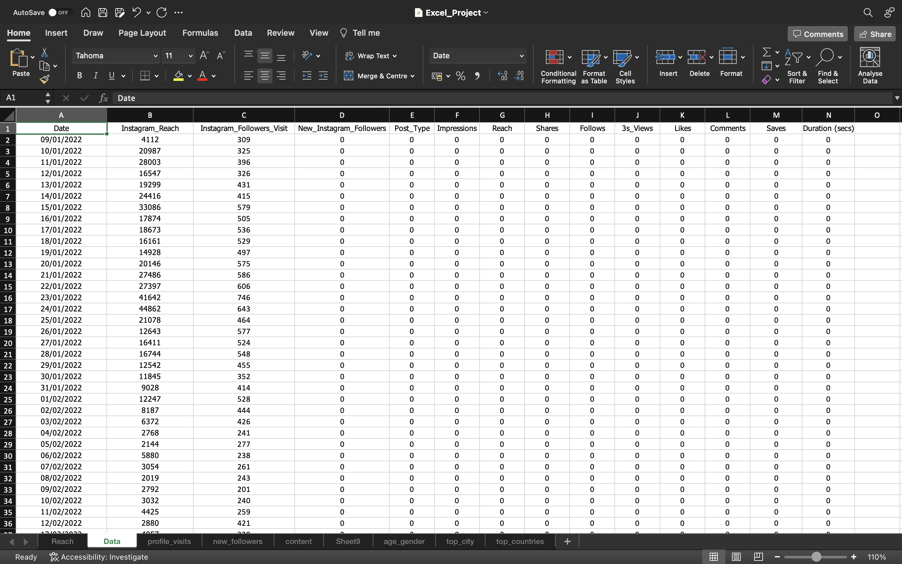
So this is the Dataset which we are gonna work with to perform Exploratory Data Analysis.
Exploratory Data Analysis
Engagement Rate/Proportion
Engagement Rate defines how people are engaging with your content. It is about people commenting, liking, saving & sharing the posts. So this is how you are engaging with it.
The formula :
Engagement Rate per day = Sum of ( Likes + Comments + Saves + Shares ) per day / (Total number of Followers per day )
Sum of ( Likes + Comments + Saves + Shares ): This number will be duplicated that means one person could have done everything i.e can like, comment, save & share the post.
So now we need to calculate total number of followers per day.
Let’s first inspect the dataset which is displayed in the below output:
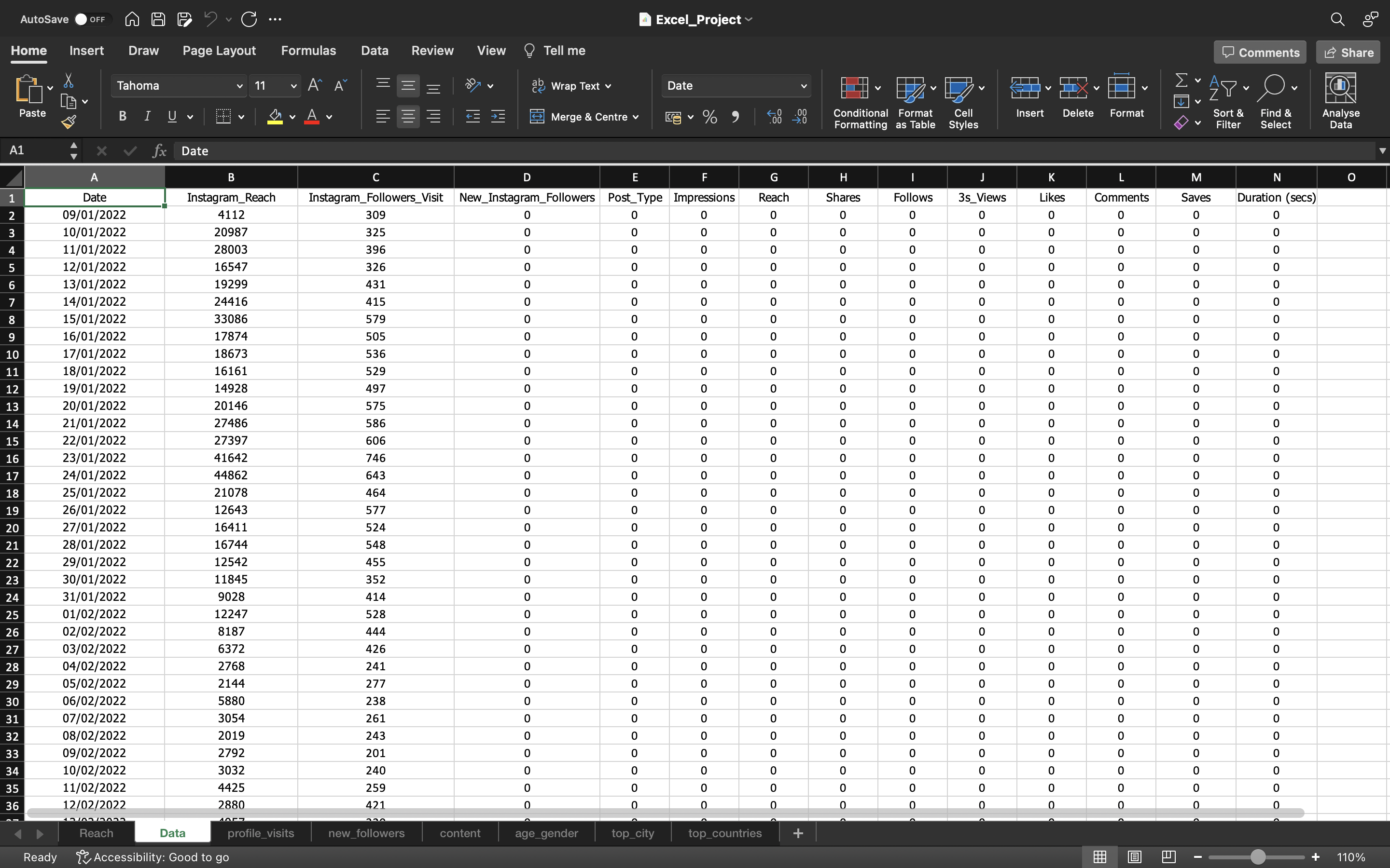
From the above output, We can see we have Date starting from 9th January 2022 till 19th August 2023 only for Instagram reach & Instagram_Followers_Visit columns. For other columns, date is not available starting from 9th January 2022.
If we simply use New_Instagram_Followers as base and using Filter removing all the Zeros, we can see the Date is starting from 21st November 2022
The output can be seen below :
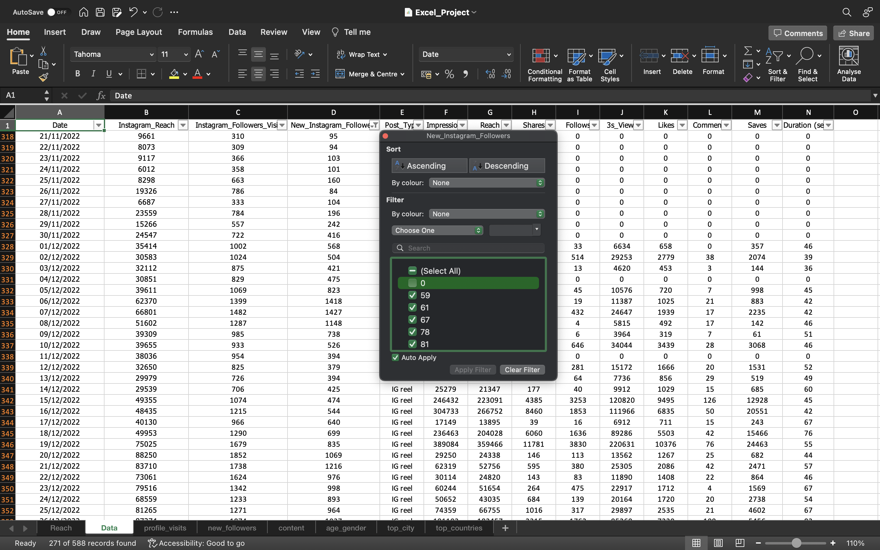
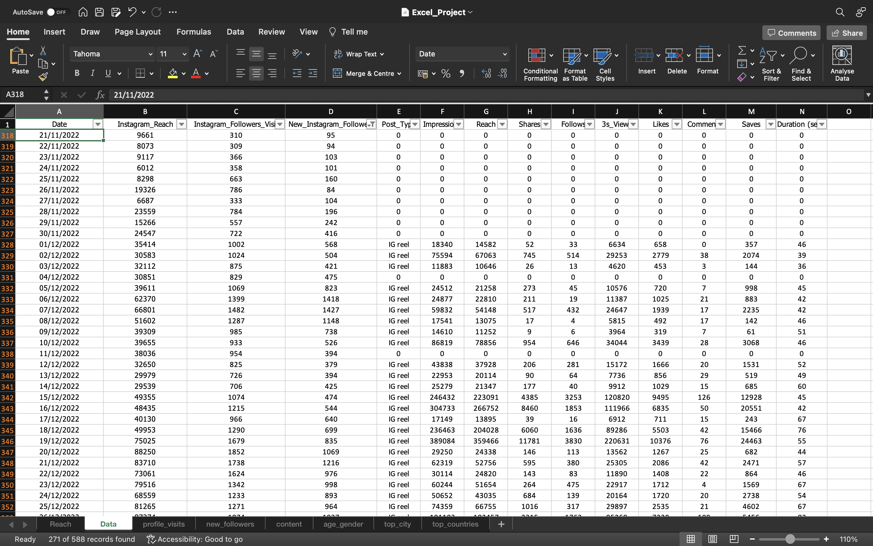
Based on the above output, for the Instagram Post_Type, the Date is starting from 1st December 2022.
So we can consider this as a starting point and take our analysis forward because we need to have everything in one particular scale or one particular time period our analysis should always be. We cannot have one metric in different time period & another metric in another time period. To explain it to stakeholders it will be very challenging. So in such cases it is best to keep your entire dataset into a particular time period. So we can start our analysis from 1st December 2022.
The output can be seen below:
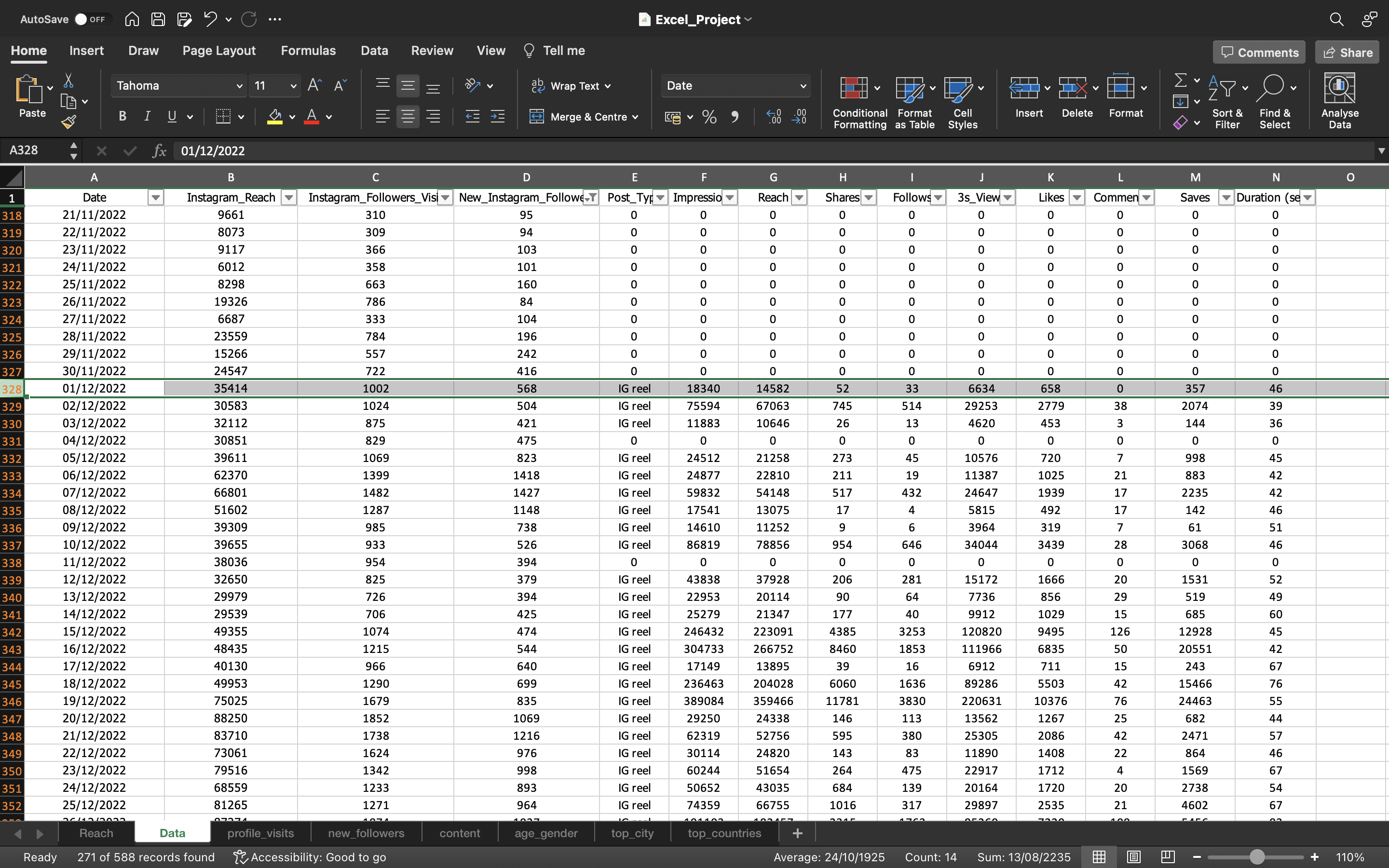
Based on the above output, Now we can just filter the Date column which is highlighted above to start from 1st December 2022
The output can be seen below:
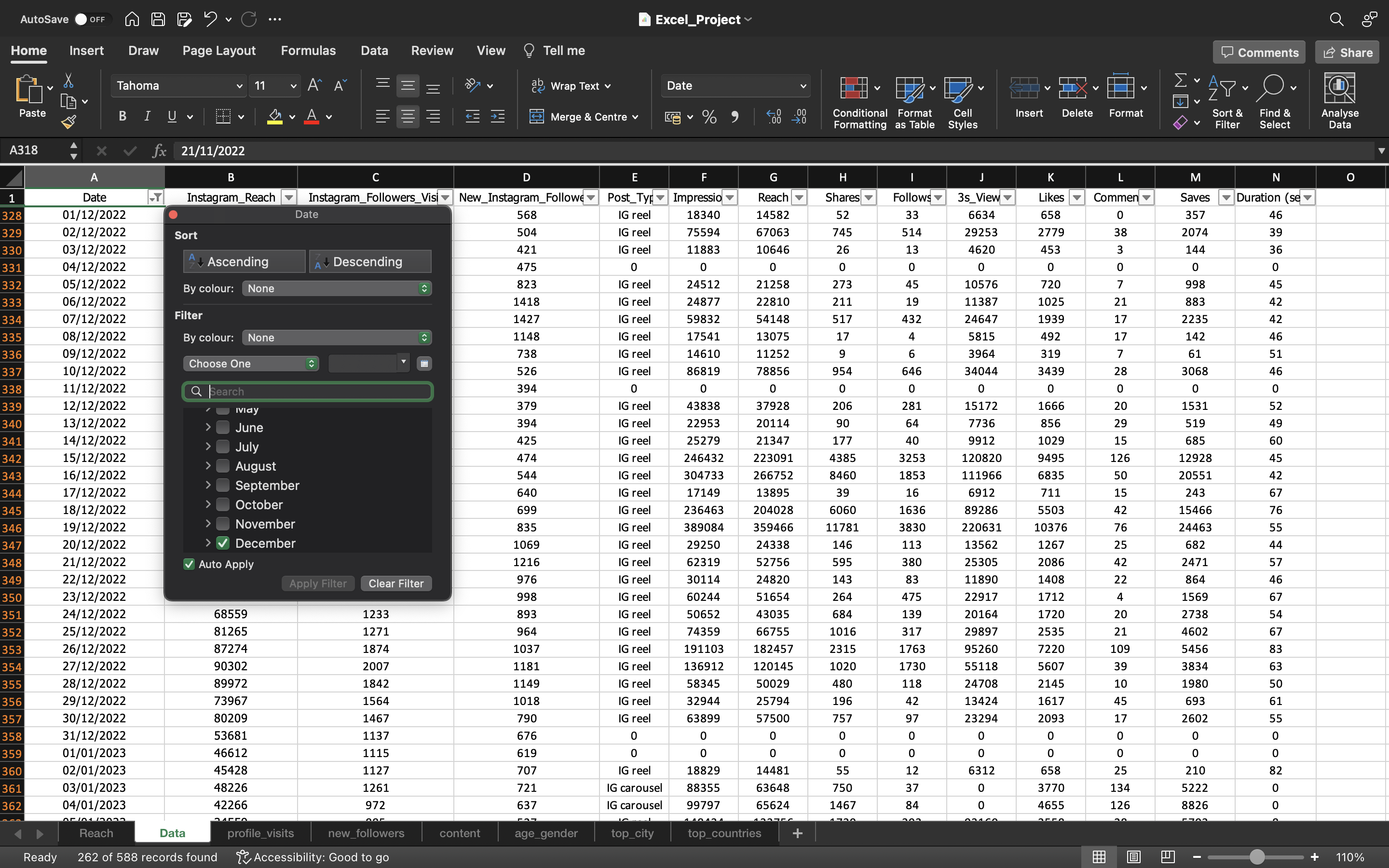
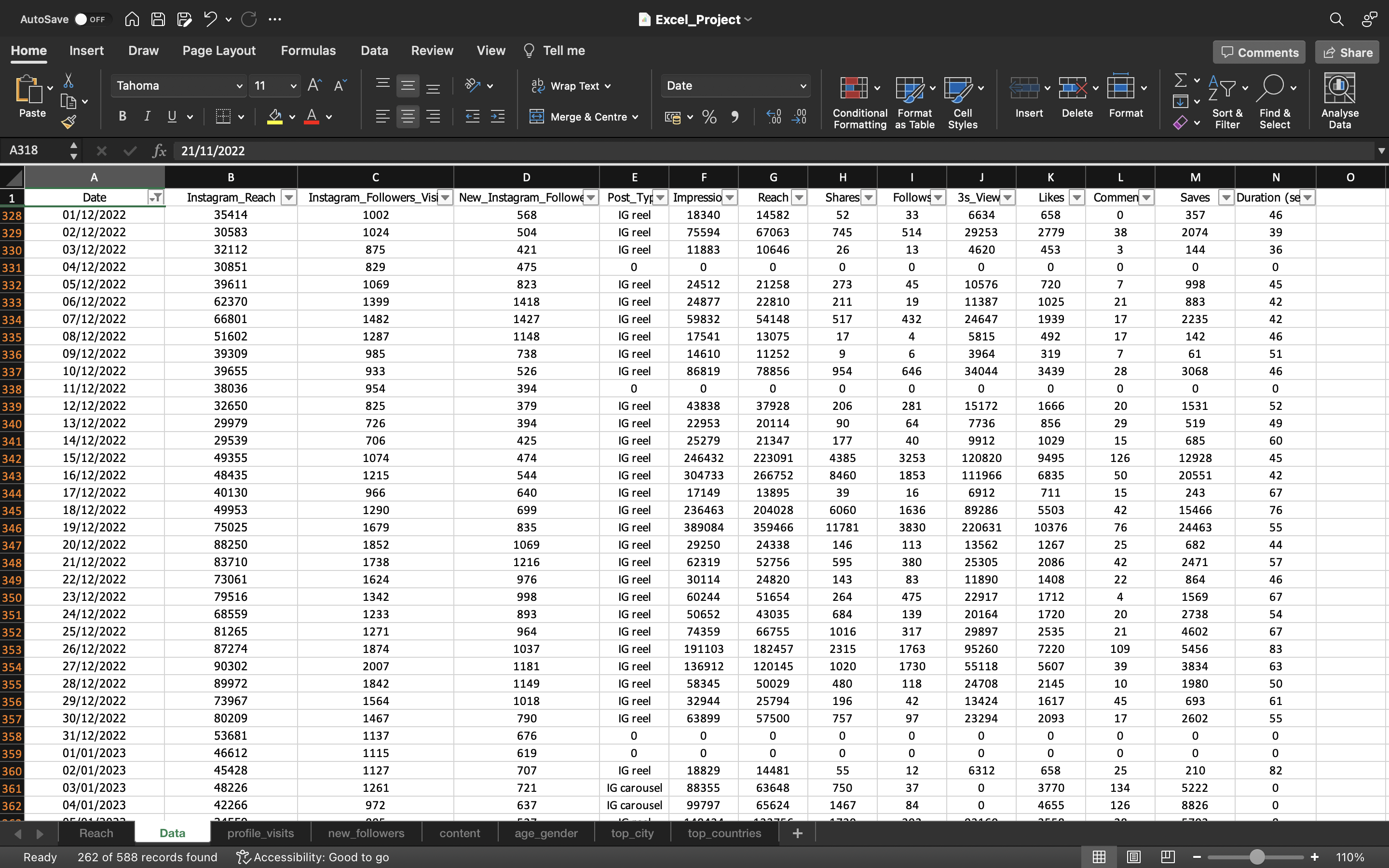
So based on the above output, we can just copy this data which has Date starting from 1st December 2022 till 19th August 2023 into a separate sheet & name it is as Subset.
This Subset data can be used as our final dataset for our analysis.
The output can be seen below:
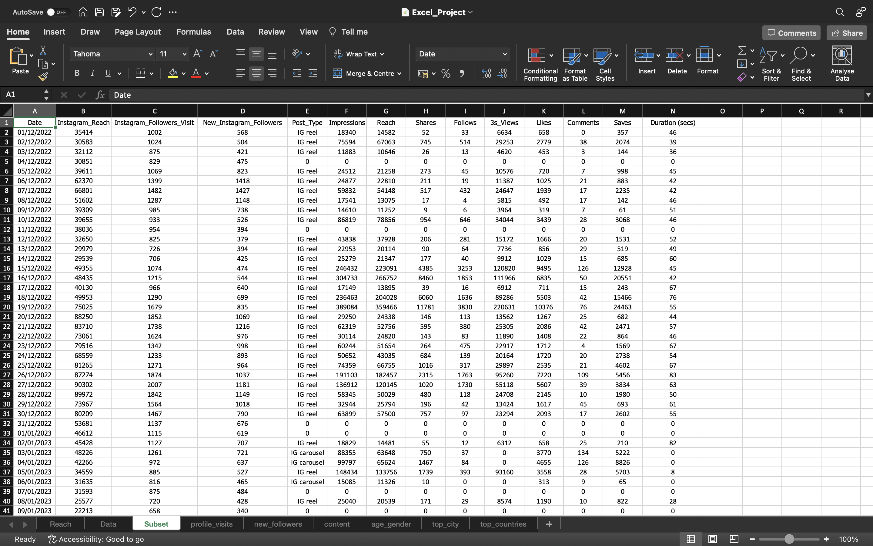
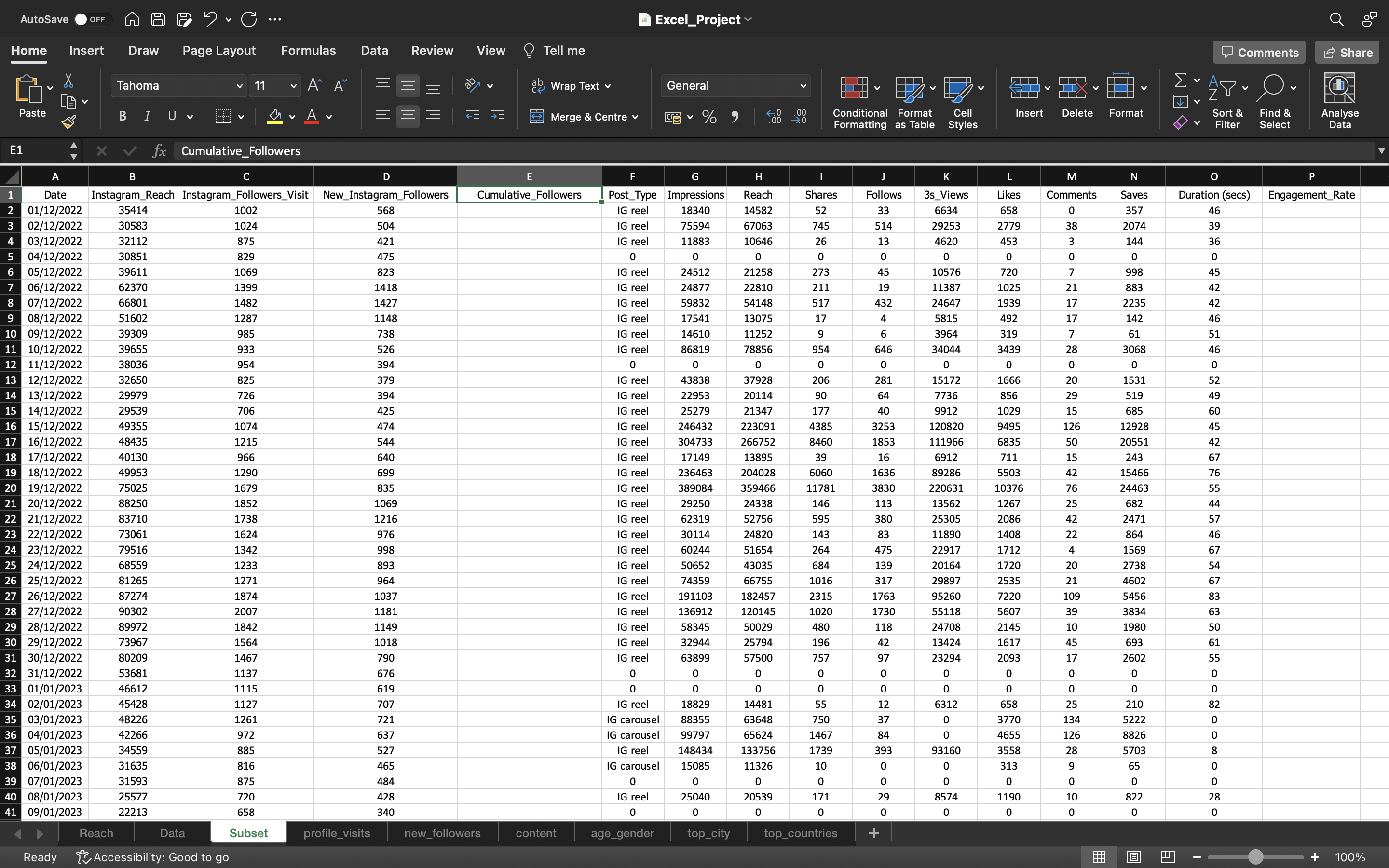
Now we need to find the Total number of followers per Date
First we create an empty column. This can be done by:
- Selecting the column by using CTRL+SPACEBAR.
- Then we use CTRL + shift + ‘+’ to add the column.
The new column is named as Cumulative_Followers.
The output can be seen below:
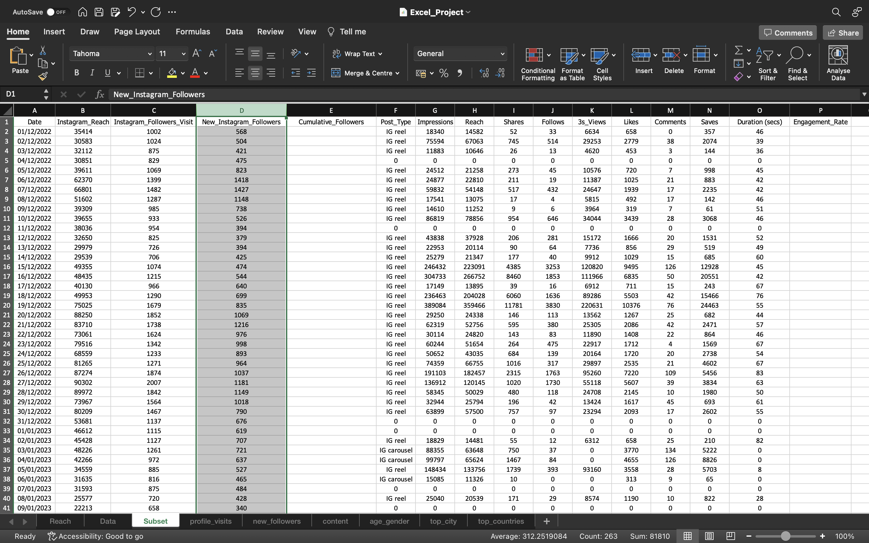
As per the information with respect to Age_Gender spreadsheet(can be checked in Data Preparation step), we know the total follower count is 104224.
If we calculate the sum of all New_Instagram_Followers which gives the value as 81810.
This can be done by:
- Using the formula “=SUM(D2:D263)” (or)
- Click the column header or use “CTRL+A”. The status bar, in the lower-right corner of your Excel window, will tell you the Sum value.
So Sum value says that there are total of 81810 followers gained starting from 1st December 2022 till 19th August 2023
So how many followers we had before 1st December 2022?
This can be calculated as :
104224 - 81810 = 22414
So the value 22414 acts as a total number of followers before the date 1st December 2022. Then we can add it to each value calculating the total number of followers for each date.
This can be done using the SUM formula. Then we drag it down to fill the formula/values to the remaining cells by using CTRL+D.
Then we again copy the values to convert the formula into values.
This can be done by :
- Copying all the values in the column “Cumulative_Followers” using CTRL+C and pasting it again using CTRL+V
- Click on the “CTRL” icon and select “paste values”.
So for the date 19th August 2023, the Cumulative_Followers count is 104224 which is exact match to our total follower count
The output can be seen below:

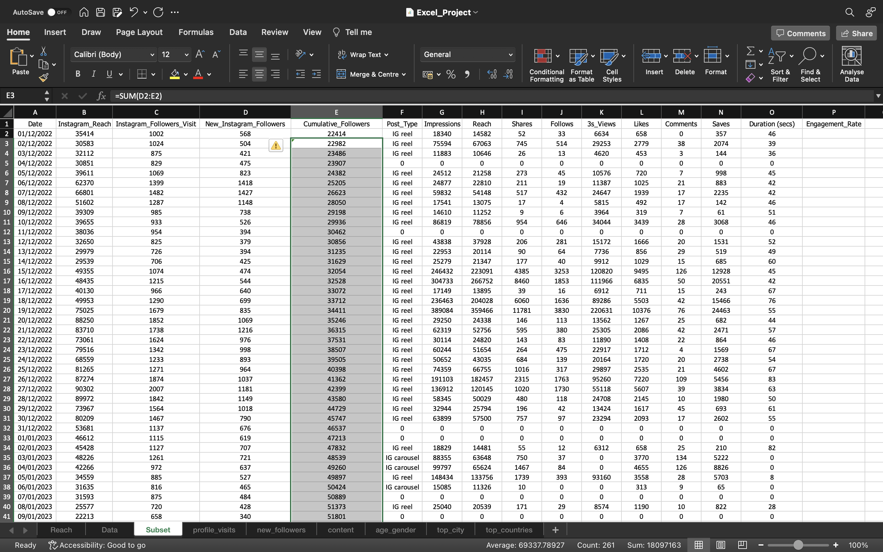
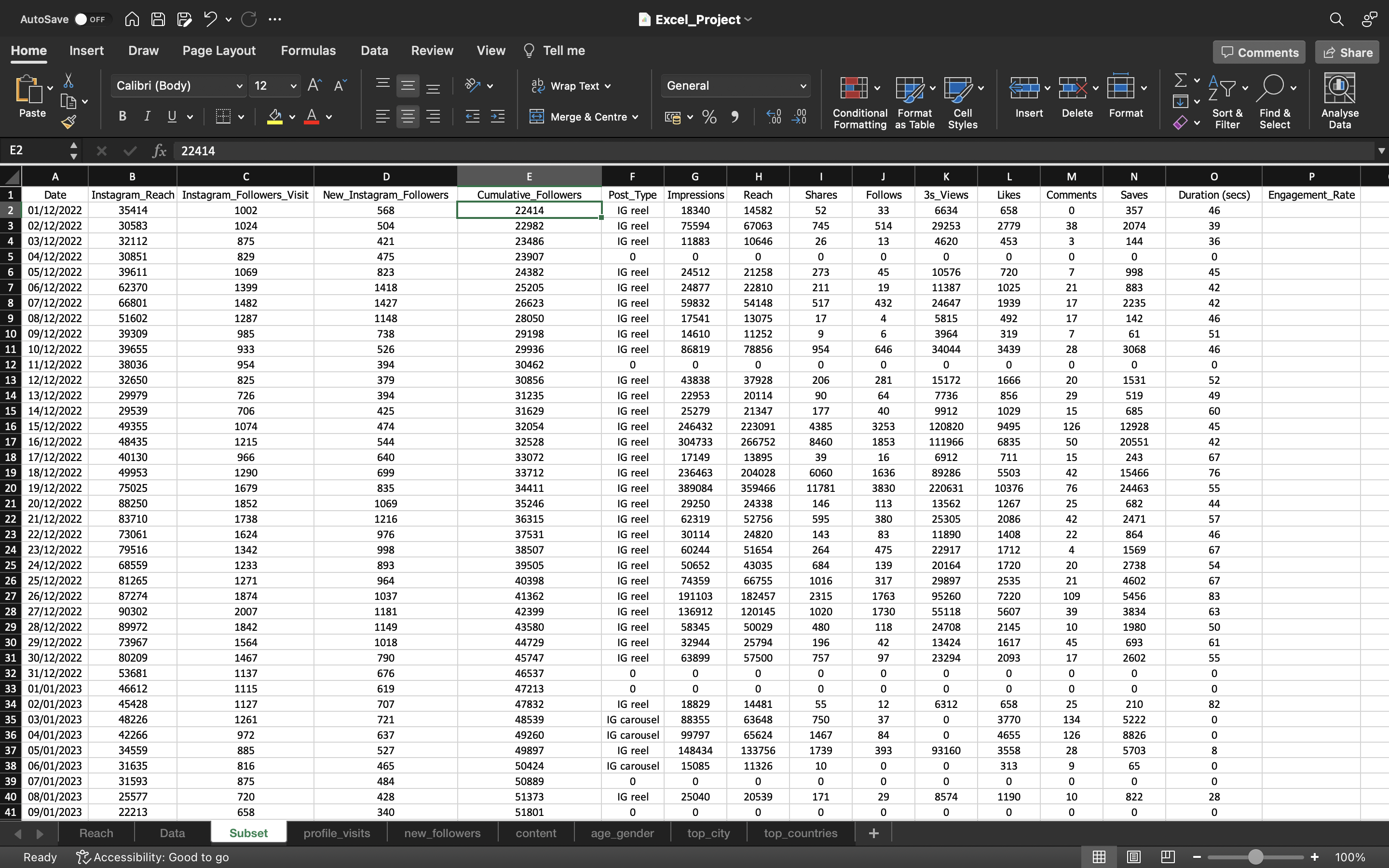
Starting from 1st December 2022 till 19th August 2023 i.e around 9 months we have gained 81810 followers. On an average we are gaining around 9000 followers per month.
Let’s calculate the engagement rate. This can be done using the formula:
SUM(Shares+Likes+Comments+Saves)per day/Cumulative_Followers per day
Finally convert the output value into percentage.
The output can be seen below:
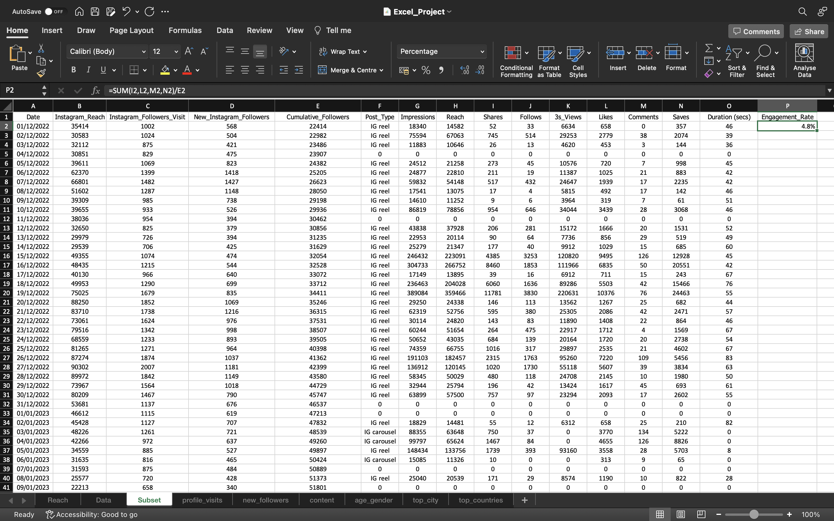
From the above output we can infer:
Even though we had 22414 Followers during the Date 1st December 2022, only 4.8% of those 22414 followers engaged with my content i.e IG Reels. So out of 22414 around 1000 people have engaged with my content. I won’t say 1000 people because this number is duplicated means one person could have done everything i.e like, comment, save and share. So if we consider this, I think this number will come down around 2 or 3%. As of now let’s take everything.
The follower count does not matter generally because more engaged the content is, more helpful it is for someone. So only 1000 folks are engaging/liking this content i.e IG Reels.
Now we are gonna drag this down to copy the formula/values into the remaining cells using CTRL+D.
Then we again copy the values to convert the formula into values.
This can be done by :
- Copying all the values in the column “Cumulative_Followers” using CTRL+C and pasting it again using CTRL+V
- Click on the “CTRL” icon and select “paste values”.
We can see the output below:
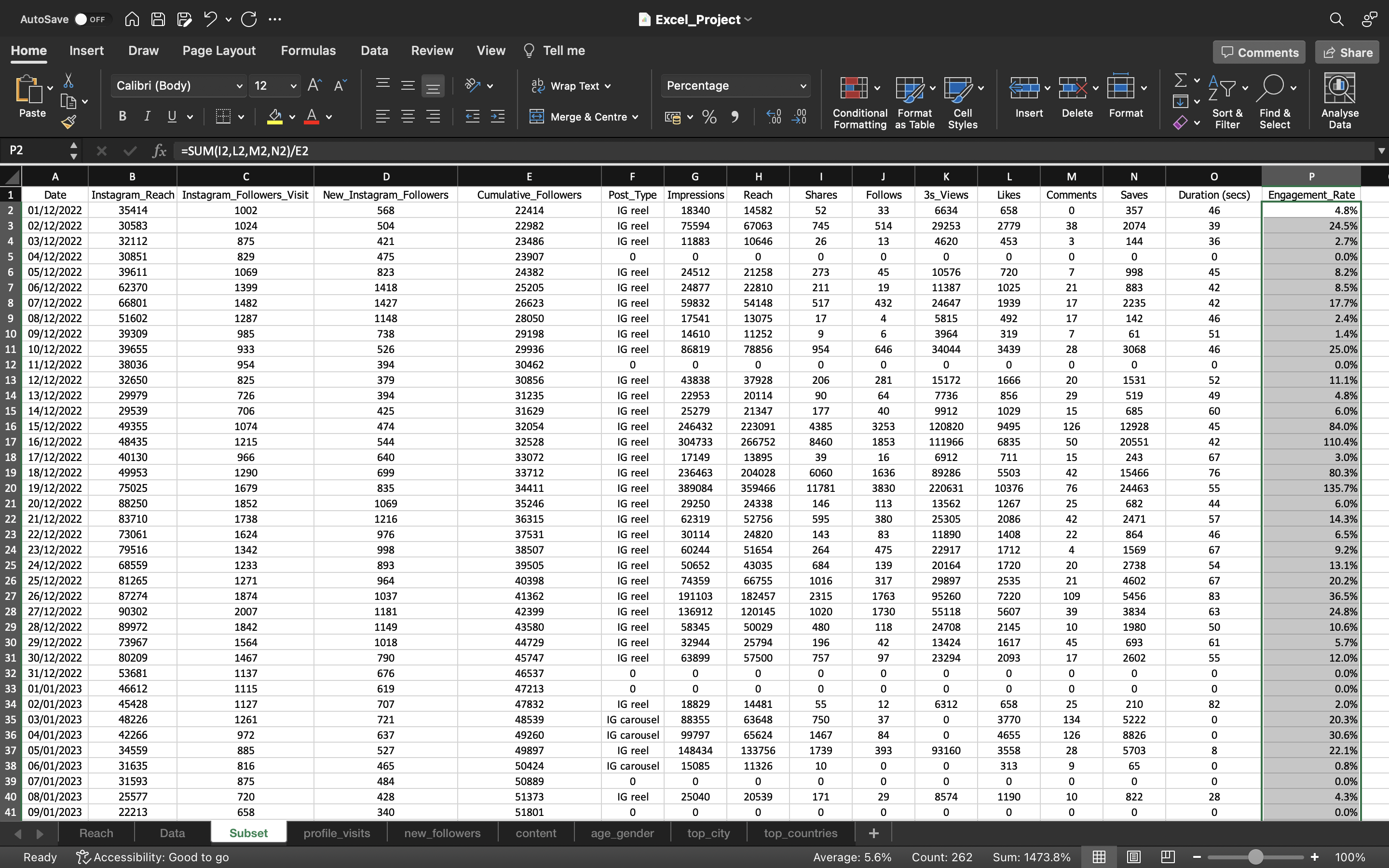
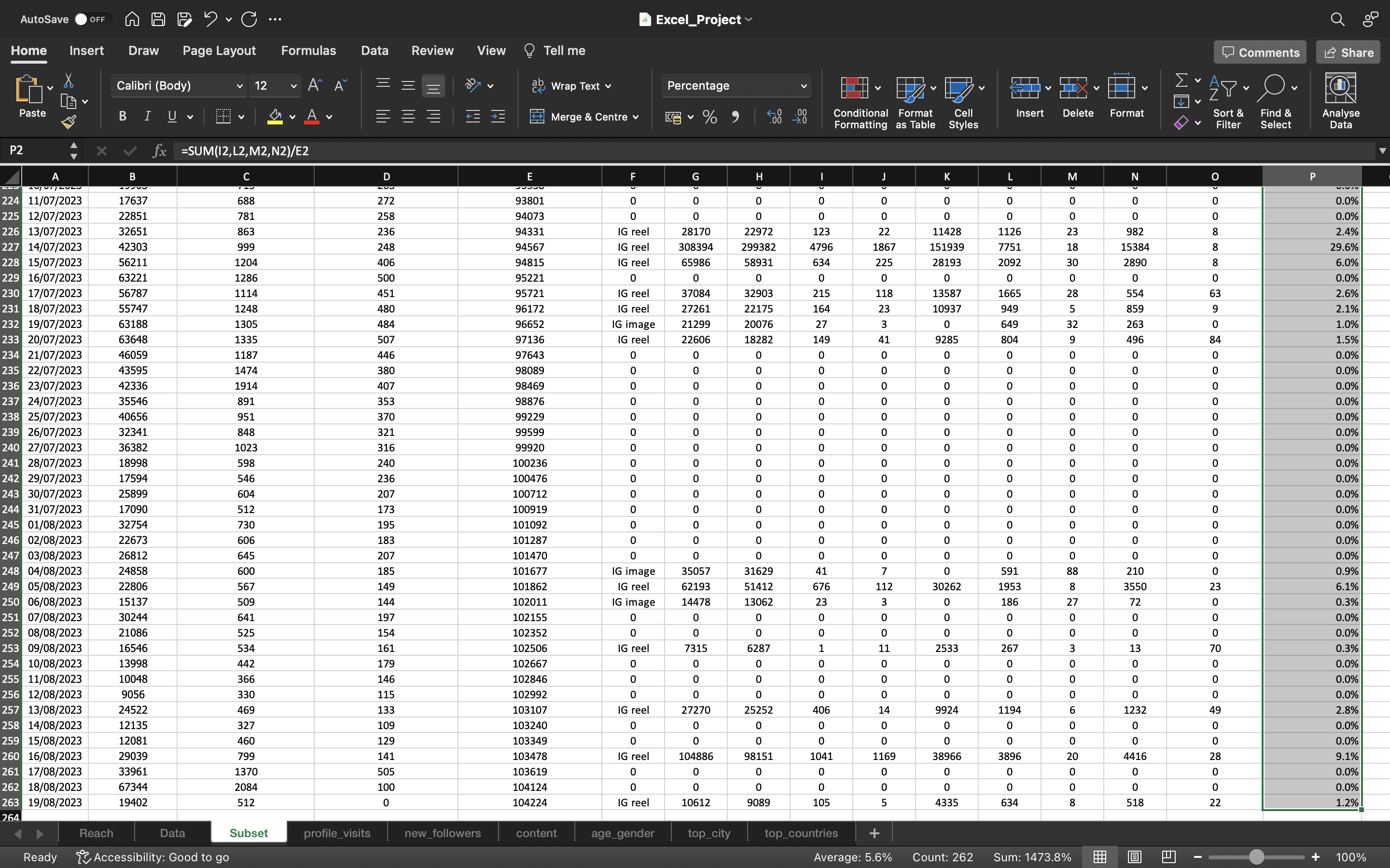
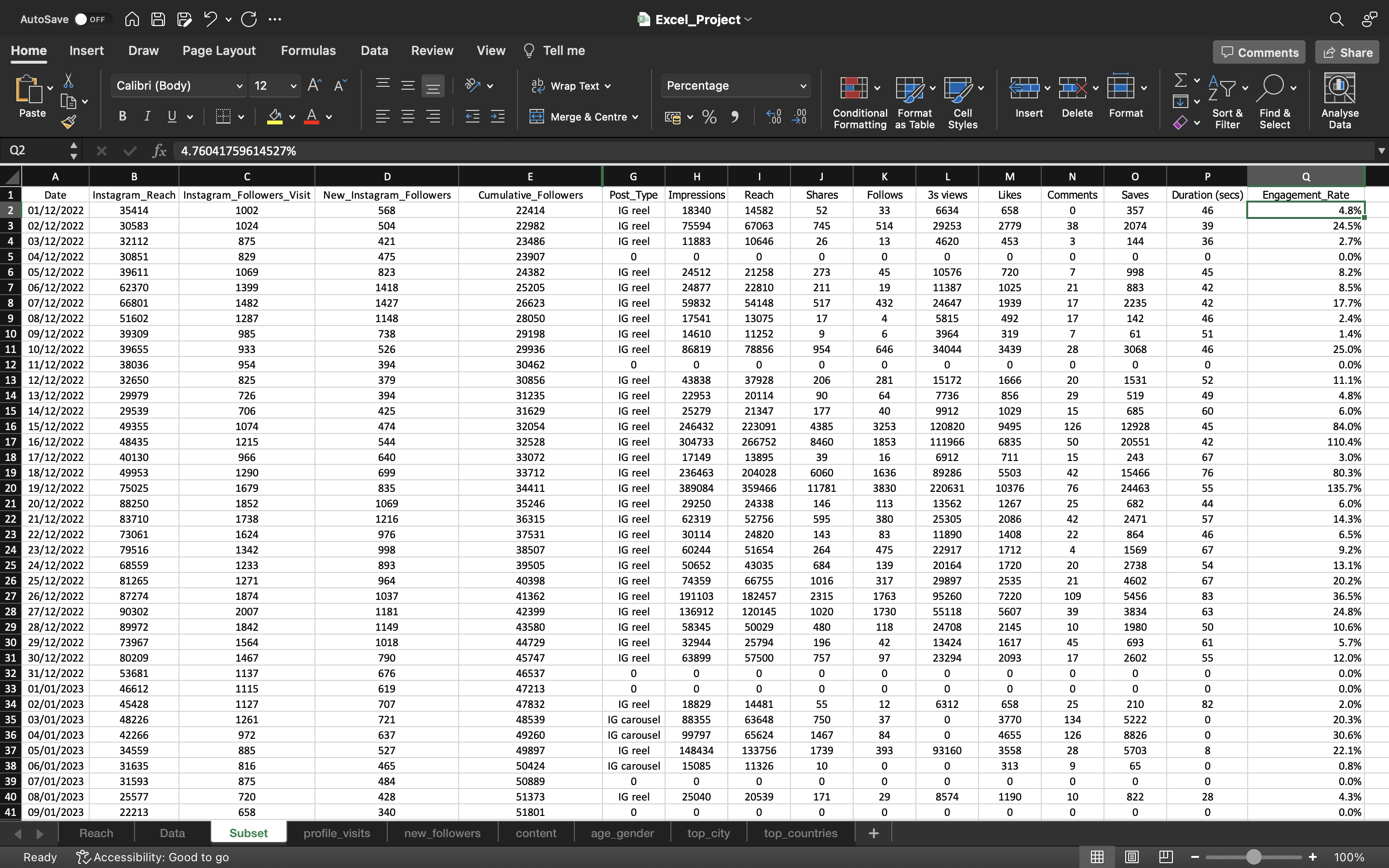
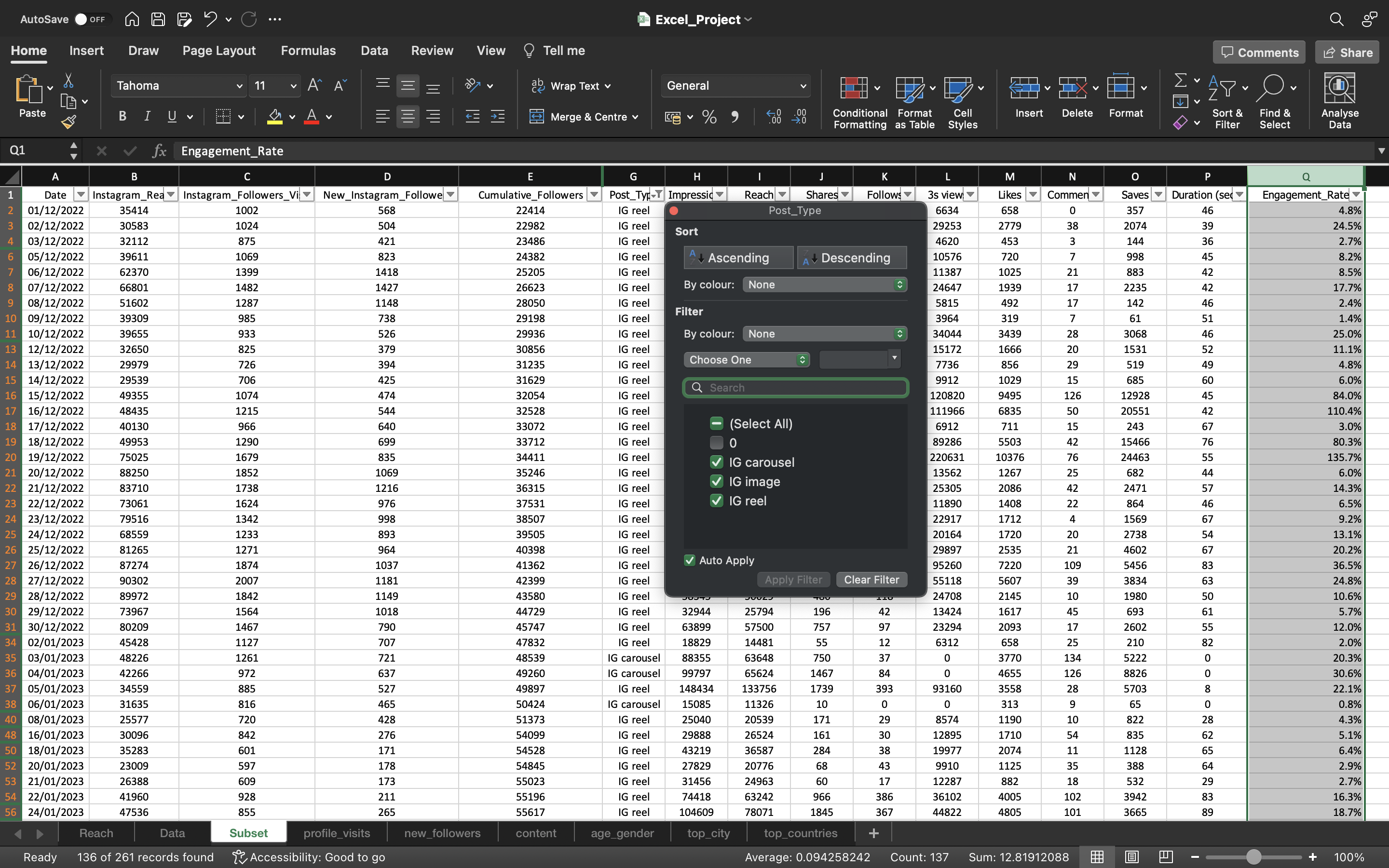
From the above output we can infer:
- Look at this engagemet rate of 110.4% on the Date 16th December 2022(row number - 17) with cumulative followers of 32528 for this particular content. For this content, we had around 20,000 Saves and 304733 impressions.
- We have filtered the Post_Type column to exclude Zeros because zero represent no post available during the day. Then we calculated the average engagement rate after filtering which is 9.4% for the period of 1st December 2022 till 19th August 2023.
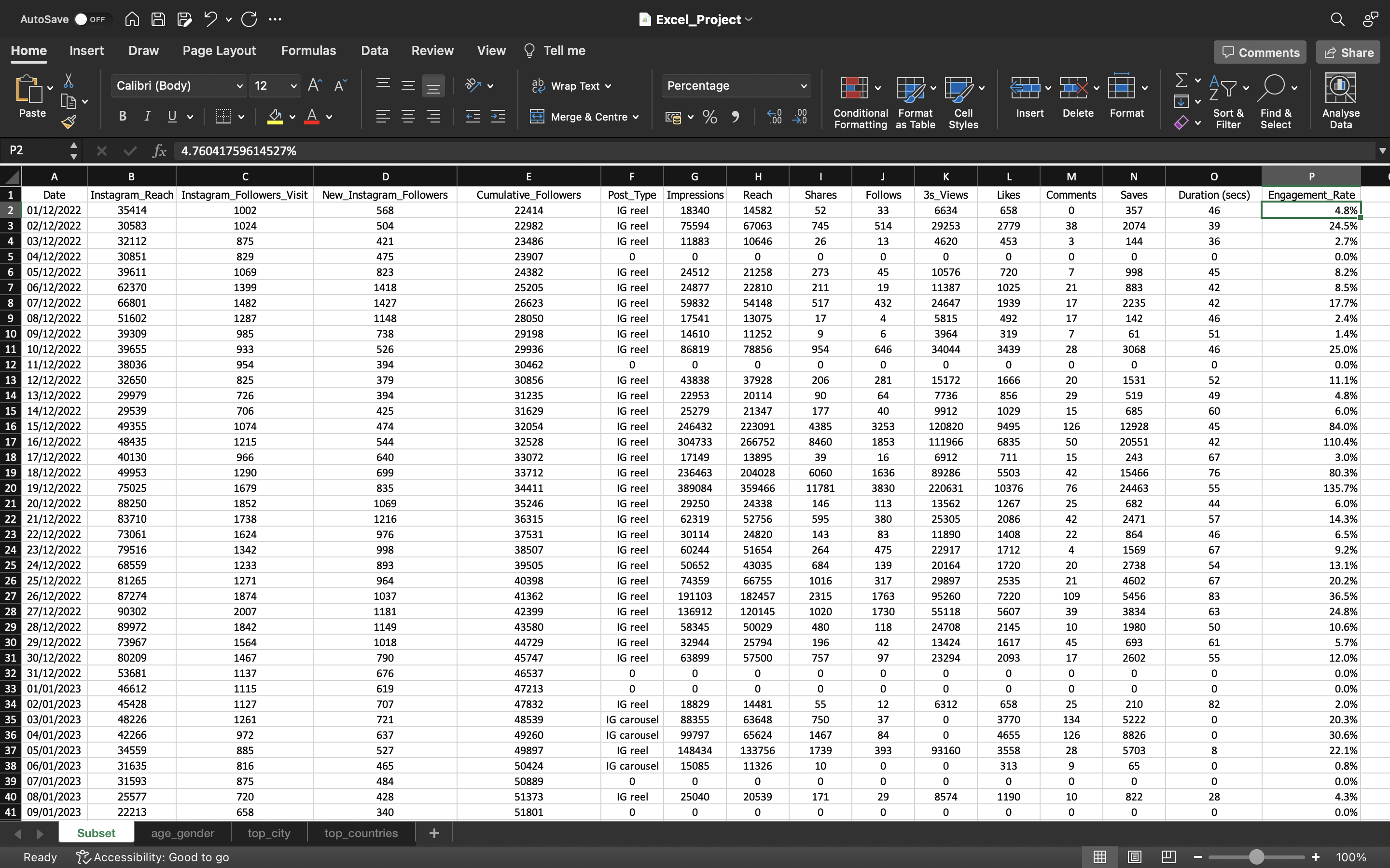
Now for further analysis, we hided the unwanted sheets such as Reach, Data, profile_visits, new_followers & content.
We can see the output below:
3S_Views
3S_Views is a new metric introducted by instagram to check how many people watched atleast 3 seconds of IG reels
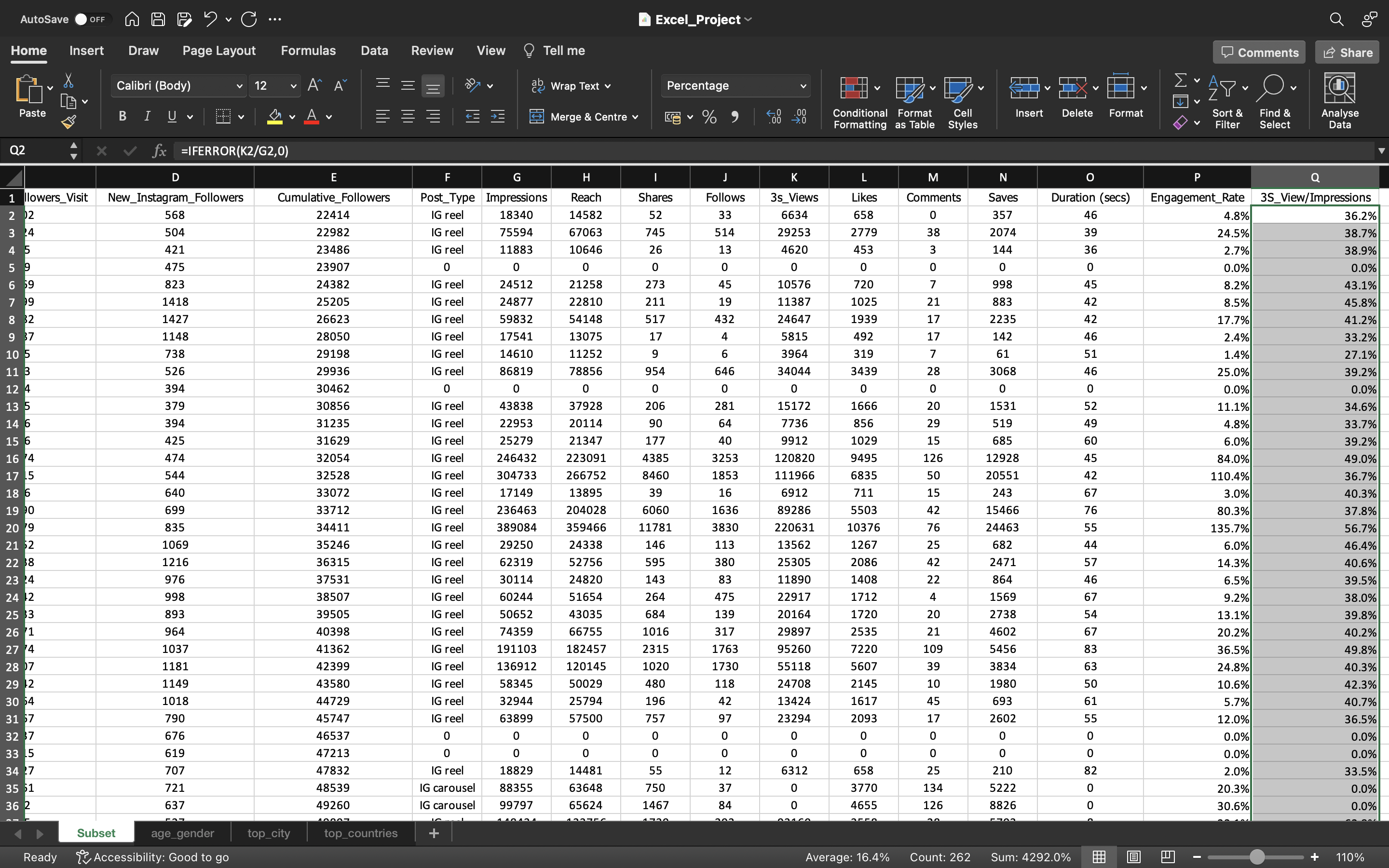
Let’s try to club it with Impressions and create a new metric named as 3S_Views/Impressions.
We can see the output below:
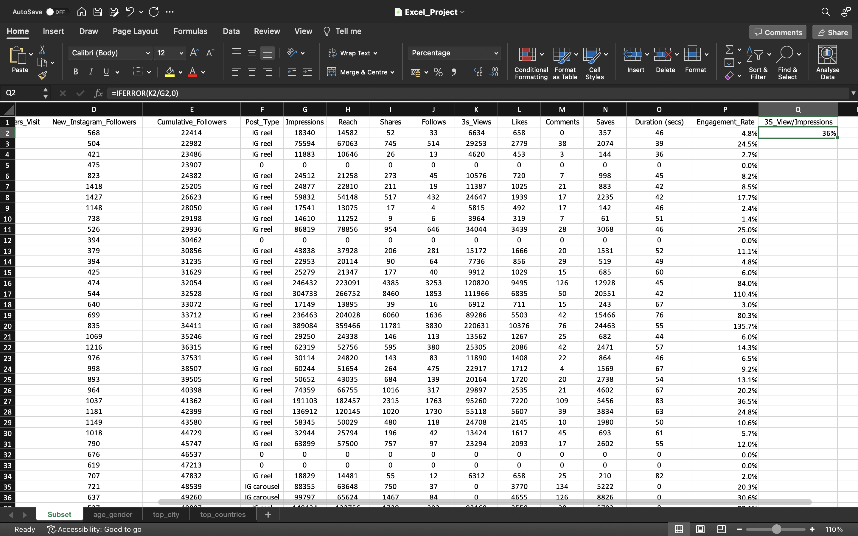
From the above output, we can see we have calculated 3S_Views/Impressions using the formula “=IFERROR(3S_Views/Impressions,0)”
We can see the first value as 36%. It says 36% of people only engaged with the content for atleast 3 seconds. Rest of 64% of people did not watch atleast for 3 seconds i.e they skipped the content within 3 seconds.
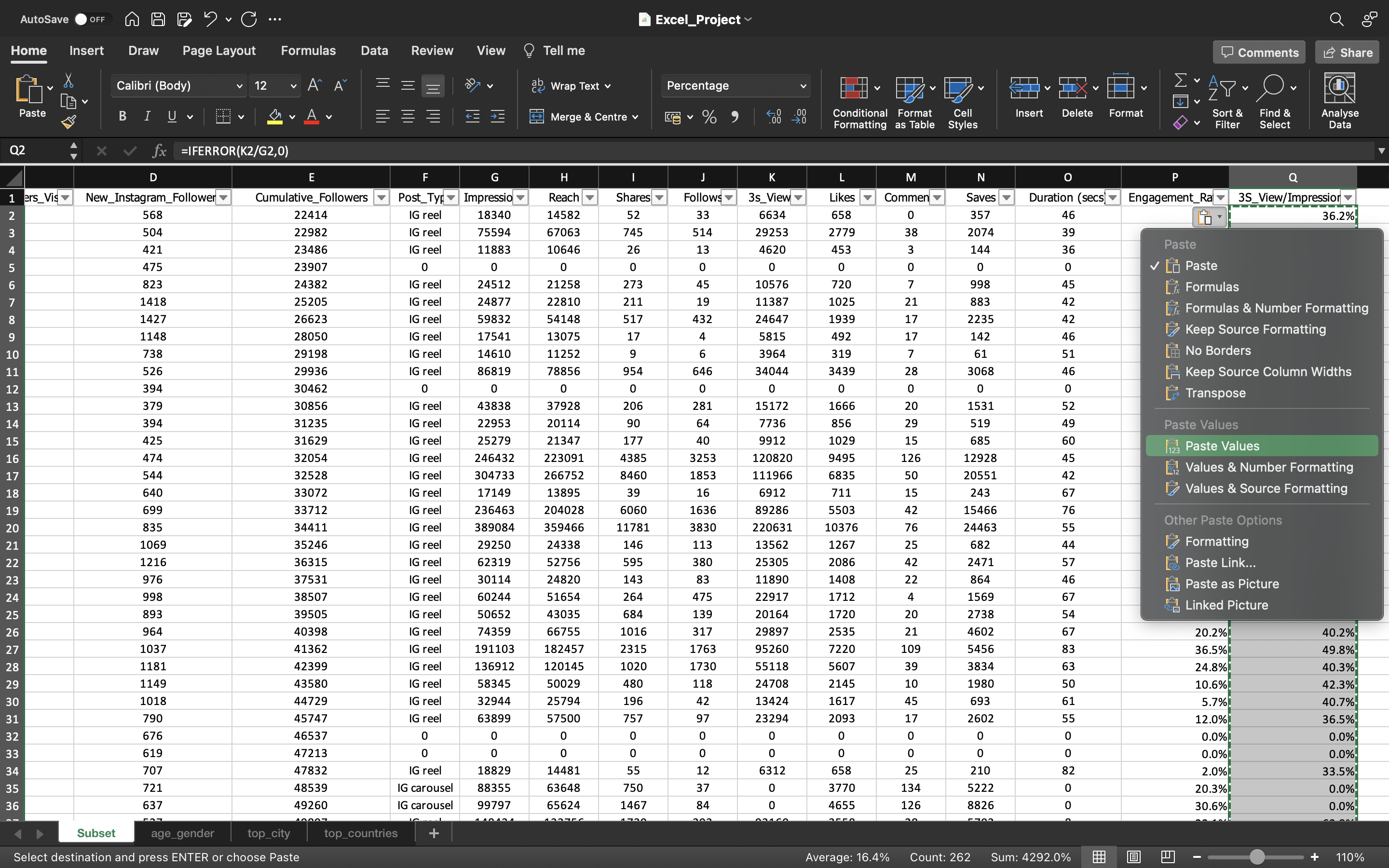
Let’s try to drag the formula/values down to the remaining cells and Then we again copy the values to convert the formula into values.
This can be done by :
- Copying all the values in the column using CTRL+C and pasting it again using CTRL+V
- Click on the “CTRL” icon and select “paste values”.
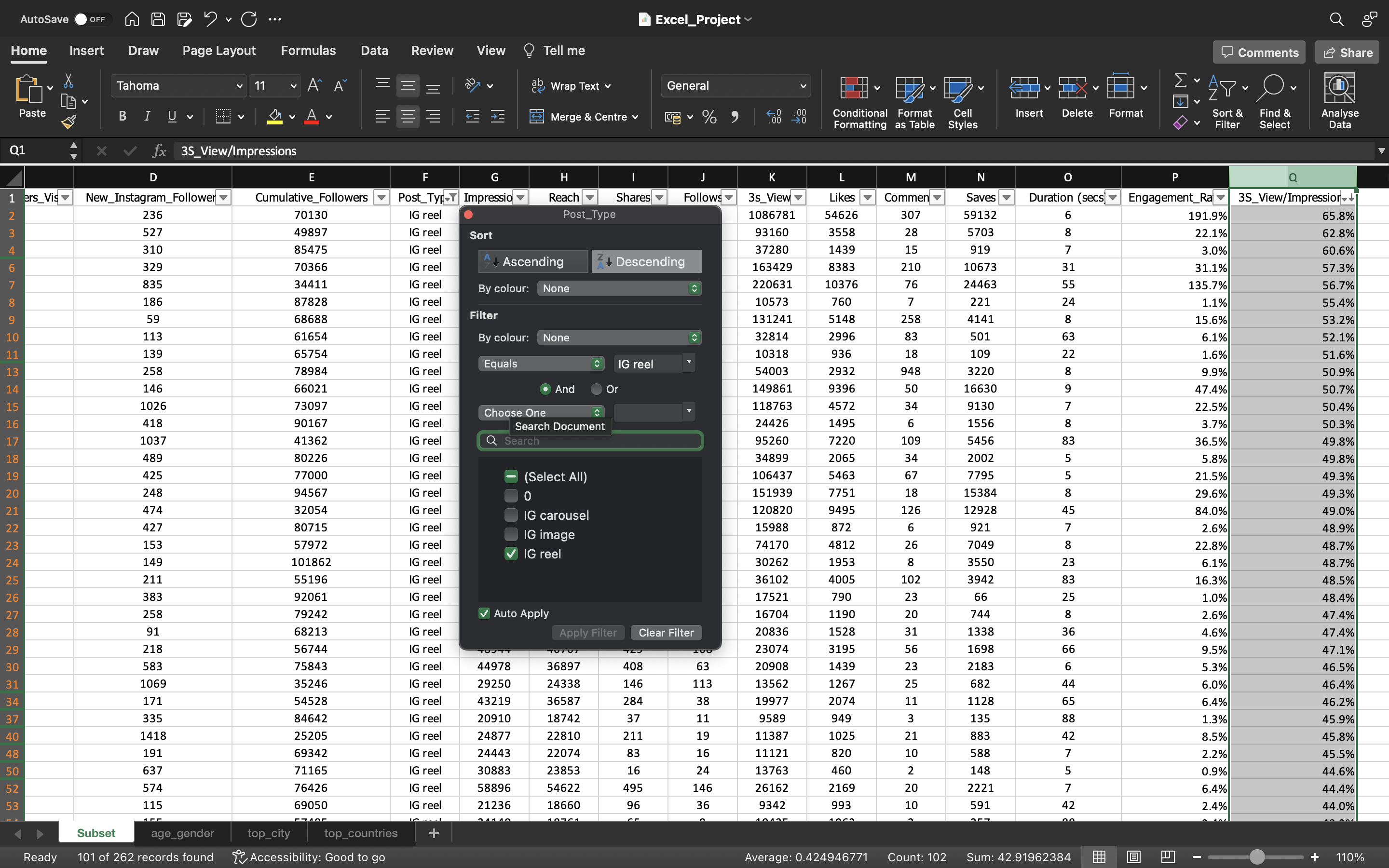
Finally if we filter the post type with IG_Reels, we can see the average which is 42.5% in the status bar, in the lower-right corner of your Excel window. This means 42% of the people engaged with the content for atleast 3 seconds meaning they have tendency to watch the full video or more than 3 seconds and rest 58% of the people skipped the content.
The 58% of the people who skipped the content can be due to the below mentioned reasons.
- Not interested in the topic of the reel. Maybe he knows the topic or already have the information.
- The hook is not strong, meaning 3 second is what the hook game is. In 3 Seconds you say something like this that people actually tend to watch it. This is what big creators do. If you see their video content, they try and you know say something in the first few seconds that make sure you watch the entire video.
- probably the audience is not relevant. For example, when you scroll through instagram and you tend to follow that person because you liked a reel or a post from that person and then you forget about it. you don’t care about it anymore.
Note
- IFERROR - If you are calculating something and if the output does not have a value we can just input it with a value. In this case we input the value as Zero.
- Values as 0% in 3S_Views/Impressions column represents IG Carousel & IG Image.
We can see the output below:
Engagement metrics by Post_Type using Pivot Tables
Let’s create a pivot table using all the data in the Subset spreadsheet and we try to create few metrics.
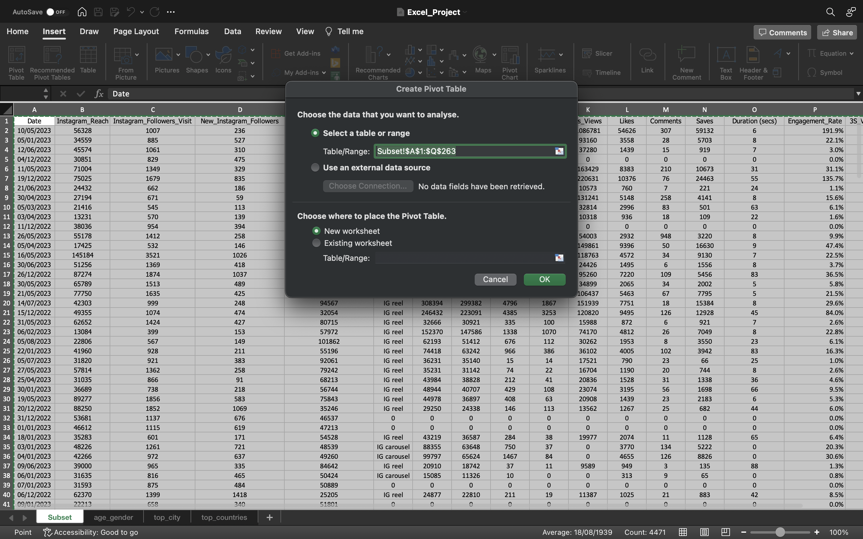
This can be done by:
- Select all the data in the Subset spreadsheet using CTRL+A.
- Go to Insert tab and select Pivot Table and click on From Table/Range. A dialog box appears, select New Worksheet and click on ok.
- Use the shortcut ALT + N + V + T to create pivot table instead of using Mouse.
The output can be seen below:
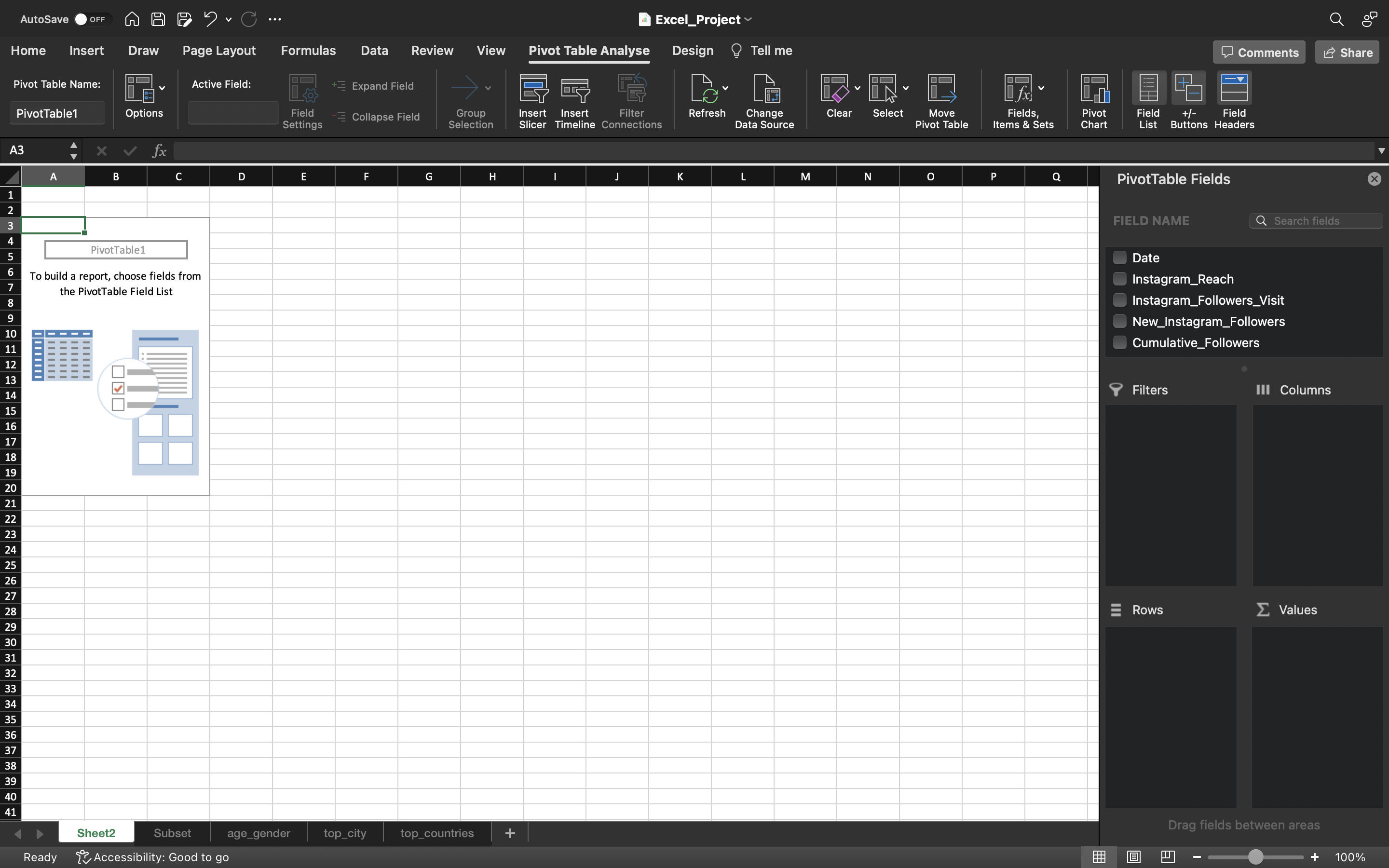
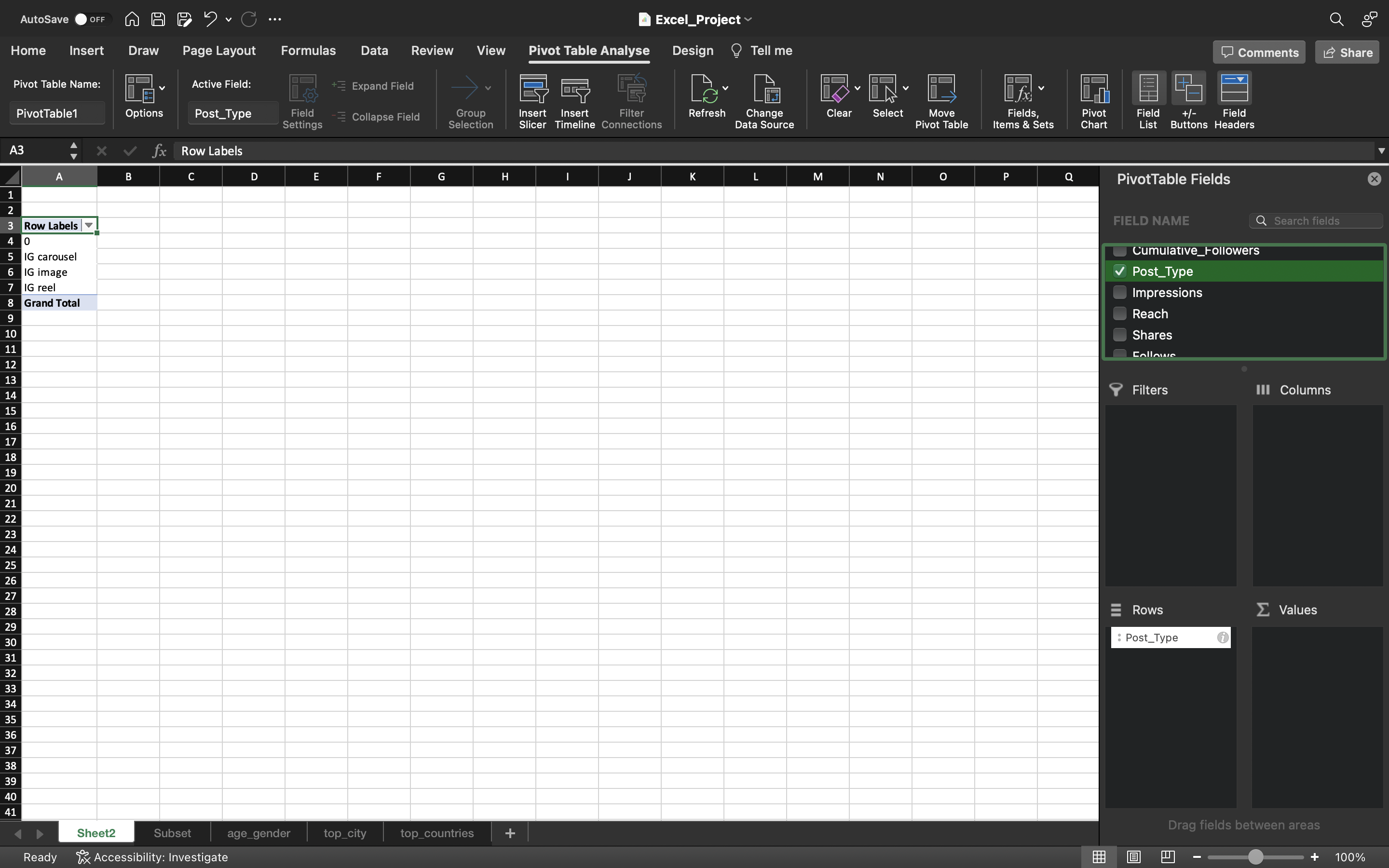
Based on the above output, we are gonna select post_type from FIELD NAME and drag it down to the Rows area.
We can Rows Label has been popped on the screen. We will filter the Rows to display all the post type such as IG Carousel, IG Image & IG Reels excluding 0.
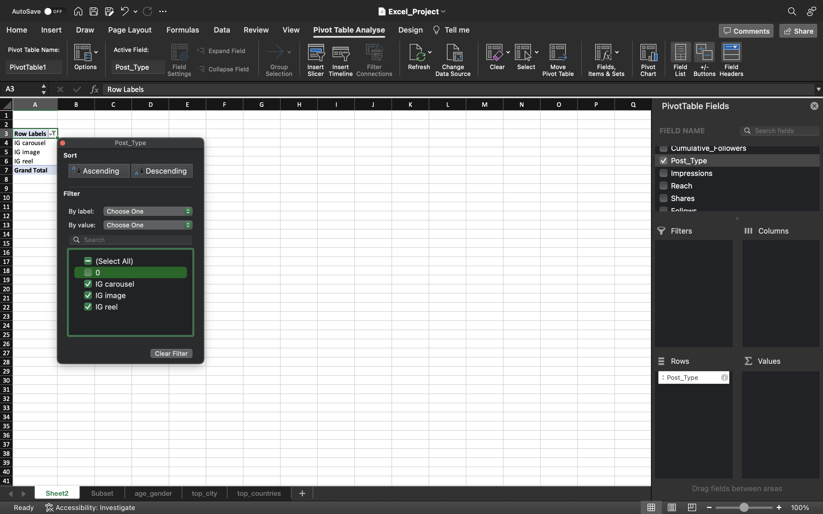
Now we will drag the Likes, Comments, Saves, Shares, Reach, Impressions from FIELD NAME to the Values area.
All these values are in SUM i.e total values. Sum is not a good metric to summarize everything. For example, You cannot say in total I got from IG Carousel this much reach or this much likes. This is not something which is helpful.
What we can identify is, For example we can say on an average my carousel post gives me this much likes or this much saves or shares etc. This makes sense instead of using Total/Sum.
So I am gonna convert the Sum into Average for all the metrics such as Likes, Comments, Saves, Shares, Reach, Impressions
The output can be seen below:
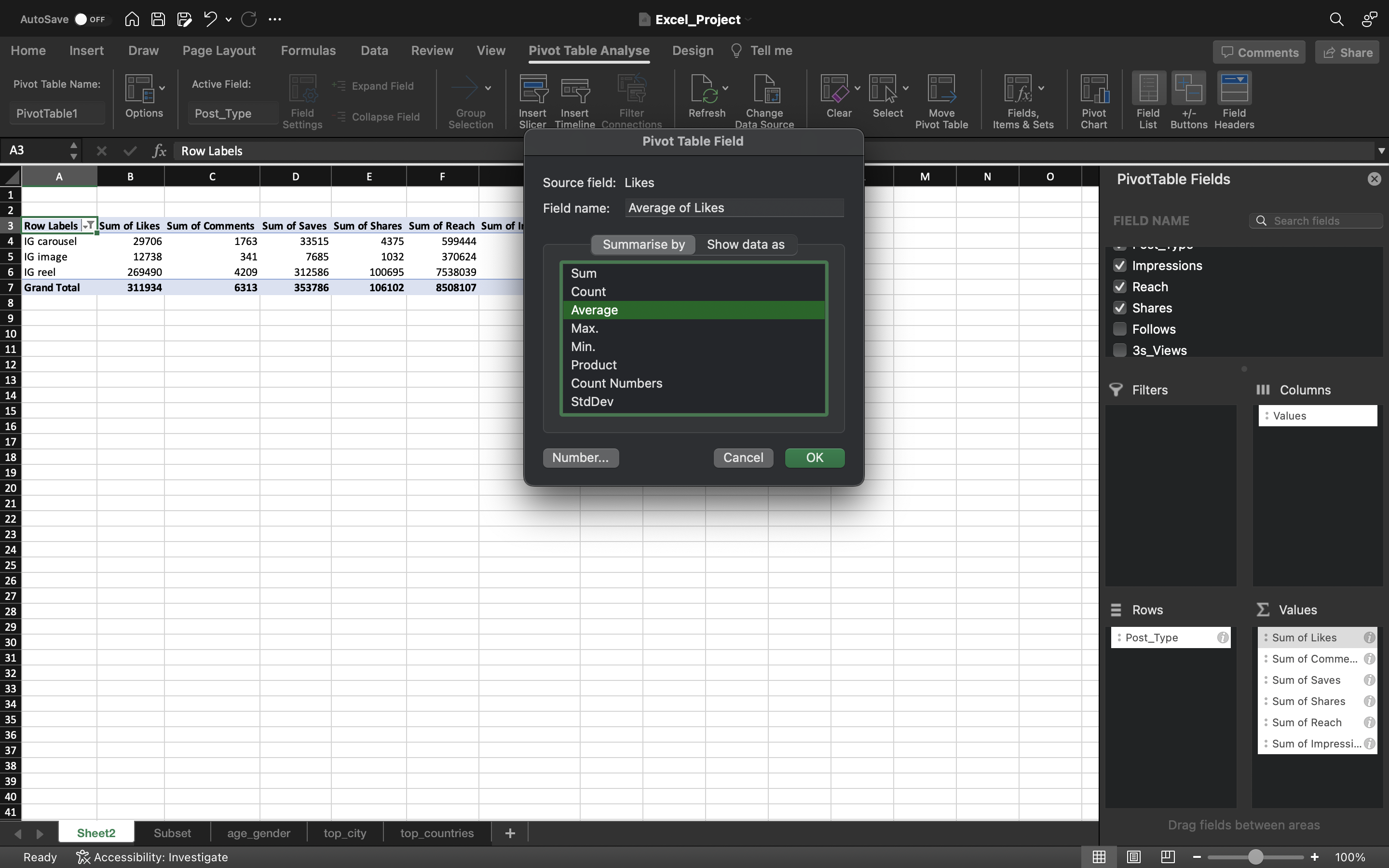
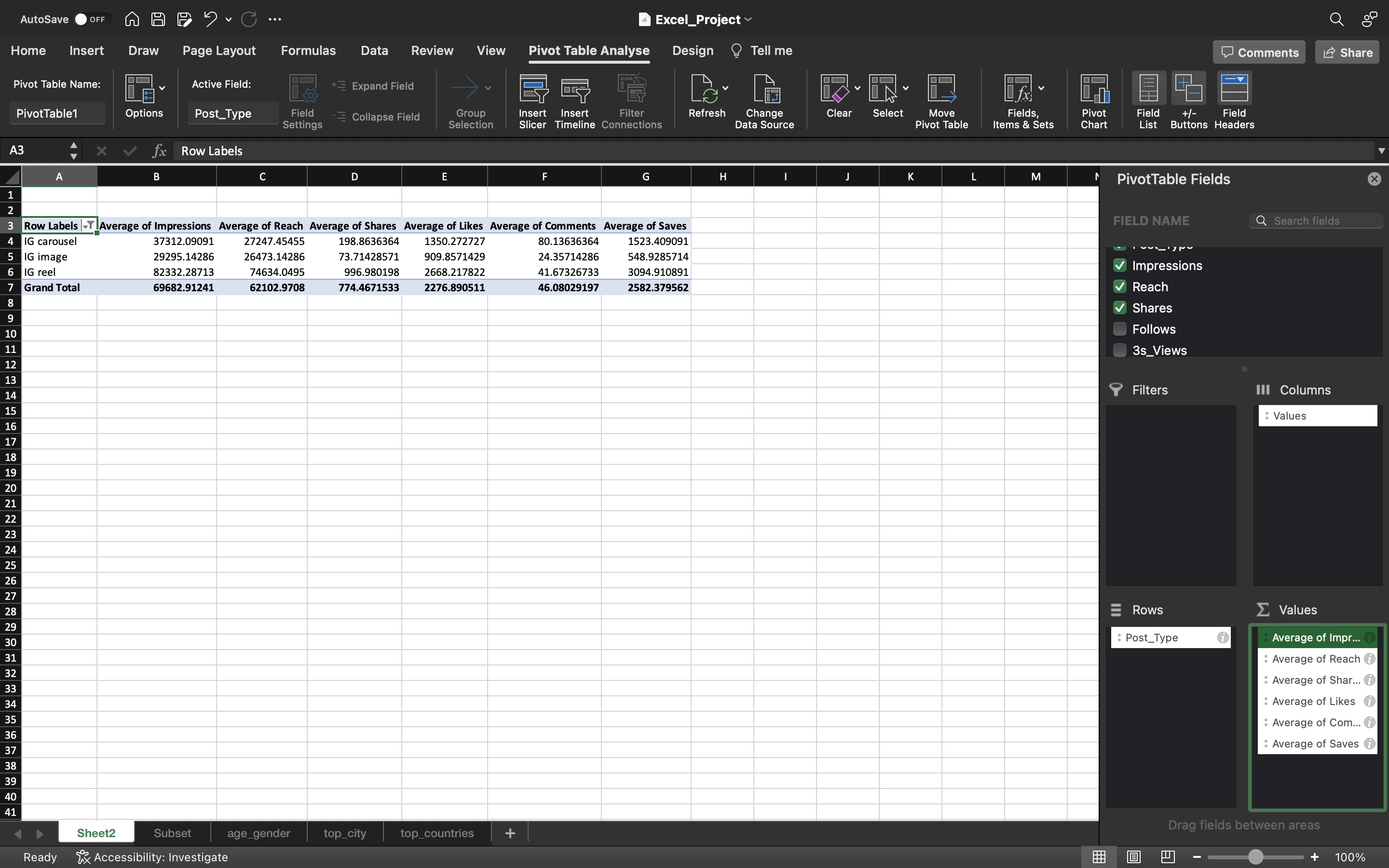
So from the above output we can infer:
For an IG Carousel, we can say on an average it reaches around 27000 people. So this is what we can expect when we put out IG carousel post. Similarly it goes for other metrics too such as IG Image, IG Reels.
Considering Outliers, there could be some posts which would have outperformed other posts. So let’s try and check for outliers and then decide whether we want to remove it or not.
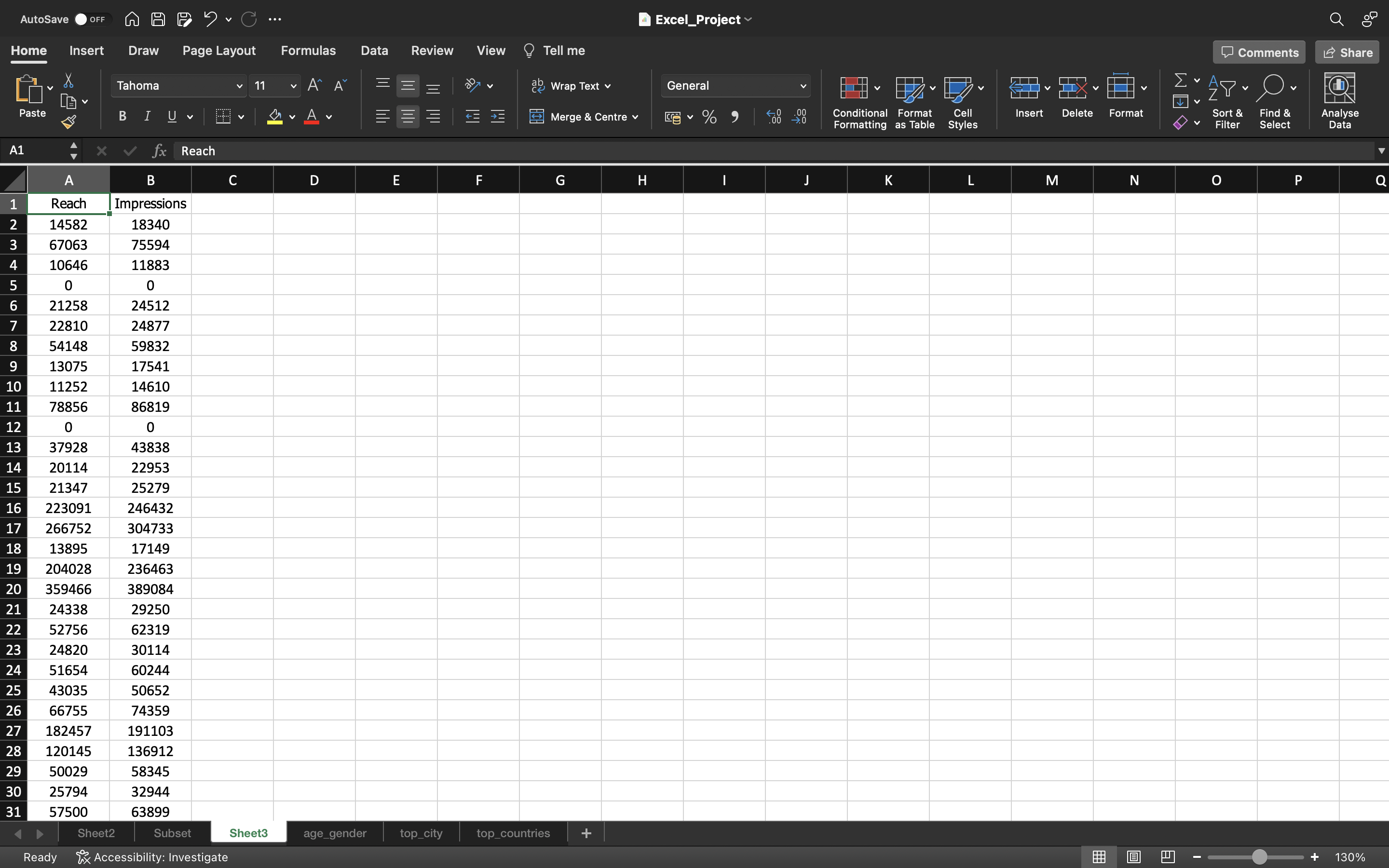
Now we will select the columns Reach, Impressions and put it in a separate sheet and create a box plot of these columns to check for outliers
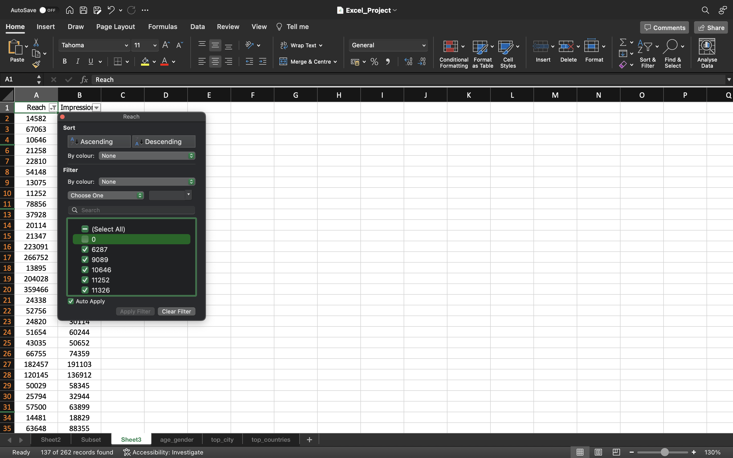
We just exclude the values which are Zero which means there is no post uploaded during that particulary day and select remaining values to create box plot.
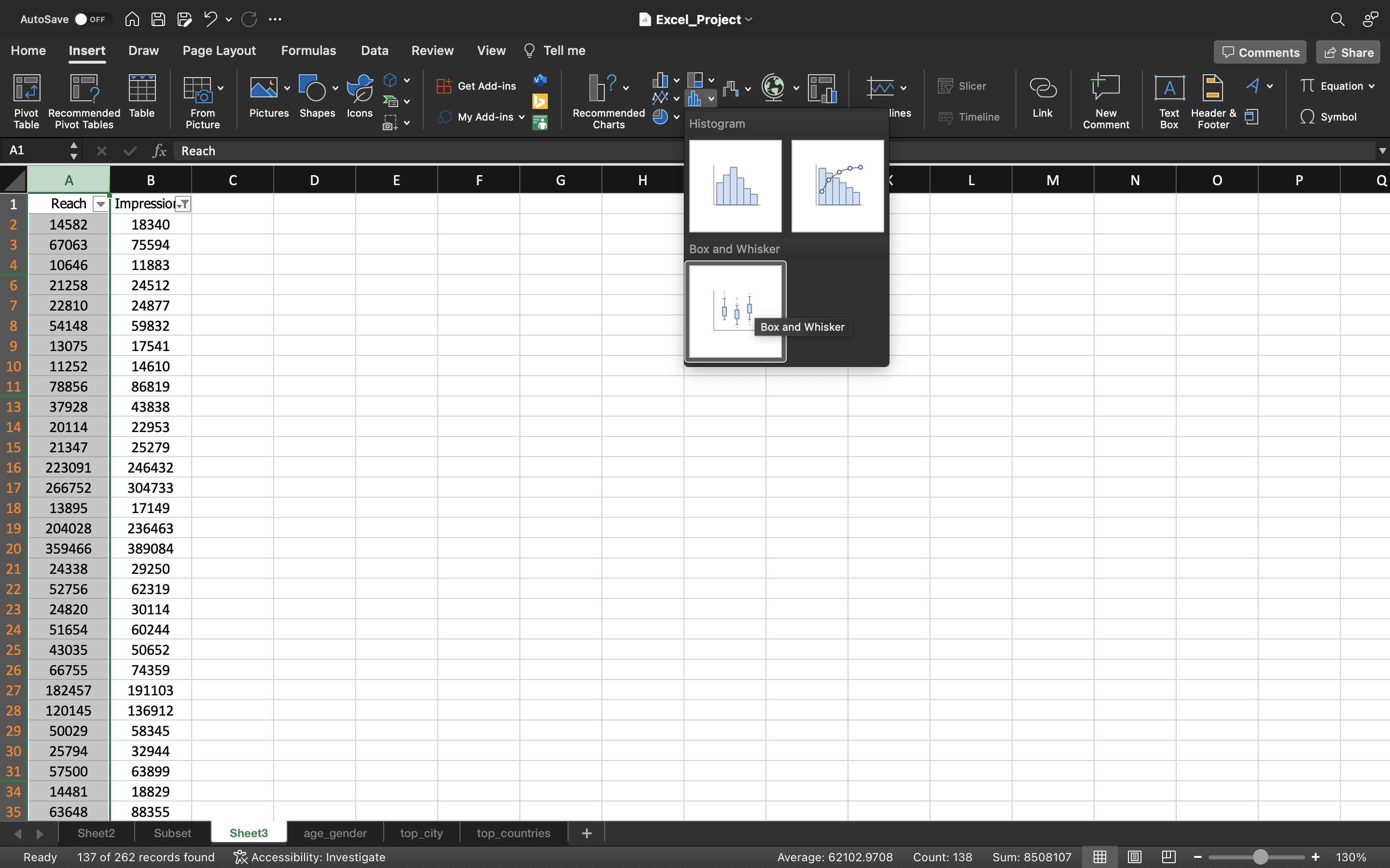
We go to Insert tab and select statistical icon and click on Box and Whisker option.
The output can be seen below:
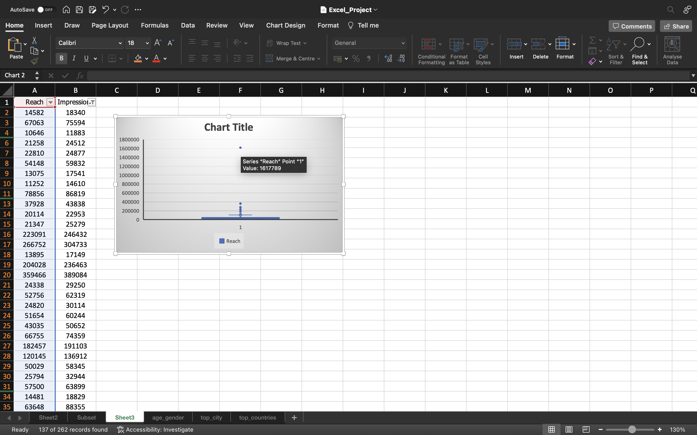
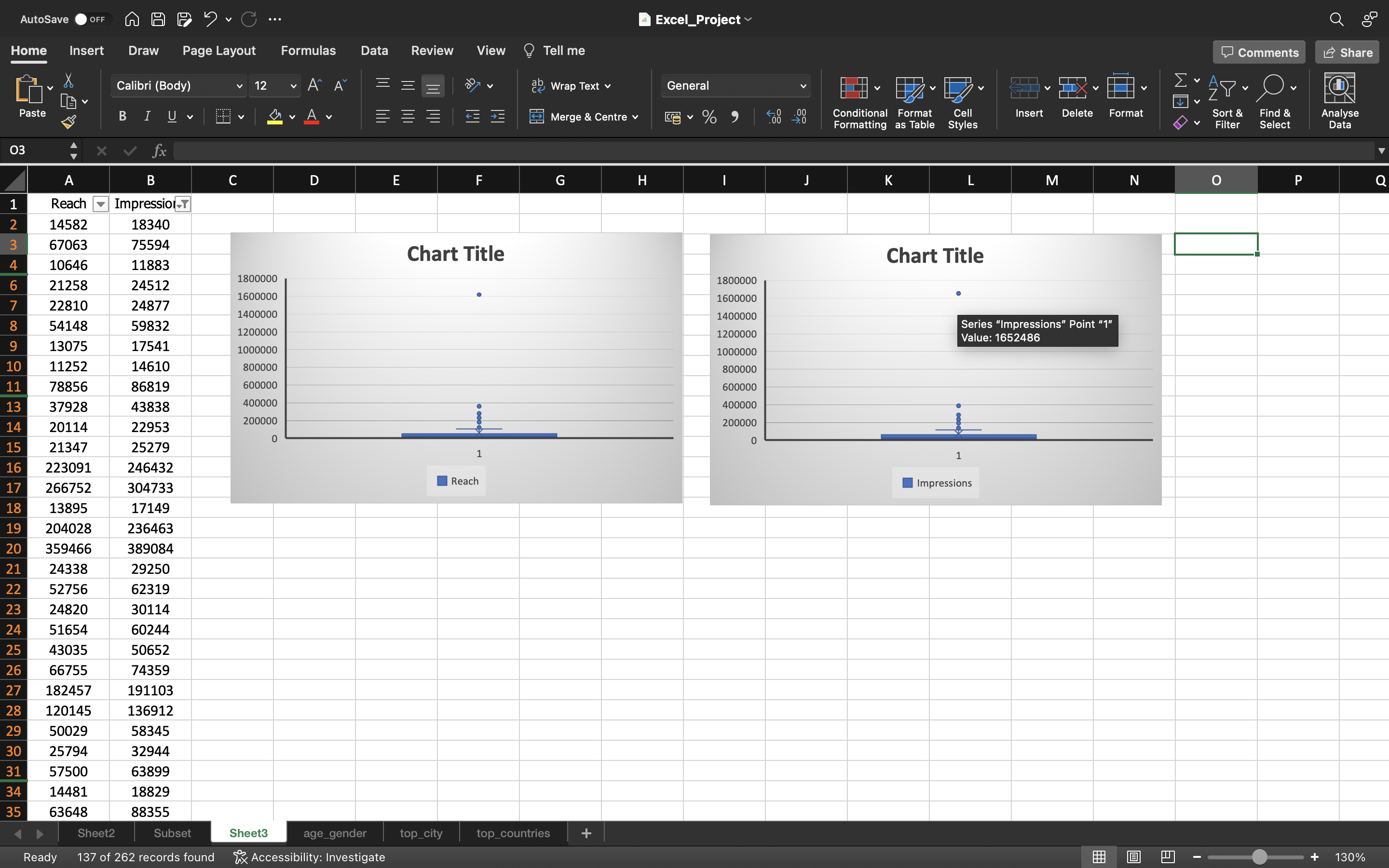
From the above output, we can infer:
- There is one IG Reel which went viral which has 1617789 reach and 1652486 impressions.
Now we can try to remove that IG Reel which went viral to understand the impact in the metrics. Let’s try to do that.
We can remove this value in the subset spreadsheet and refresh the pivot table to see the difference.
Referesh can be done by:
- Go to Pivot Table Analyze and click on Refresh.
The output can be seen below:
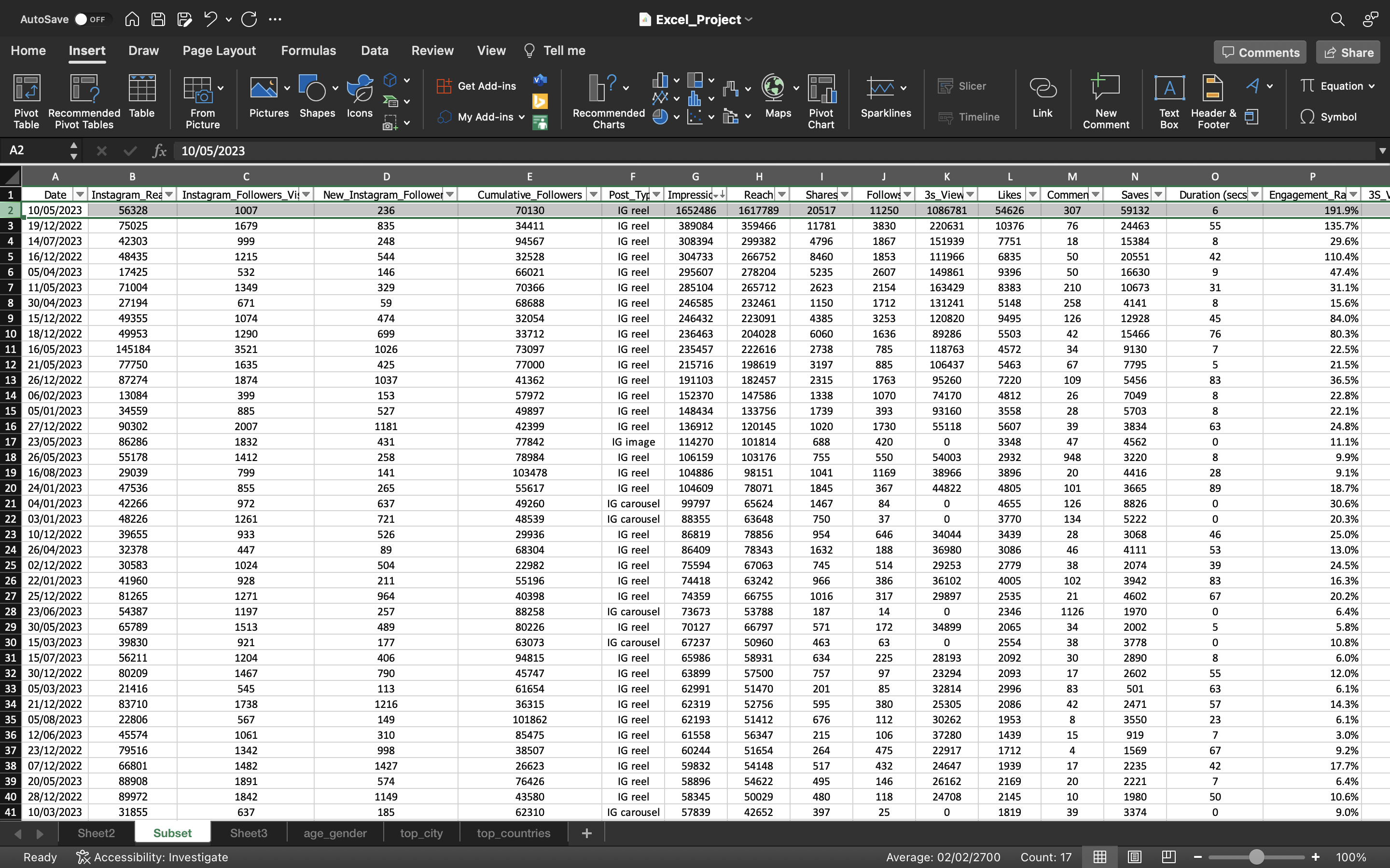
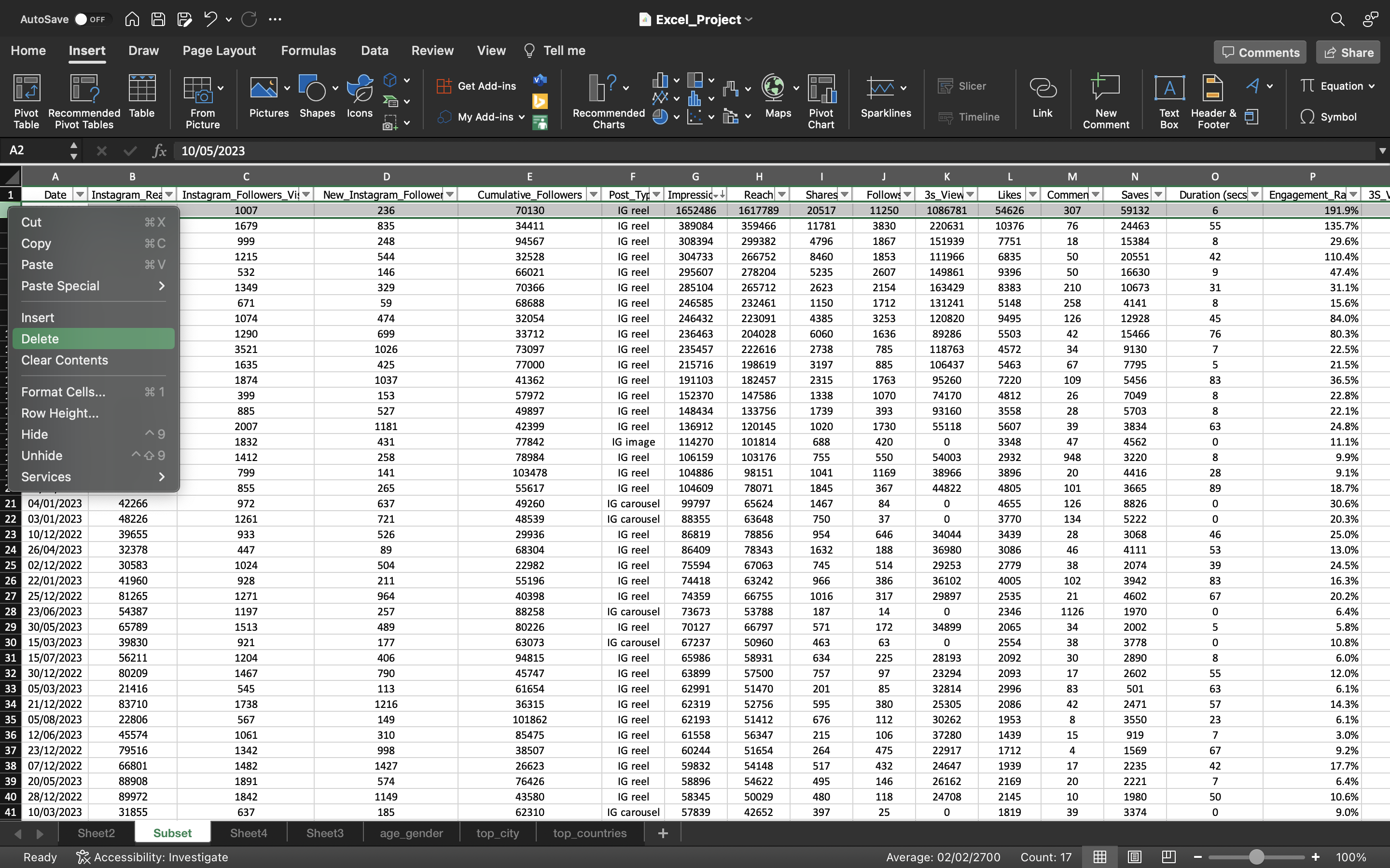
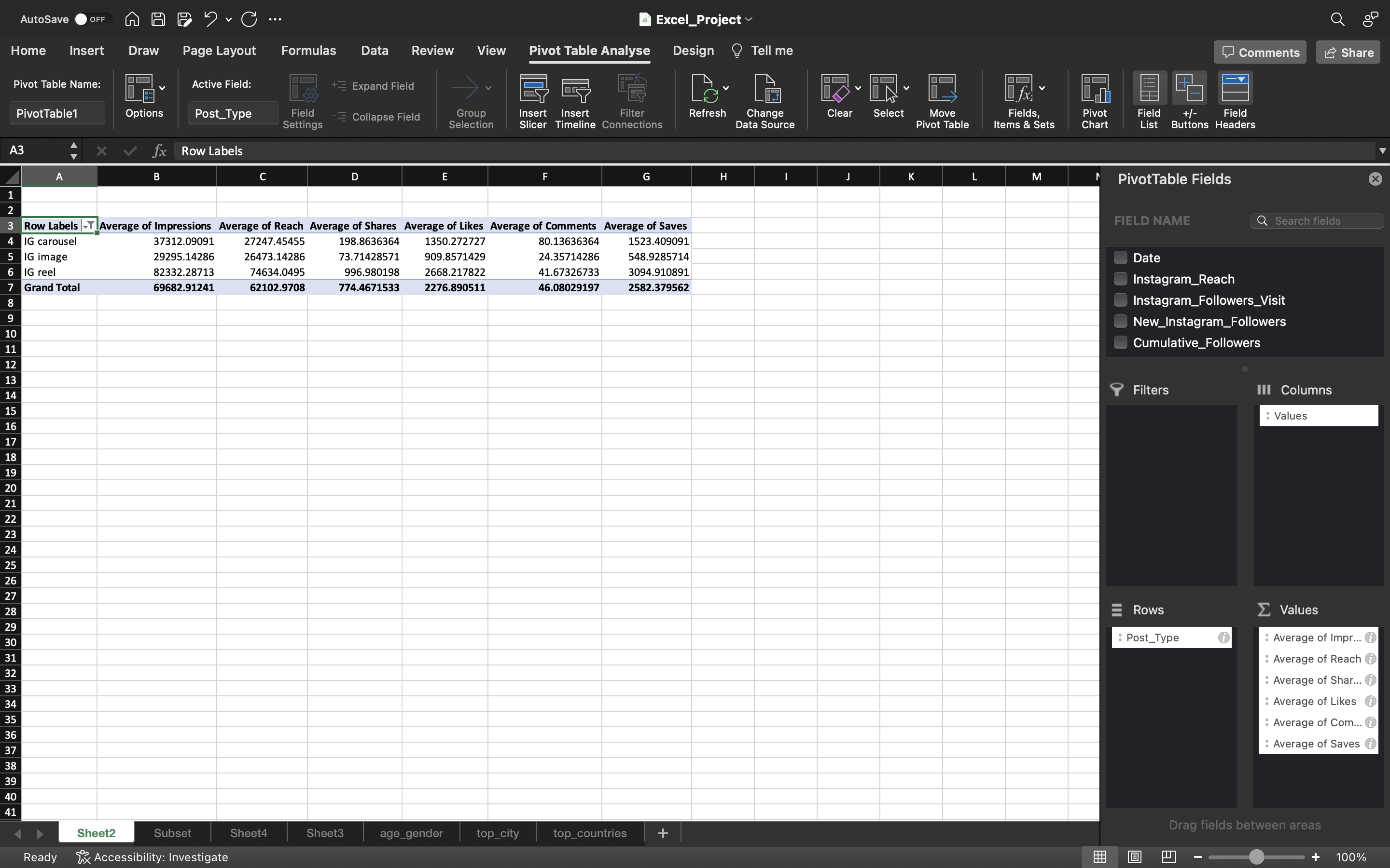
We can see the below output that before we refresh the pivot table, the average of Reach, Impressions of IG_Reel(considering the viral reel) is around 74000 & 82000
We can see the below output that after we refresh the pivot table, the average of Reach, Impressions of IG_Reel(Without viral reel) is around 59000 & 66000
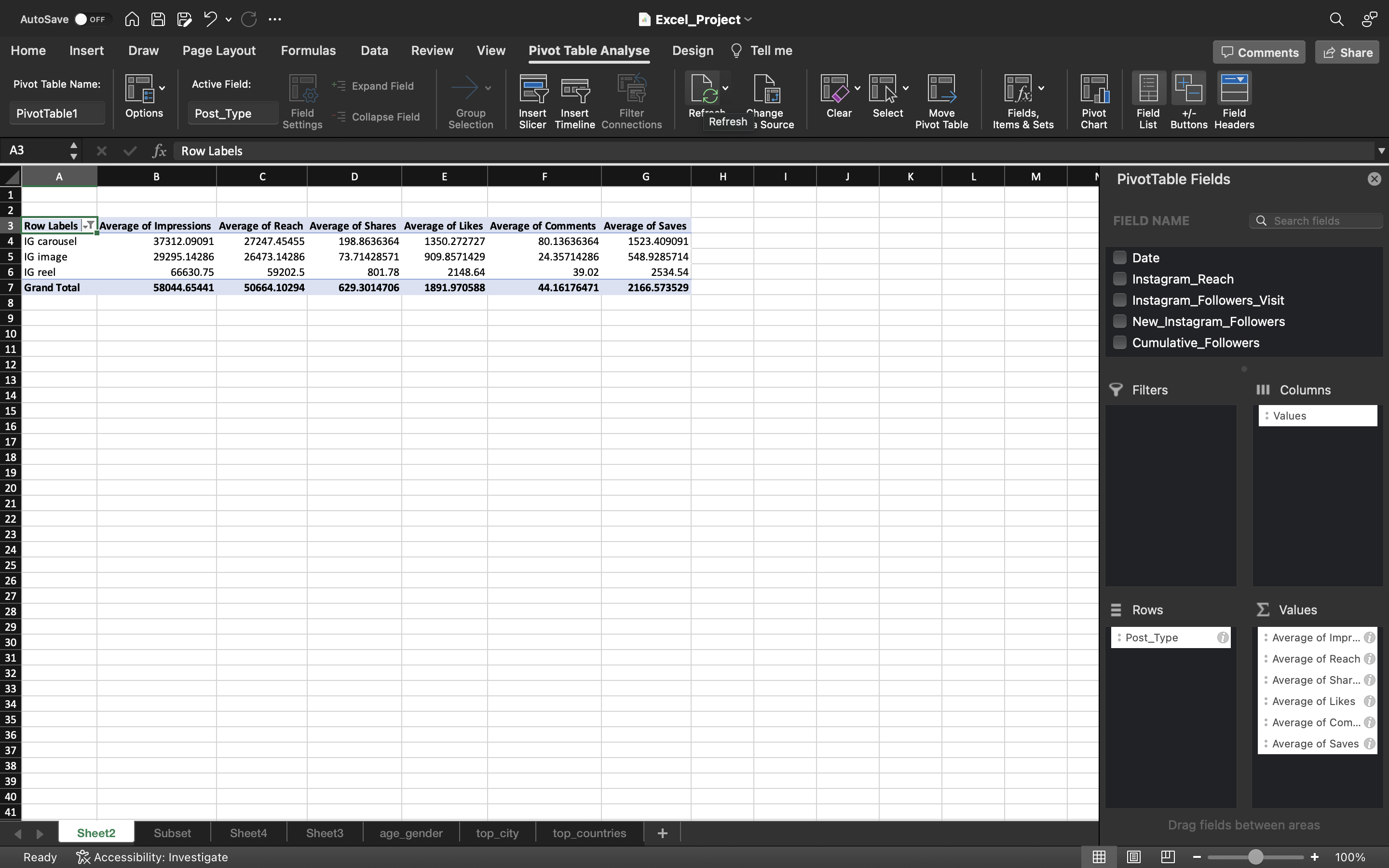
There are not much difference in the average of Likes, Comments, Saves & Shares but in Reach & Impressions there are lot of difference around 15,702 for Reach & 15,432 for Impressions.
So we can remove this reel which went viral because its definitely going to inflate our observations.
Duration vs Reach
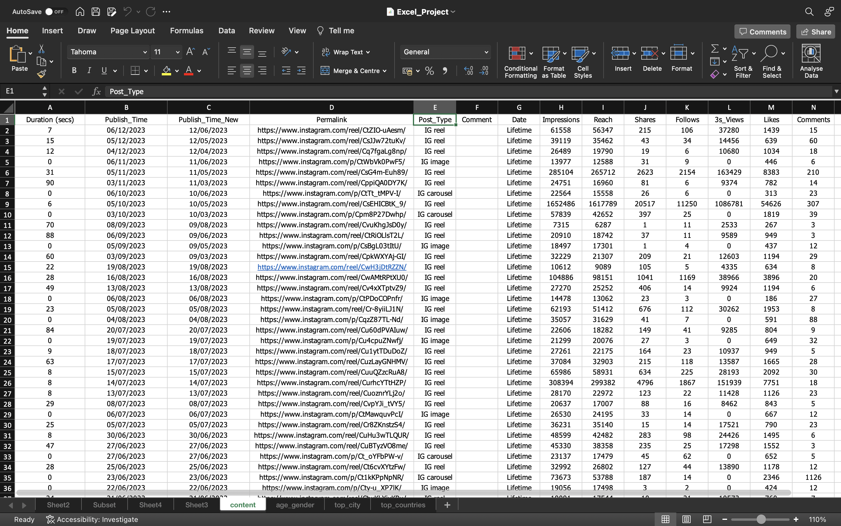
Let’s compare the Duration and Reach to see if there is any correlation between them.
Let’s unhide the content spreadsheet and look for the comparison.
The output can be seen below:
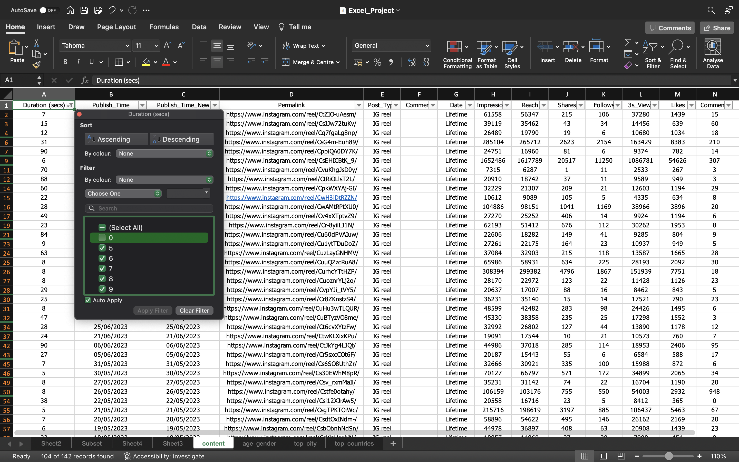
Now let’s filter the values in the Duration column except Zero.
You can see the below output:
Now let’s sort the Duration column in Ascending order and check the Average Impressions for the duration Less than 10 Seconds.
We can see the Average Reach(Considering the Viral reel) is around 176000 when the duration is less than seconds.
The status bar, in the lower-right corner of your Excel window, will tell you the Average.
The output can be seen below:
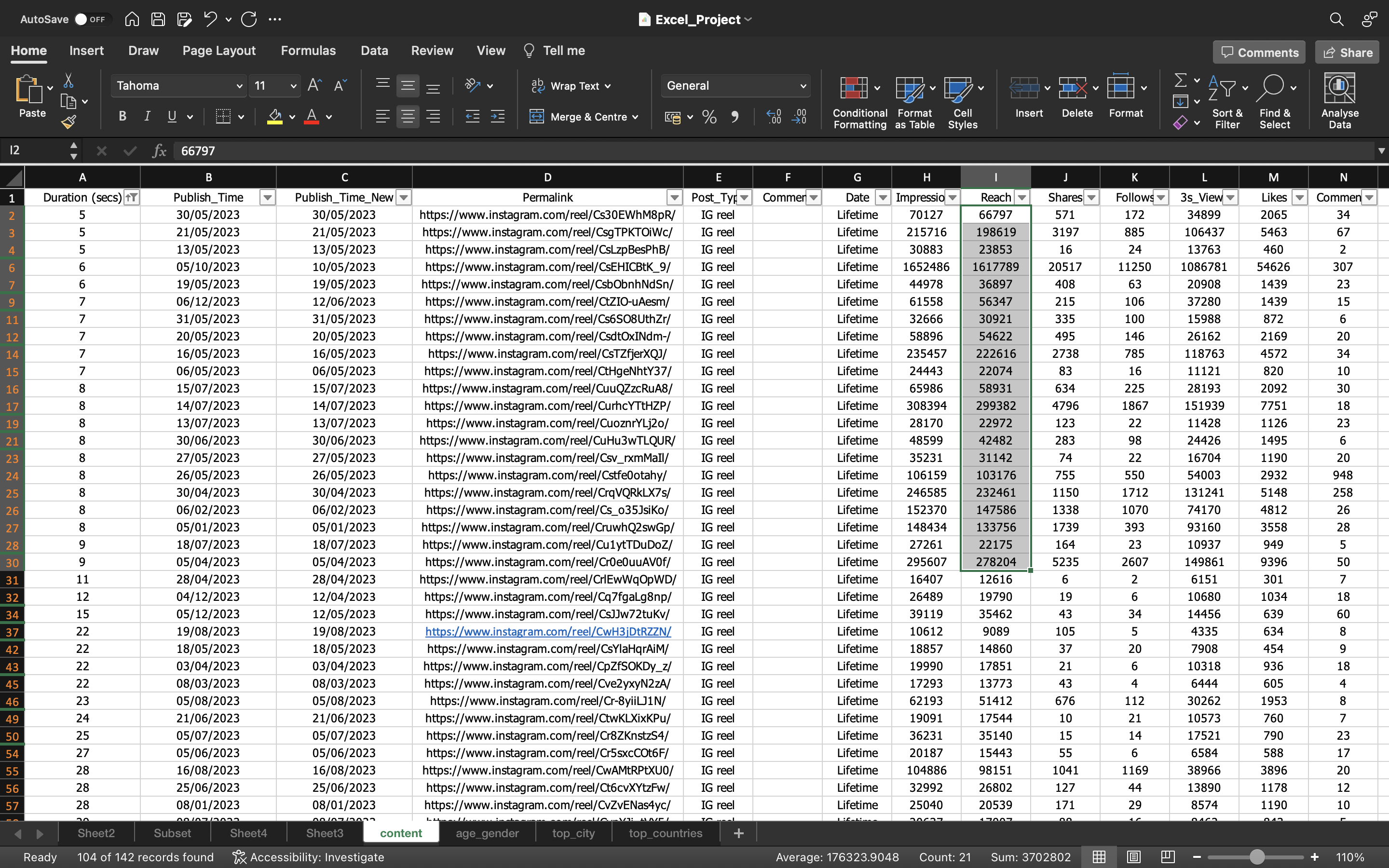
Now let’s remove the row of the Viral Reel as you can see it is higlighted in the below output.
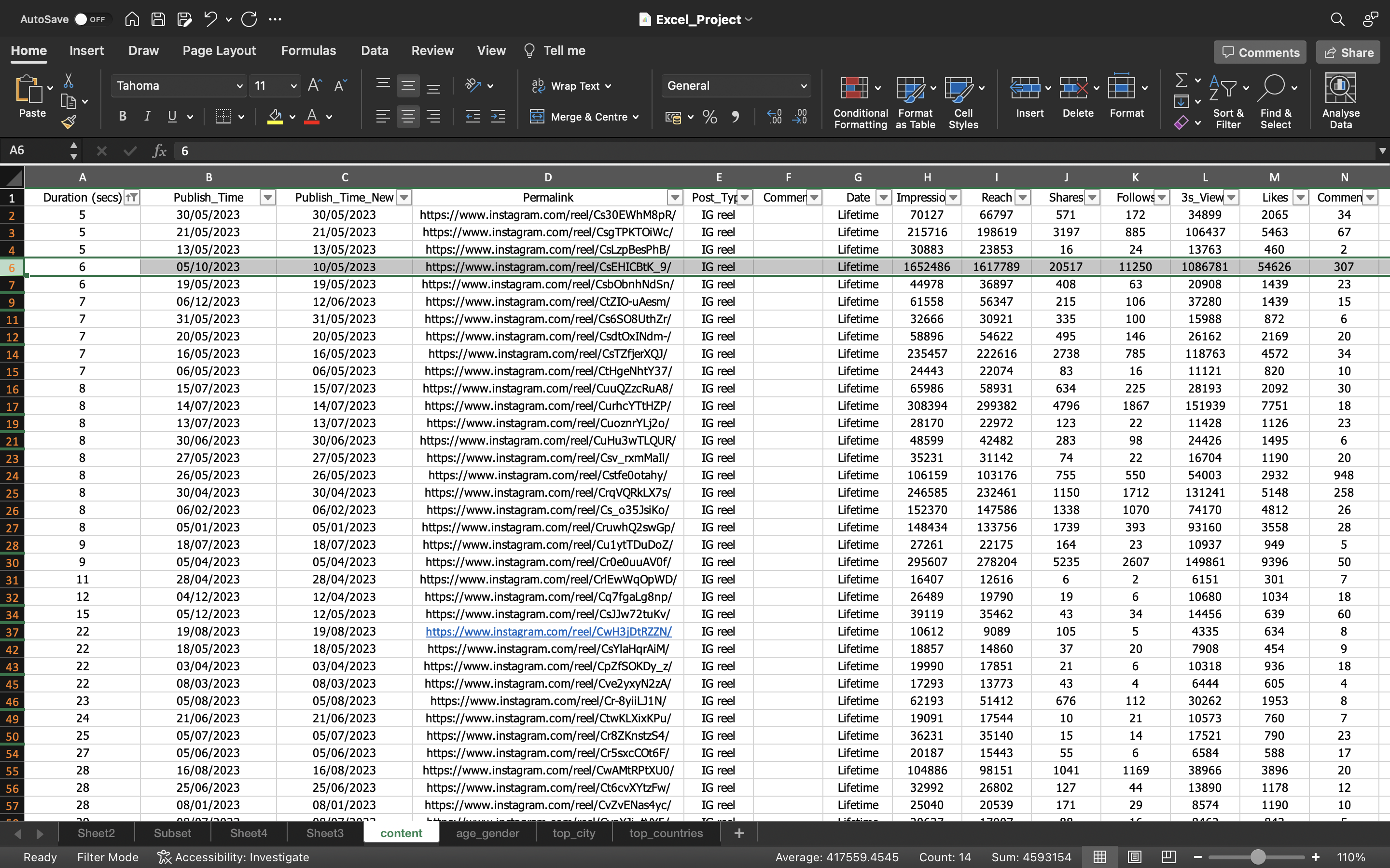
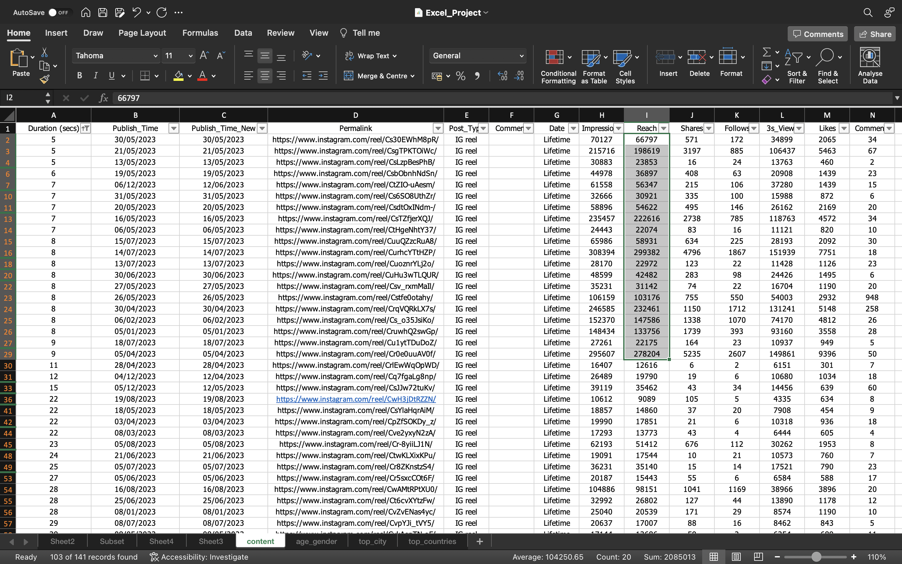
Now let’s again compare the Duration vs Reach.
We can see the Average Reach(Without the Viral reel) is around 104000 when the duration is less than 10 seconds.
There is big difference without considering the Viral reel in the Average Impressions when duration is less than 10 seconds.
The status bar, in the lower-right corner of your Excel window, will tell you the Average.
The output can be seen below:
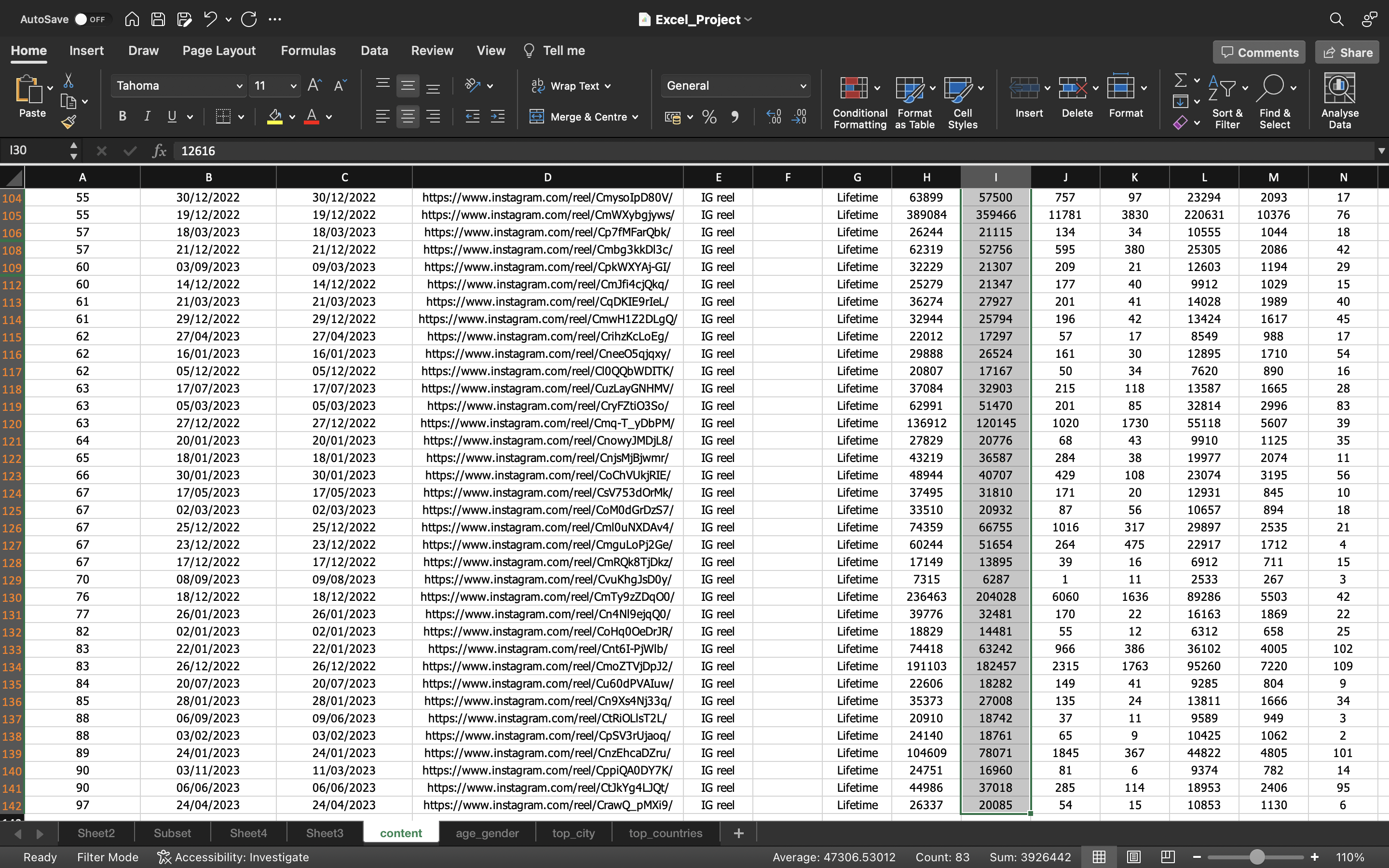
We can also check the Average Reach(Without the Viral reel) is around 47300 when the duration is more than 10 seconds.
The status bar, in the lower-right corner of your Excel window, will tell you the Average.
The output can be seen below:
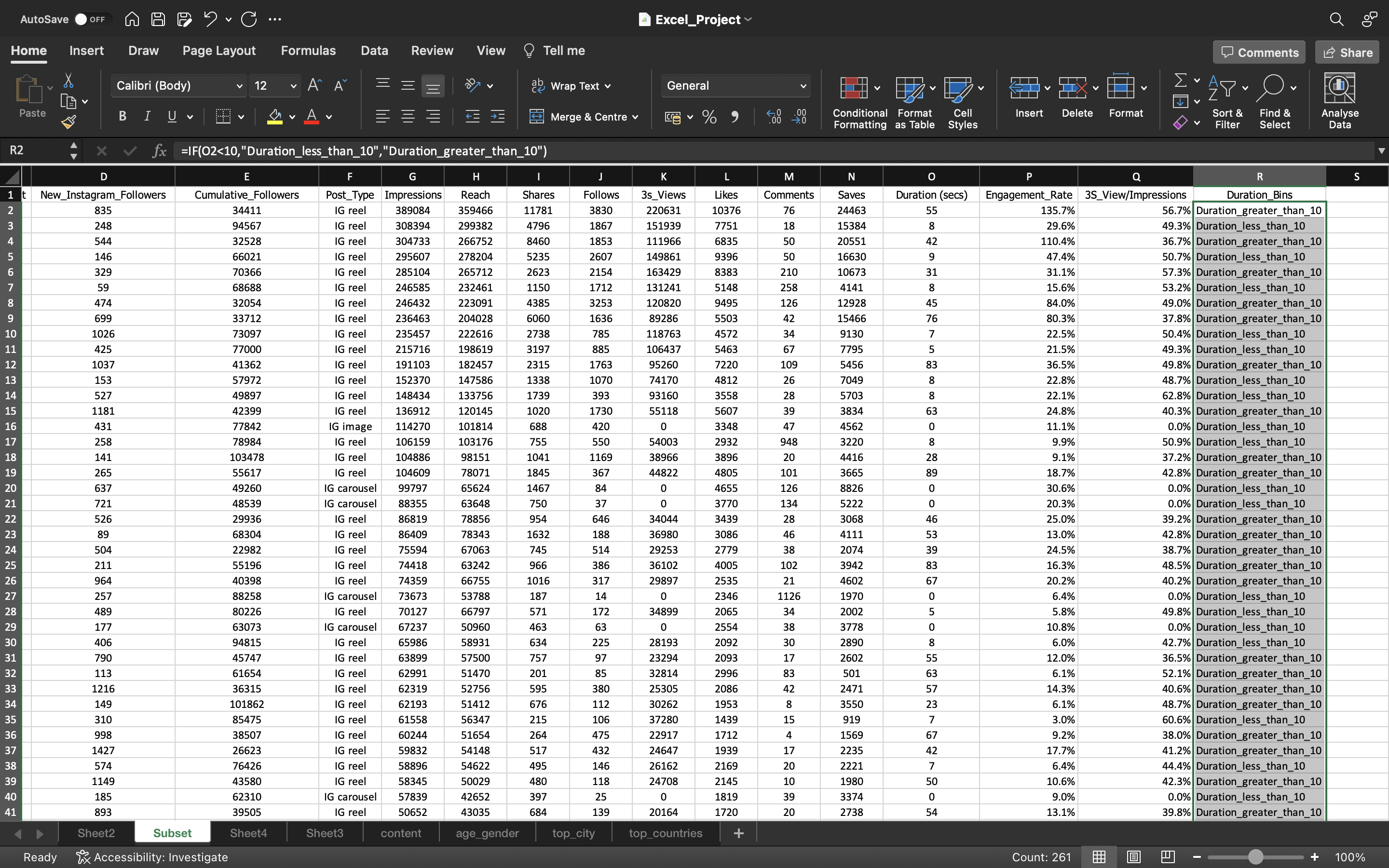
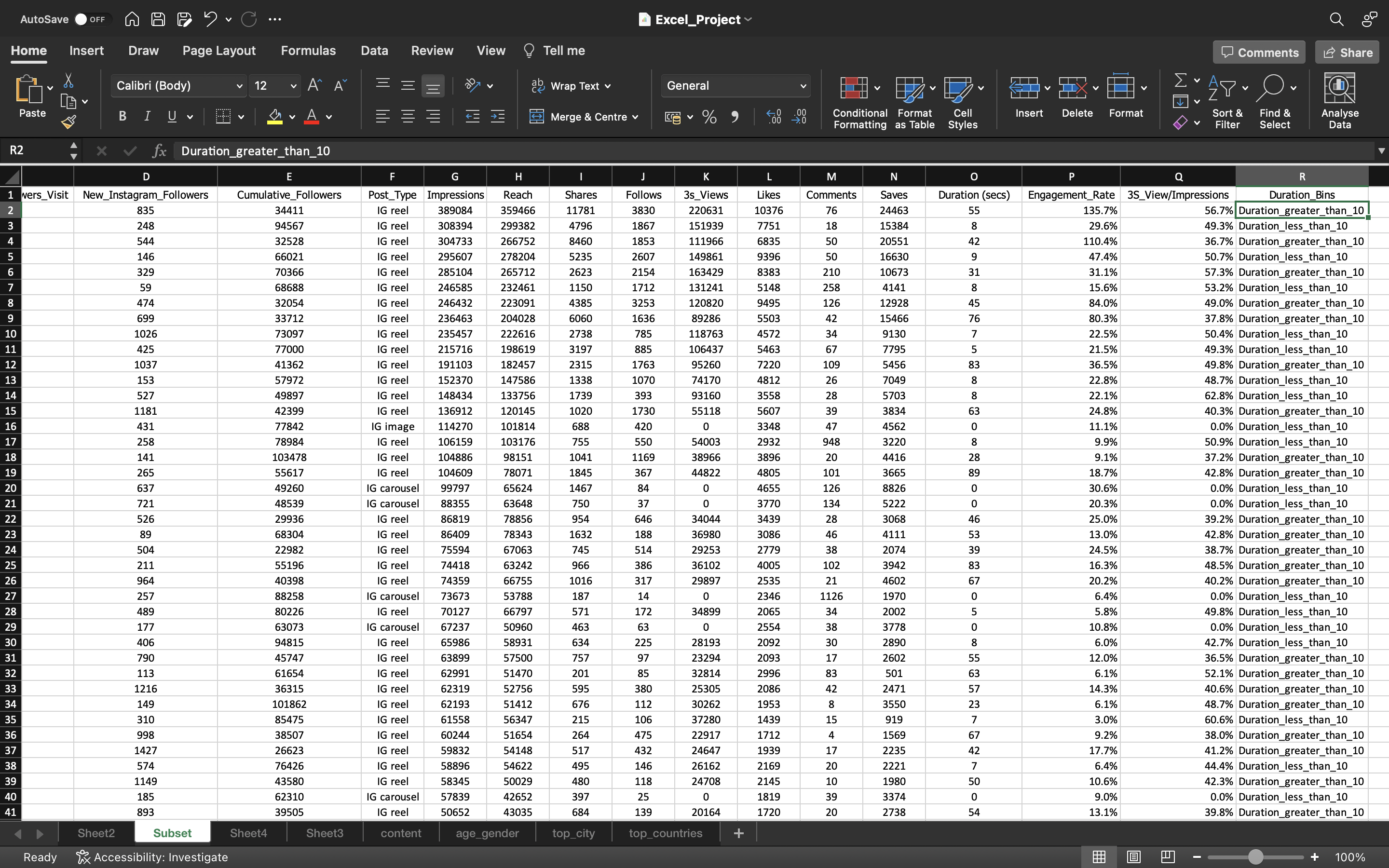
Let’s create a new column named Duration_Bins in the subset spreadsheet and add two values Duration_less_than_10 & Duration_greater_than_10 based on the conditon If duration is < 10.
Let’s drag down the values/formula to the remaining cells using CTRL+D.
Then we again copy the values to convert the formula into values.
This can be done by :
- Copying all the values in the column using CTRL+C and pasting it again using CTRL+V.
- Click on the “CTRL” icon and select “paste values”.
The output can be seen below:
Now let’s incorporate Duration_Bins into pivot_table.
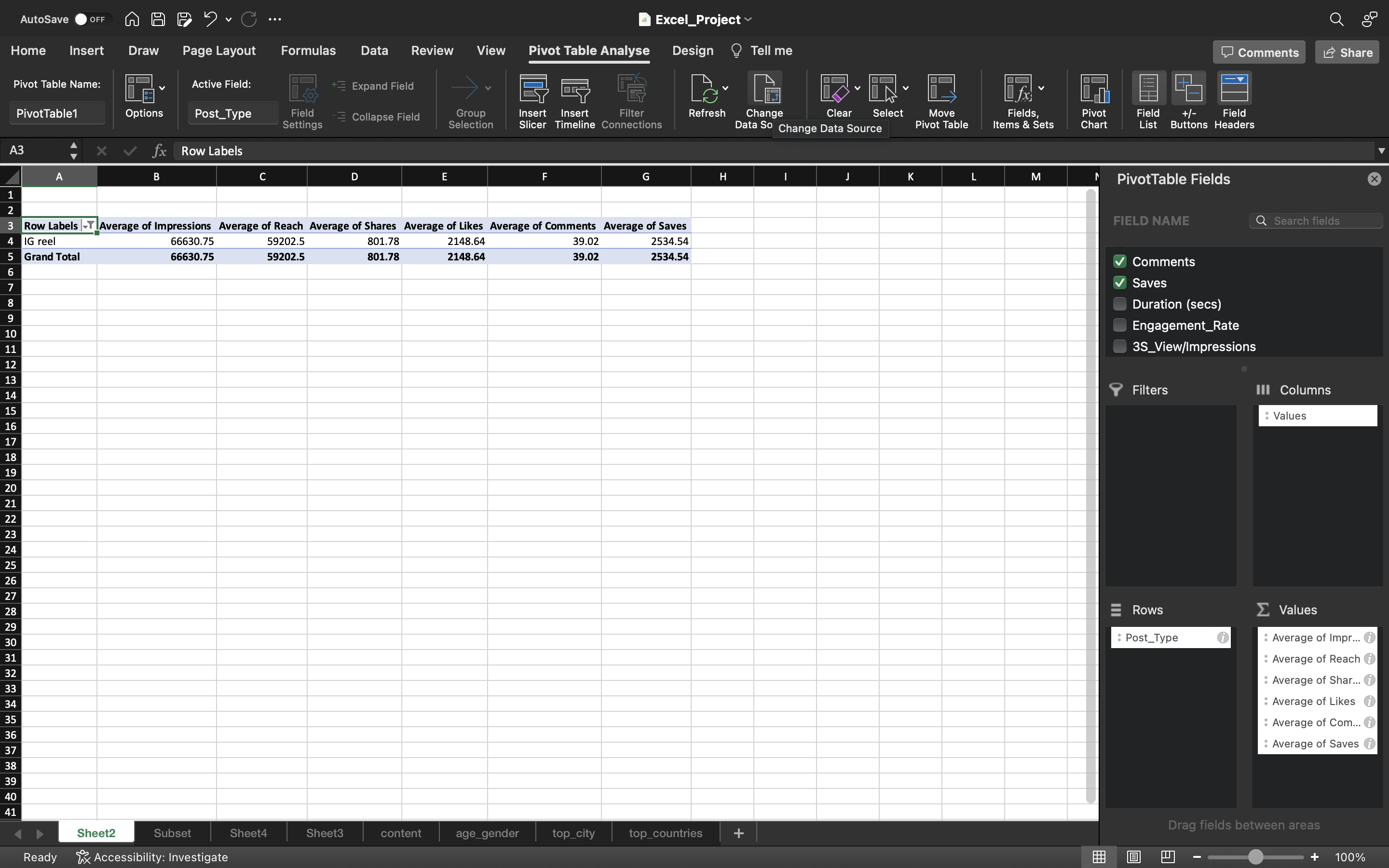
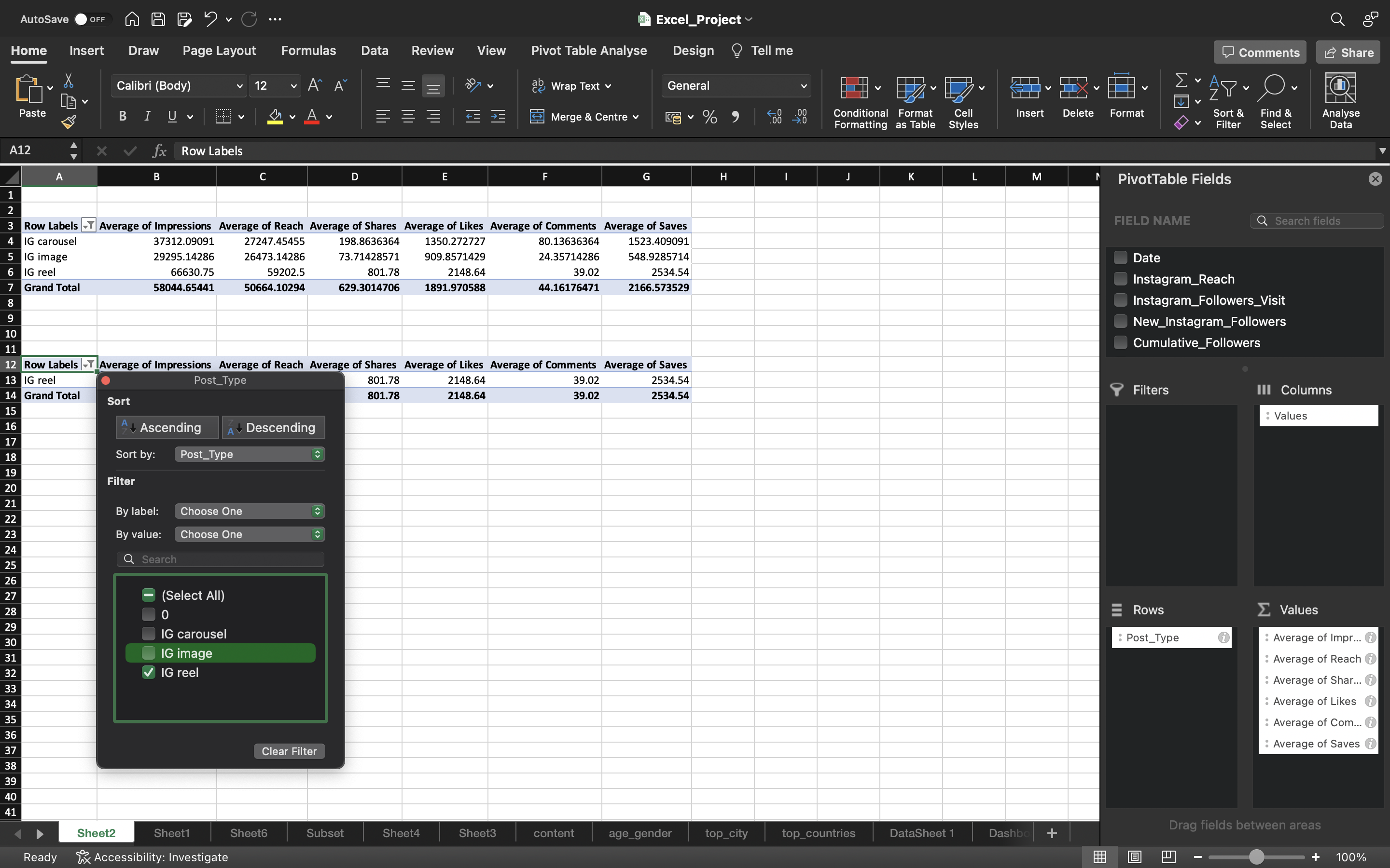
Let’s go the sheet where pivot table is present and filter the Row labels and select IG reel.
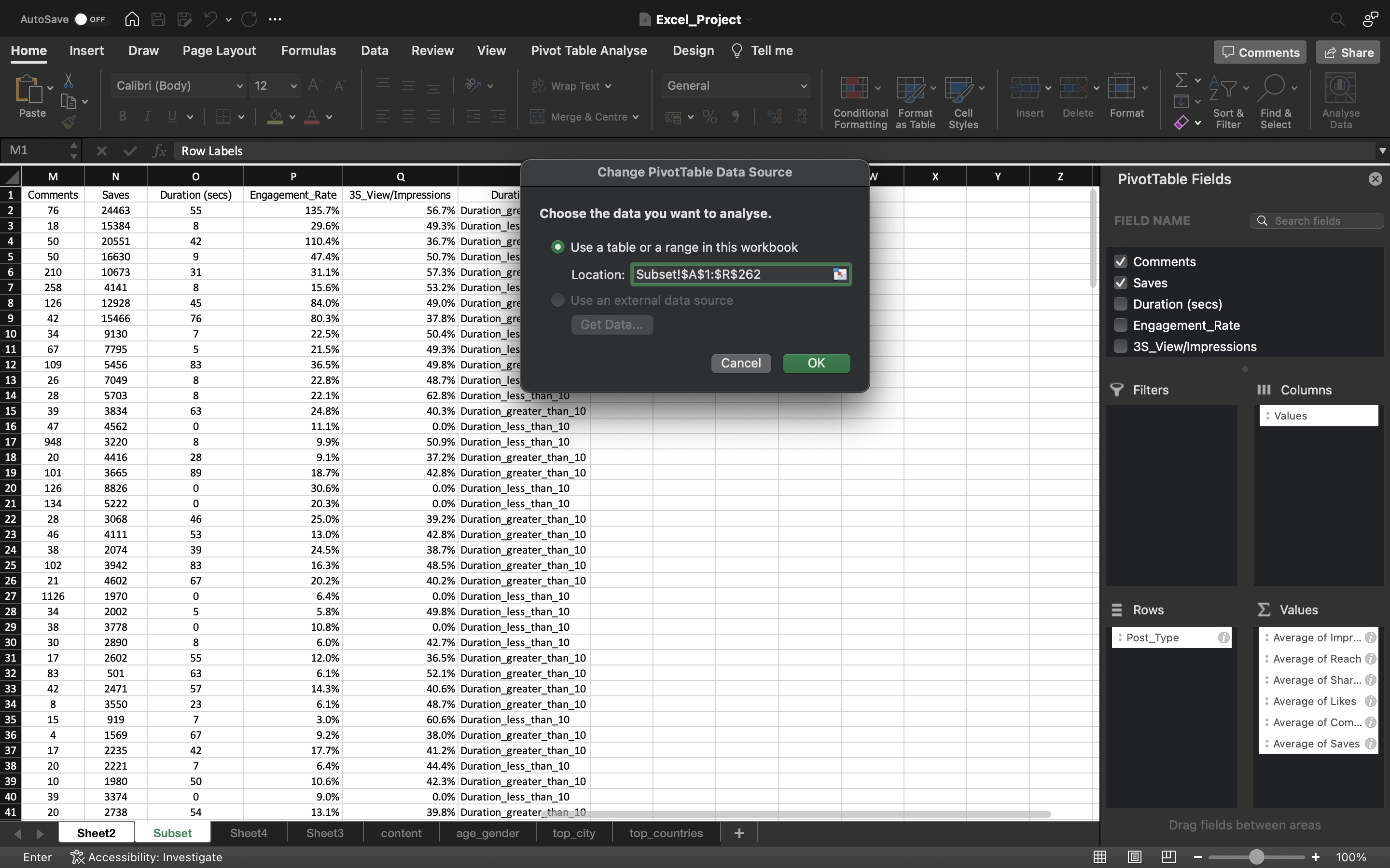
Go to Pivot Table Analyse and click on Change Data Source. Now we have added one more column which is R aka Duration_Bins.
In Table/Range, instead of O use R and click on ok.
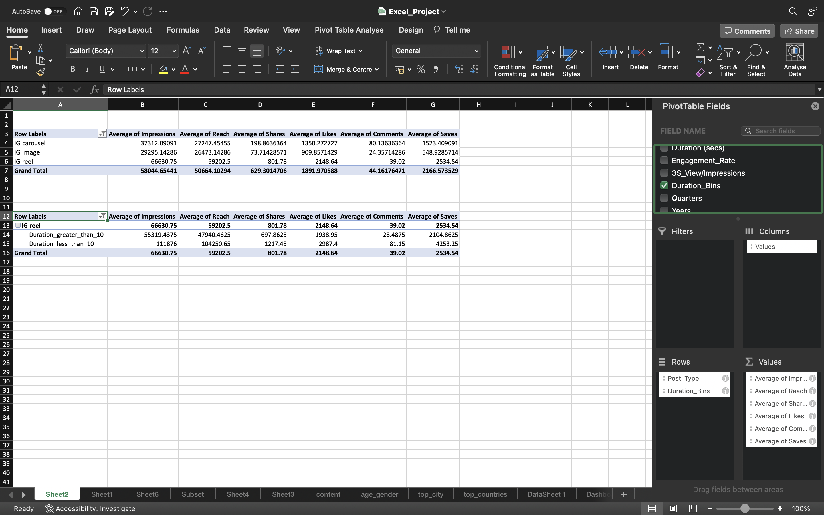
Now we can see in the pivot table, Duration Bins is added and let’s drag it down to the Rows Area.
The output can be seen below:
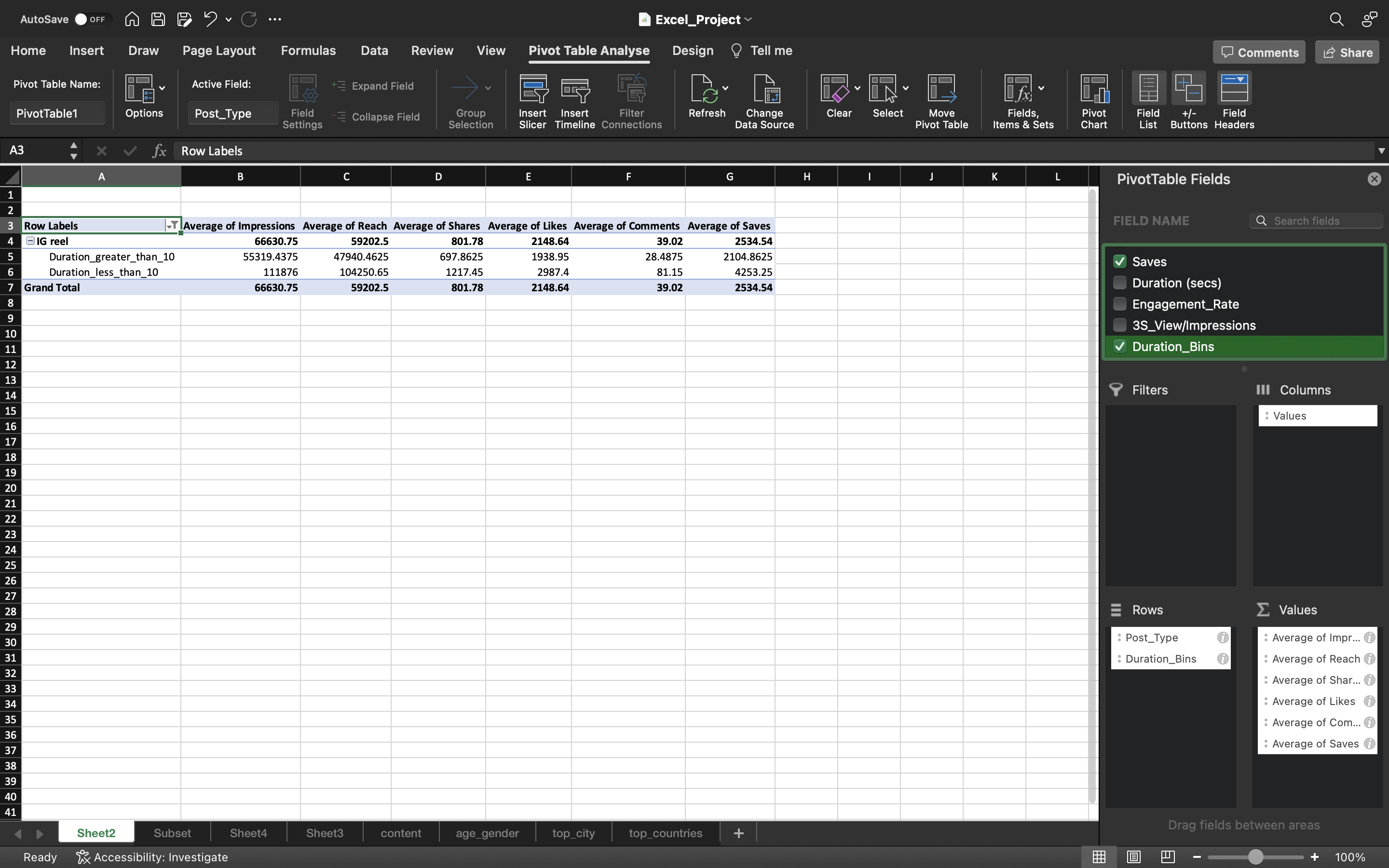
The above pivot table from the output is a great insight.
if we keep the duration less than 10 seconds, we can get high number of Average Reach, Impressions, Shares, Likes, Comments & Saves as you can see in the above output.
age_gender
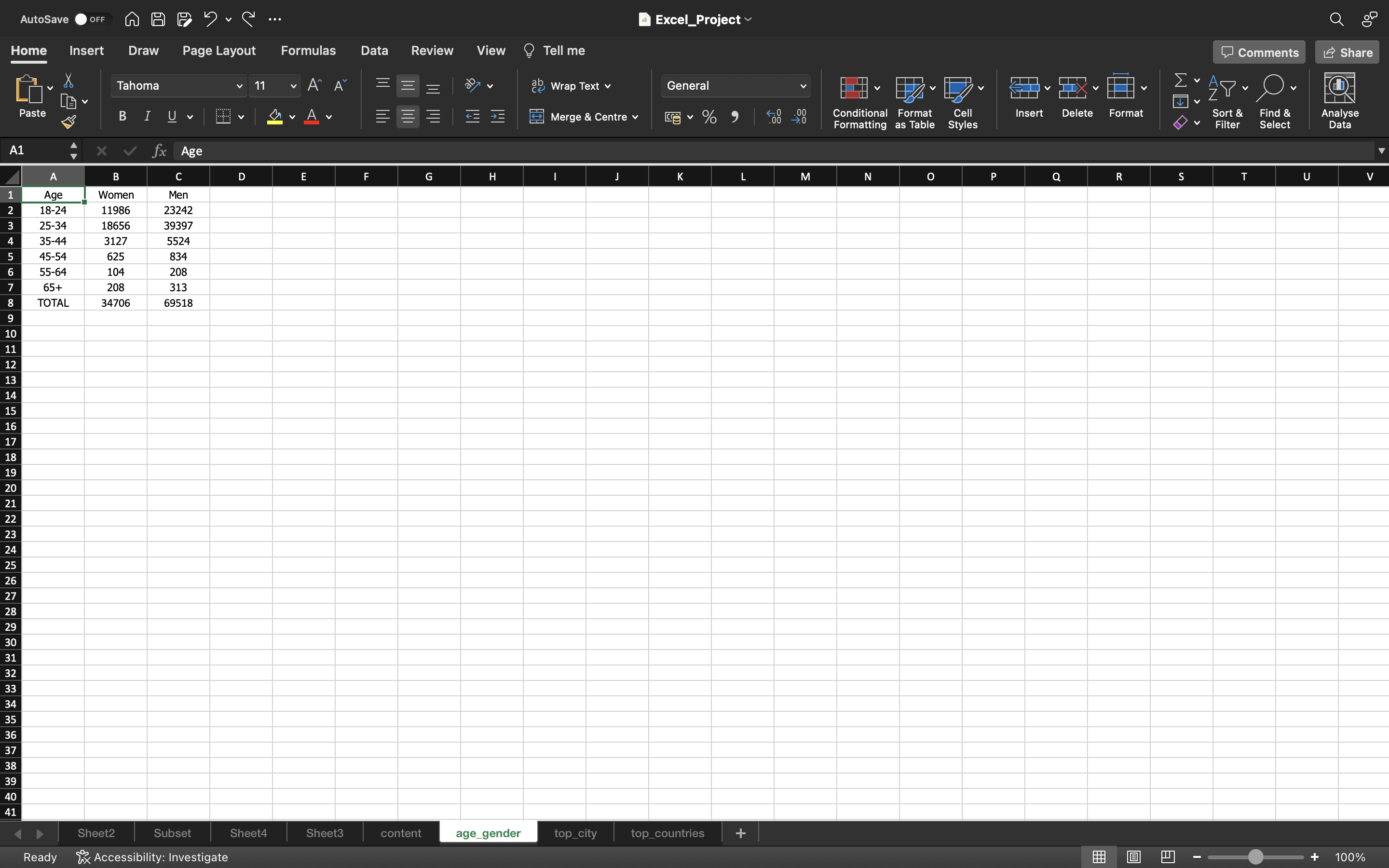
Let’s inspect the age_gender table and create percentage of women and men for each age-group.
Percentage for a single value for a Women column can be calculated using the formula: “=B2/$B$8”. Then we drag down the formula/values into the remaining cells using CTRL+D and convert these values into percentage by clicking on Percentage Style and convert the formulas into paste values.
This can be done by :
- Copying all the values in the column using CTRL+C and pasting it again using CTRL+V
- Click on the “CTRL” icon and select “paste values”.
The output can be seen below:
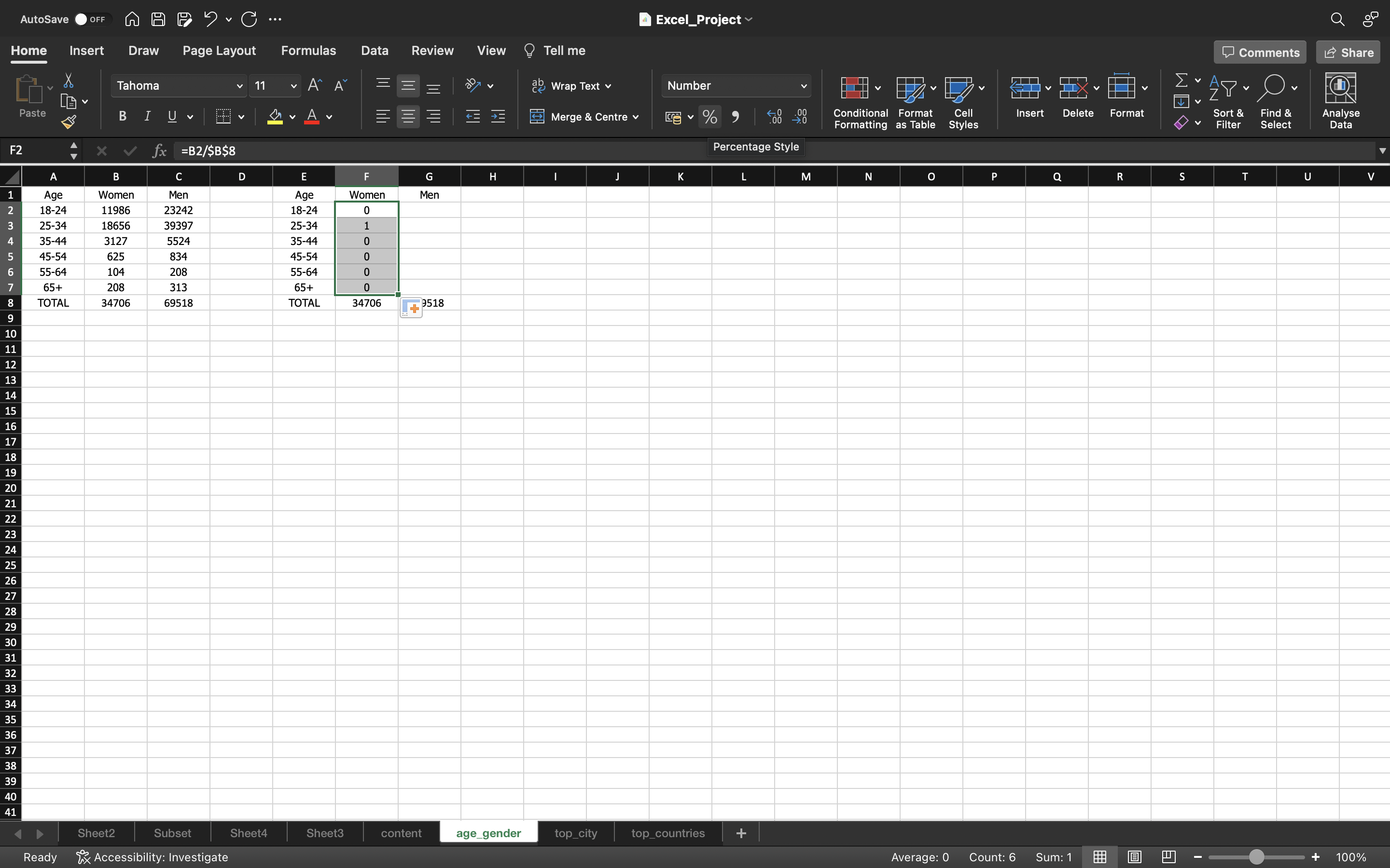
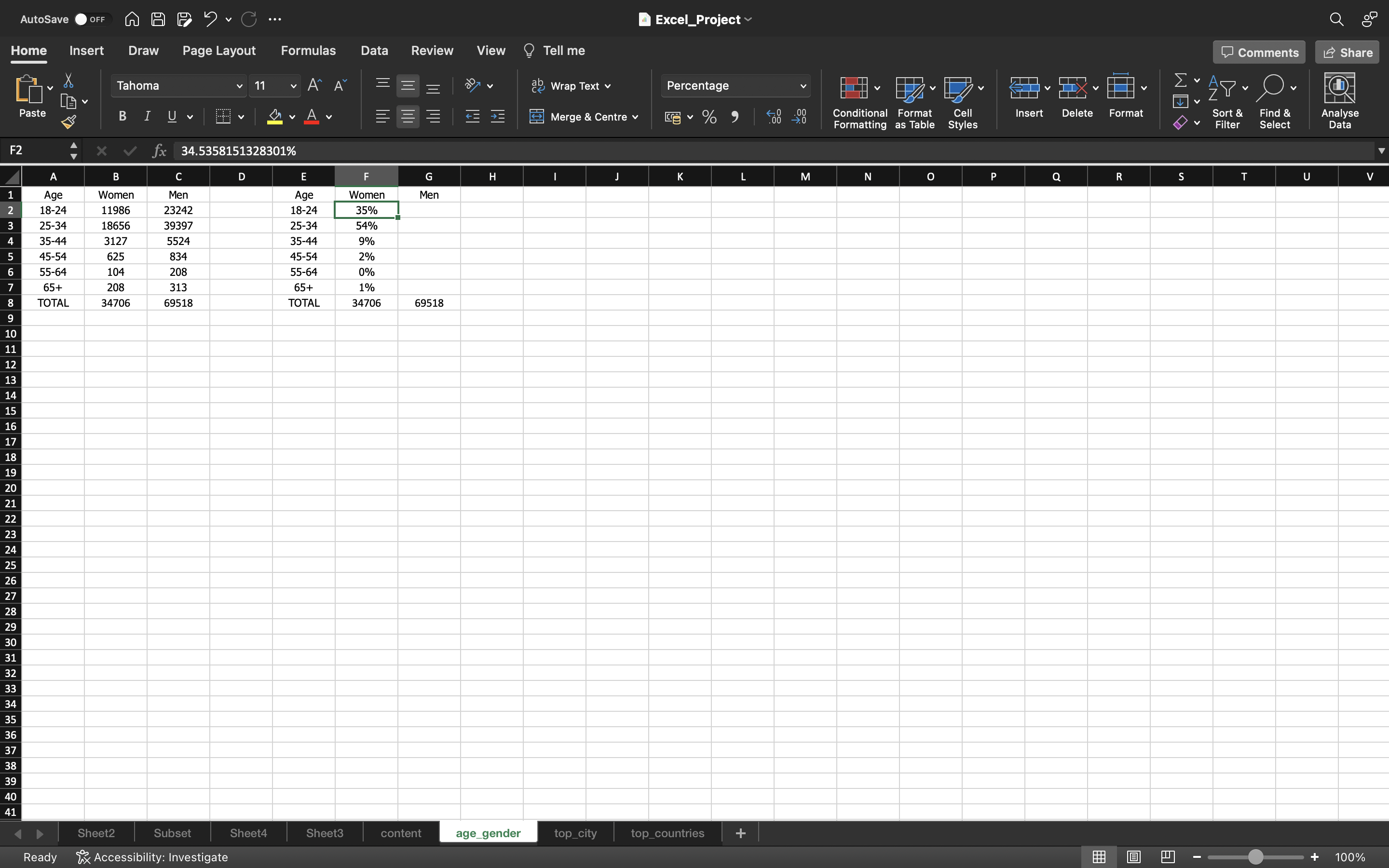
Then we follow the exact same process for the Men column.
You can see the below output:
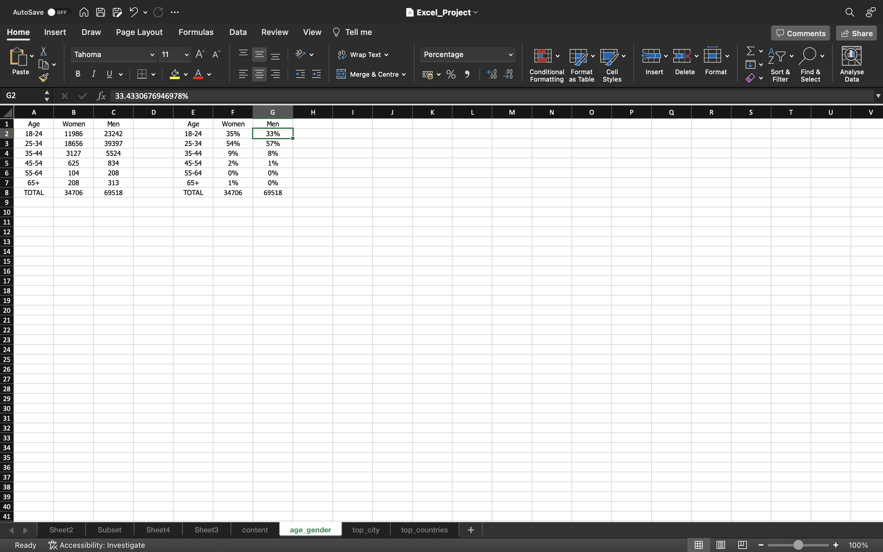
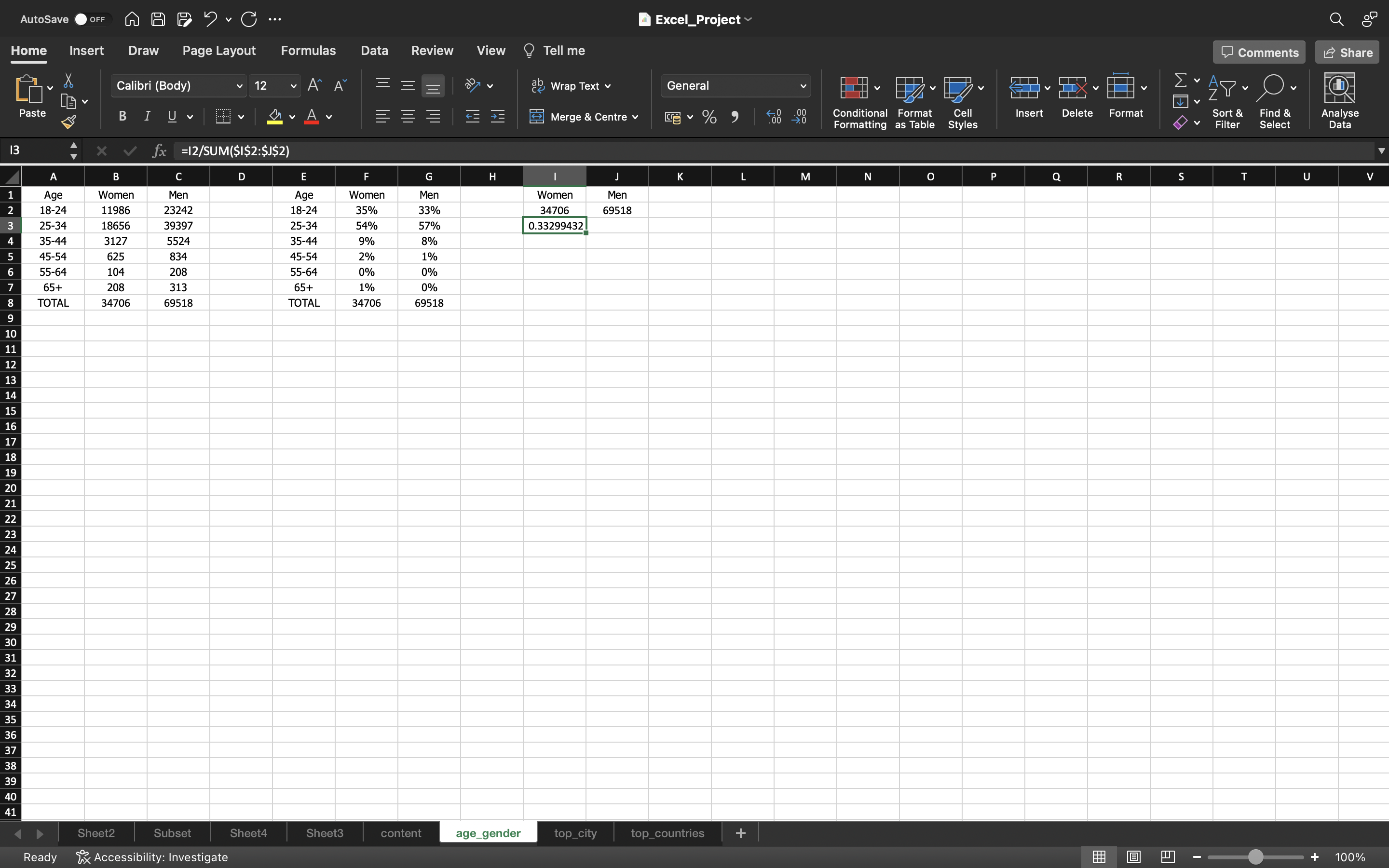
We are gonna create percentage of Men & Women who follow data analyst duo.
This is calculated for a women can be done using the formula “=I2/SUM(I2:J2)”.Then we drag right the formula/values into the remaining cells using CTRL+A.
We convert the formulas into paste values.
This can be done by :
- Copying all the values in the column using CTRL+C and pasting it again using CTRL+V
- Click on the “CTRL” icon and select “paste values”.
You can see the below output:

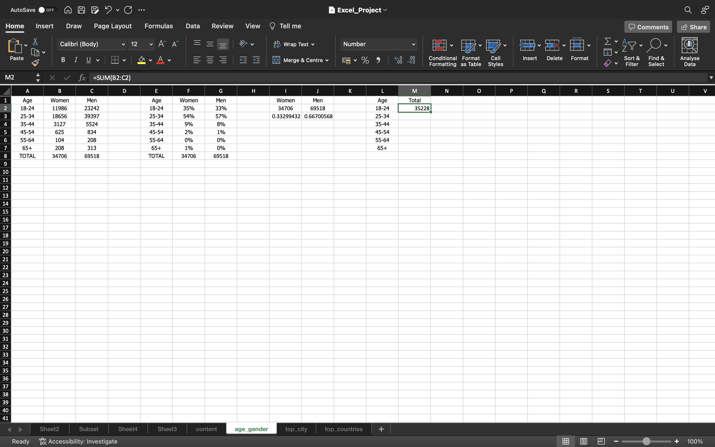
Then we create % of total followers within each age group. A single value i.e Total Sum is created for an age group 18-24 using the formula “=SUM(B2:C2)”.Then we drag down the formula/values into the remaining cells using CTRL+A.
We convert the formulas into paste values
This can be done by :
- Copying all the values in the column using CTRL+C and pasting it again using CTRL+V
- Click on the “CTRL” icon and select “paste values”.
Then we calculate % of total followers using the formula “M2/SUM($M$2:$M$7)”.Then we drag down the formula/values into the remaining cells using CTRL+A.After this, we convert the formulas into paste values and convert these values into percentage by clicking on Percentage Style.
You can see the below output:
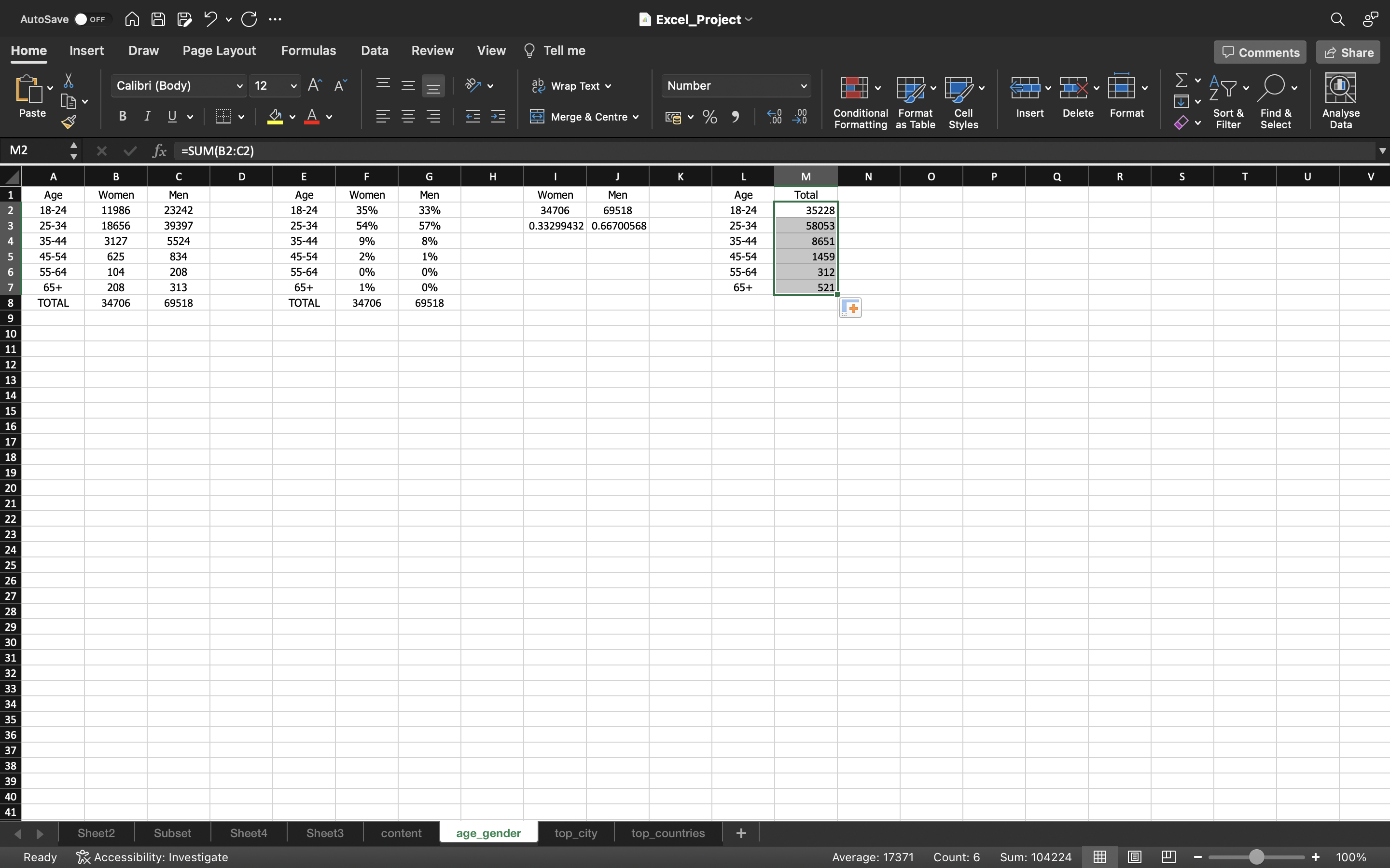
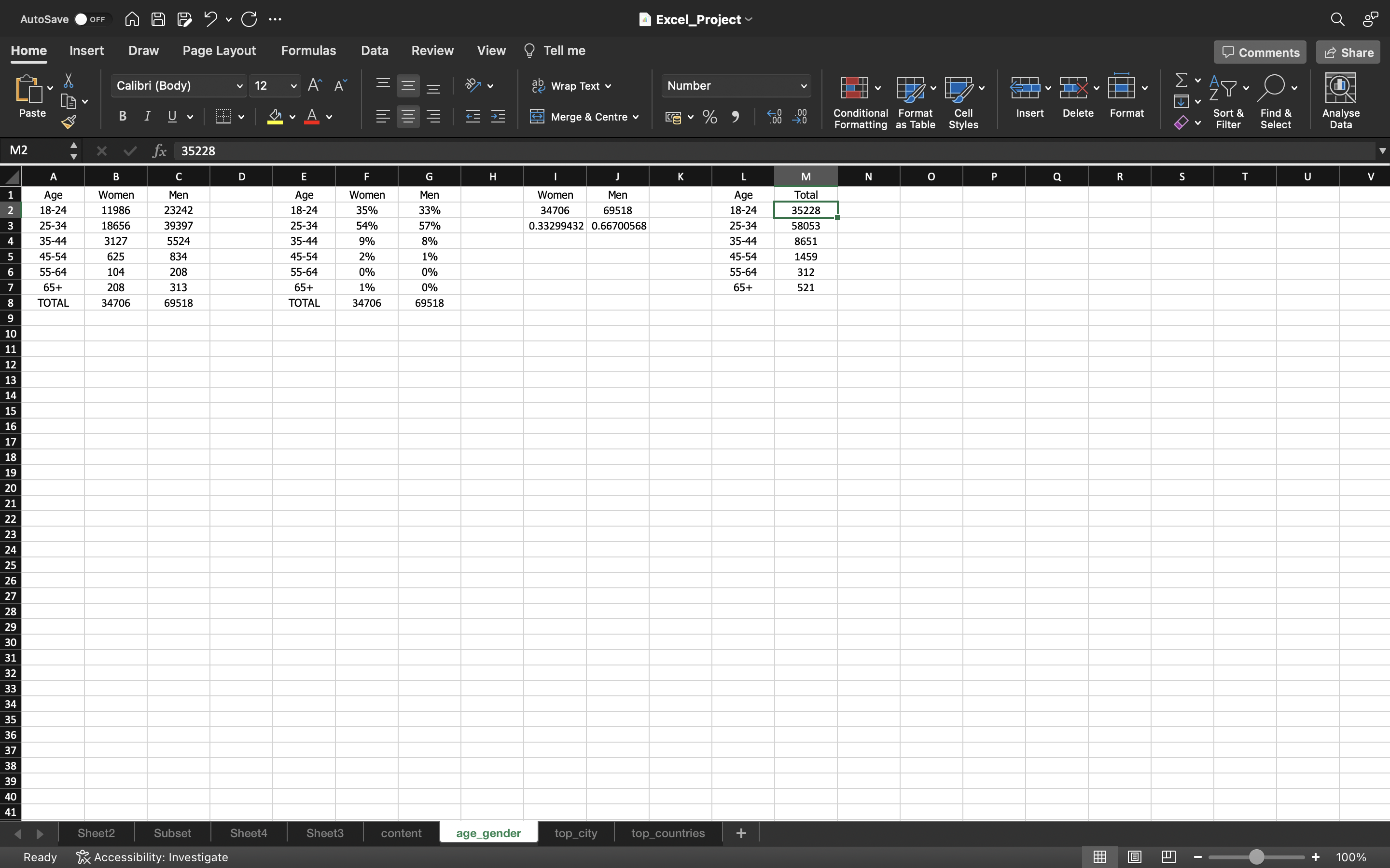
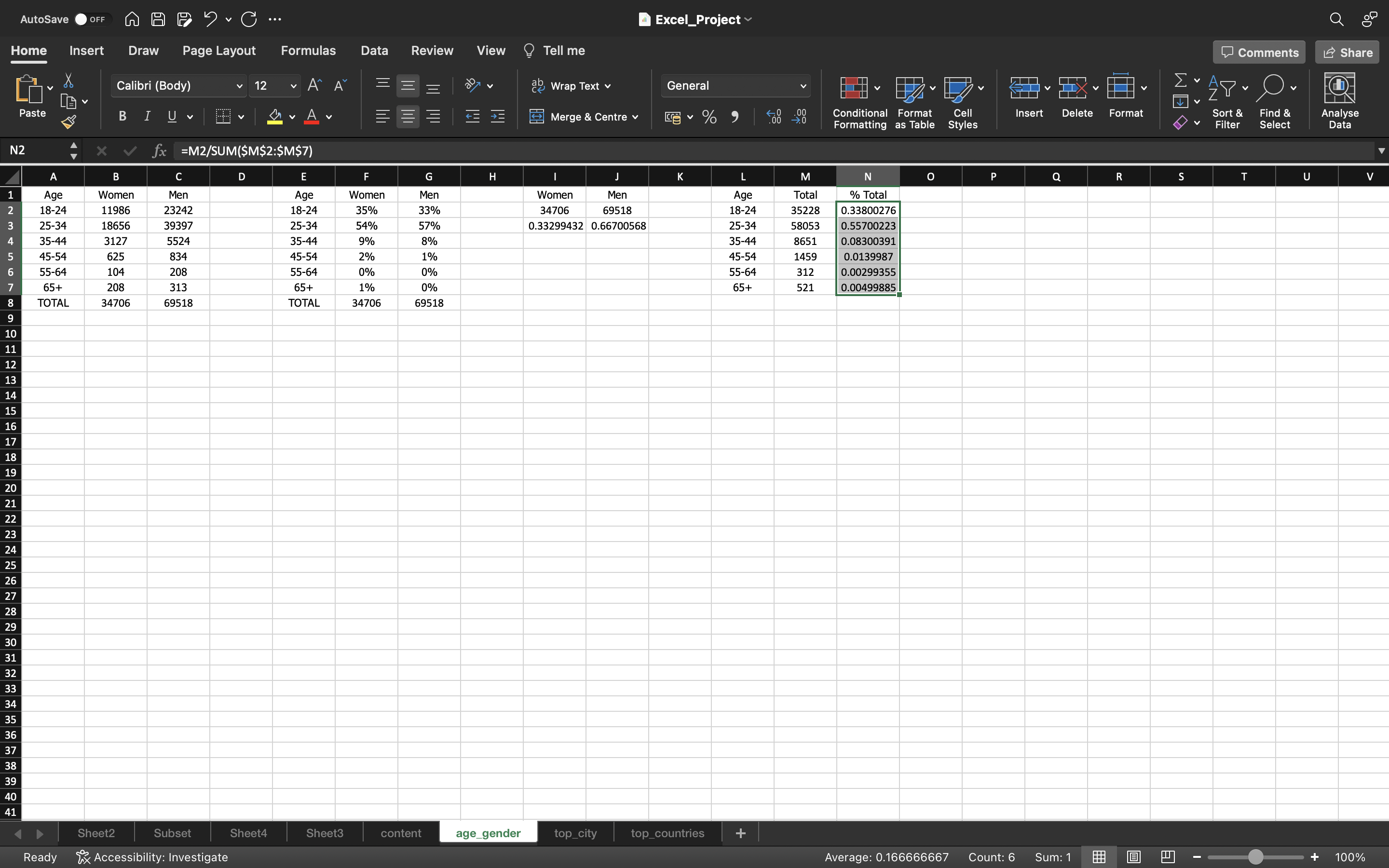
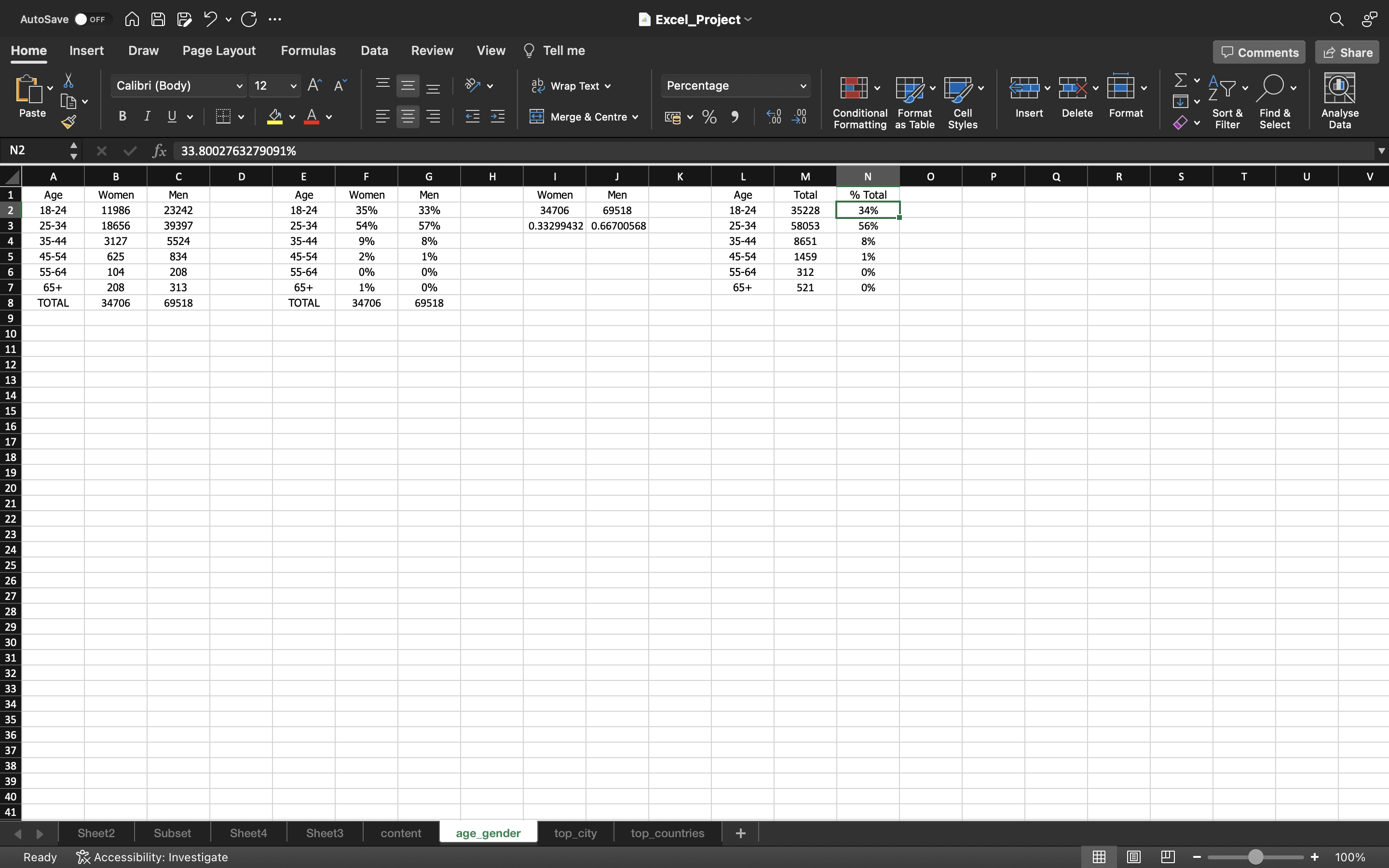
From the above ouput what we can infer is:
- 56% of the followers belong to the age category of 25-34.
- 34% of the followers belong to the age category of 18-24.
- Majority of the portion is from 18-34 age group and small portion of followers of 8% from 35-44 age group and very less % of followers above age of 45.
Our main audience is from age group 25-34 and majority of them are Males.
Top_City
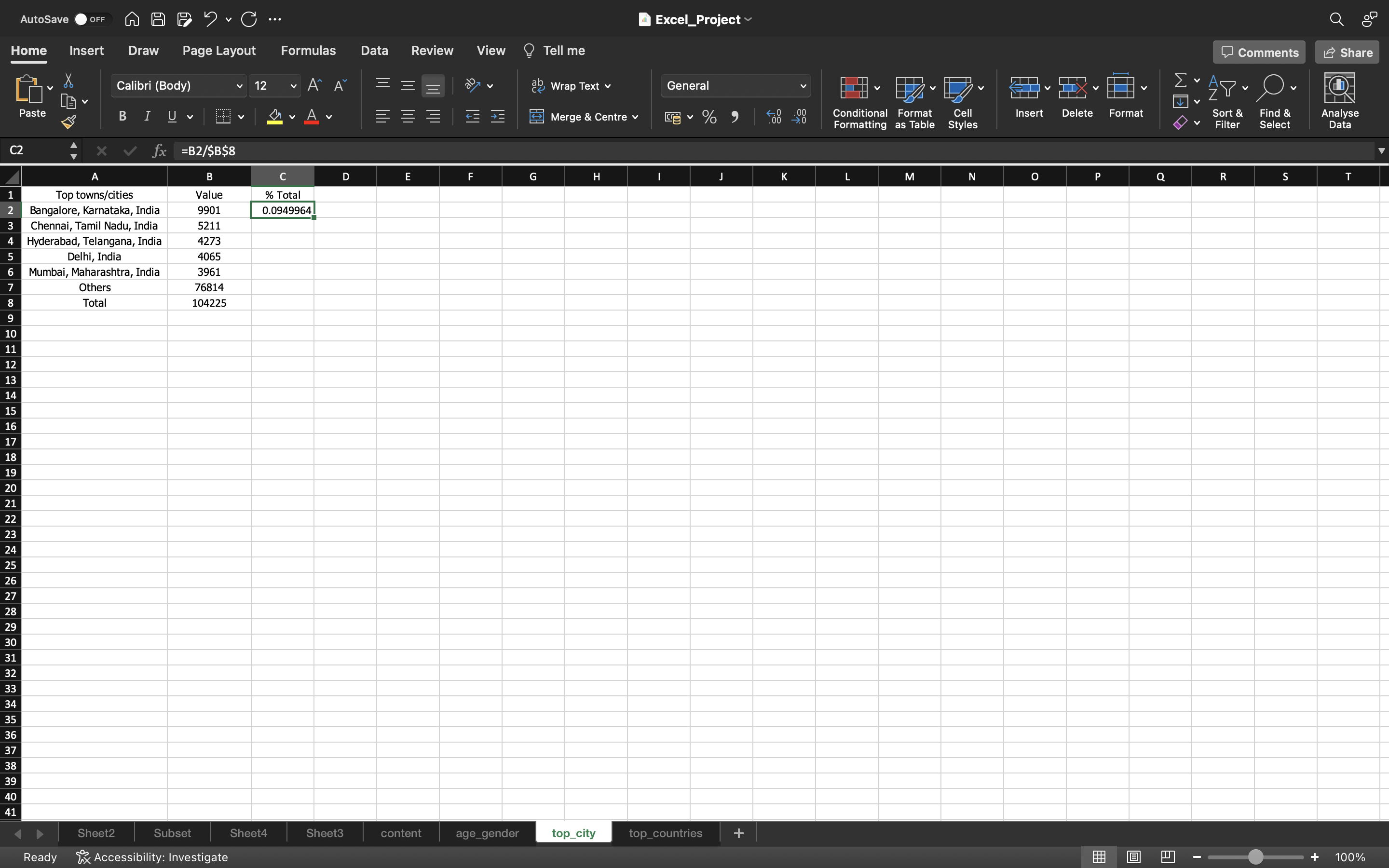
Let’s calculate % of people from each city
- A single value i.e Total Sum is created for a city Banglore,Karnataka,India using the formula “=B2/$B$8”.
- Then we drag down the formula/values into the remaining cells using CTRL+D.
- After this, we convert the formulas into paste values and convert these values into percentage by clicking on Percentage Style.
You can see the below output:
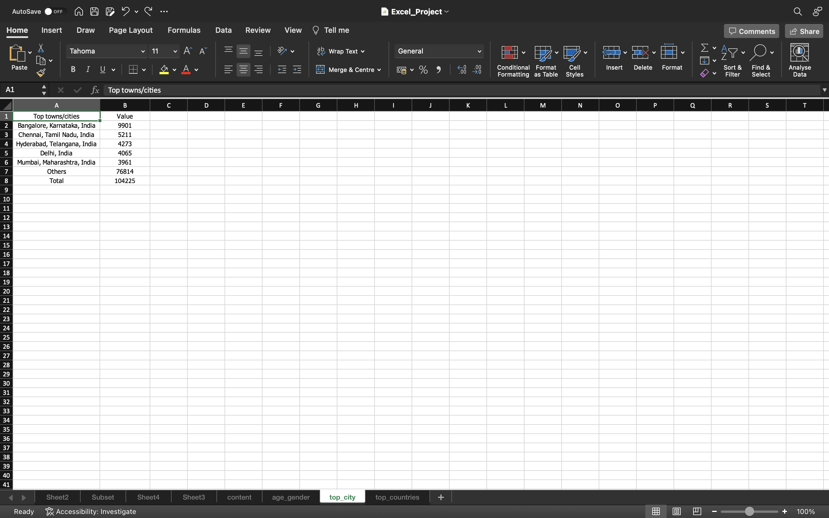
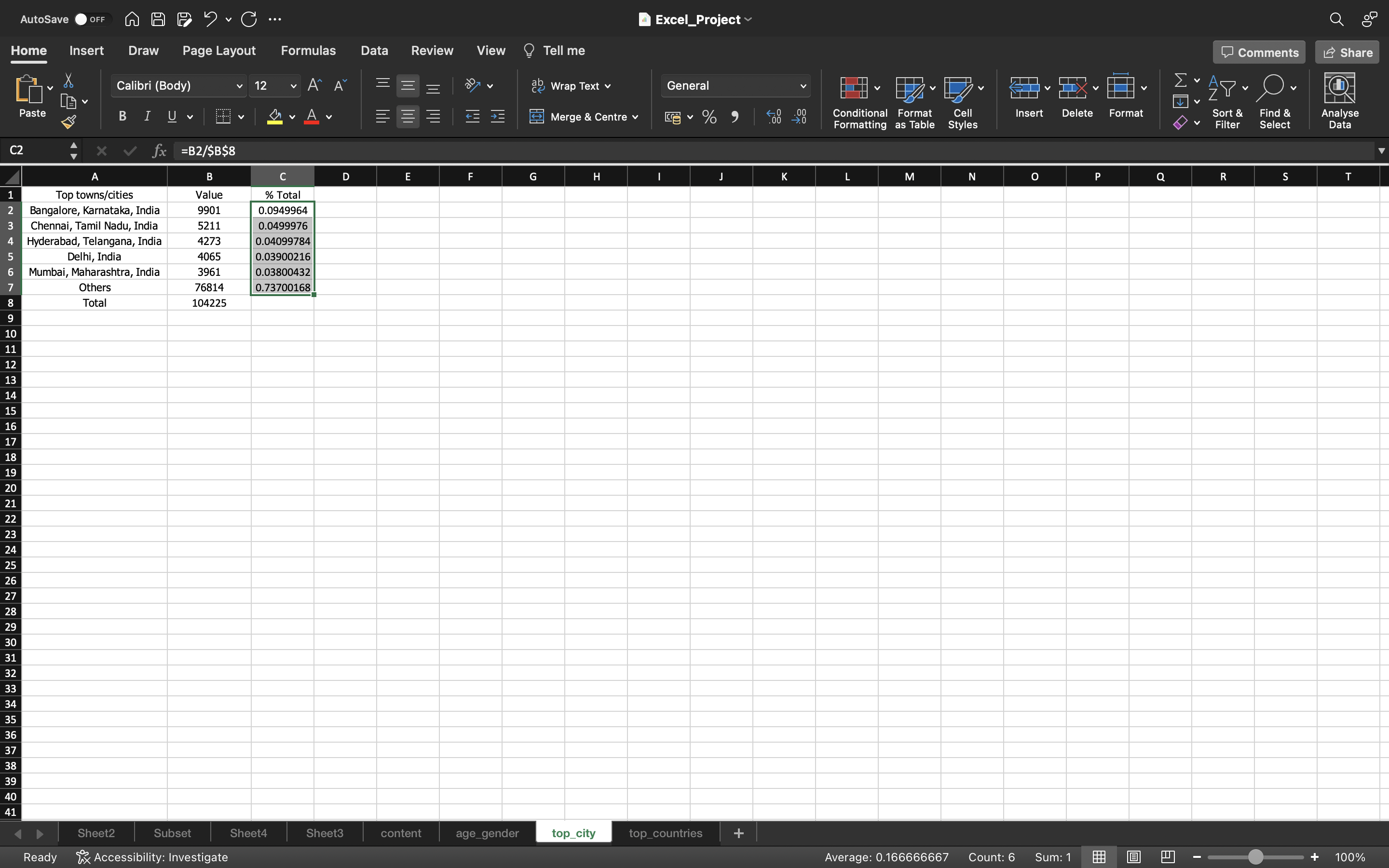

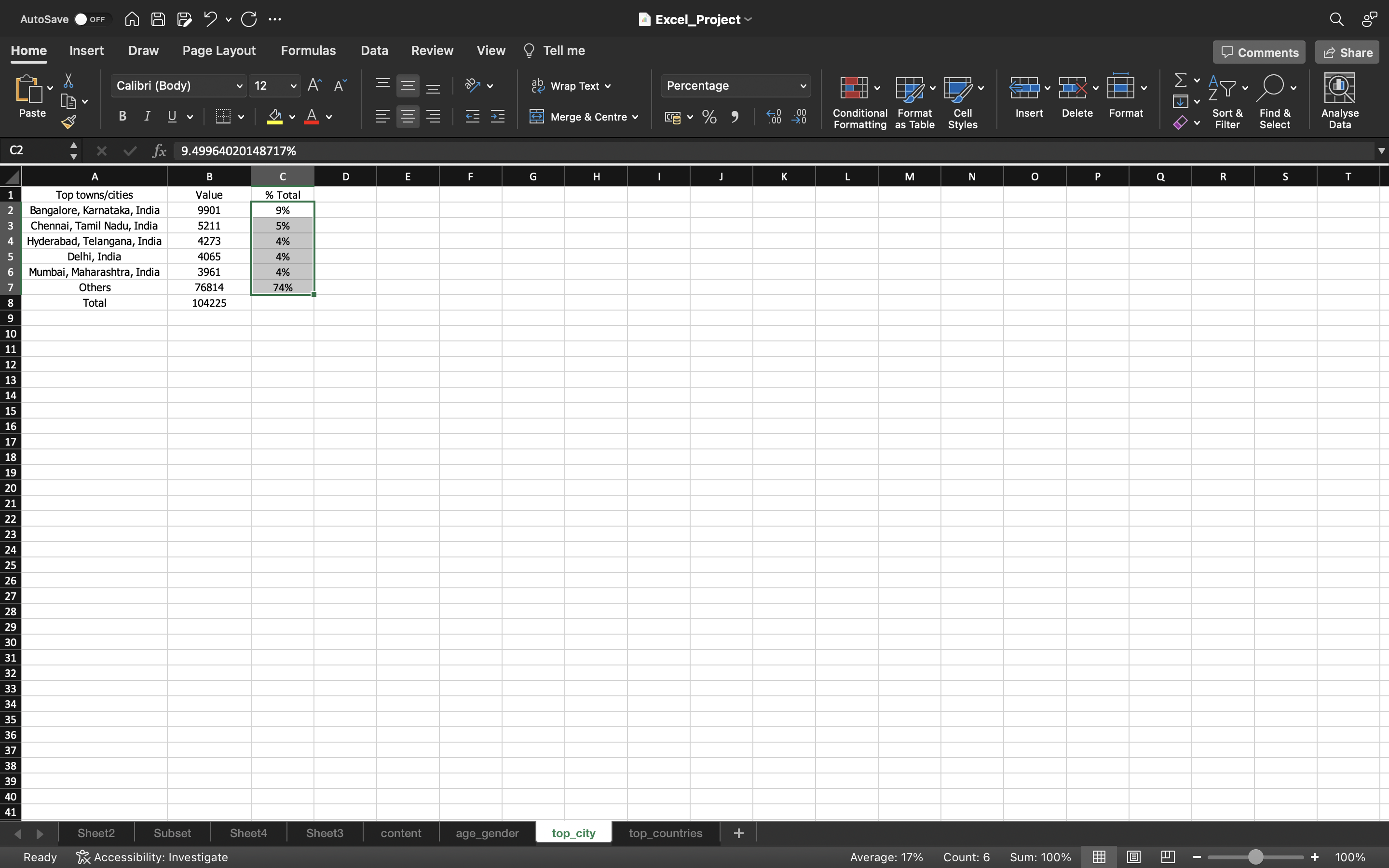
From the above ouput what we can infer is:
- 9% of the people are from Banglore.
- 5% of the people are from Chennai.
- 4% of the people are Hyderabad,Delhi and Mumbai.
Majority of the people are from Banglore. So we can have a meet up in Banglore. Others represents rest of the cities we have i.e 74%.
So banglore, Chennai, Hyderabad, Delhi and Mumbai contribute to around 26%.
Top_Country
Let’s calculate % of people from each country.
- A single value i.e Total Sum is created for a country India using the formula “=B2/$B$8”.
- Then we drag down the formula/values into the remaining cells using CTRL+D.
- After this, we convert the formulas into paste values and convert these values into percentage by clicking on Percentage Style.
You can see the below output:
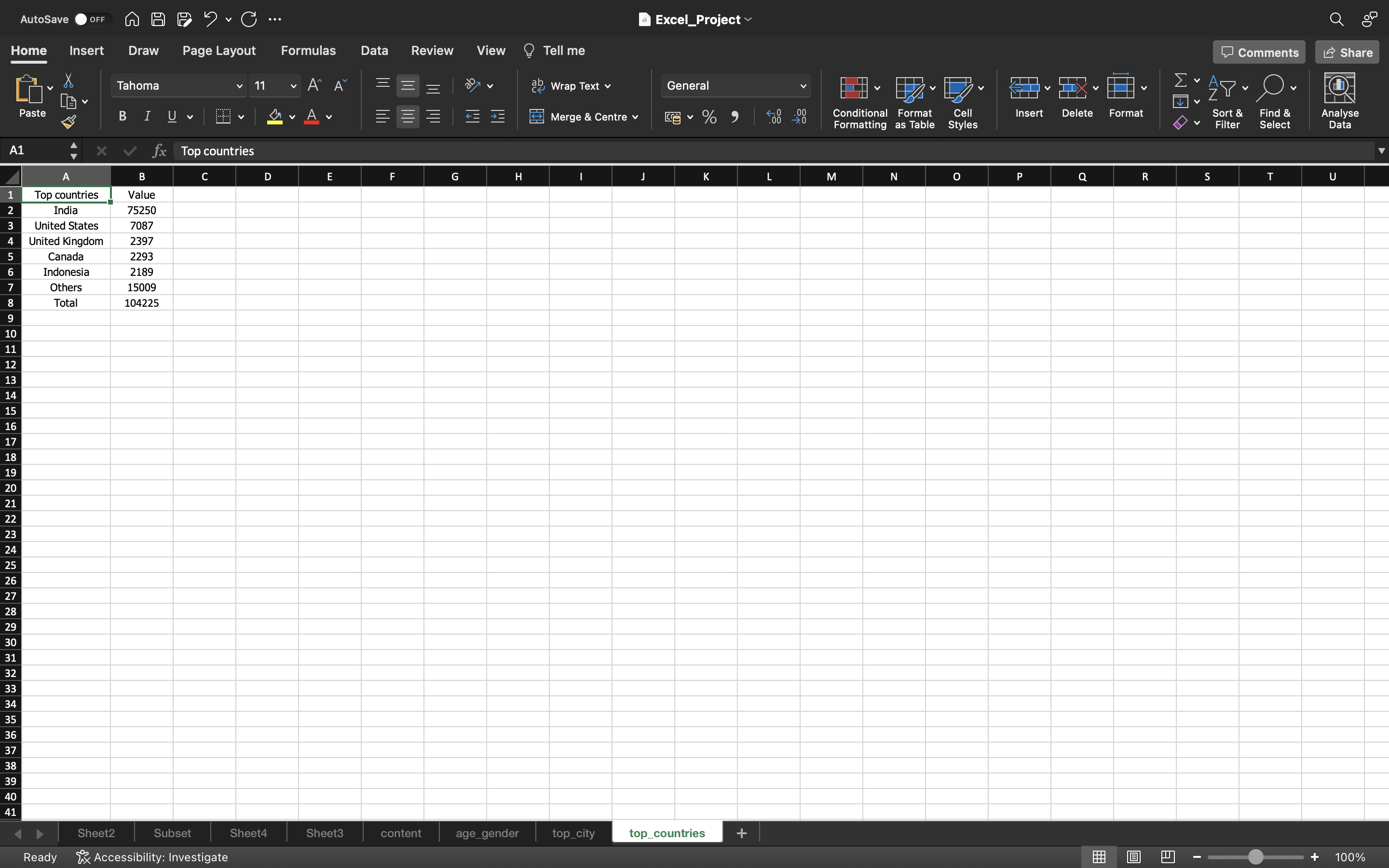
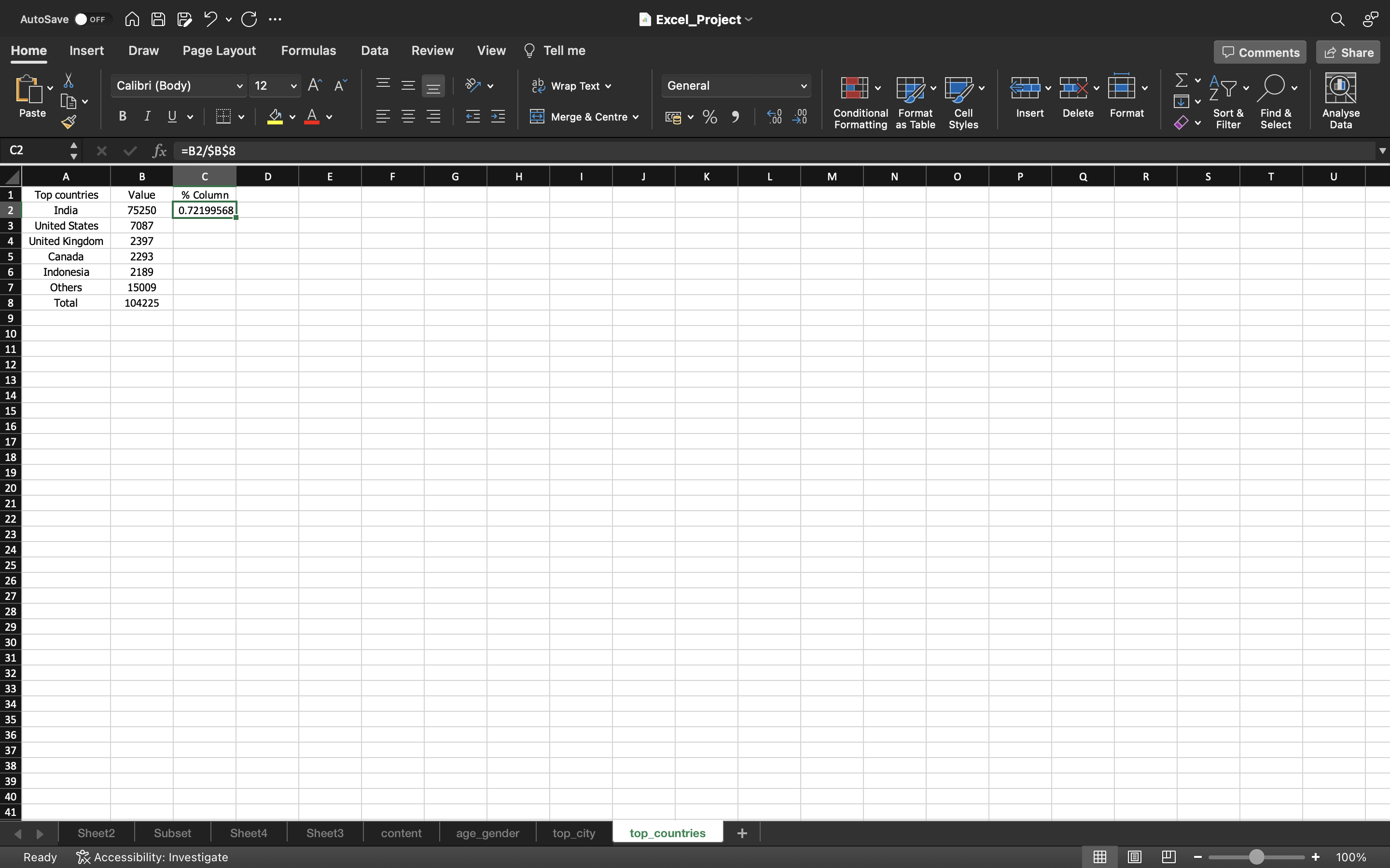
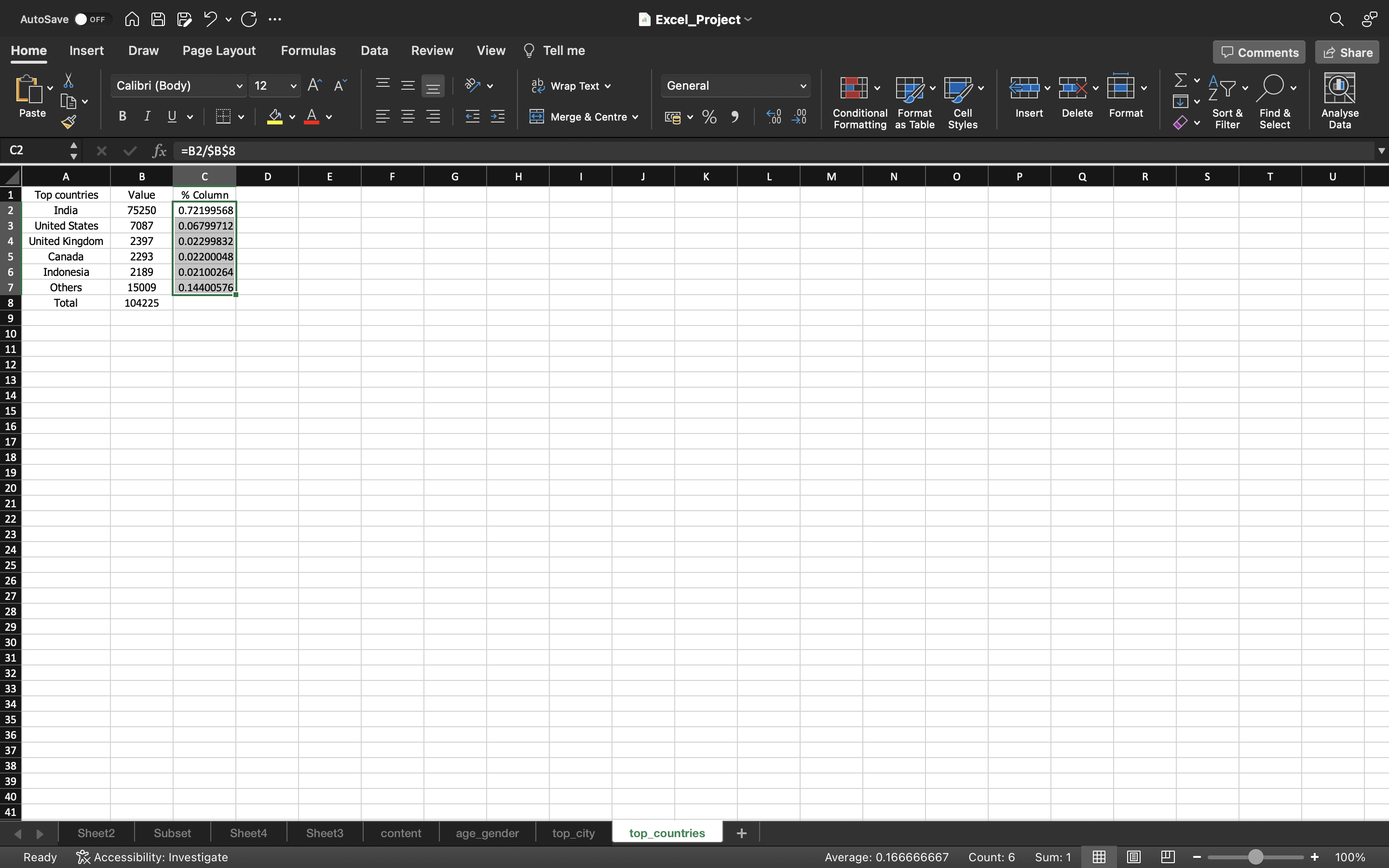
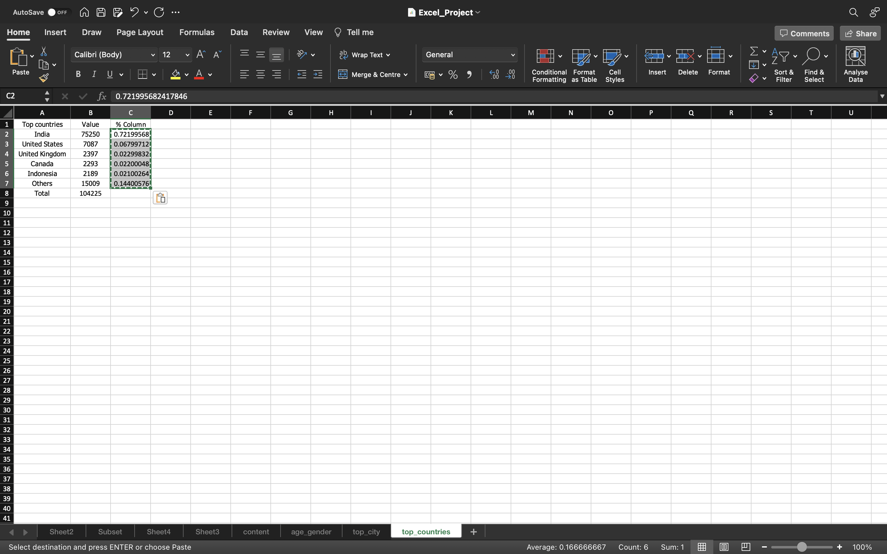
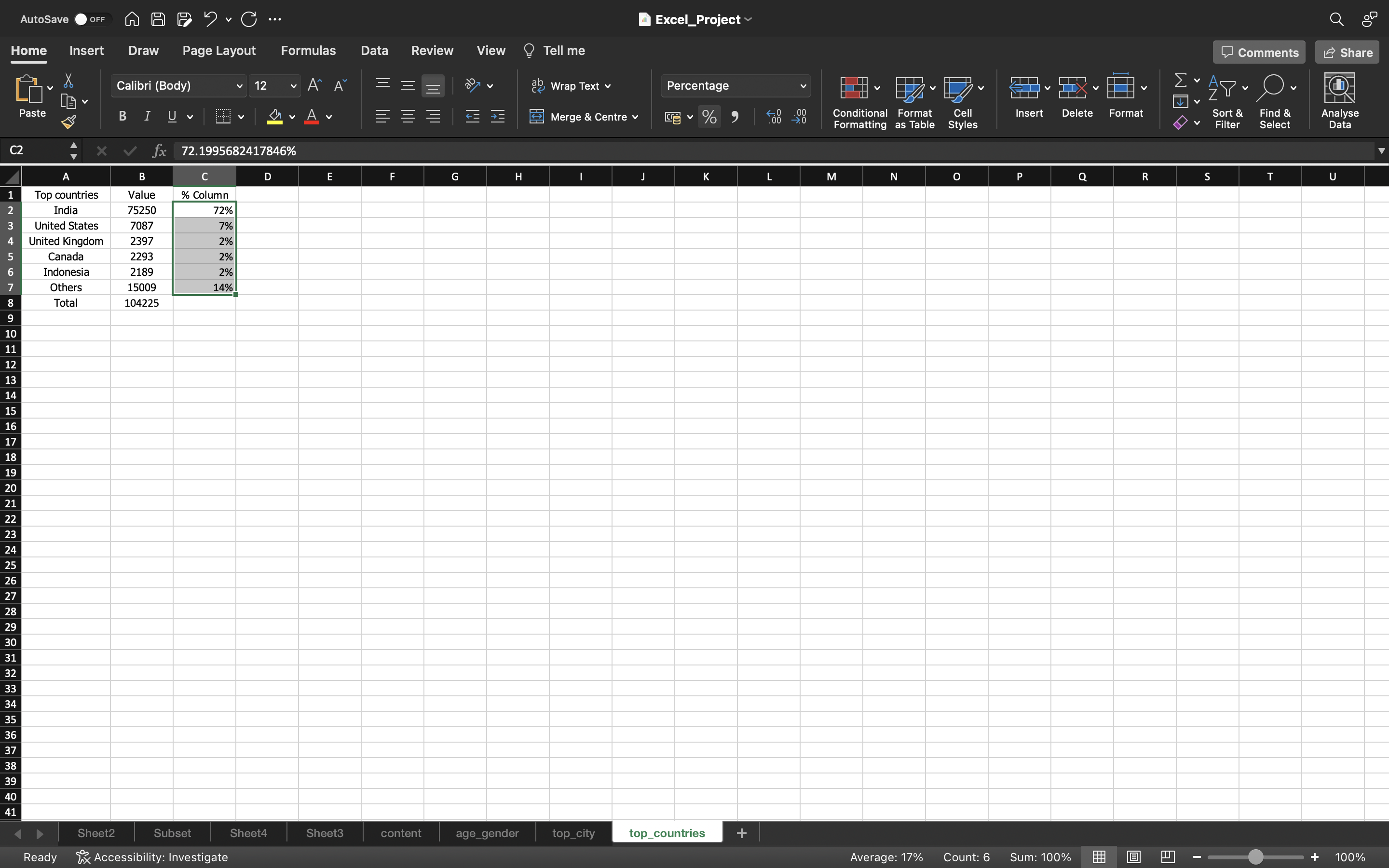
From the above ouput what we can infer is:
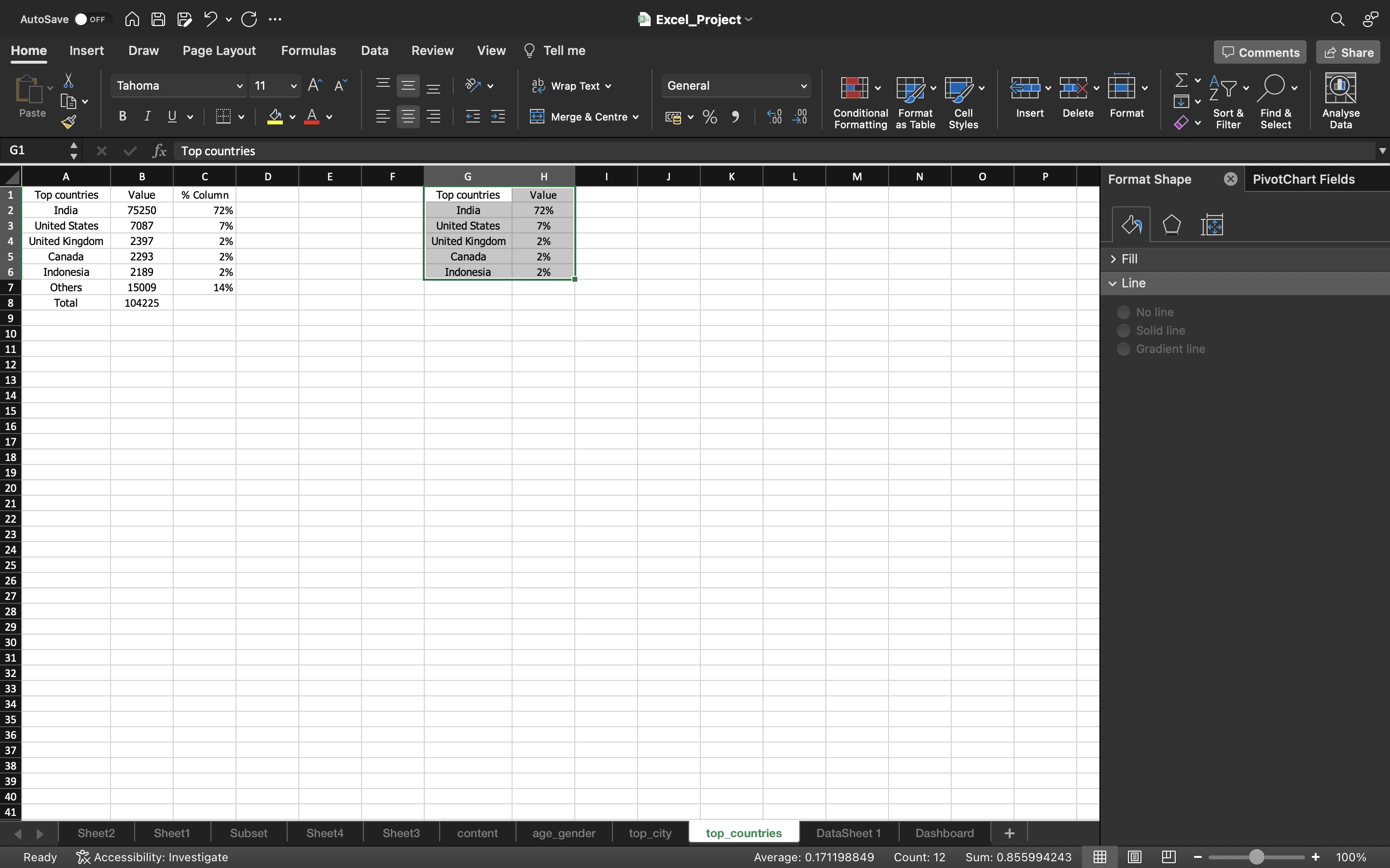
- 72% of the people are from India.
- 7% of the people are from United States.
- 2% of the people are United Kingdom, Canada and Indonesia.
Majority of the people are from India.
Creation Of Dashboard
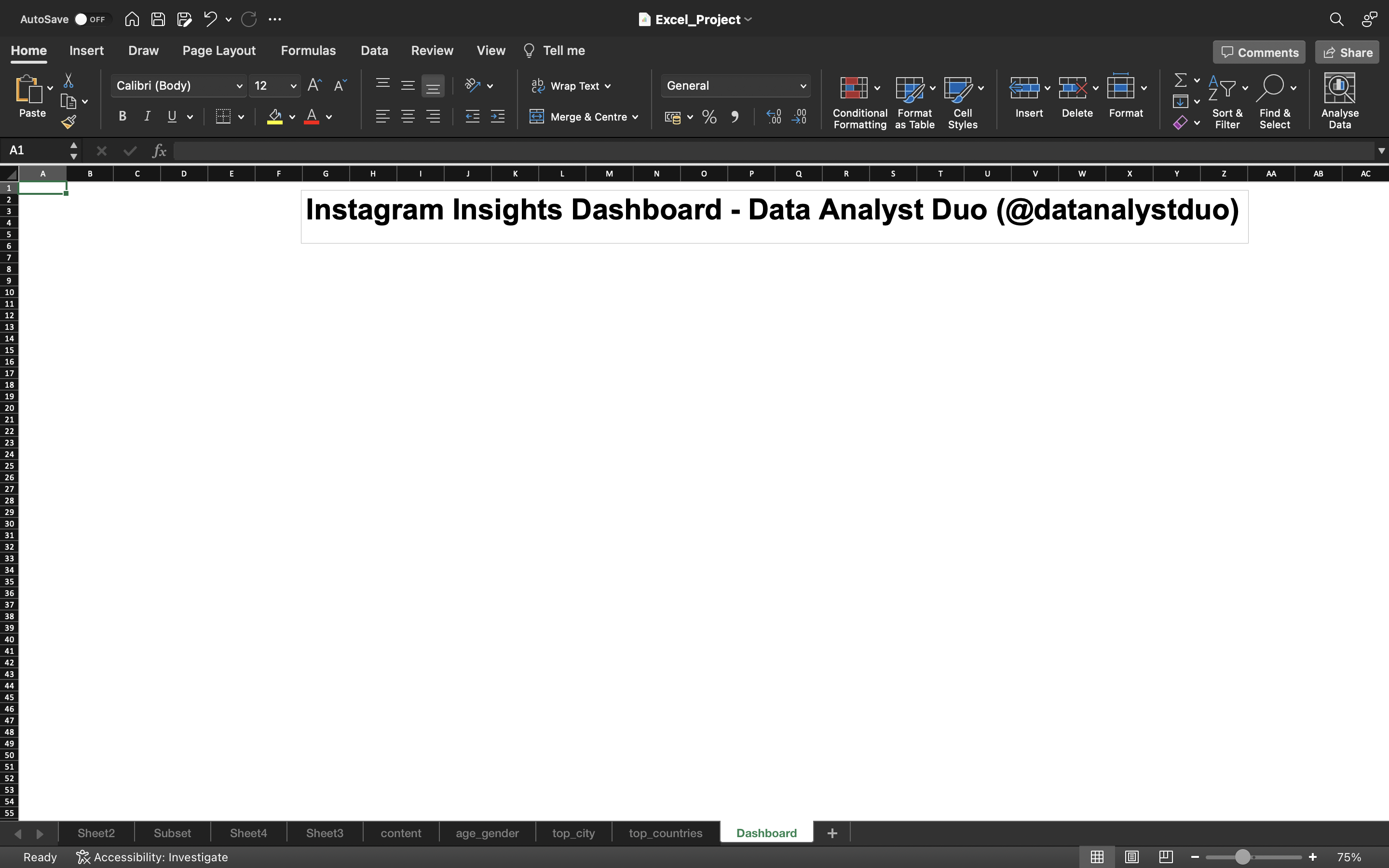
Let’s create a separate sheet named Dashboard.
- Go to View tab and disable Gridlines.
- Go to Insert tab and click on Text Box.
- Give a Title for the Dasboard.
The output can be seen below:
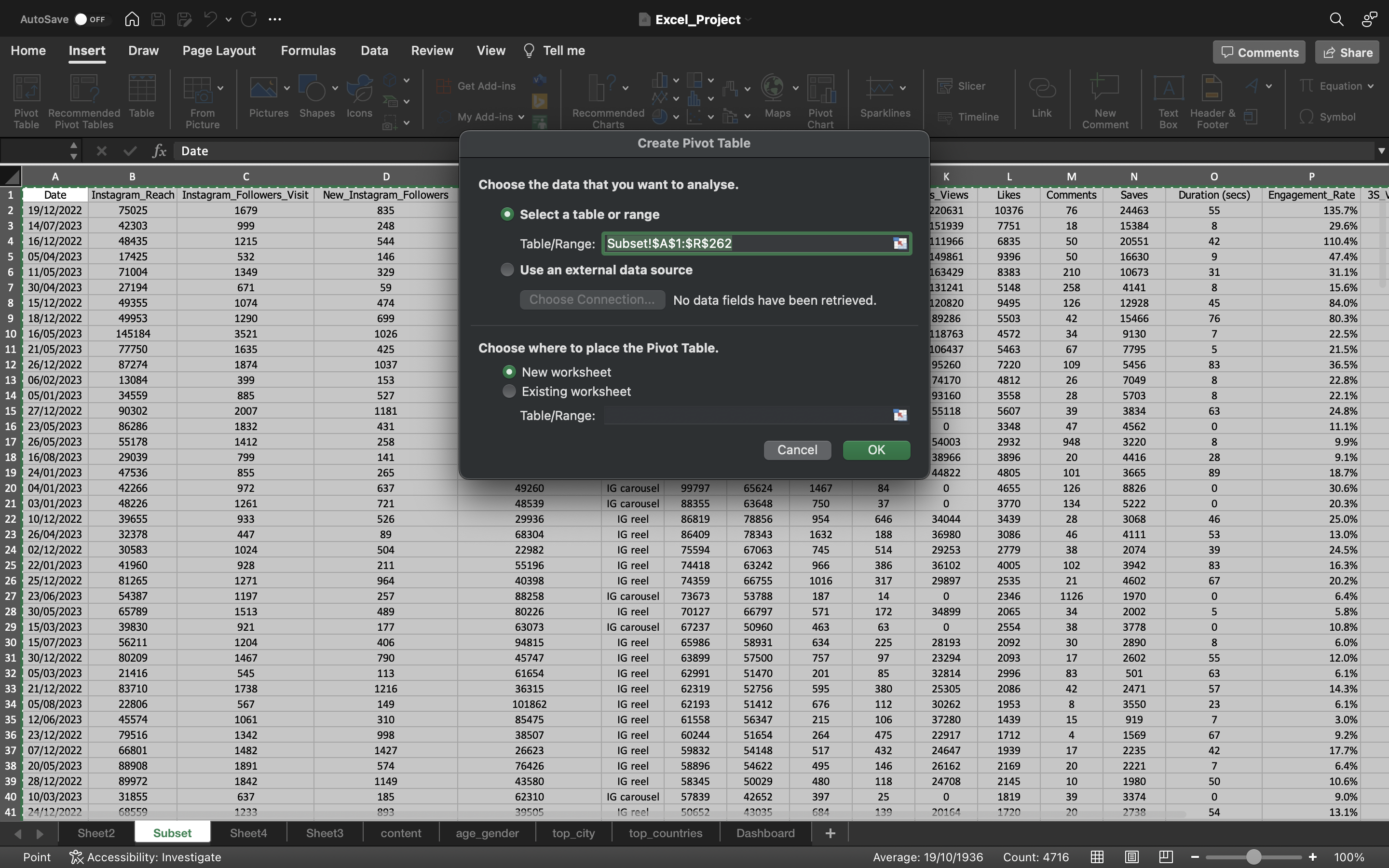
Now let’s try to find the metrics such as Maximum of Cumulative_Followers, Count of Post Type.
We can do this by creating a pivot table.
- Now go to Subset worksheet and select the entire data using CTRL+A.
- Go to Insert tab and select Pivot Table and click on From Table/Range. A dialog box appears, select New Worksheet and click ok.
The output can be seen below:
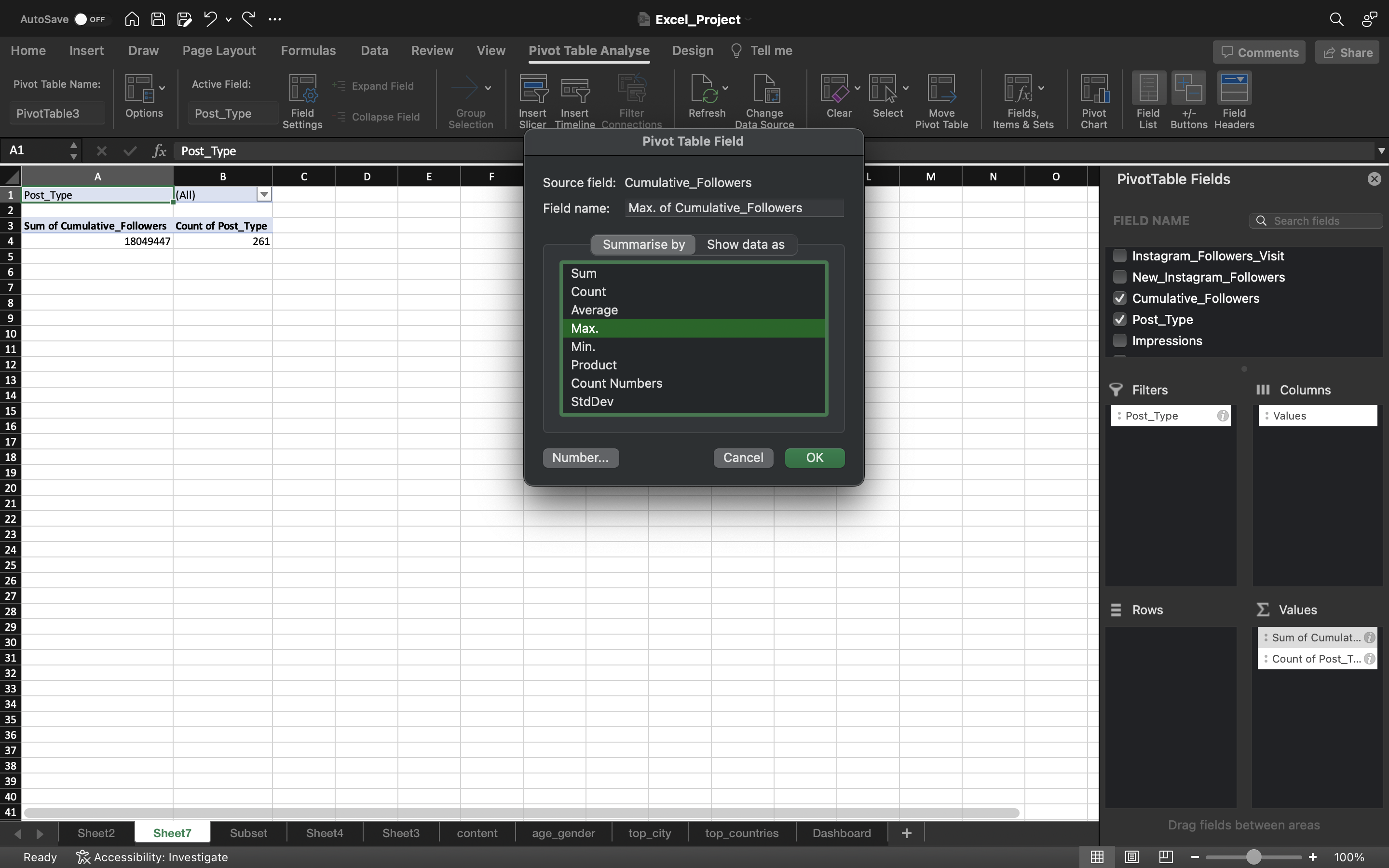
Now drag the post_type to the Filters area and Cumulative_Followers, Post_Type to the Values area.
Change the Sum of Cumulative_Followers to the Max.
You can see the below output:
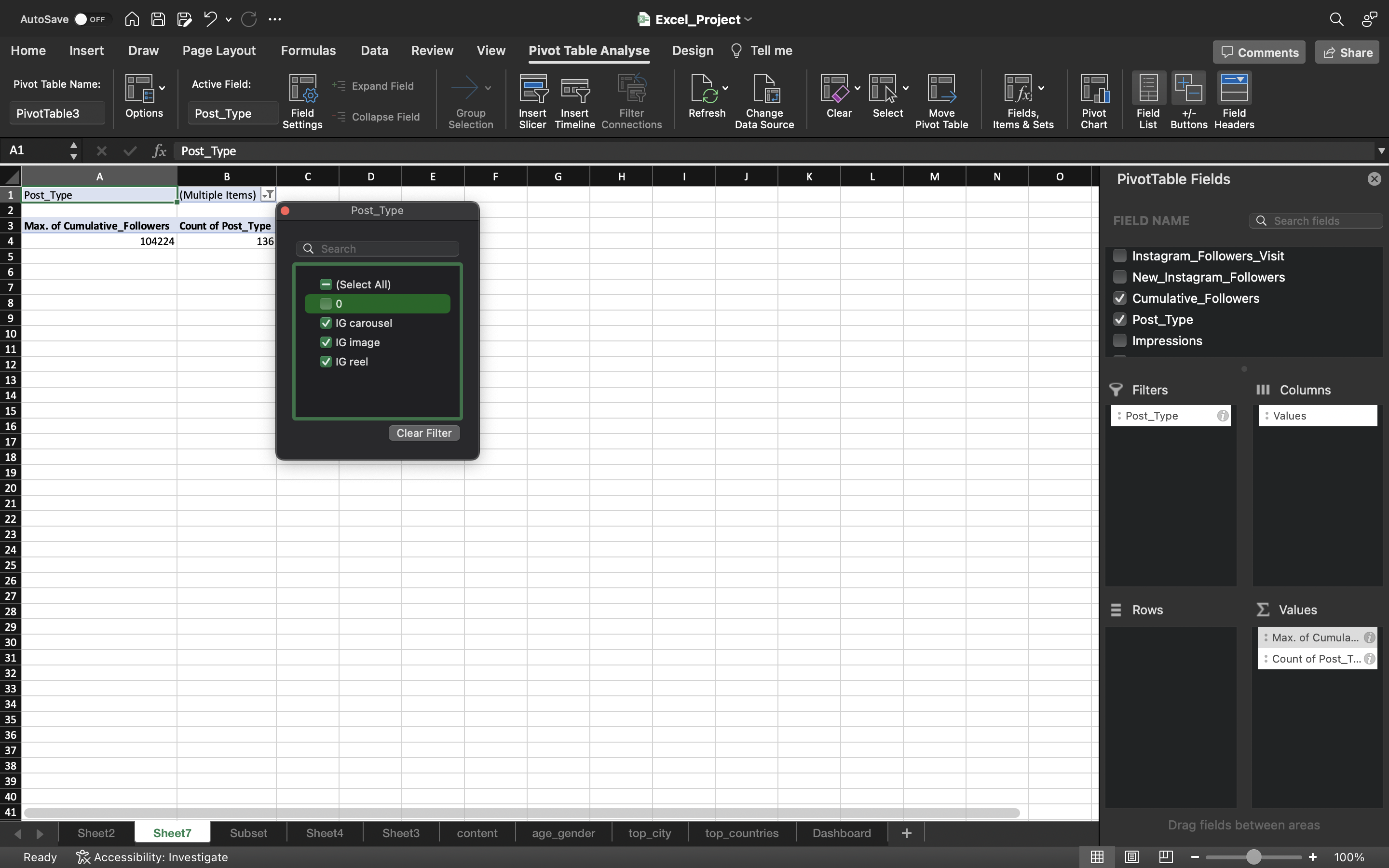
Filter the Post_Type to exclude zero because then only you will find the unique number of posts and Sum of Cumulative Followers
Why exclude Zero?
Zero values in Post_Type column represents there are no posts available during the day. If we want unique number of posts, we should exclude them.
You can see the below output:
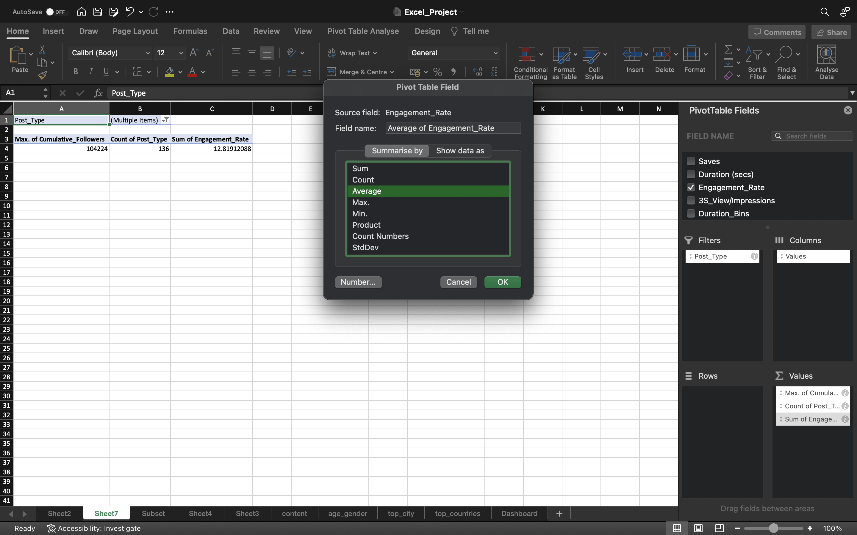
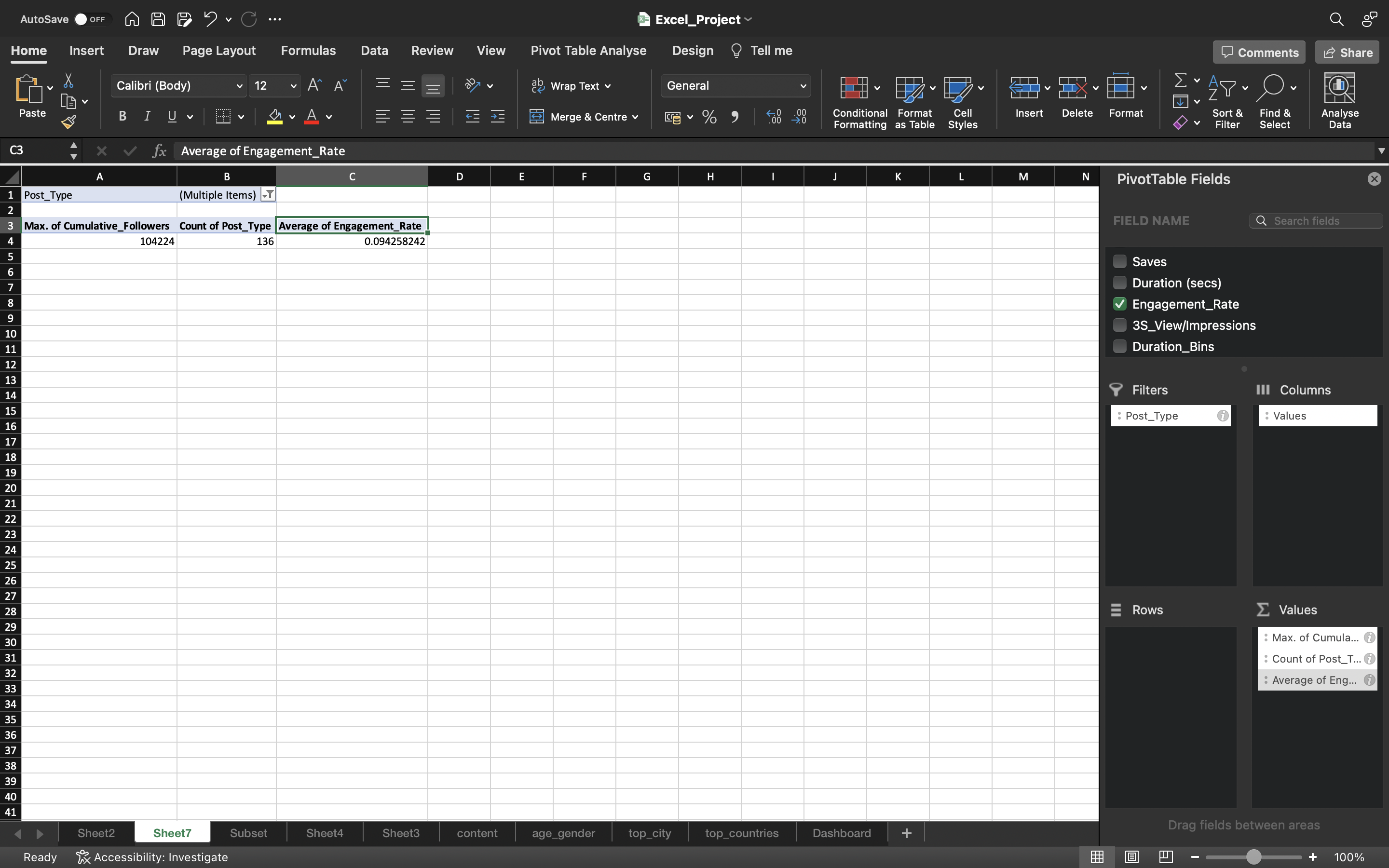
Now let’s calculate the Average Engagement_Rate. Drag the Engagement_Rate to the Values area. Then change the Sum into Average.
We know from earlier analysis, we calculated the Average Engagement_Rate which is 5%(includes all the posts) but here it shows as 9.4%. The reason is we removed the Zero values from the Post_Type filter so it includes only count of unique posts i.e 136 instead of considering all the posts i.e 261.
You can see the below output:
Let’s calculate the Follower growth rate.
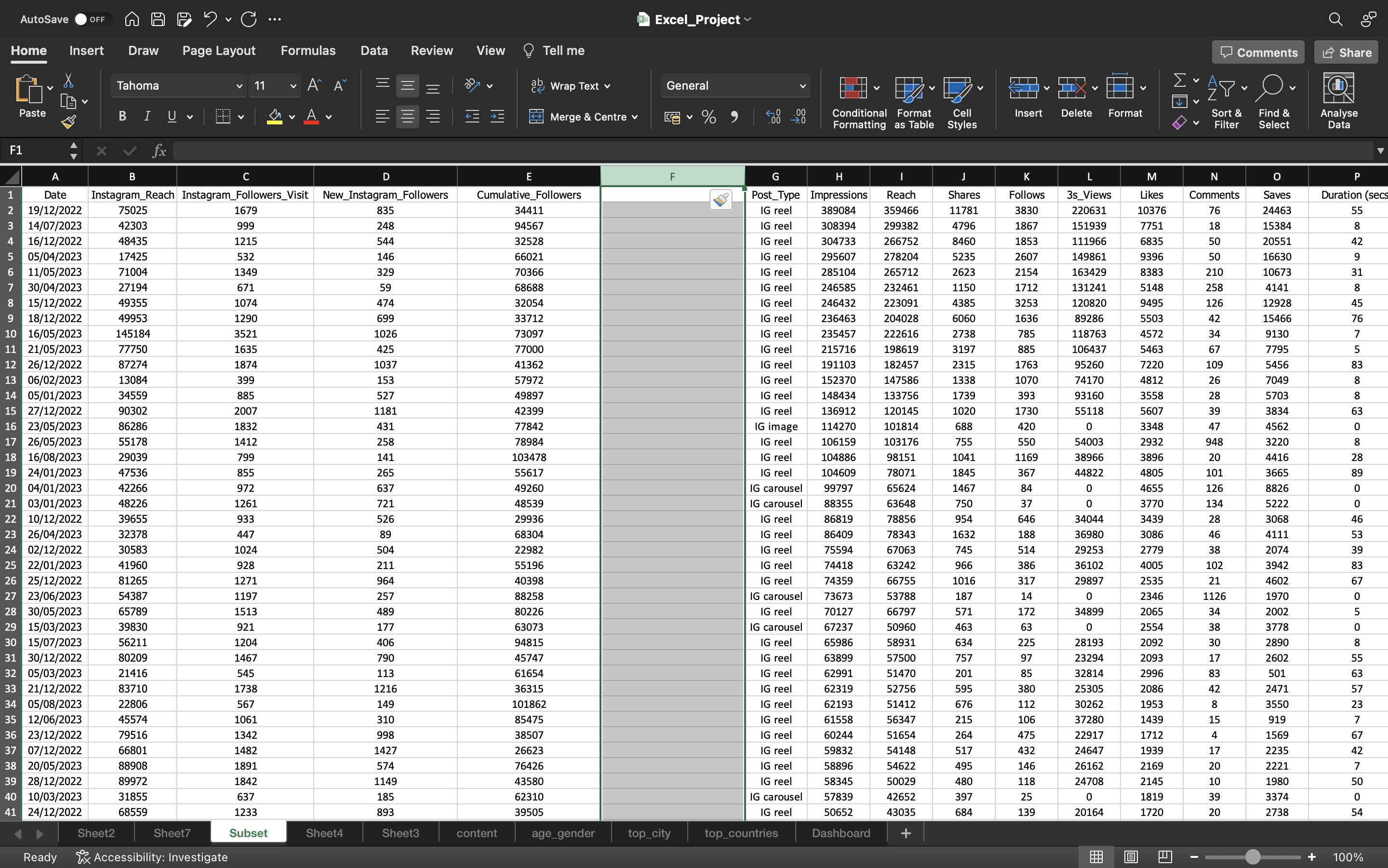
Let’s sort the Date column of Subset spreadsheet in ascending order. We then create a new column named Growth_Rate in Subset spreadsheet. This can be done by:
- Selecting the column by using CTRL+SPACEBAR.
- Then we use CTRL+’+’ to add the column.
We specify the first value as Zero. Then we specify the second value by using the formula “(Current - Previous)/ Current”. Then we convert the value into percentage by selecting Percentage Style present in Home tab.
So for example on second date i.e 2nd December 2022, it says the growth rate is 2.5% after 1st December 2022.
You can see the output below:


Now drag down the formula/values to the remaining cells using CTRL+D and convert the formula into values using Paste Values.
This can be done by :
- Copying all the values in the column using CTRL+C and pasting it again using CTRL+V
- Click on the “CTRL” icon and select “paste values”.
You can see the output below:
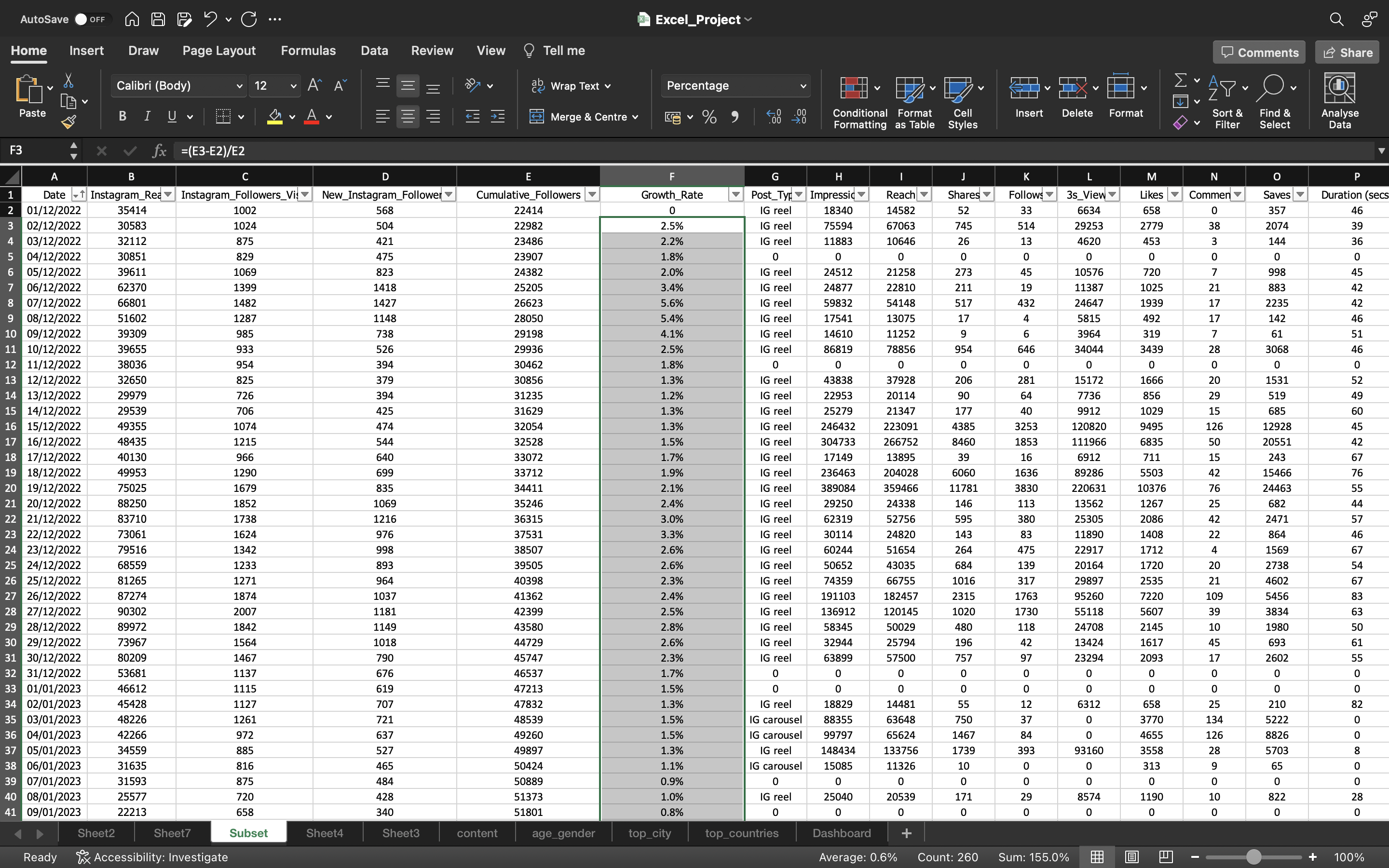
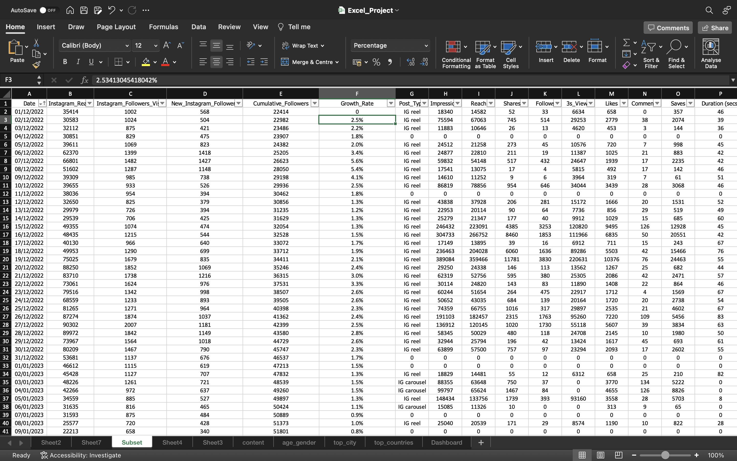
Now we the Average is 0.59% i.e 0.6%. The status bar, in the lower-right corner of your Excel window, will tell you Average
You can see the below output:

From the above output it says we are growing by 0.6% on daily basis. The number of followers are growing by 0.6% on daily basis.
Starting from December 1st 2022, we have seen 1-3% growth. After that it is less than 1% only.
Now go to the sheet where pivot table is present and click on Refresh Data under Pivot Table Analyze. You can now see Growth_Rate column is present.
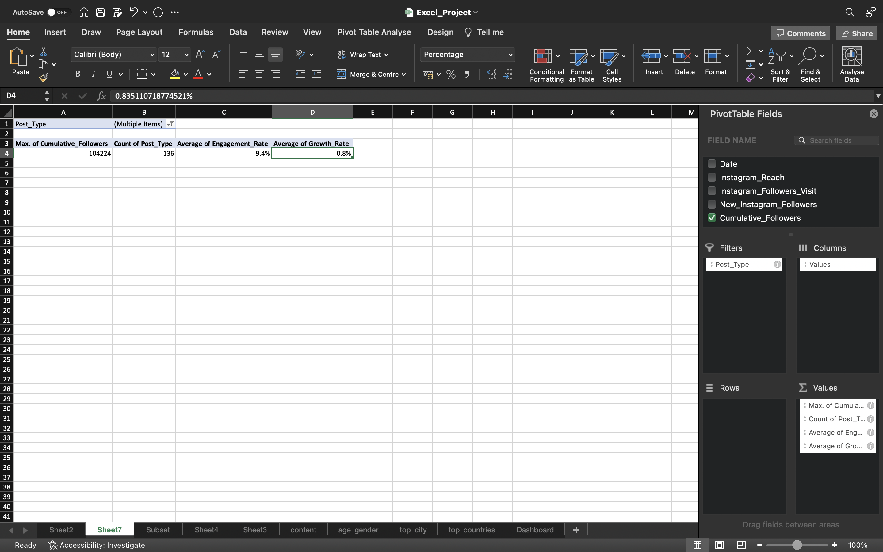
Drag the Growth_Rate column to the Values Area. Then change the Sum into Average.
You can see the below output:
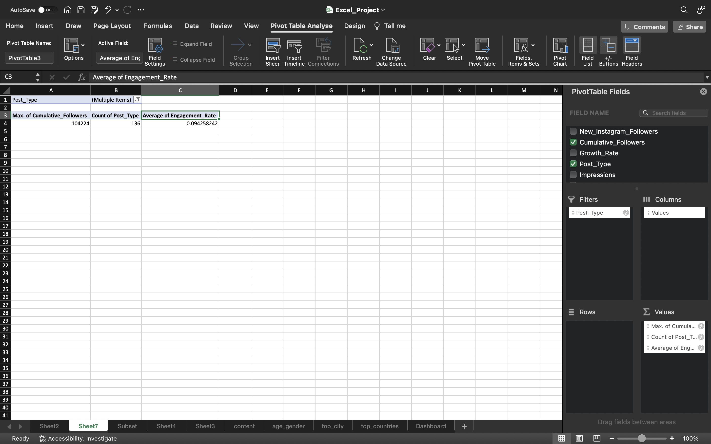
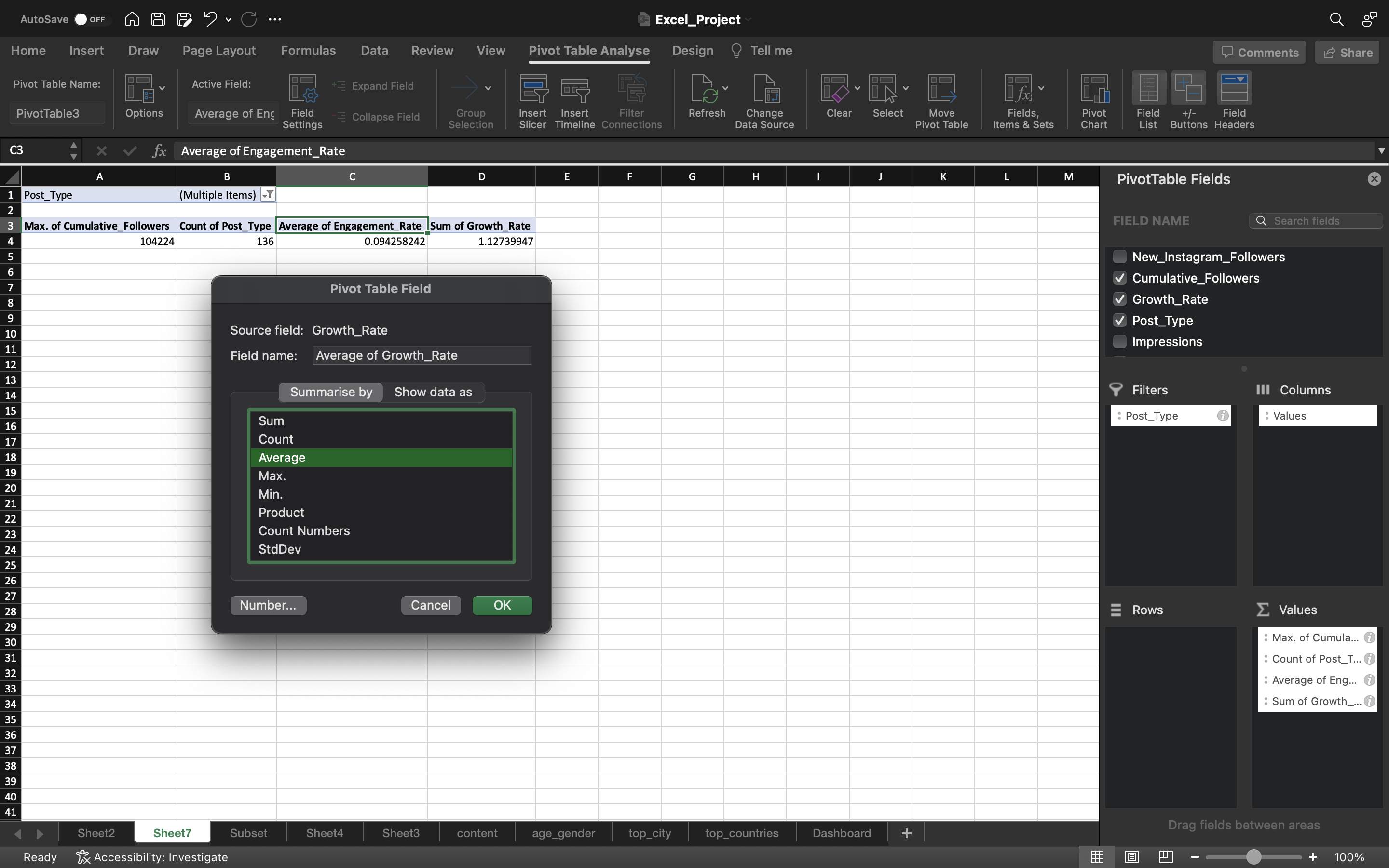
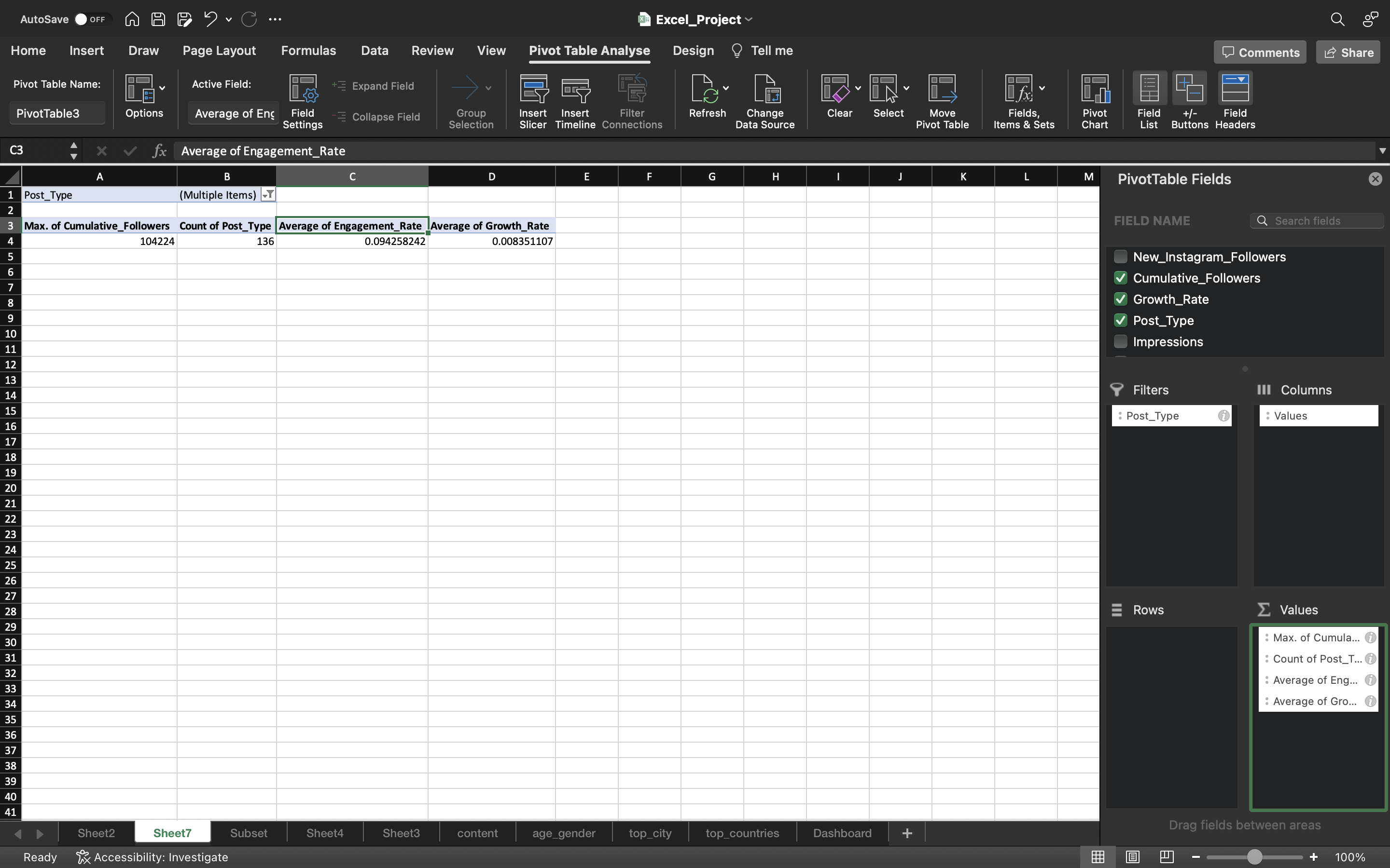
Then we convert the value into percentage by selecting Percentage Style present in Home tab.
You can see the output below:
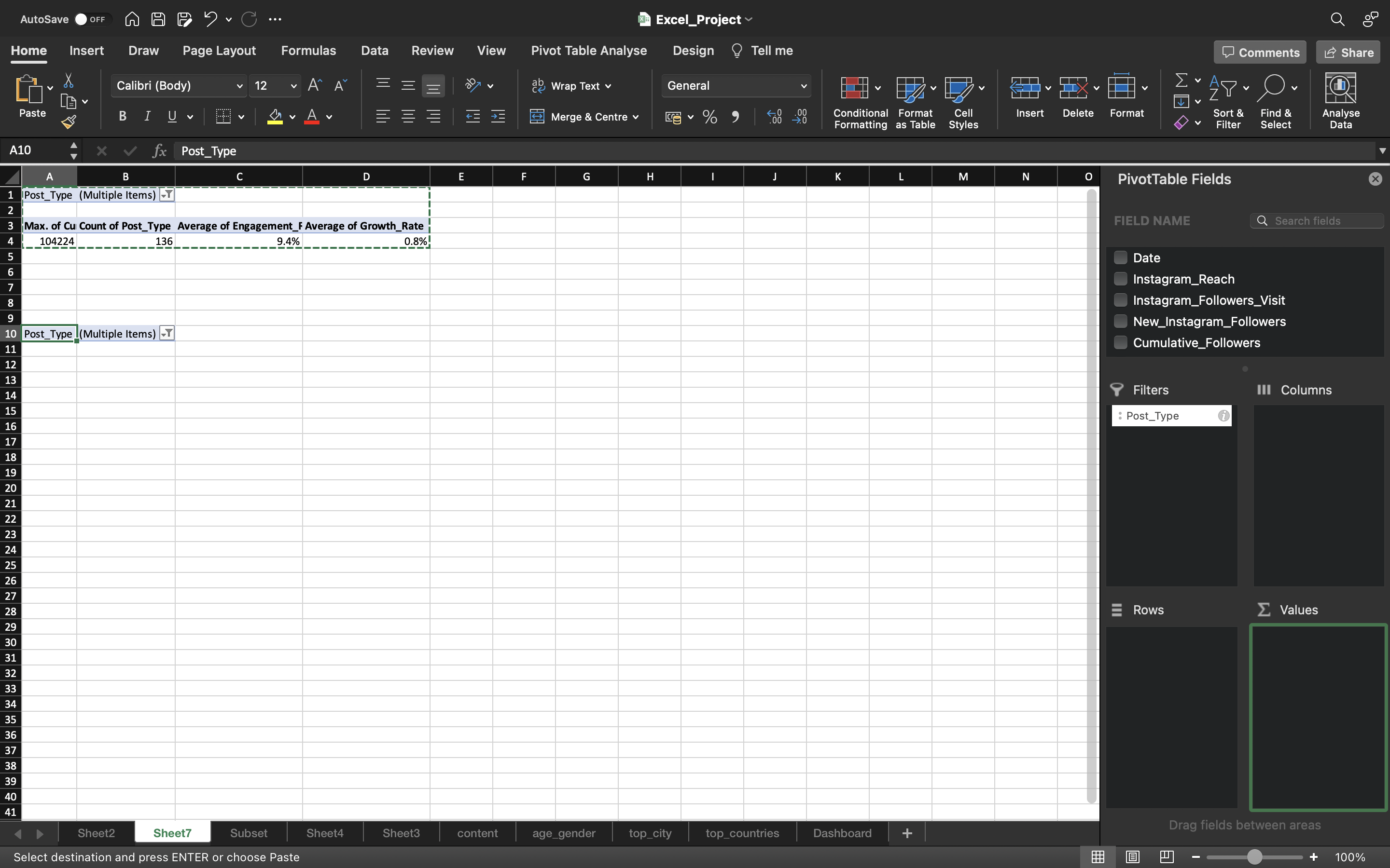
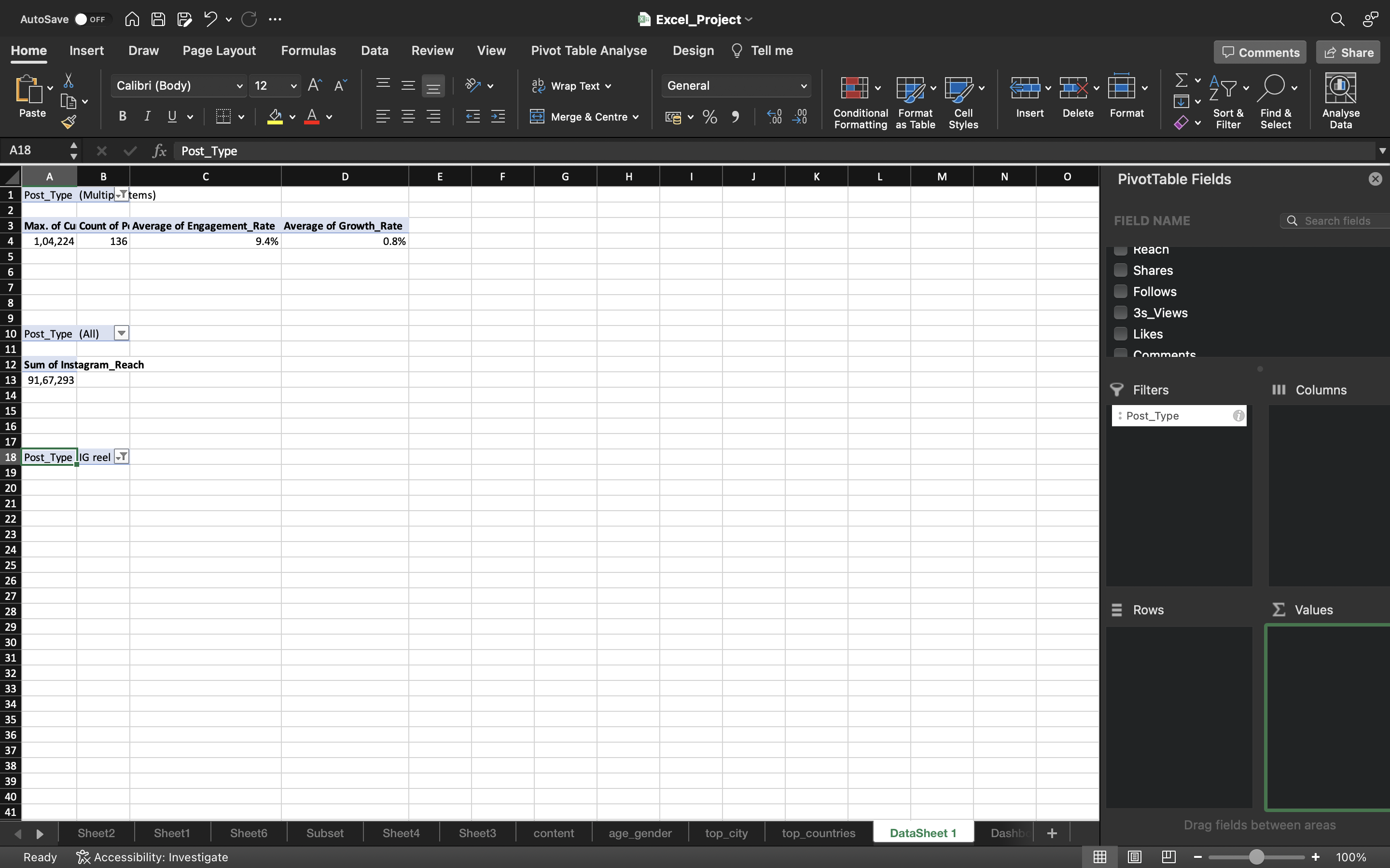
Now let’s calculate the Sum of Instagram_Reach using another pivot table.
Copy the existing pivot table present in the Sheet7 and remove all the metrics present in the copied pivot table.
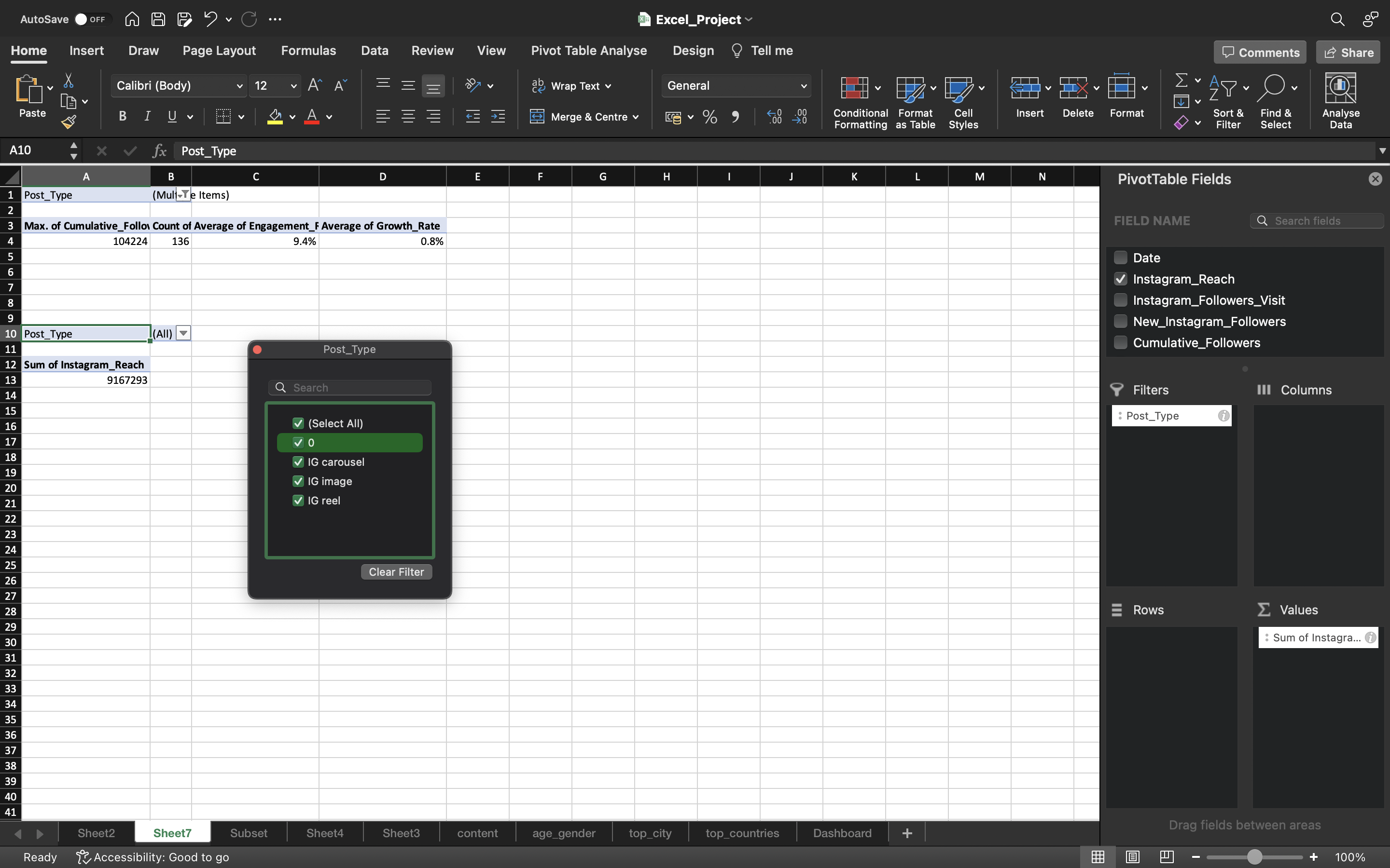
Now drag the Instagram_Reach into the Values area of copied pivot table. Now filter the Post_Type of the copied pivot table to include all the values.
We can see now we got the Sum of Instagram_Reach for all types of post.
You can see the below output:
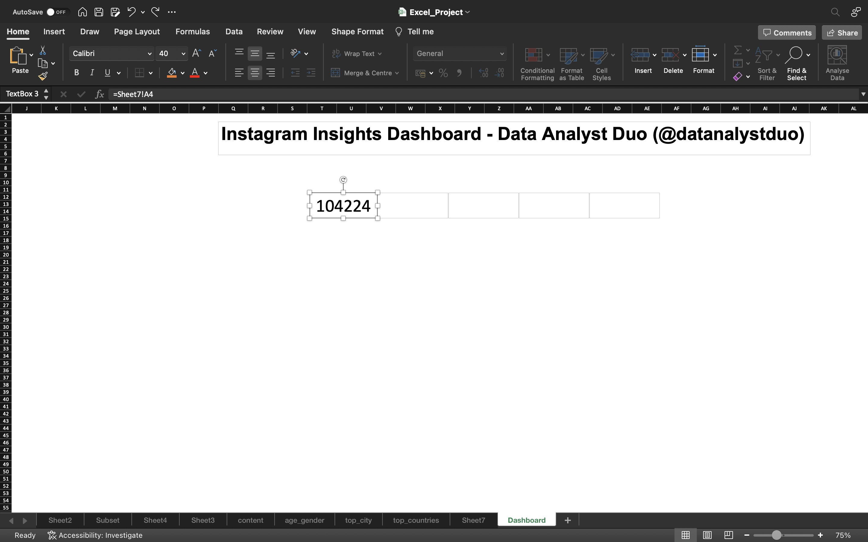
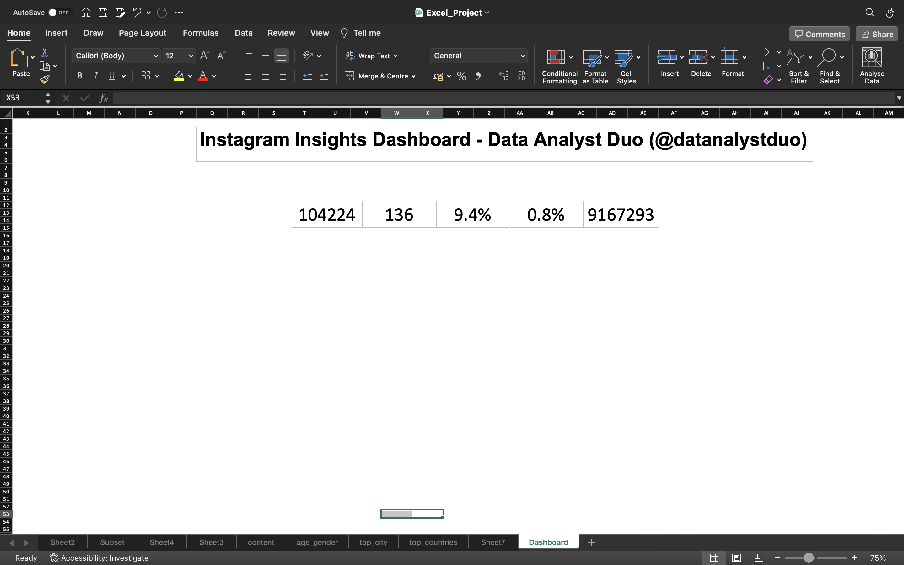
Now let’s create 5 cards to store 5 values in the Dasboard. The 5 cards include the values of Max of Cumulative Followers, Count of Unique Posts, Sum of Instagram_Reach, Average Engagement Rate and Average Growth_Rate.
- Go to Insert Tab and select Text Box to create a card.
- Click on the Card* and use the formula “=Sheetname!Cell_Number”
For example, Assume sheetname is Sheet7 and the value is present in cell A4. Now the formula is written as =Sheet7!A4.
Using the Formula, grab the values for each of the 5 boxes created and increase the size of the value using Font Size.
You can see the below output:
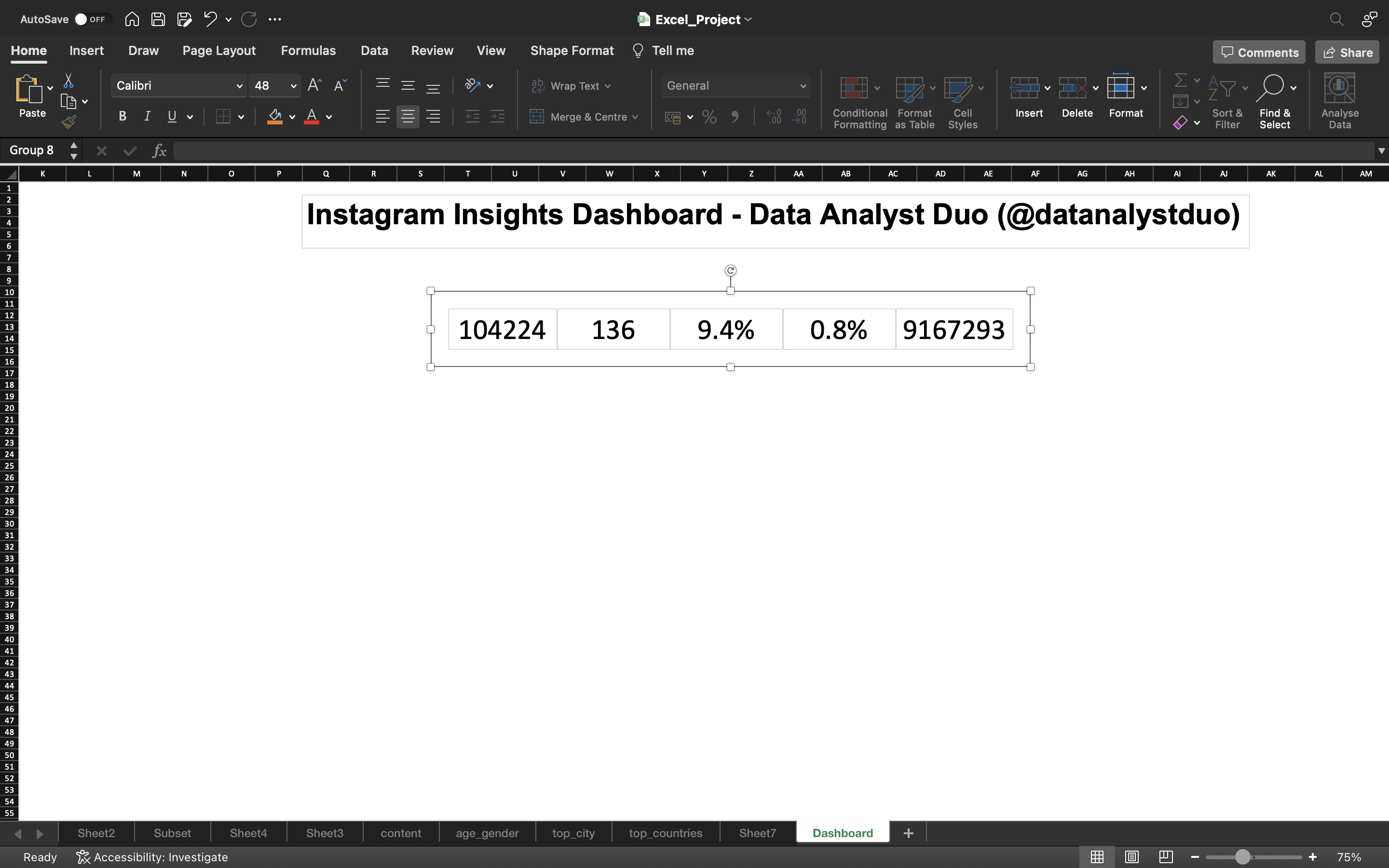
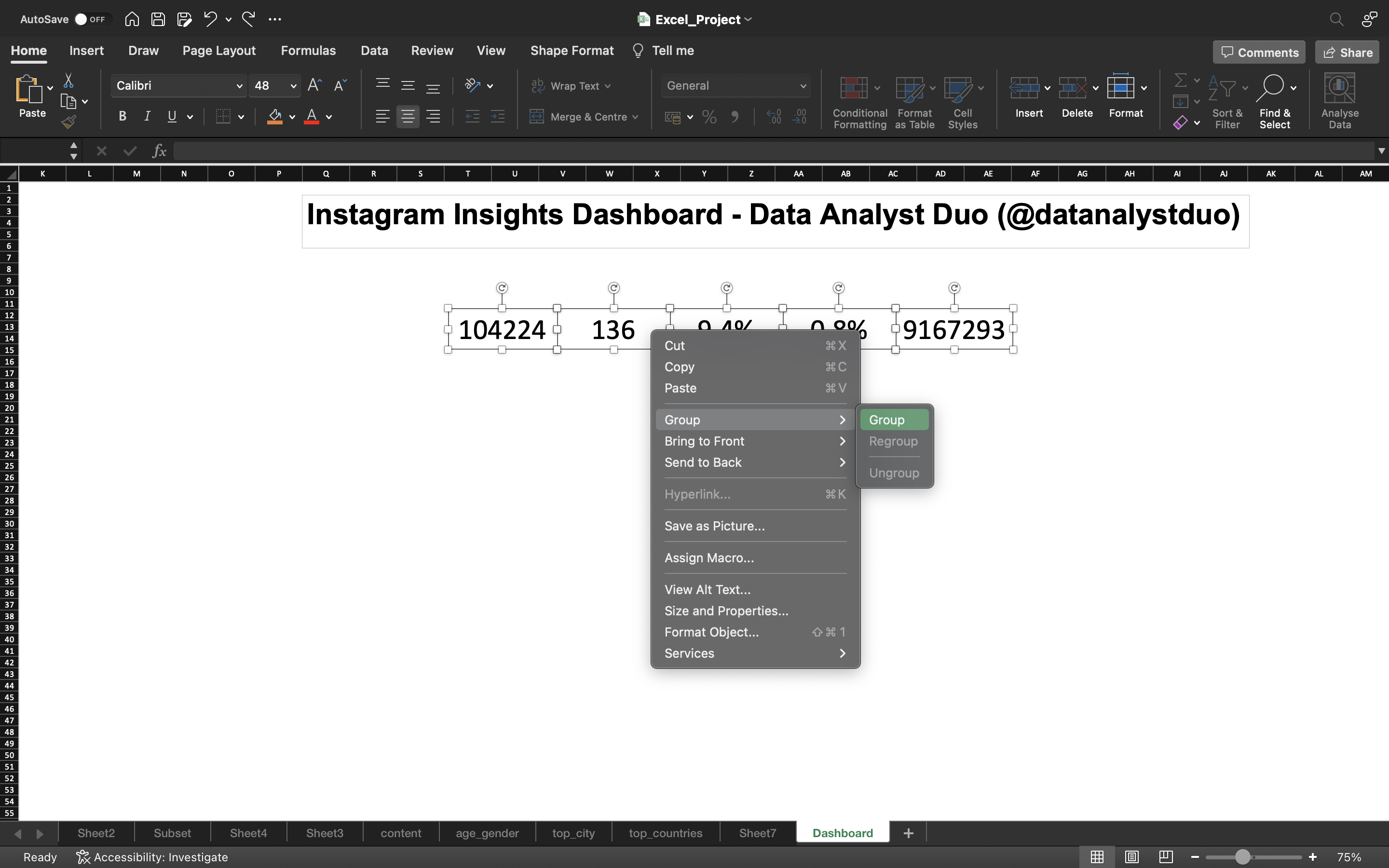
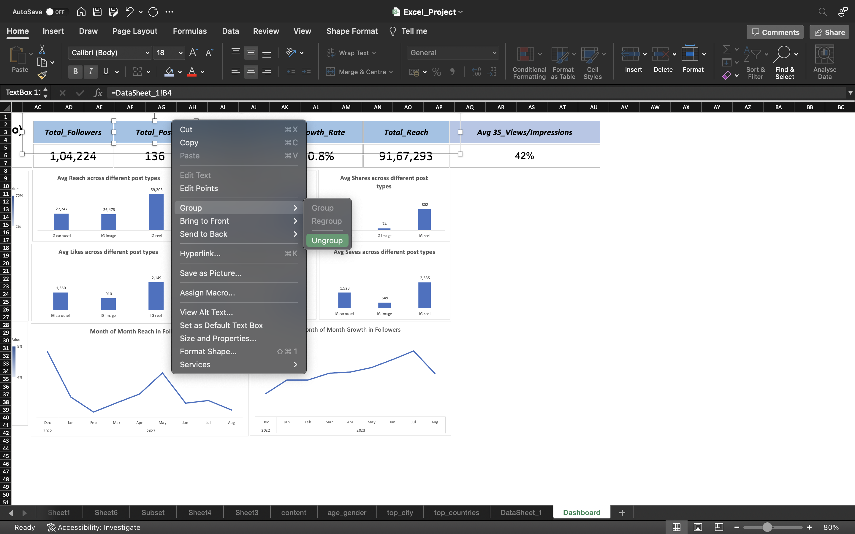
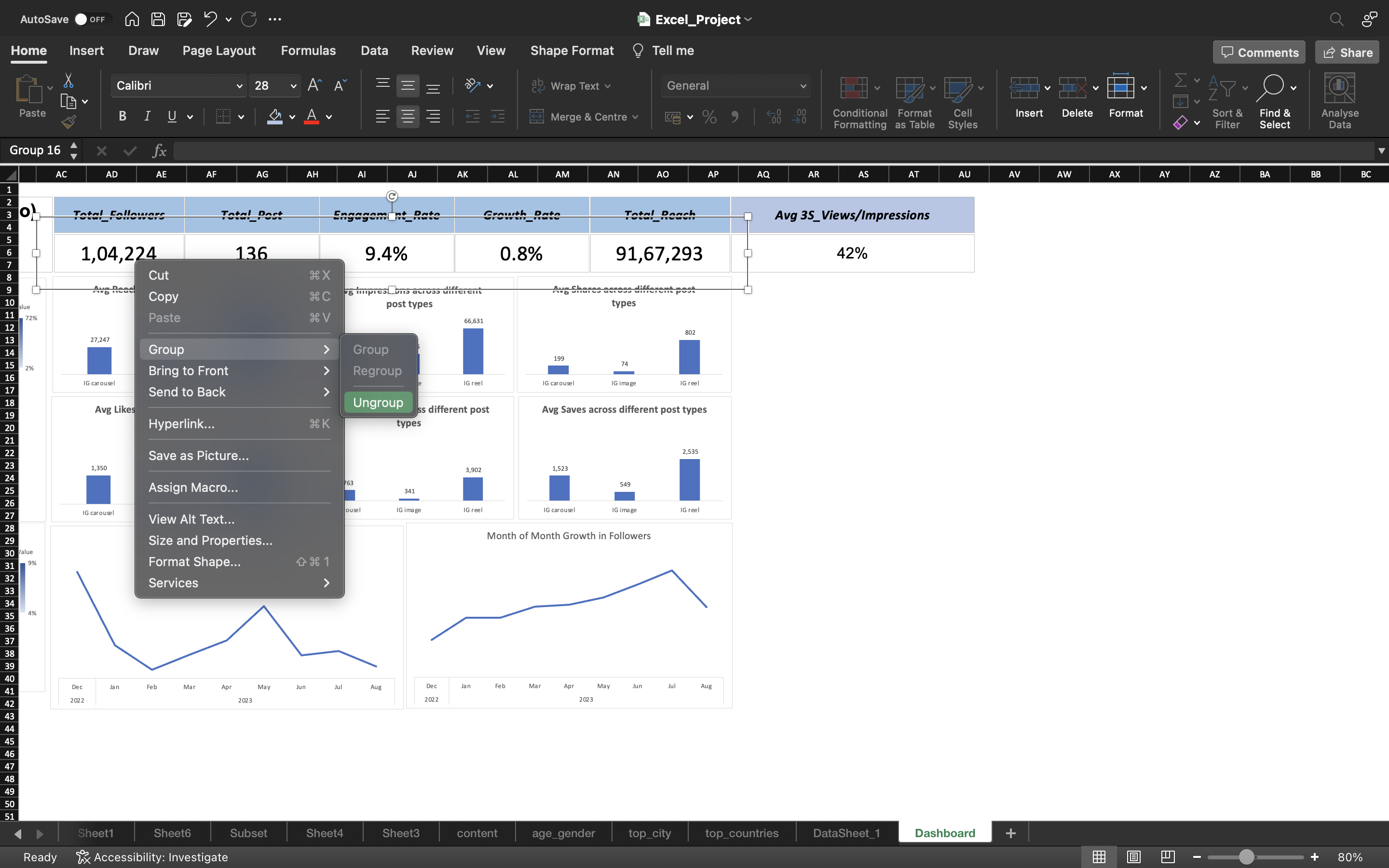
Now I will select all the boxes and right click on it. We can see an option Group and we click on it.
Now all these boxes are fixed together. Now any changes if I make in the pivot table. You can automatically see the changes reflected in the Dashboard.
You can see the below output:
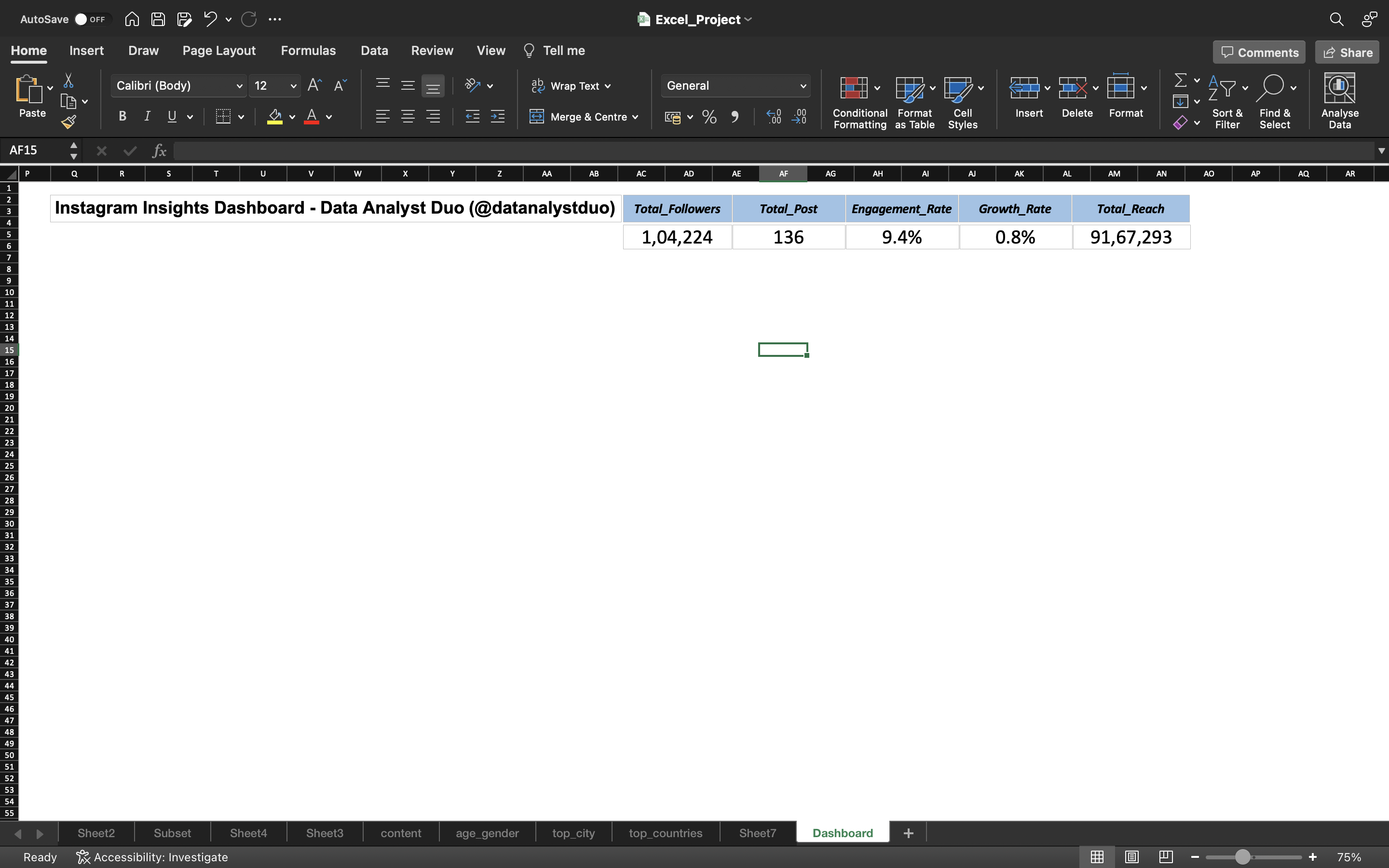
Now I just made changes to the font size and color of the values and fitted it near the title.
You can see the below output:
Now let’s look at Age_Gender Sheet
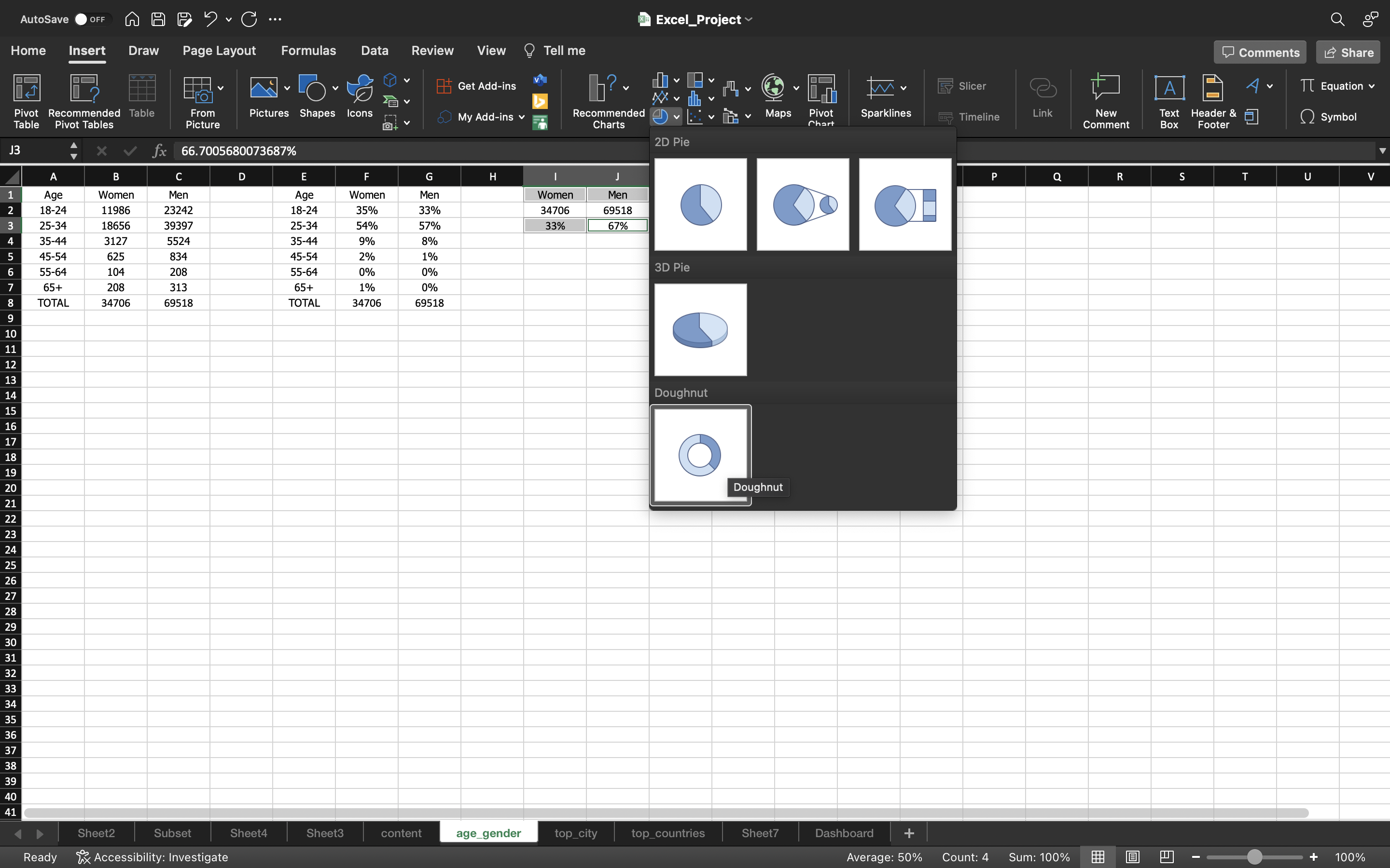
I will create a pie chart showing the percentage of Men and Women.
- Using the command button(If you are using macbook), select the cells Men, Women and the percentages of Men and Women.
- Go to Insert tab and select pie chart and select the type of chart you need. In this case, I’ve selected Doughnut chart.
You can see the below output:
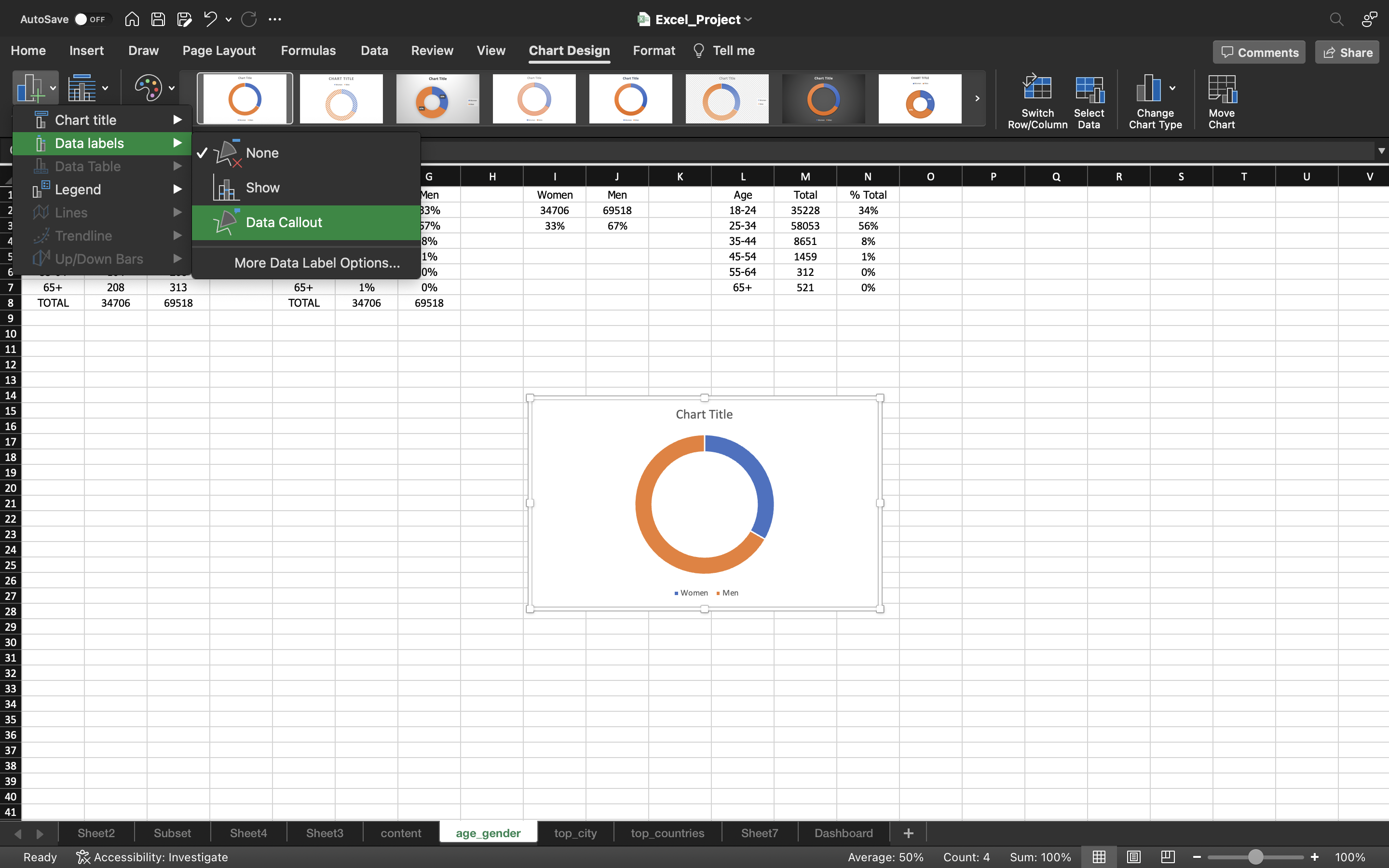
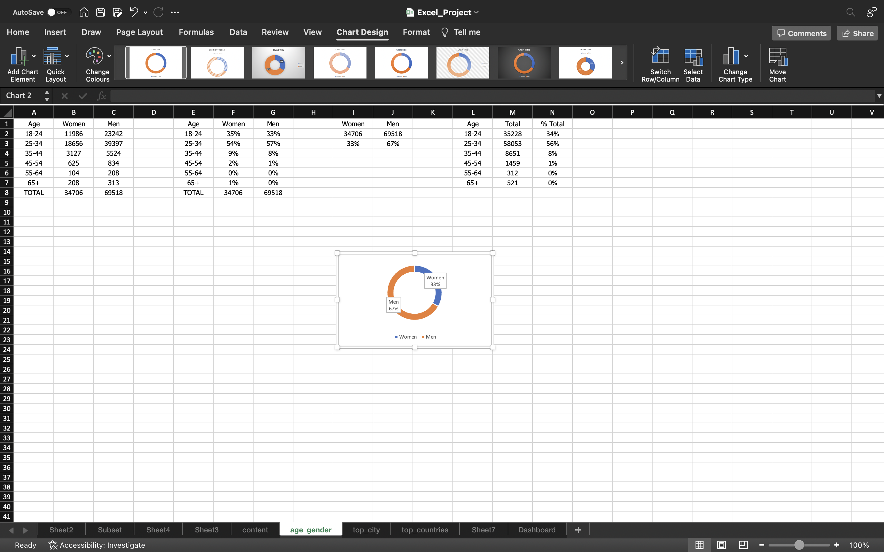
Now we just added Data Callout to the chart. It can done by:
- Under chart Design, click on Add Chart Element and select Data Labels —> Data Callout.
You can see the below output:
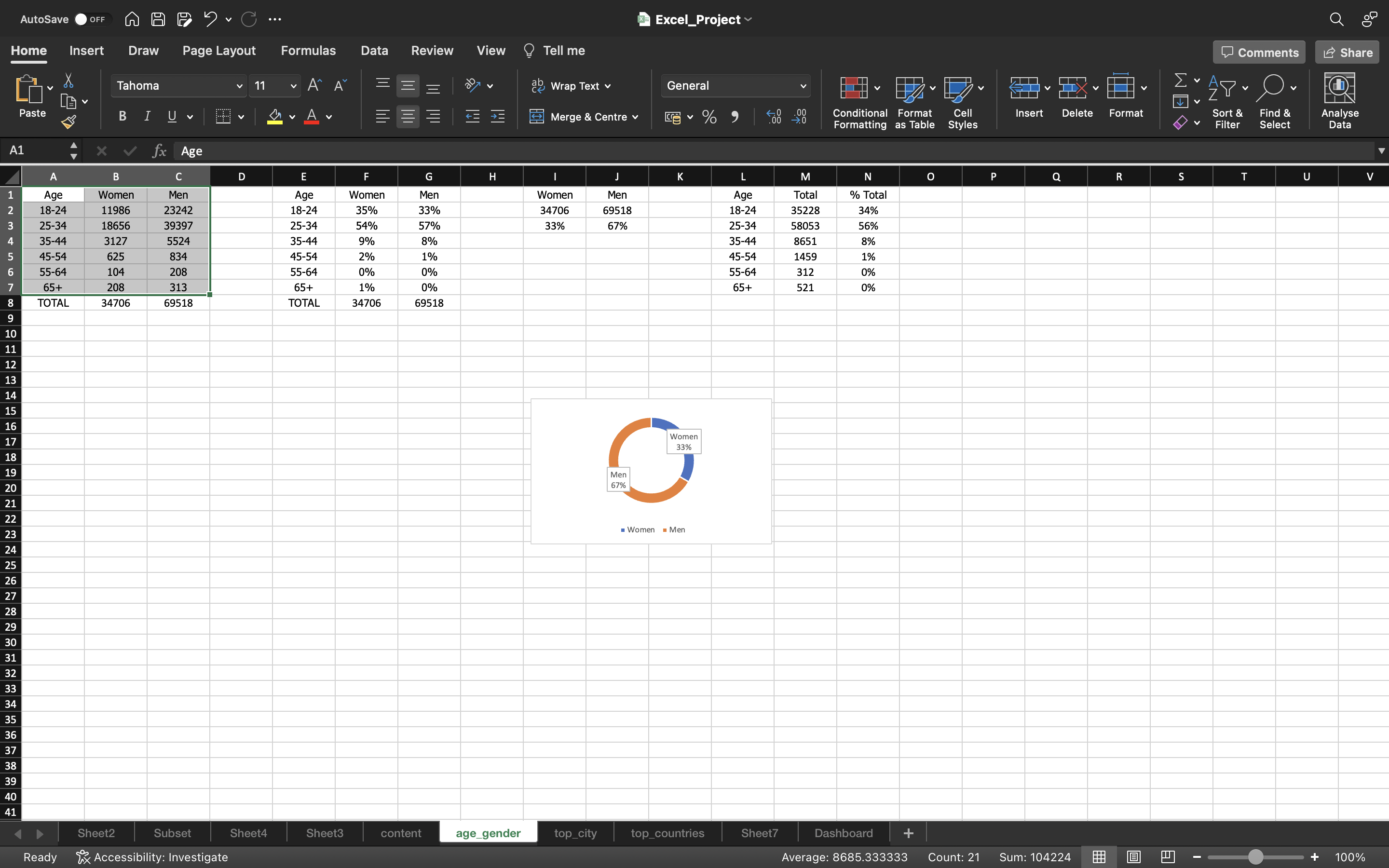
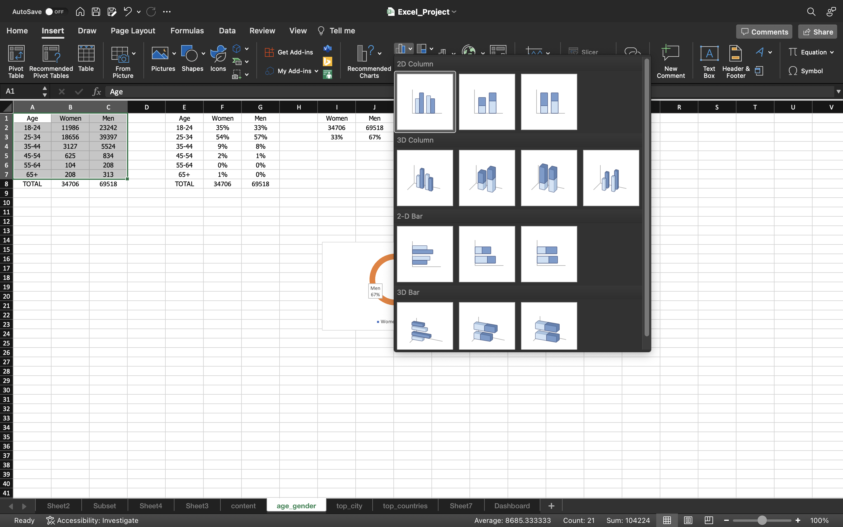
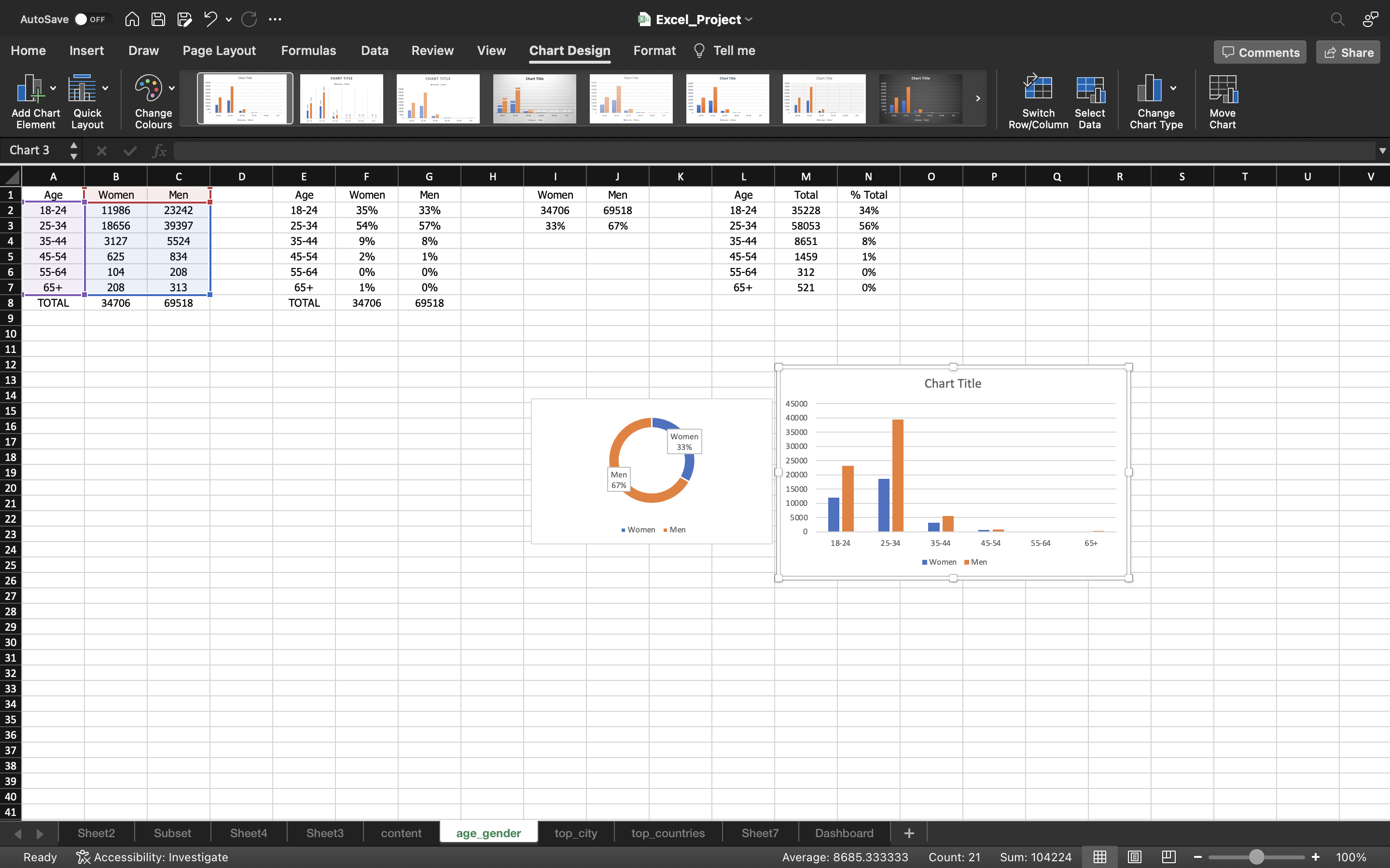
Now let’s create a bar chart for the count of Men and Women based on Age_Group.
- Select the columns using CTRL+A.
- Go to Insert menu, click on Bar Chart and select 2D Column bar chart.
The output can be seen below:
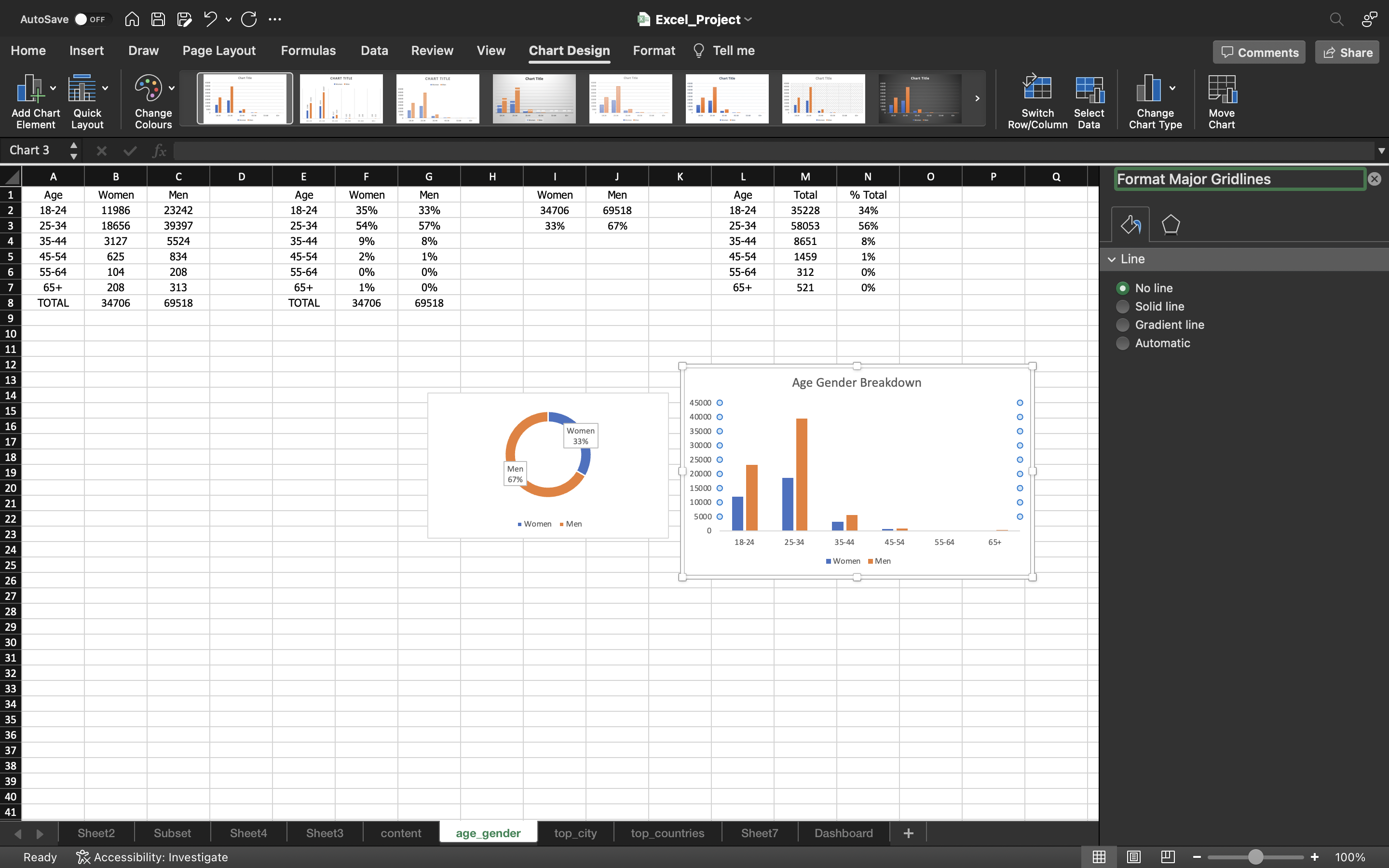
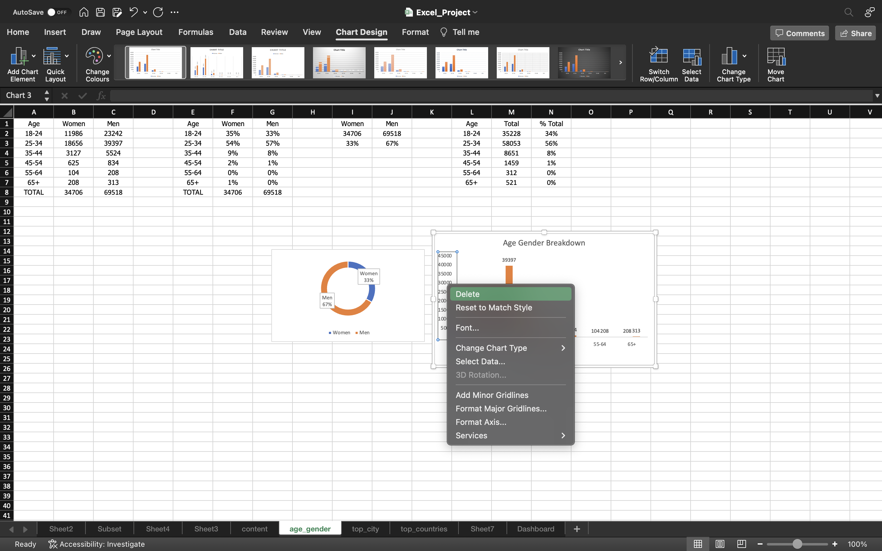
- I will add Title to the bar chart as Age Gender Breakdown.
- I will remove the gridlines by clicking on Add Chart Element under chart Design and select gridlines–> More Gridline Options and select No Outline.
- Then we will delete the Column axis which is not needed.
The output can be seen below:
Now I selected a different pie chart as you can see the below output:
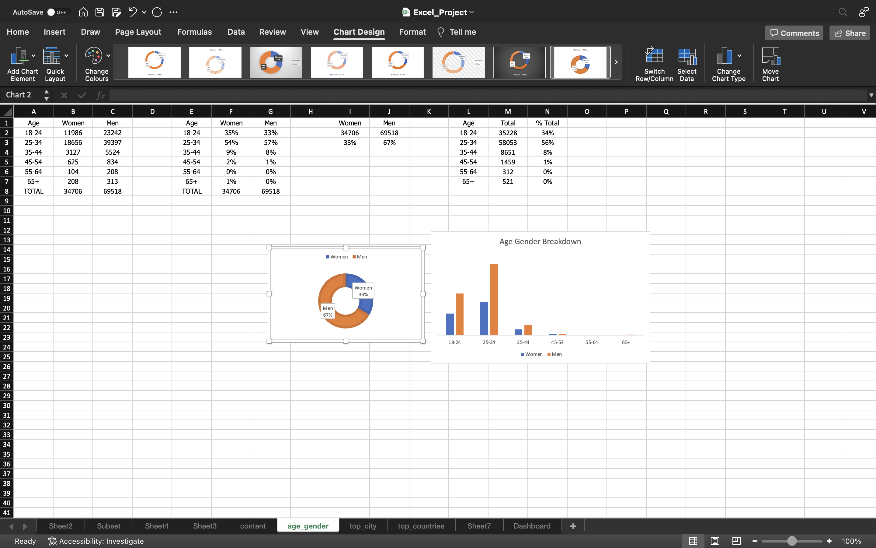
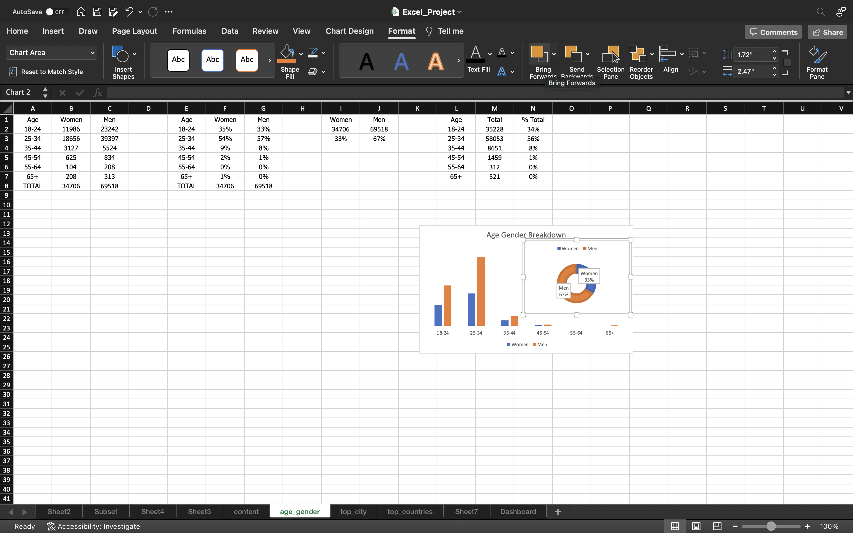
Now i will place the pie chart inside the bar chart by
- Click on Format tab and select Bring Forwards to view the bar chart which is present inside the pie chart.
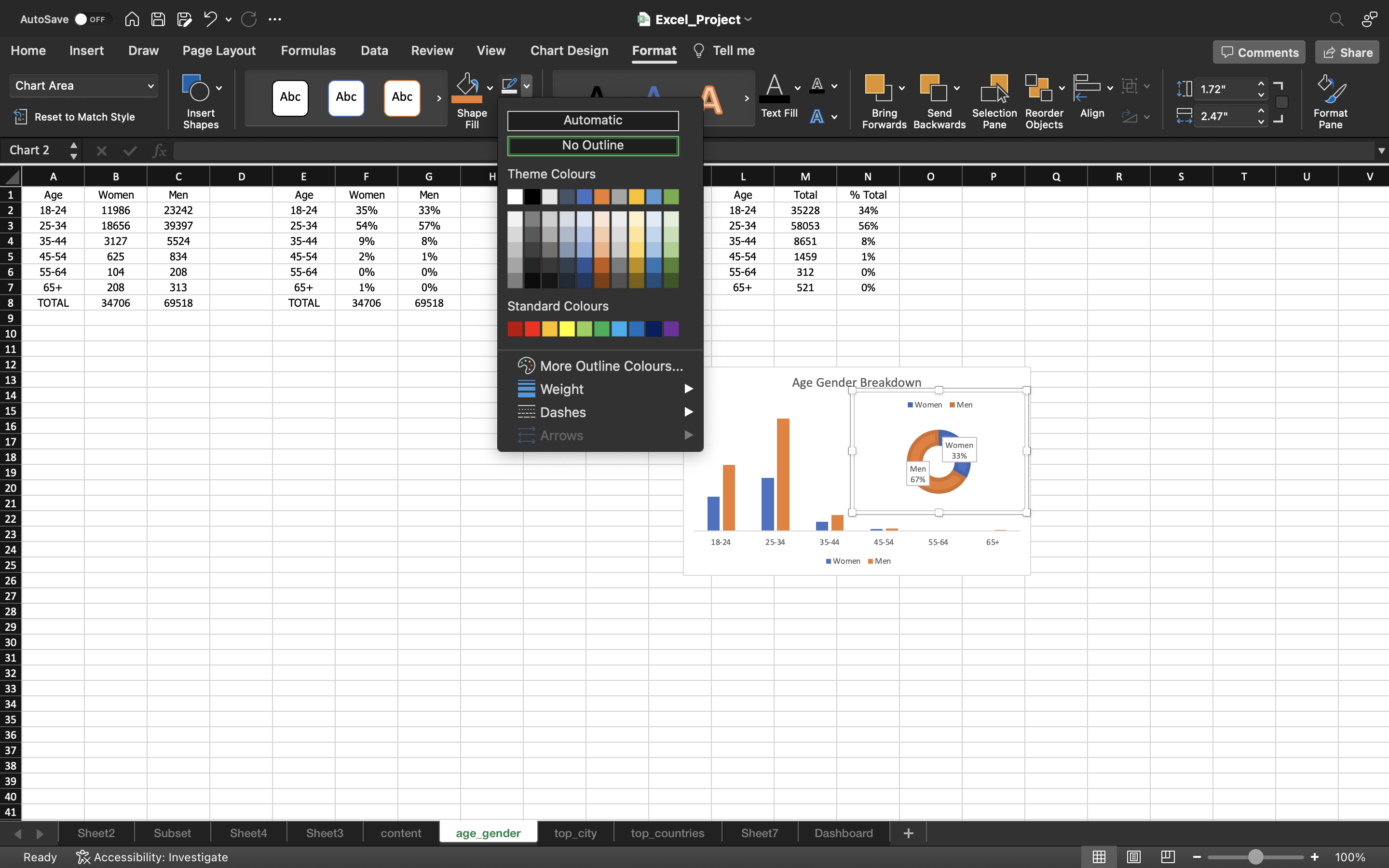
Then I will remove the outline of the pie chart by :
- Go to Format tab and select Shape Outline and click on No Outline.
You can see the below output:
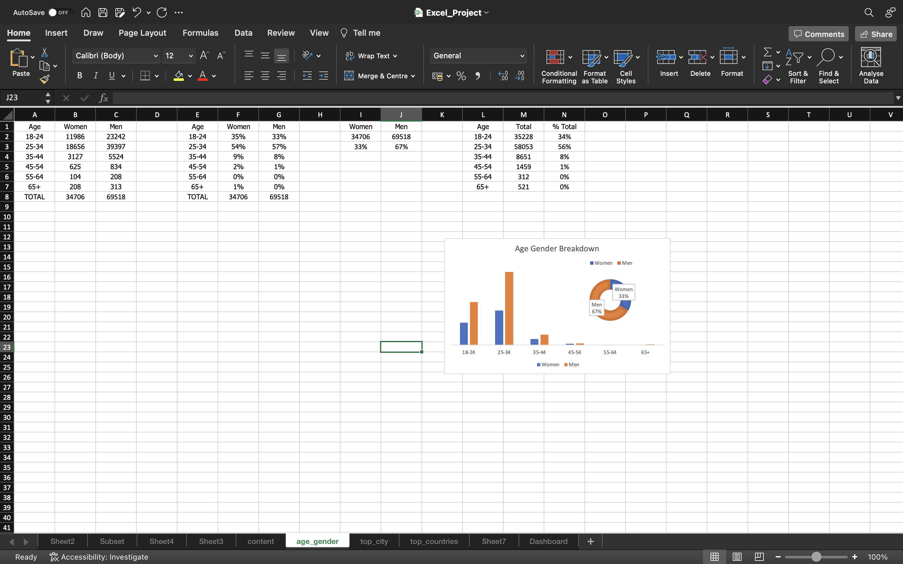
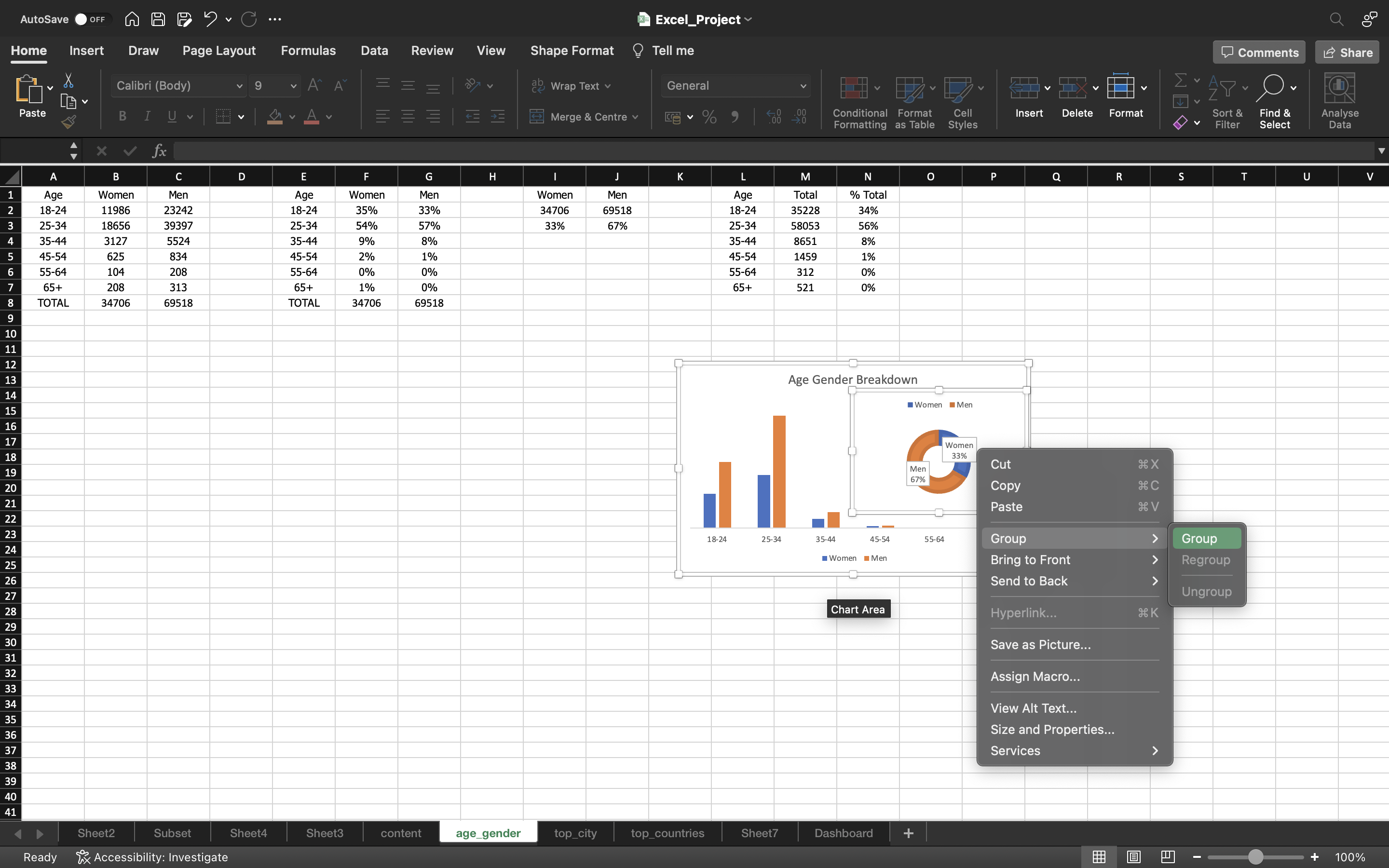
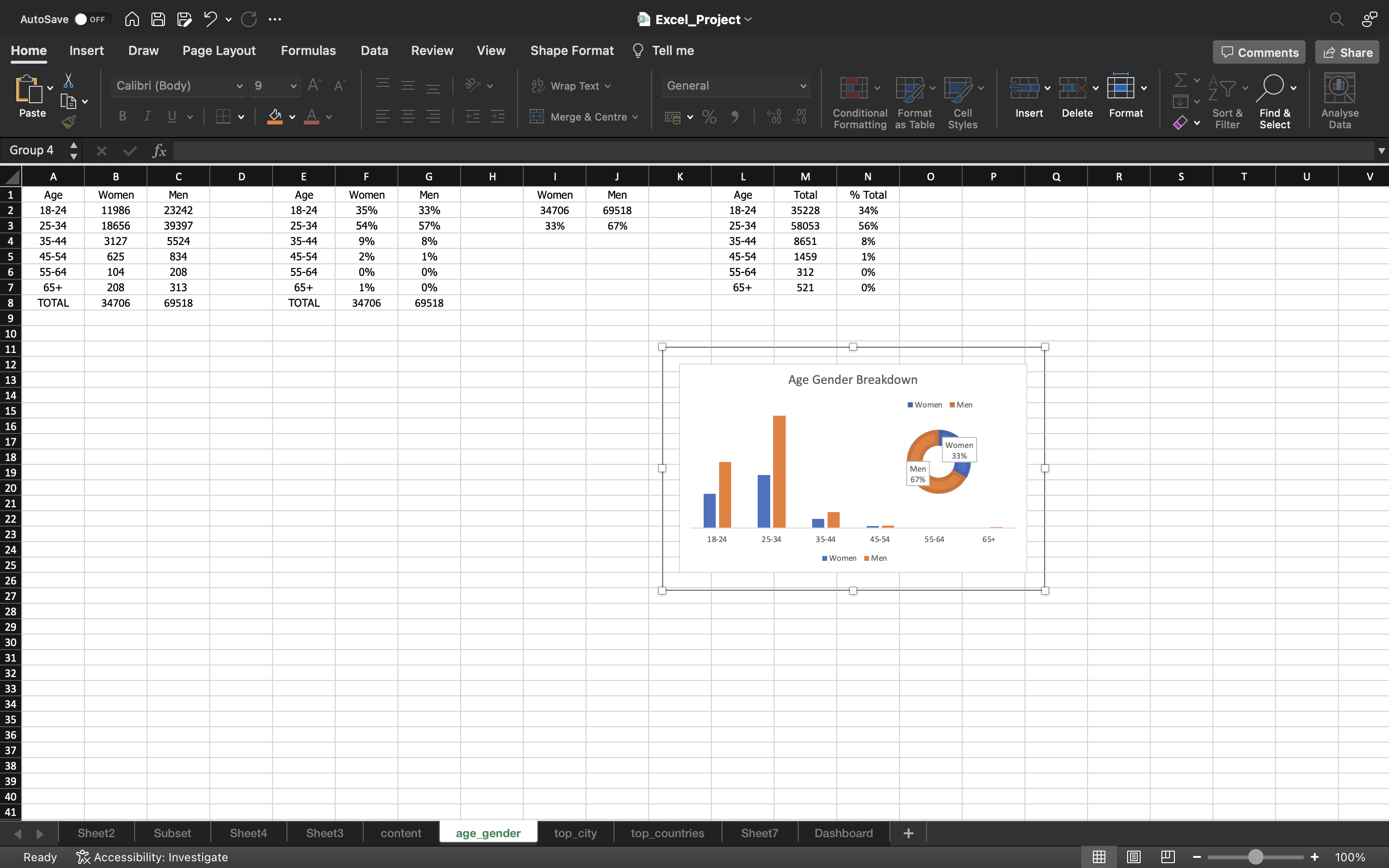
Now let’s lock the pie chart inside the bar chart by
- Select both the chart and right click on it and select Group.
Now lets the cut this chart by using CTRL+X and paste it in our Dashboard using CTRL+V.
You can see the below output:
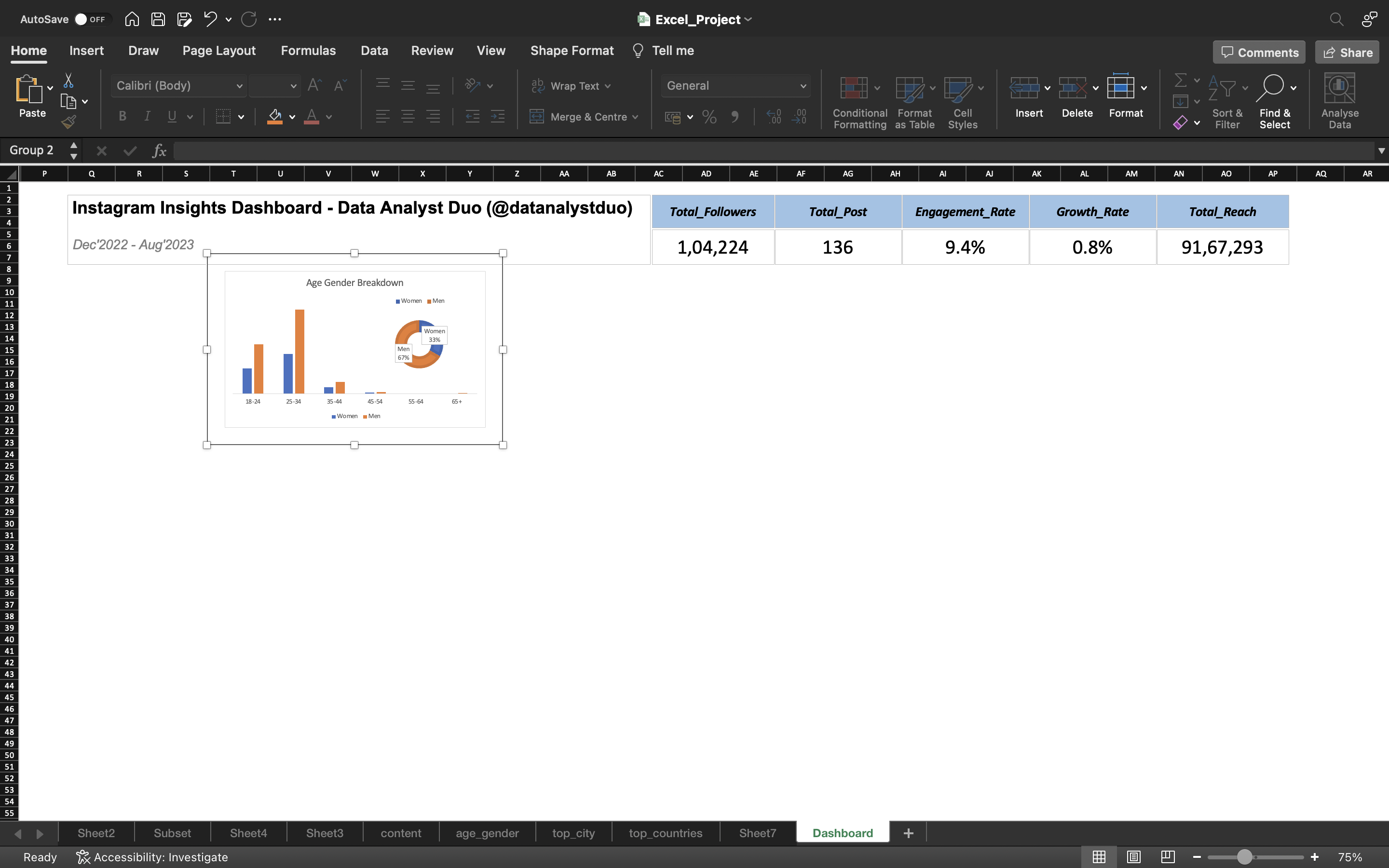
Let’s create a chart type dashboard.
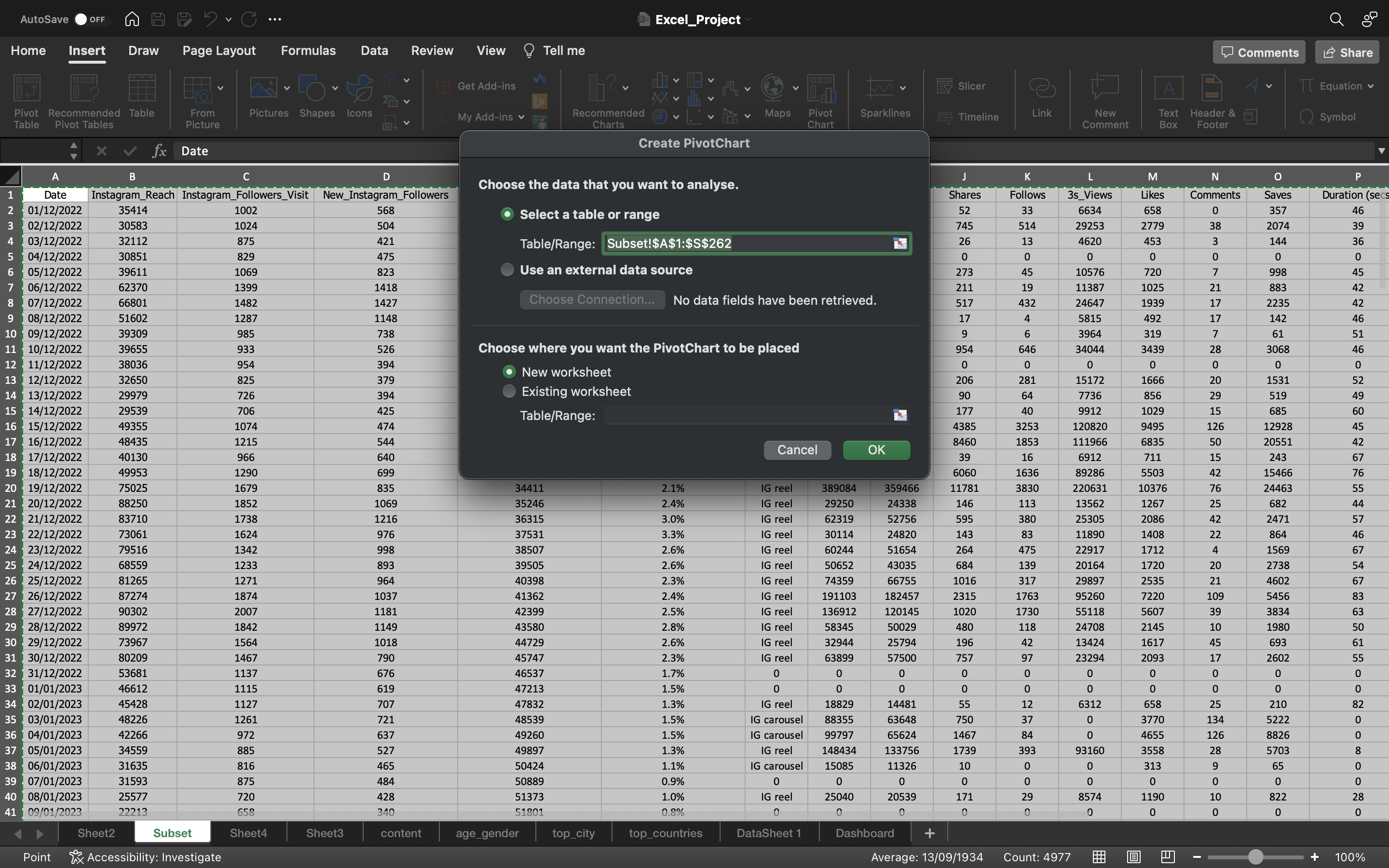
- Select all the data using CTRL+A in Subset sheet.
- Go to Insert tab, click on Pivot Chart. A dialog box appears, just click ok.
The output can be seen below:
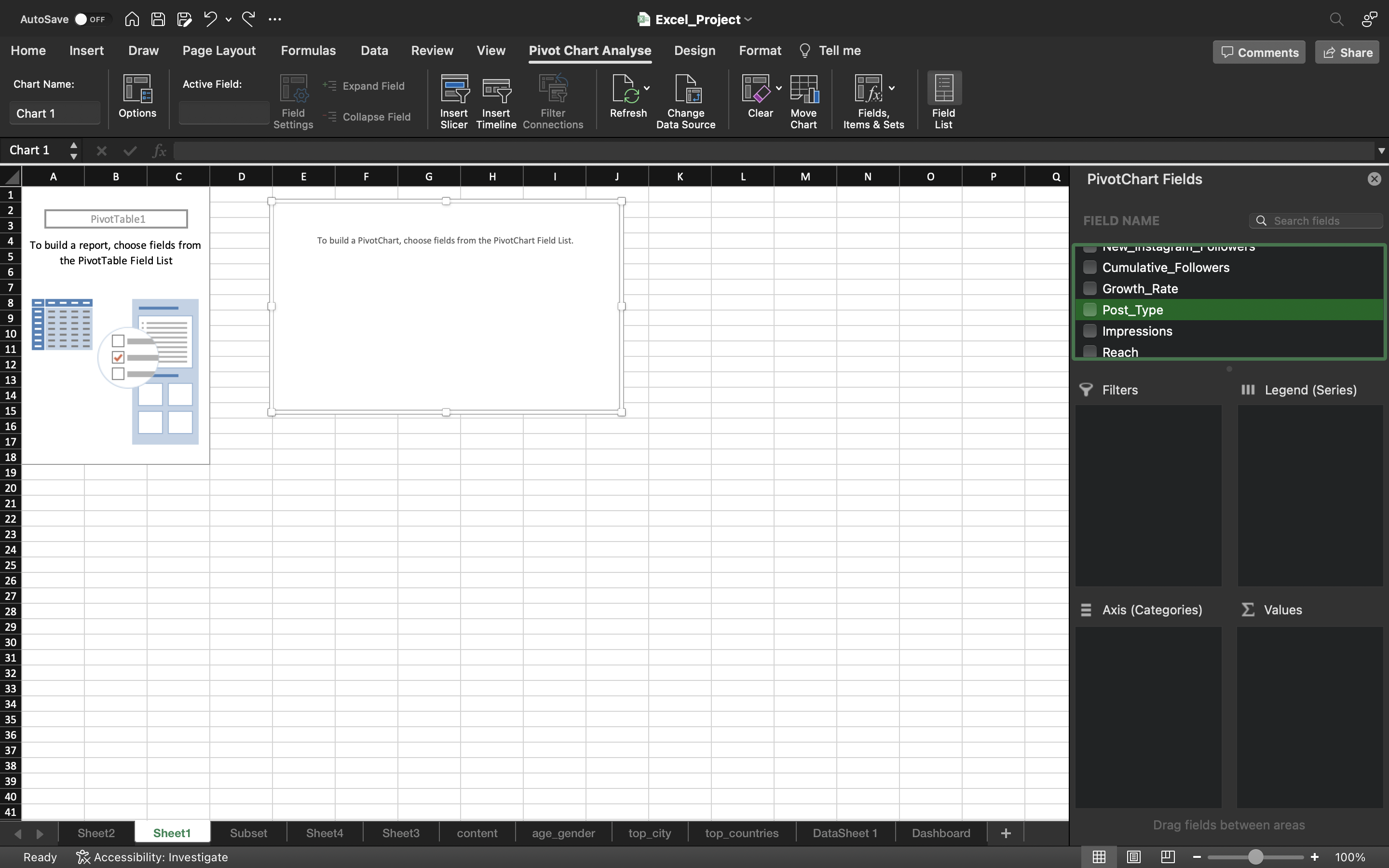
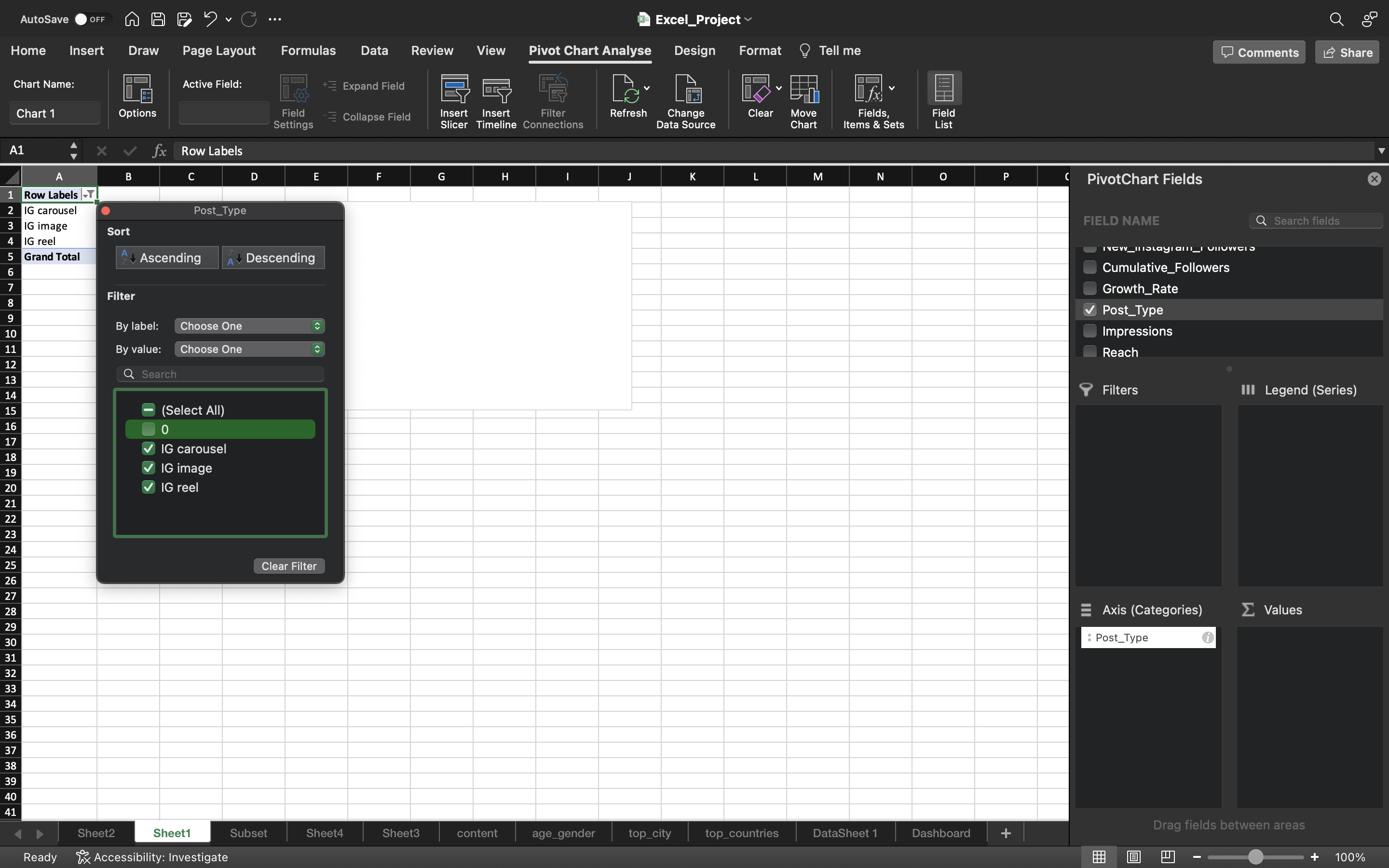
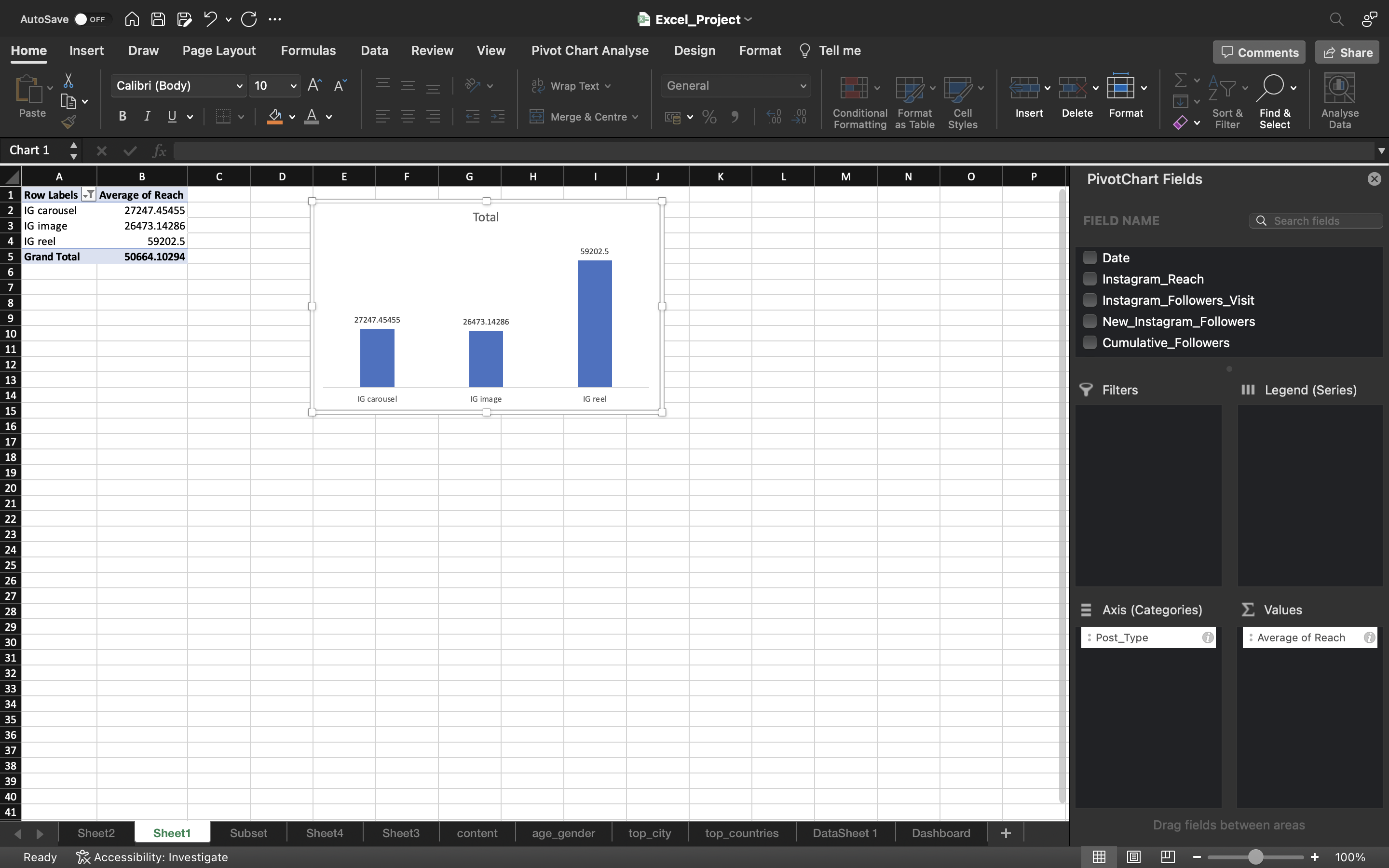
Drag the Post_Type into Axis area. Remove Zero from the post_type using Filter
The output can be seen below:
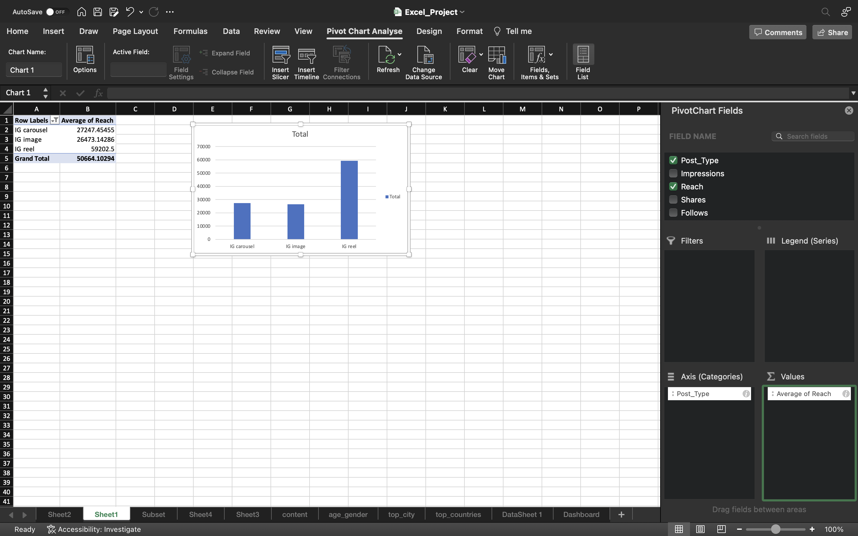
Drag the Reach into Values area. Convert from Sum into Average
The output can be seen below:
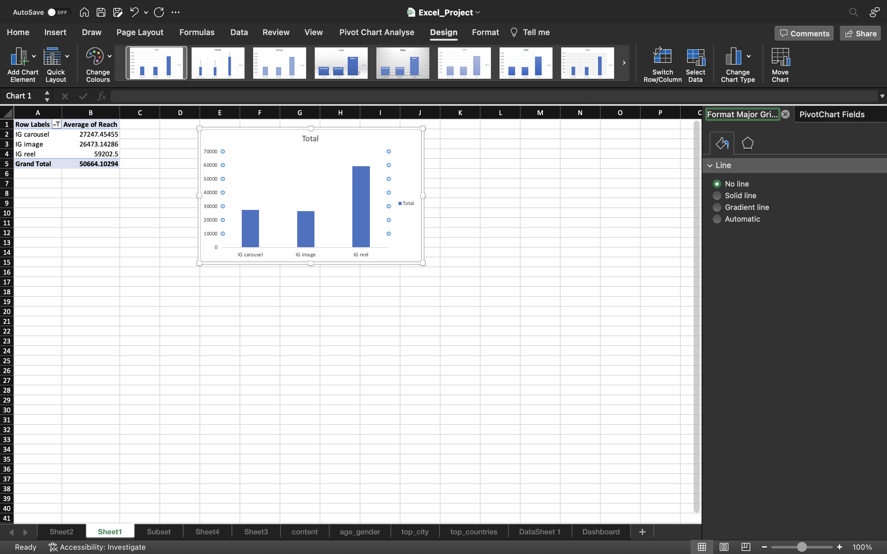
- I will remove the gridlines by clicking on Add Chart Element under chart Design and select gridlines–> More Gridline Options and select No Outline.
- Under chart Design, click on Add Chart Element and select Data Labels —> Data Callout —> Outside End.
- Remove the Total icon on the right side of the chart.
- Delete the column axis because we actually added the data labels.
You can see the below output:
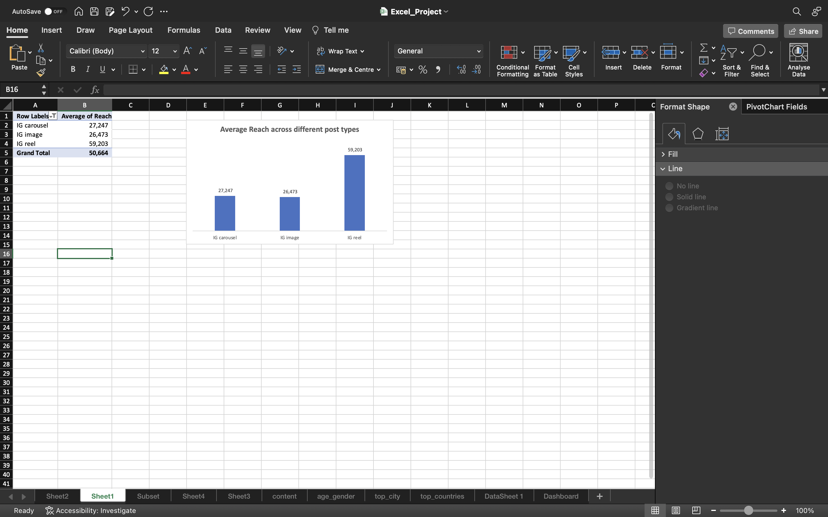
- Added a Title for the bar chart.
- Made changes to the format of the pivot table.
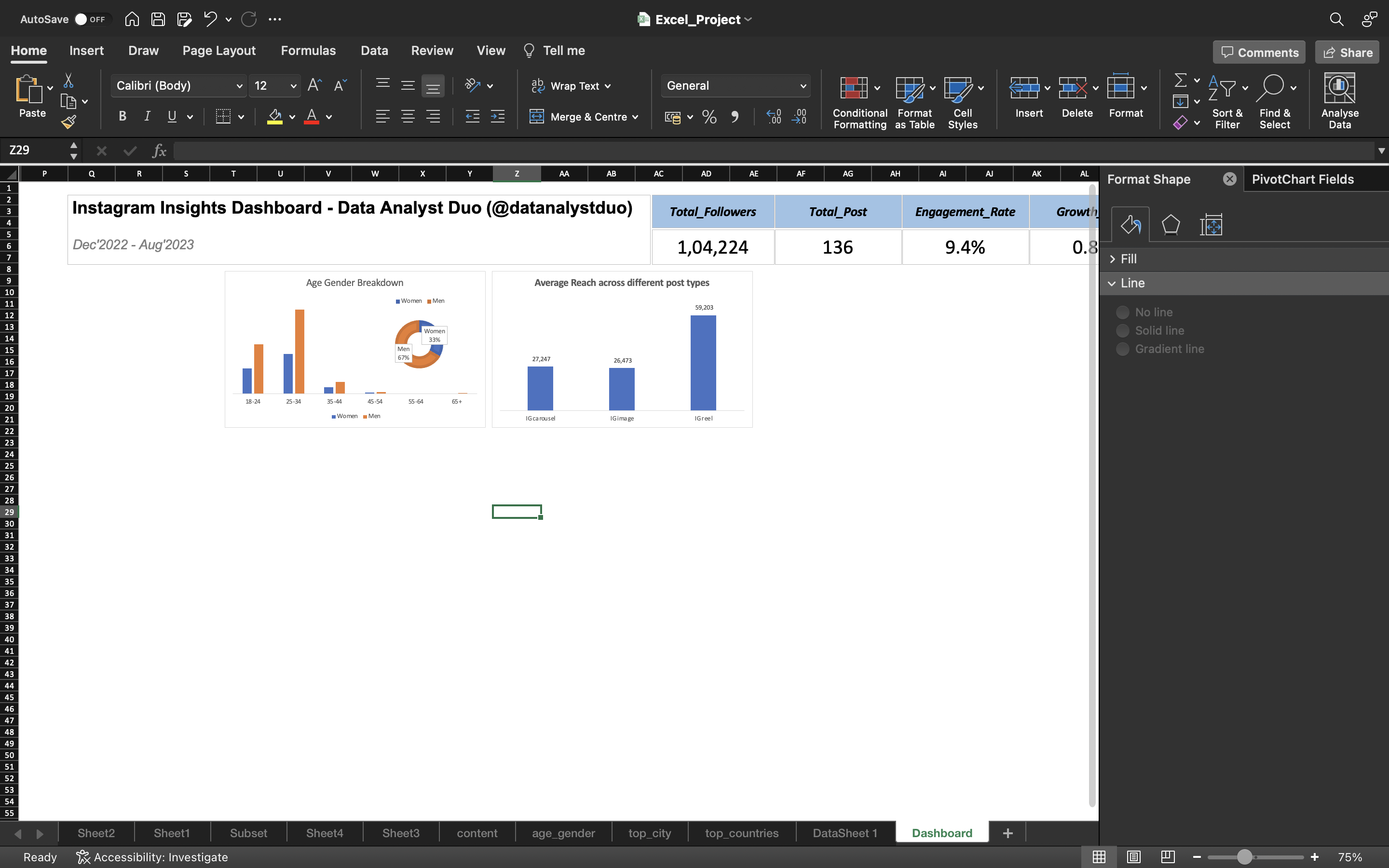
Finally we cut the chart using CTRL+X and copied the chart to the Dashboard using CTRL+V.
The output can be seen below:
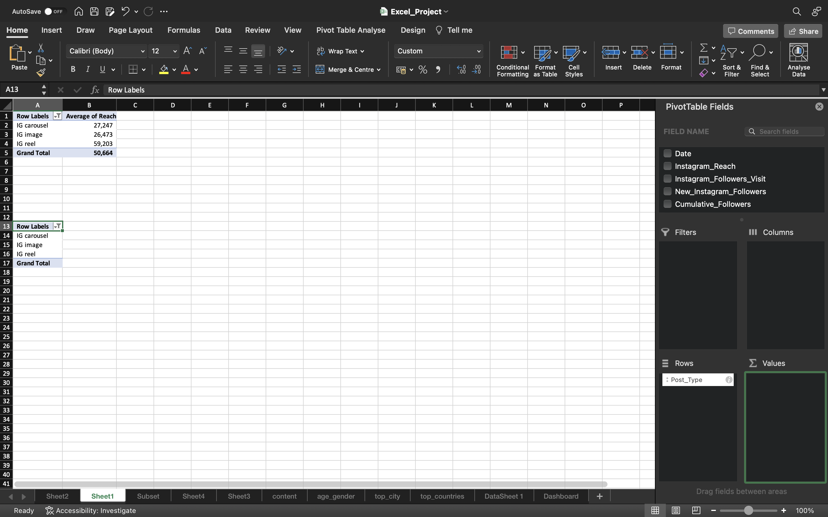
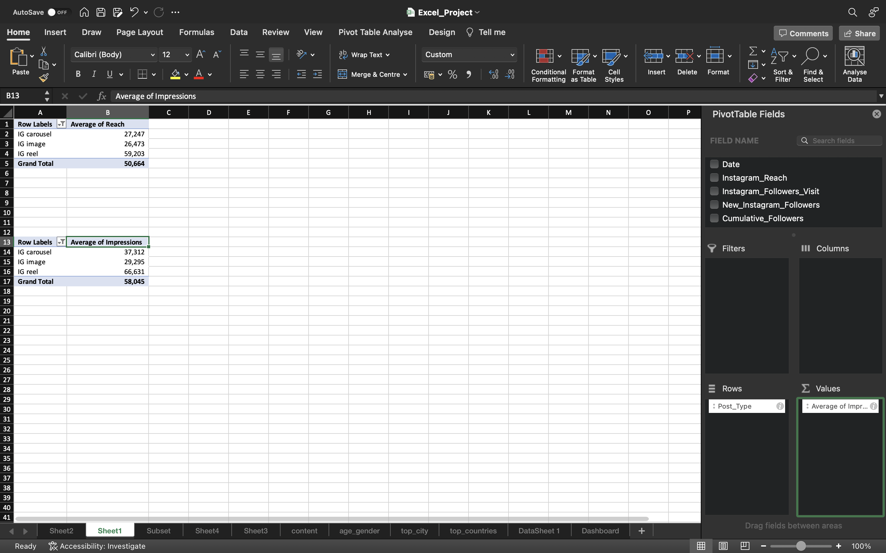
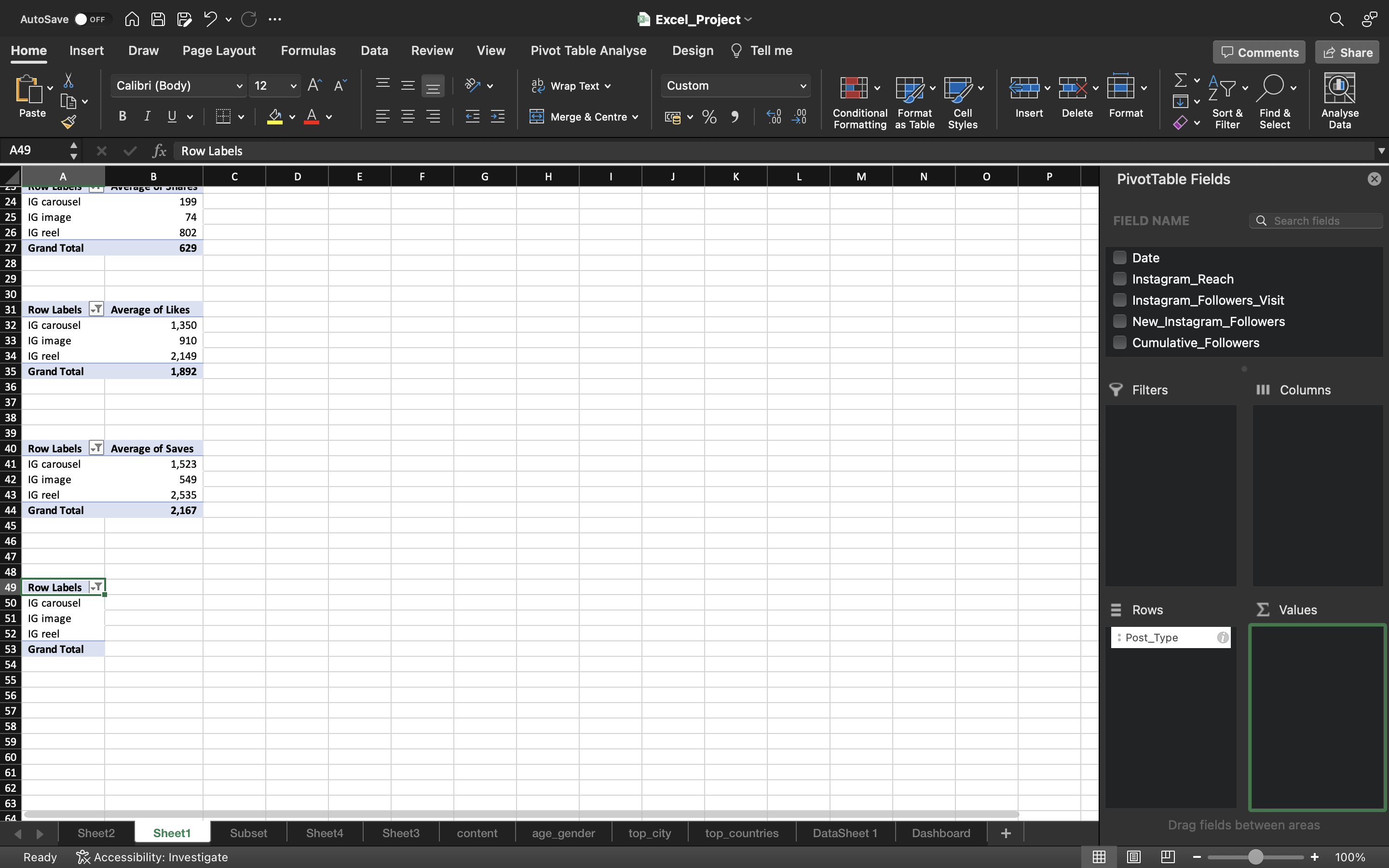
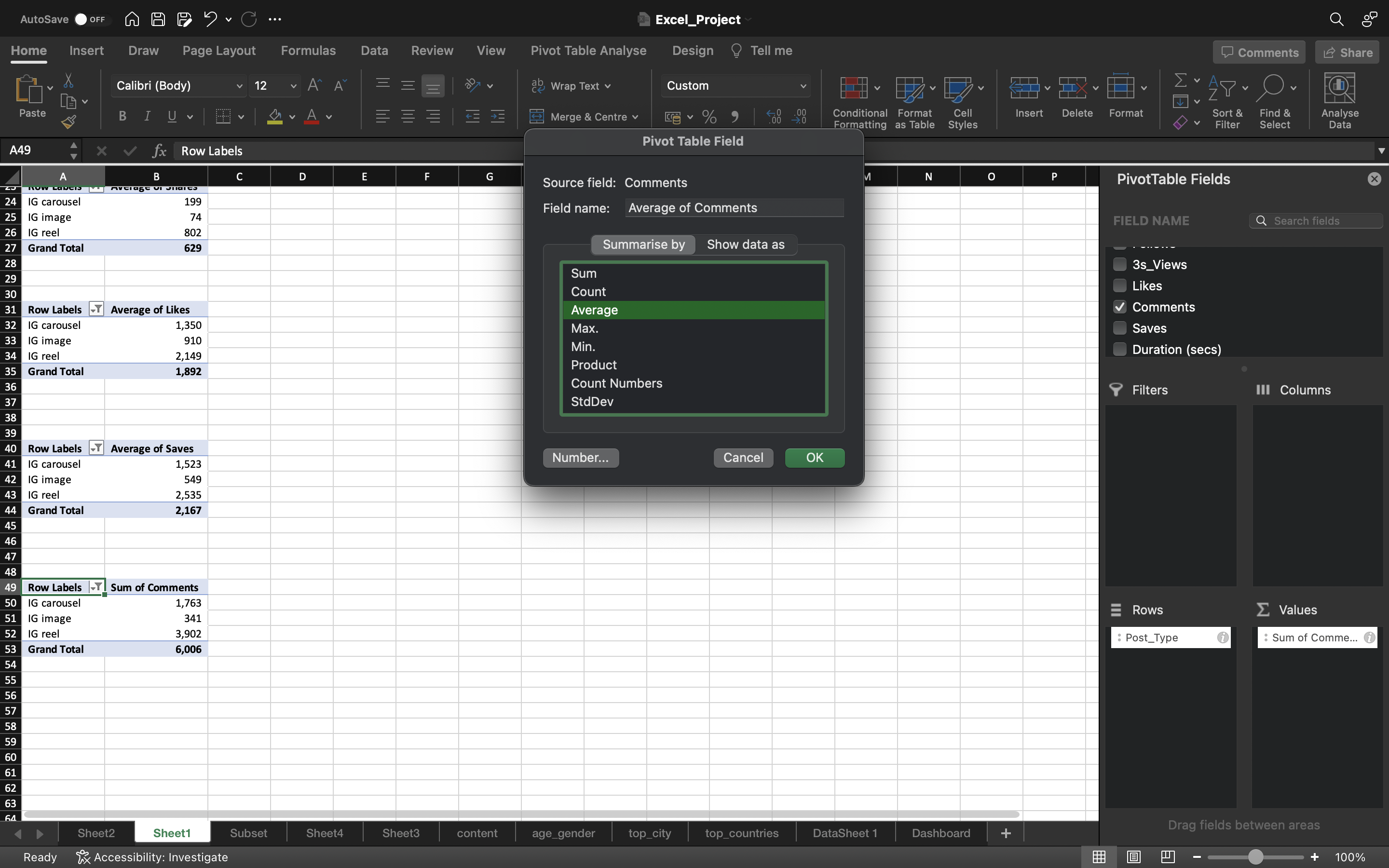
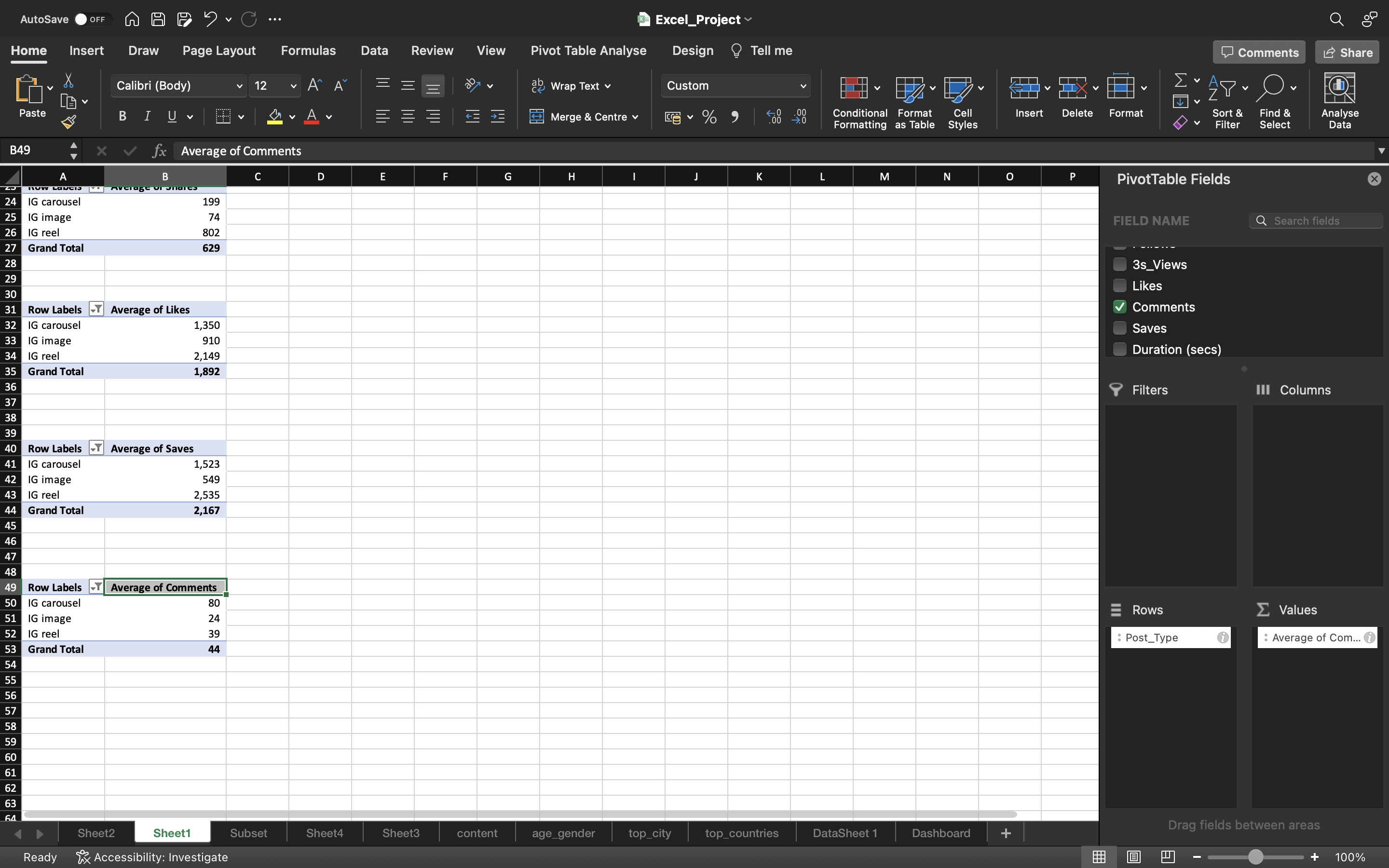
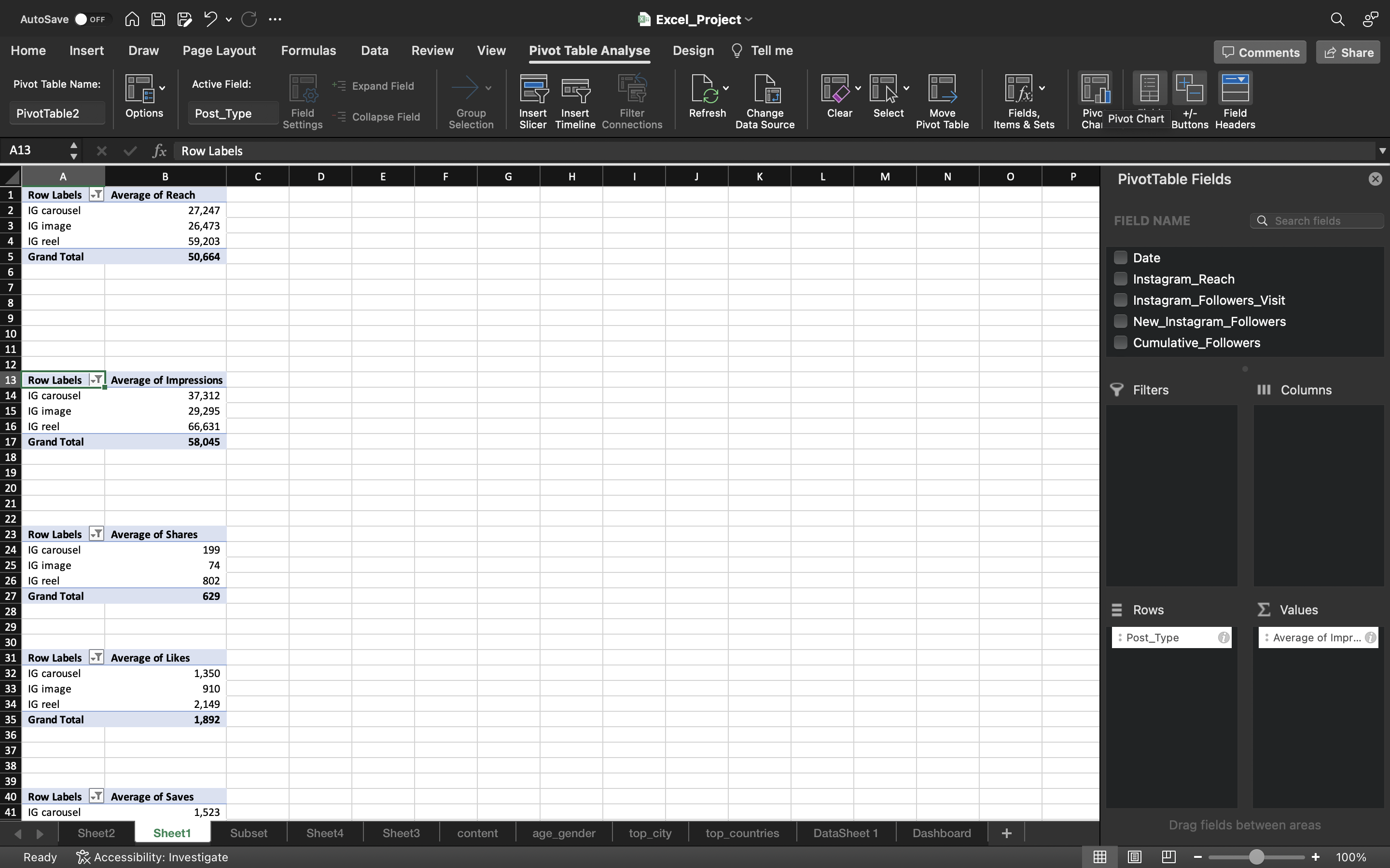
Now lets create a pivot table for Average (Impressions, Shares, Likes, Comments and Saves) as well
- Copy the pivot table which you created for Average Reach
- Remove the Reach column. Drag Impressions column into the Values area.
- Convert the Sum into Average.
Follow the above process for Shares, Likes, Coments and Saves column as well.
You can see the below output:
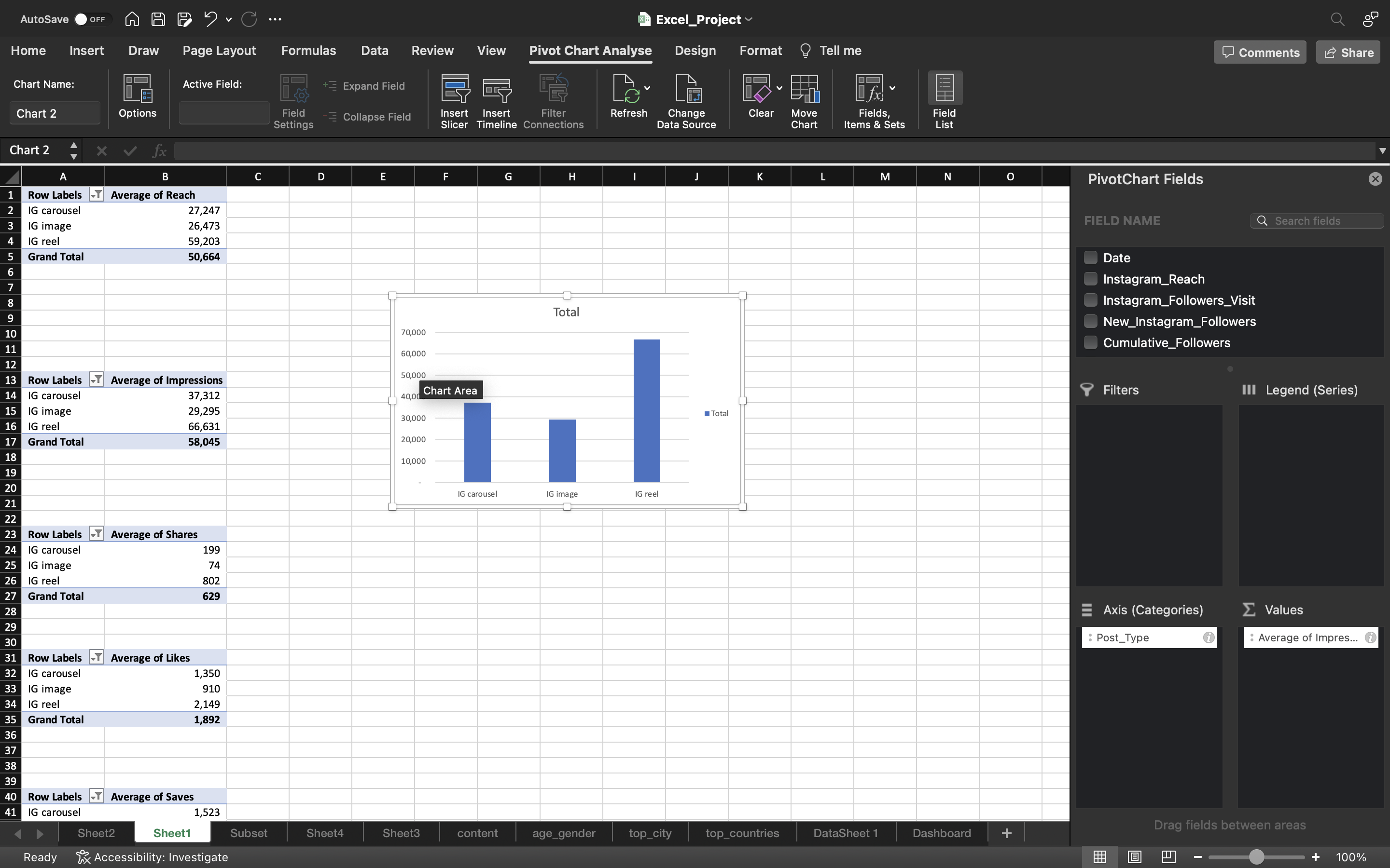
Let’s create pivot chart for the above columns Impressions, Shares, Likes, Comments and Saves.
- Select the pivot table of Average Impressions.
- Go to Pivot Table Analyze and click on Pivot Chart.
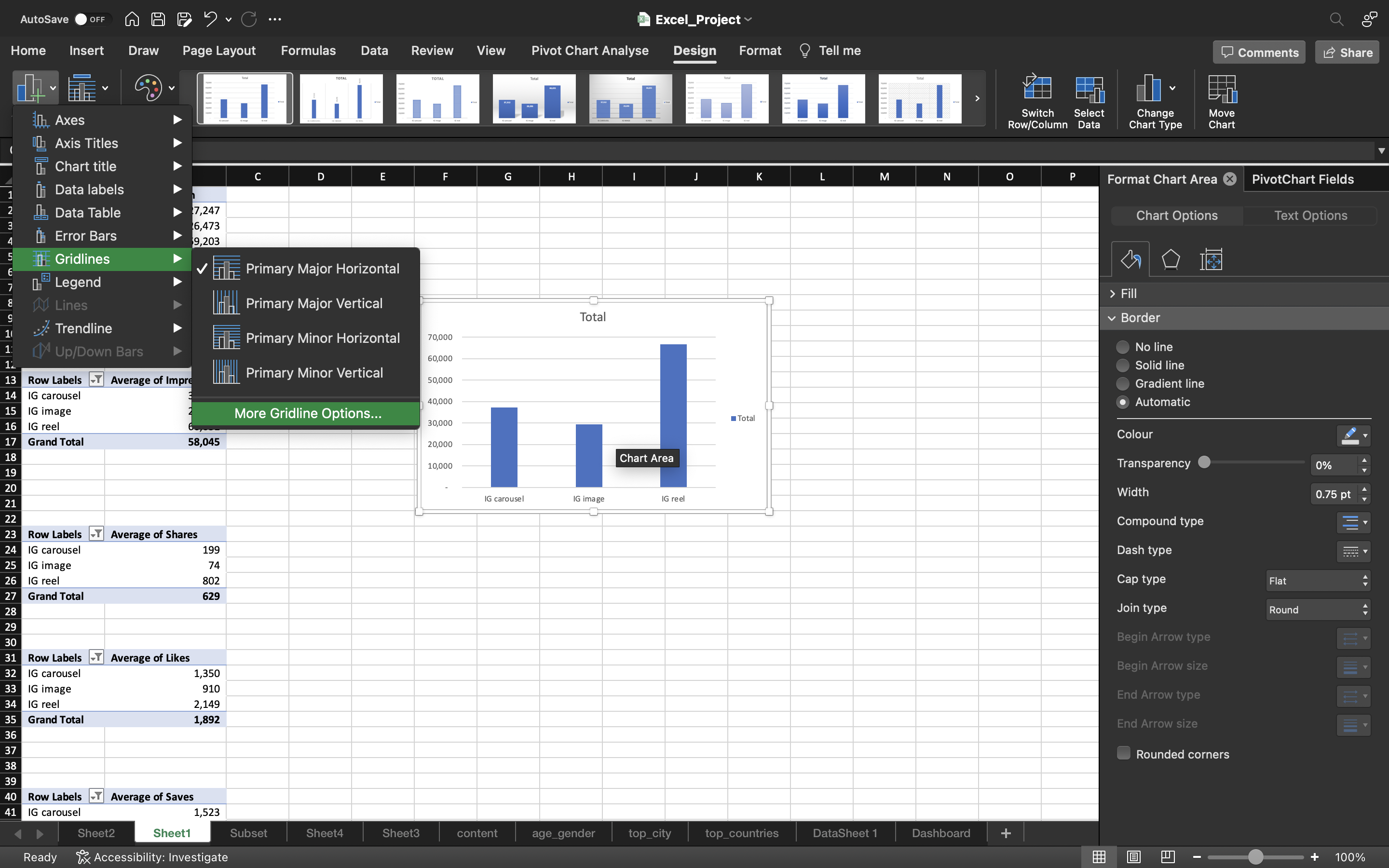
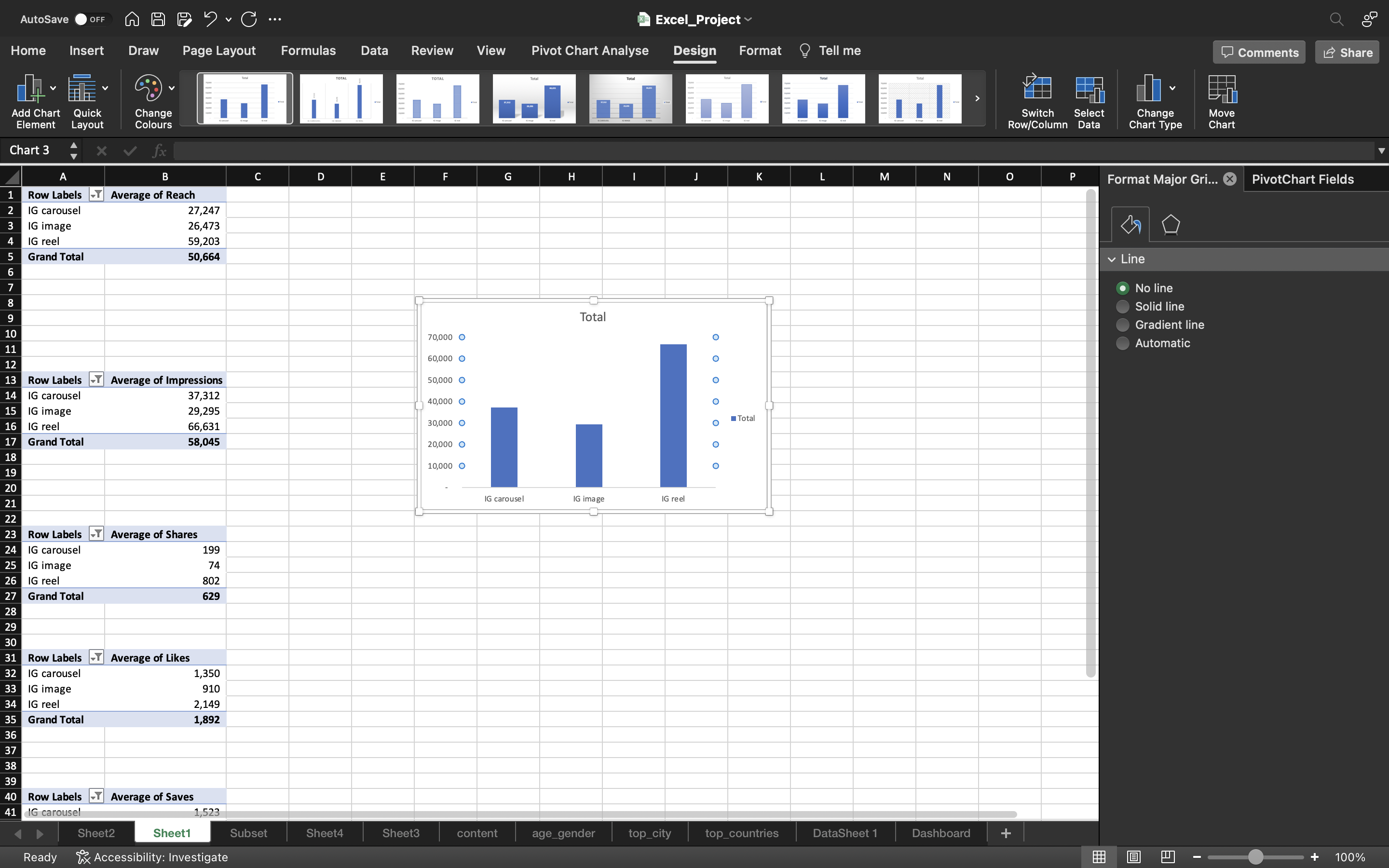
- Remove the gridlines by clicking on Add Chart Element under chart Design and select gridlines–> More Gridline Options and select No Outline.
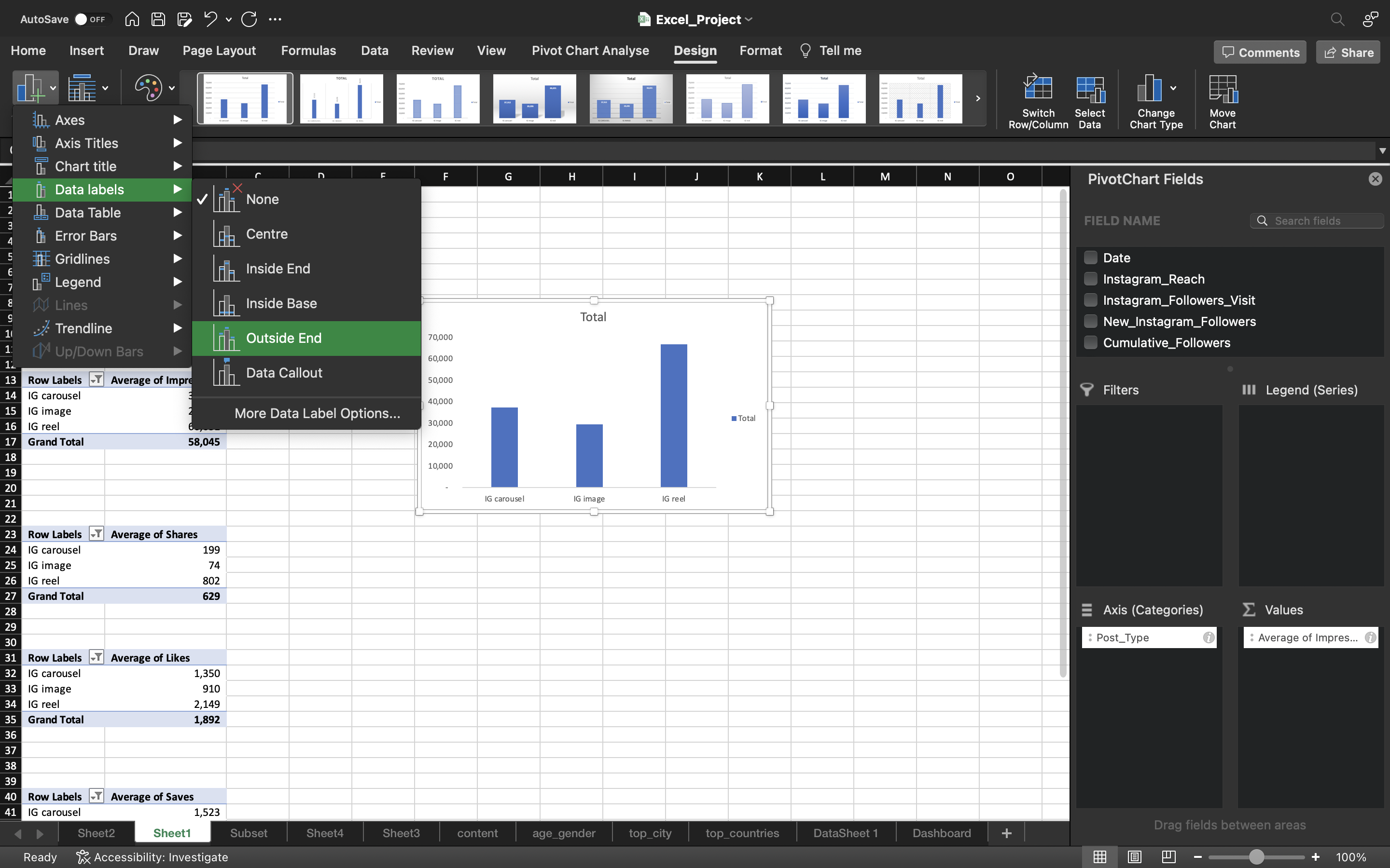
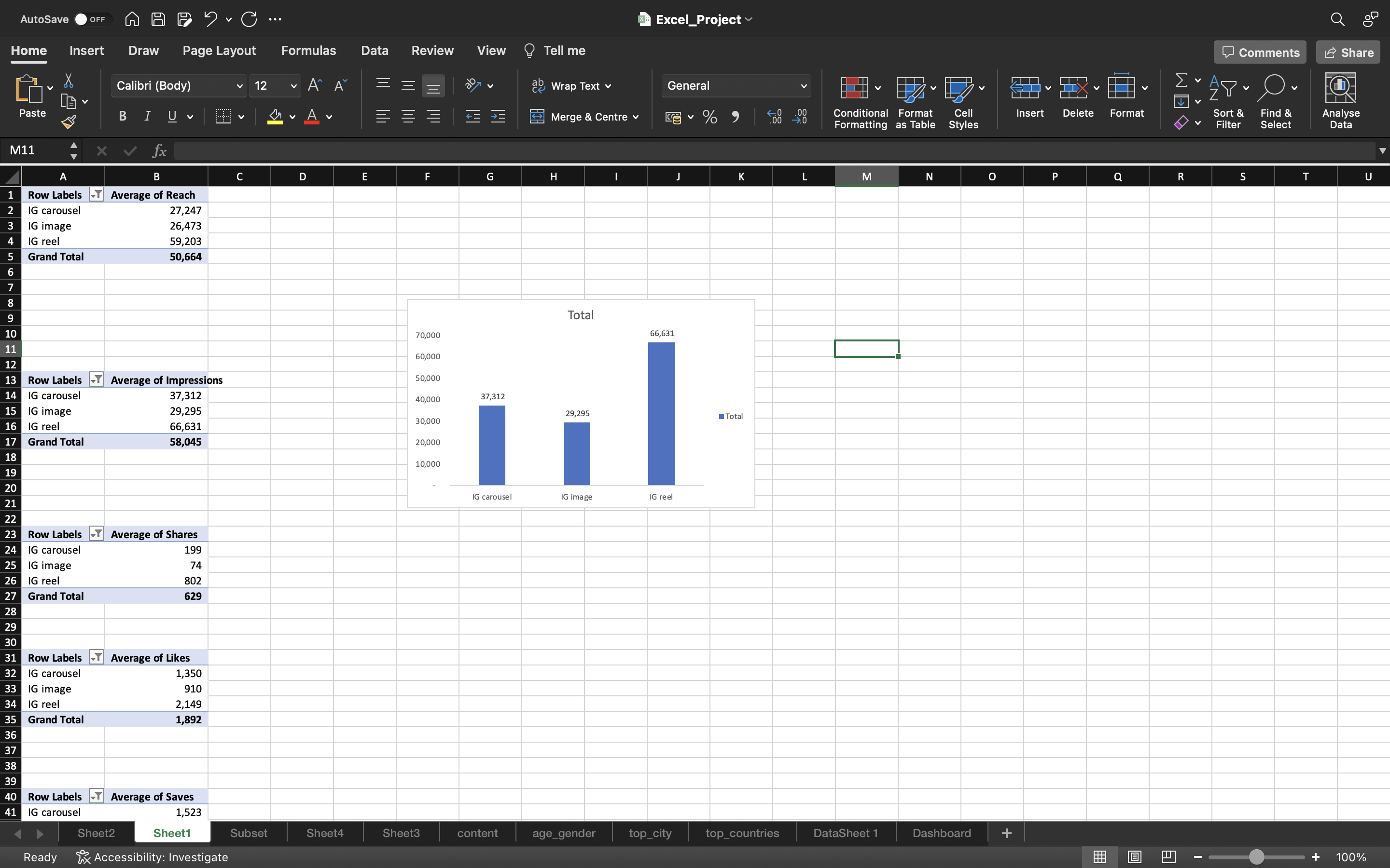
- Under chart Design, click on Add Chart Element and select Data Labels —> Data Callout —> Outside End.
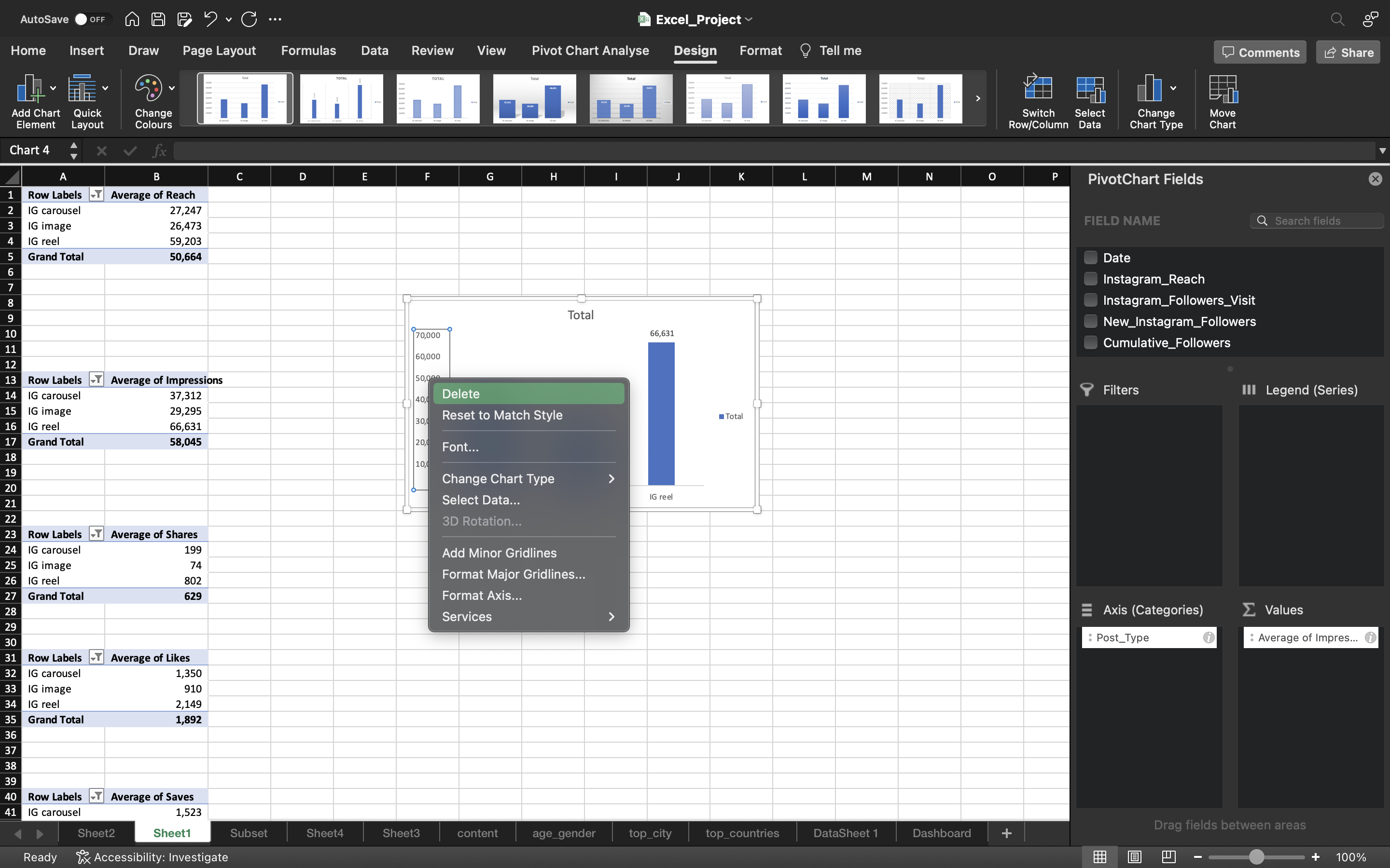
- Delete the column axis because we generated data labels and remove the Total icon on right side of the chart.
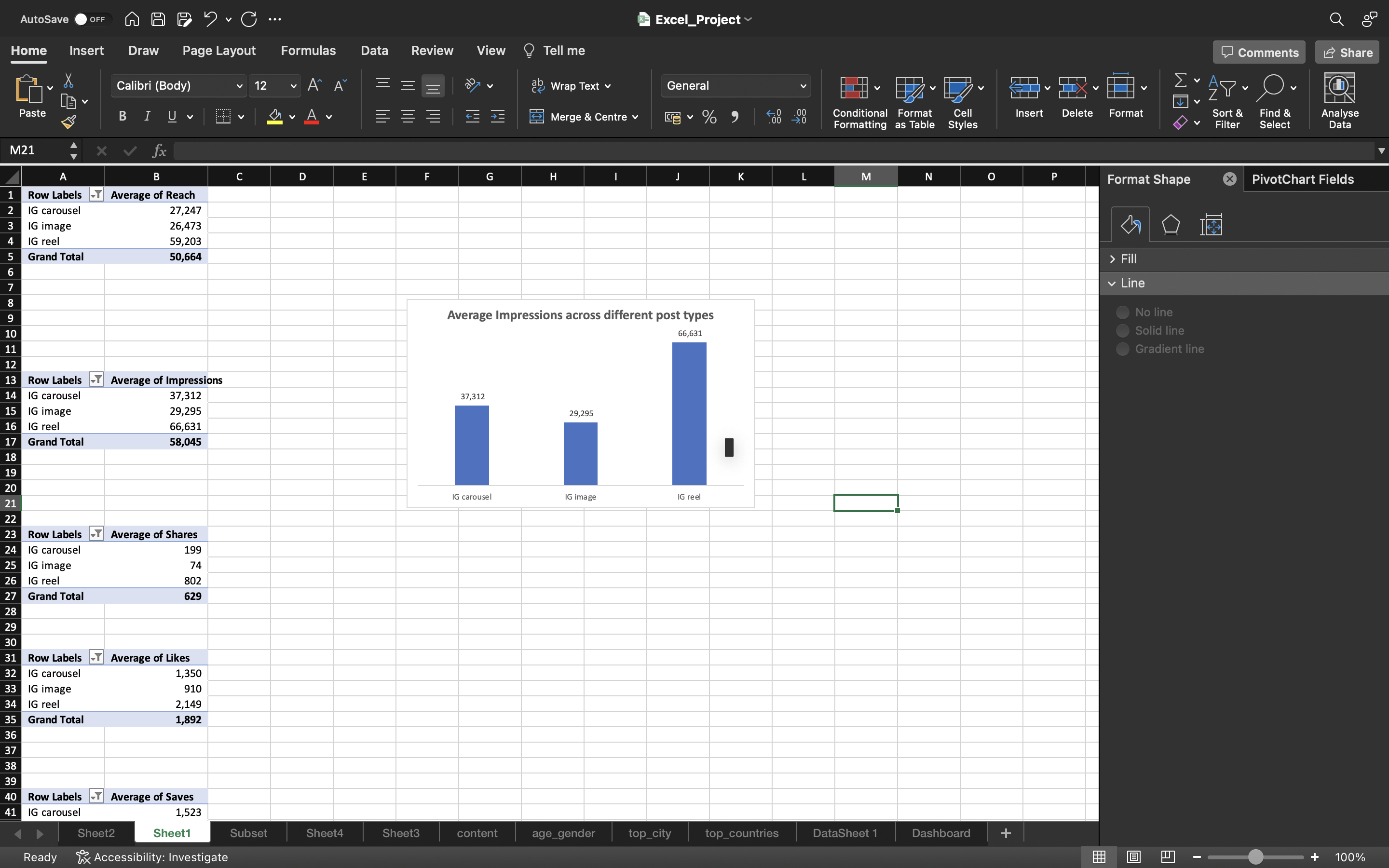
You can see the below output for Impressions column:
Followed the above steps for other columns such as Shares, Likes, Comments and Saves.
You can see the below output:
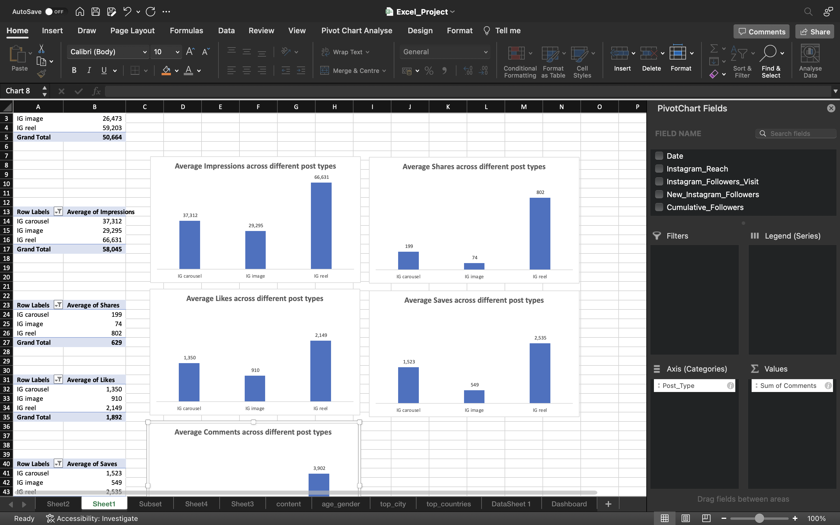
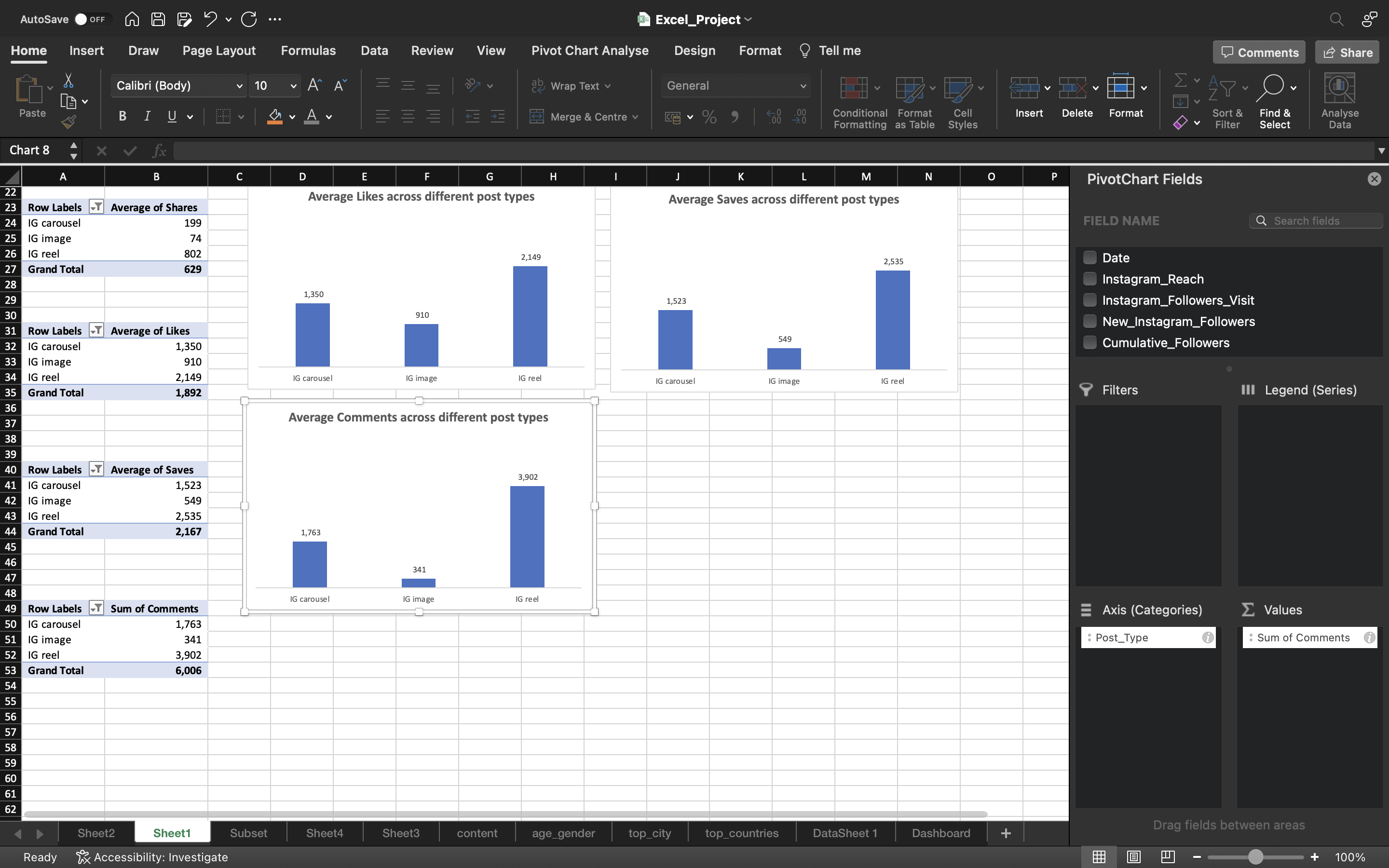
Now let’s cut all the charts using CTRL+X to the Dashboard section and paste it using CTRL+V.
- Select all the charts and right click on it.
- Select Group to lock all the charts.
You can see the below output:
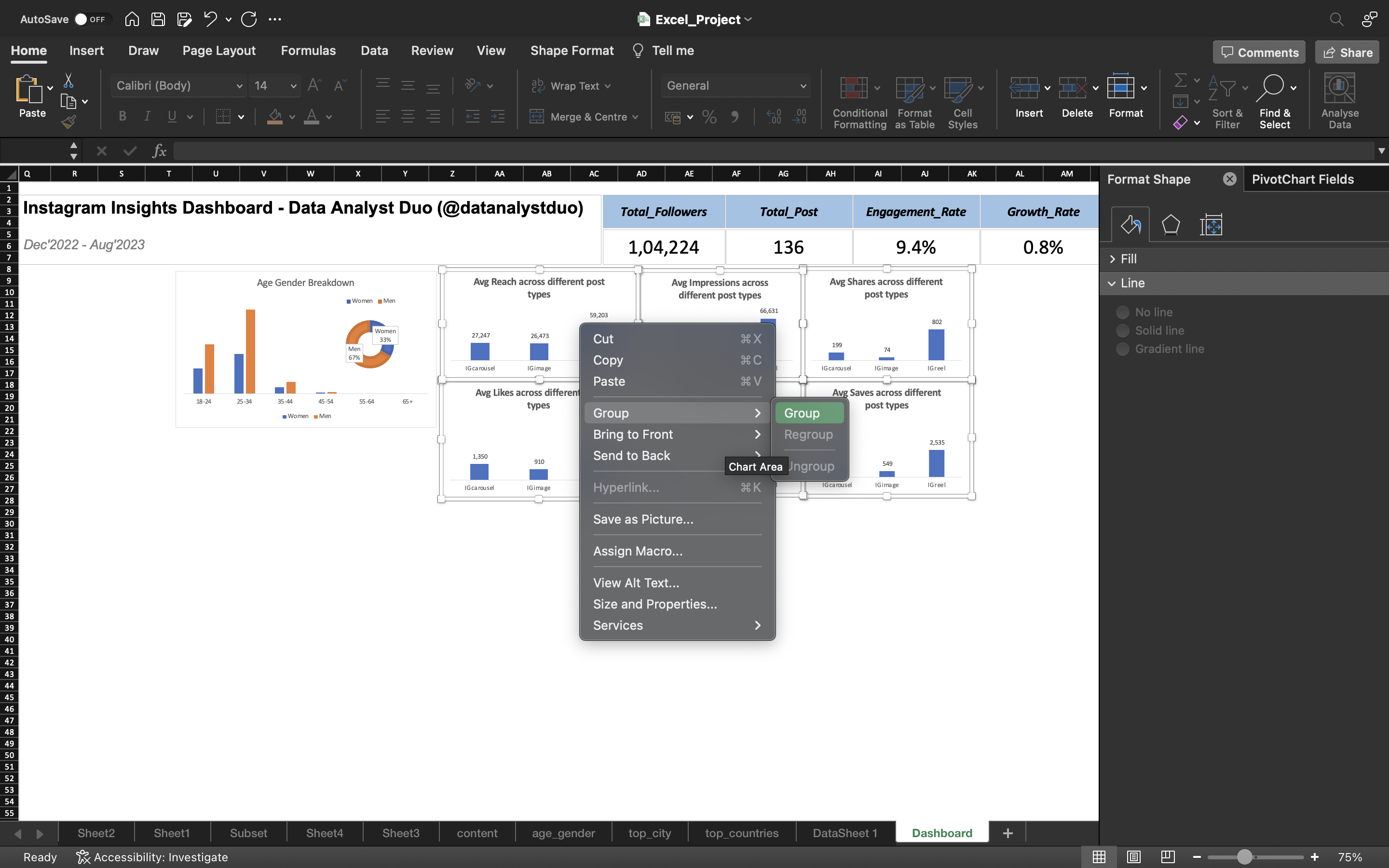
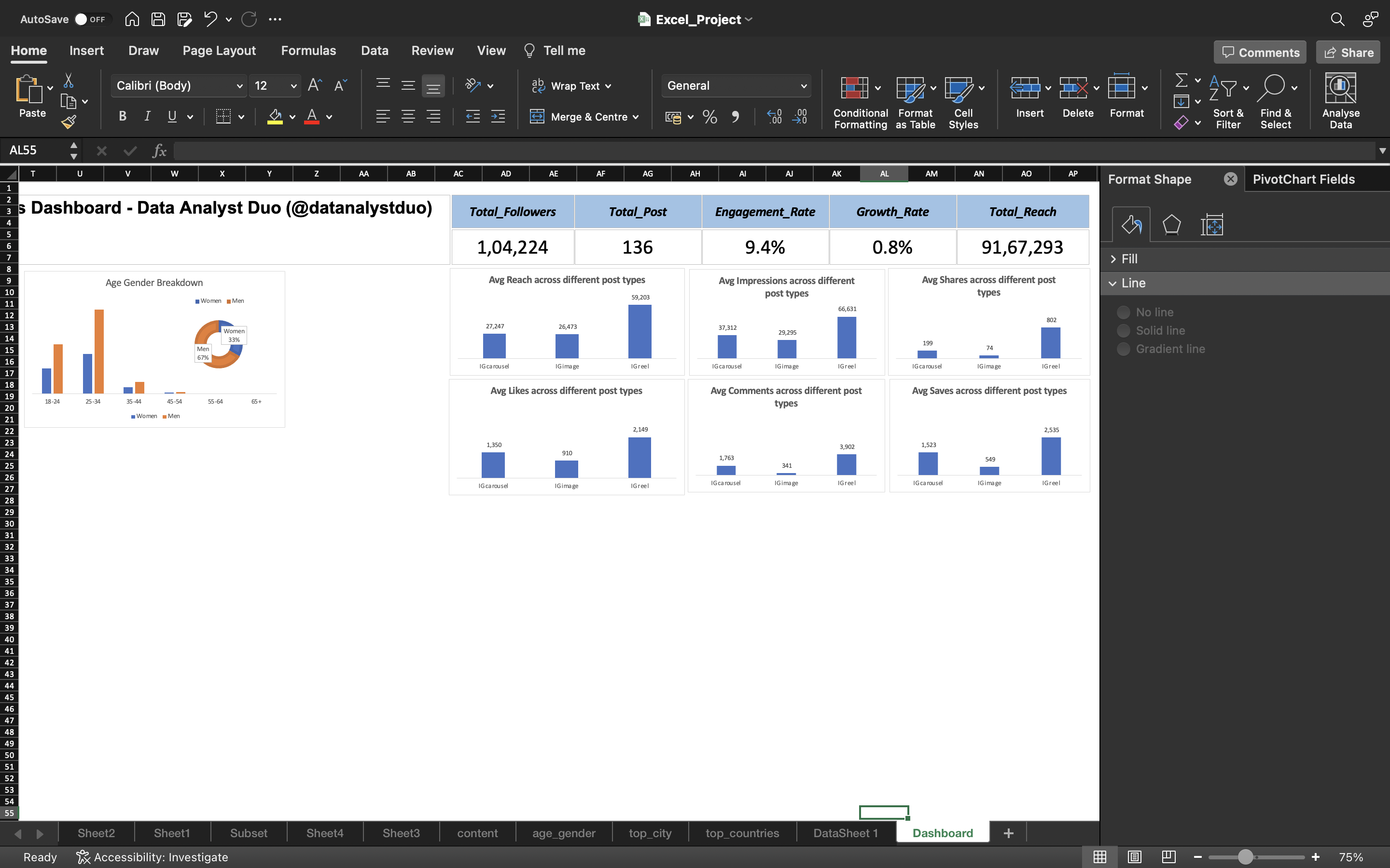
Now let’s create a pivot chart for top_countries.
- We omit the Others from Top_Countries as is not needed.
- We use the percentage of followers except Others to create a pivot chart.
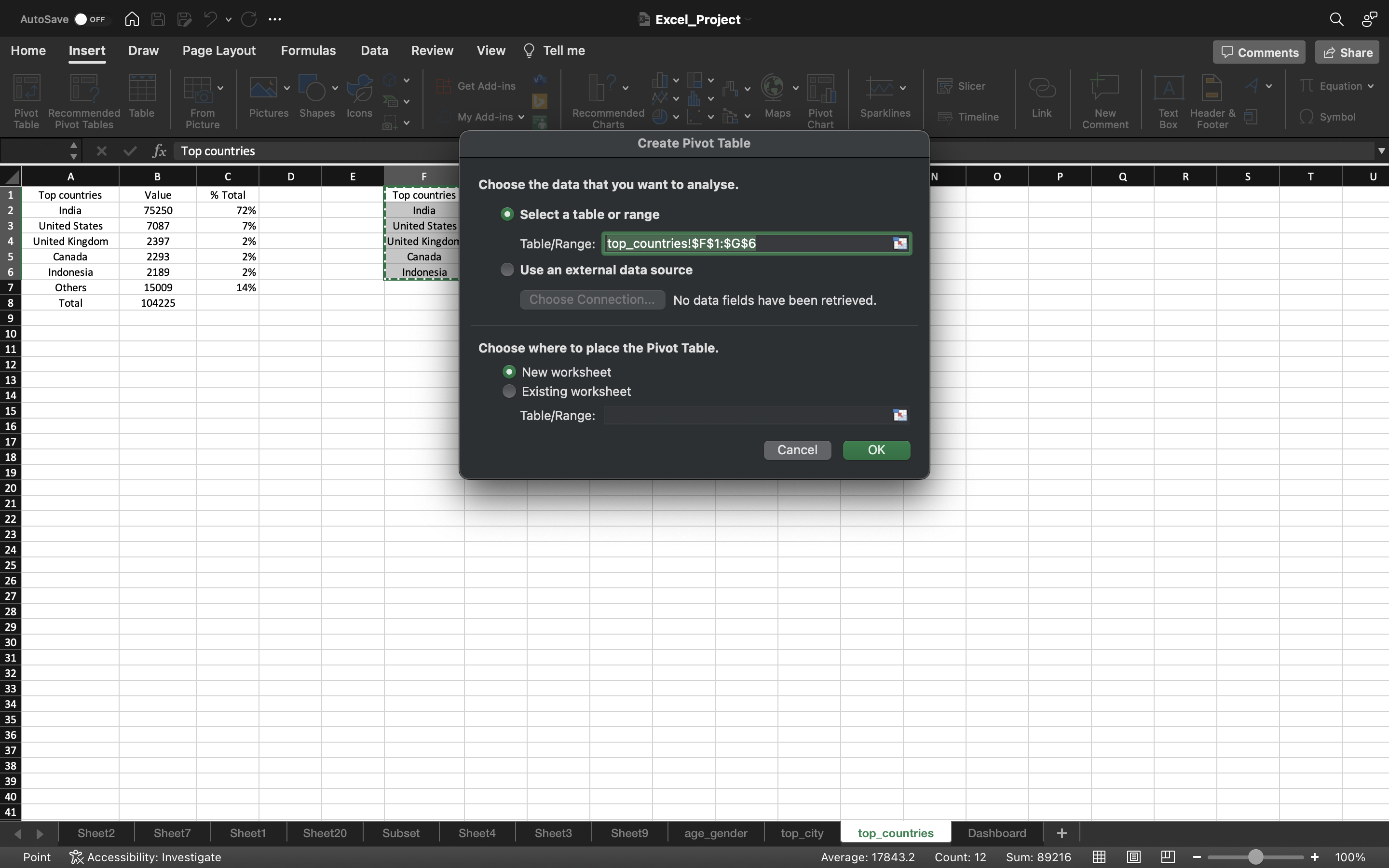
- Select all the data and go to Insert tab and click on pivot table.
- Select New_Worksheet and click ok.
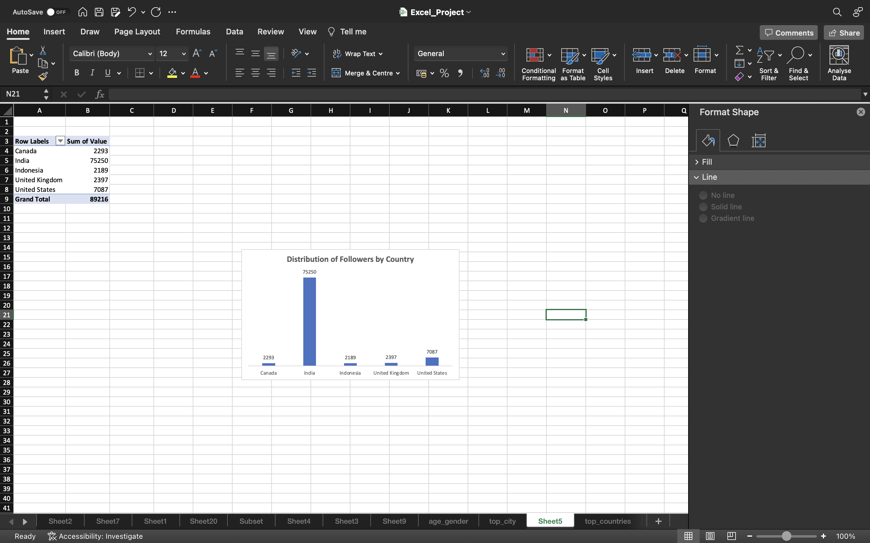
- Drag the top_country to the Axis area and value to the Values area.
- select the whole pivot table and go to **Pivot table Analyse” and click “Pivot Chart”.
- A Bar Chart is generated.
- Remove the gridlines by clicking on Add Chart Element under chart Design and select gridlines–> More Gridline Options and select No Outline.
- Under chart Design, click on Add Chart Element and select Data Labels —> Data Callout —> Outside End.
- Delete the column axis because we generated data labels and remove the Total icon on right side of the chart.
The output can be seen below:
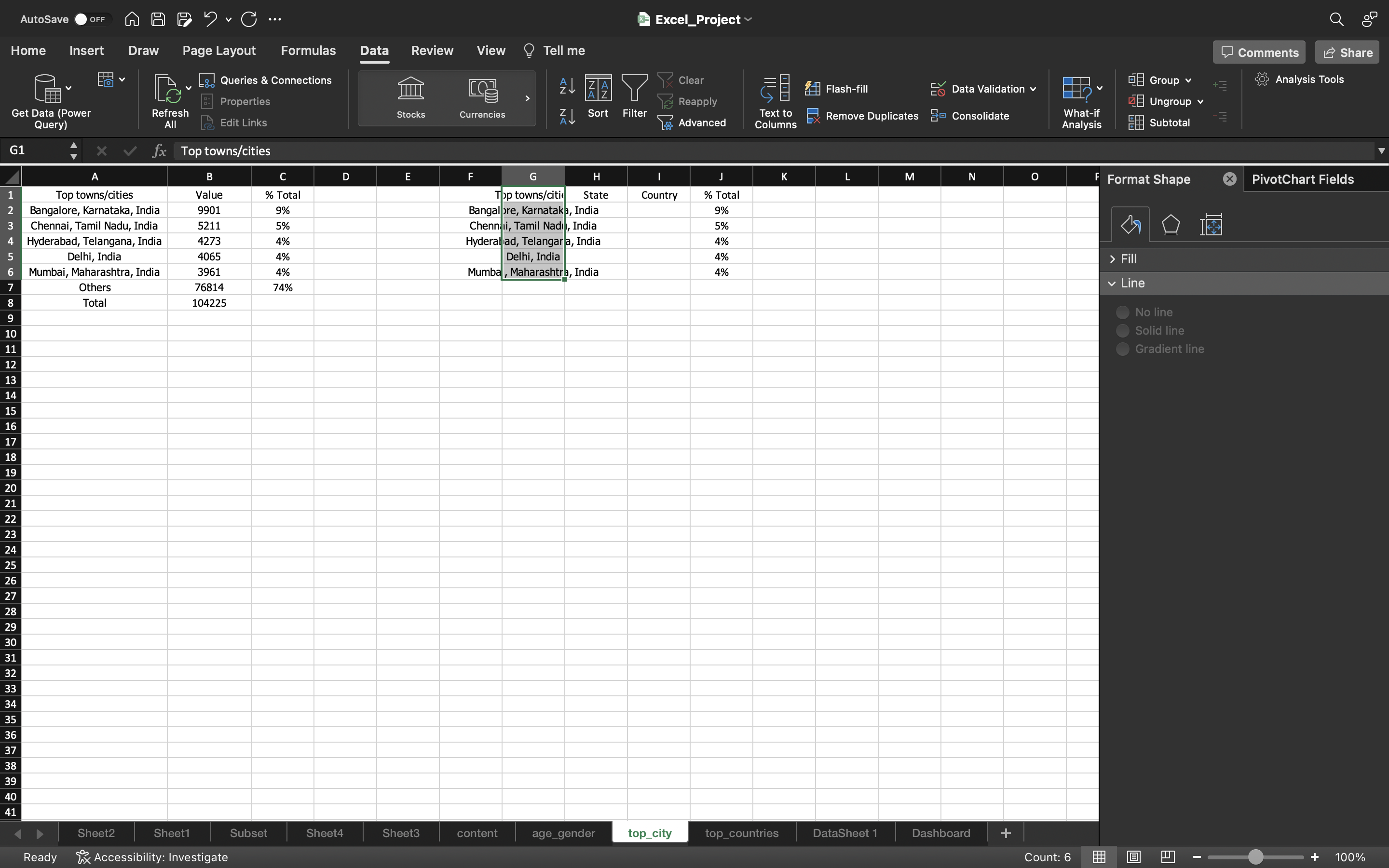
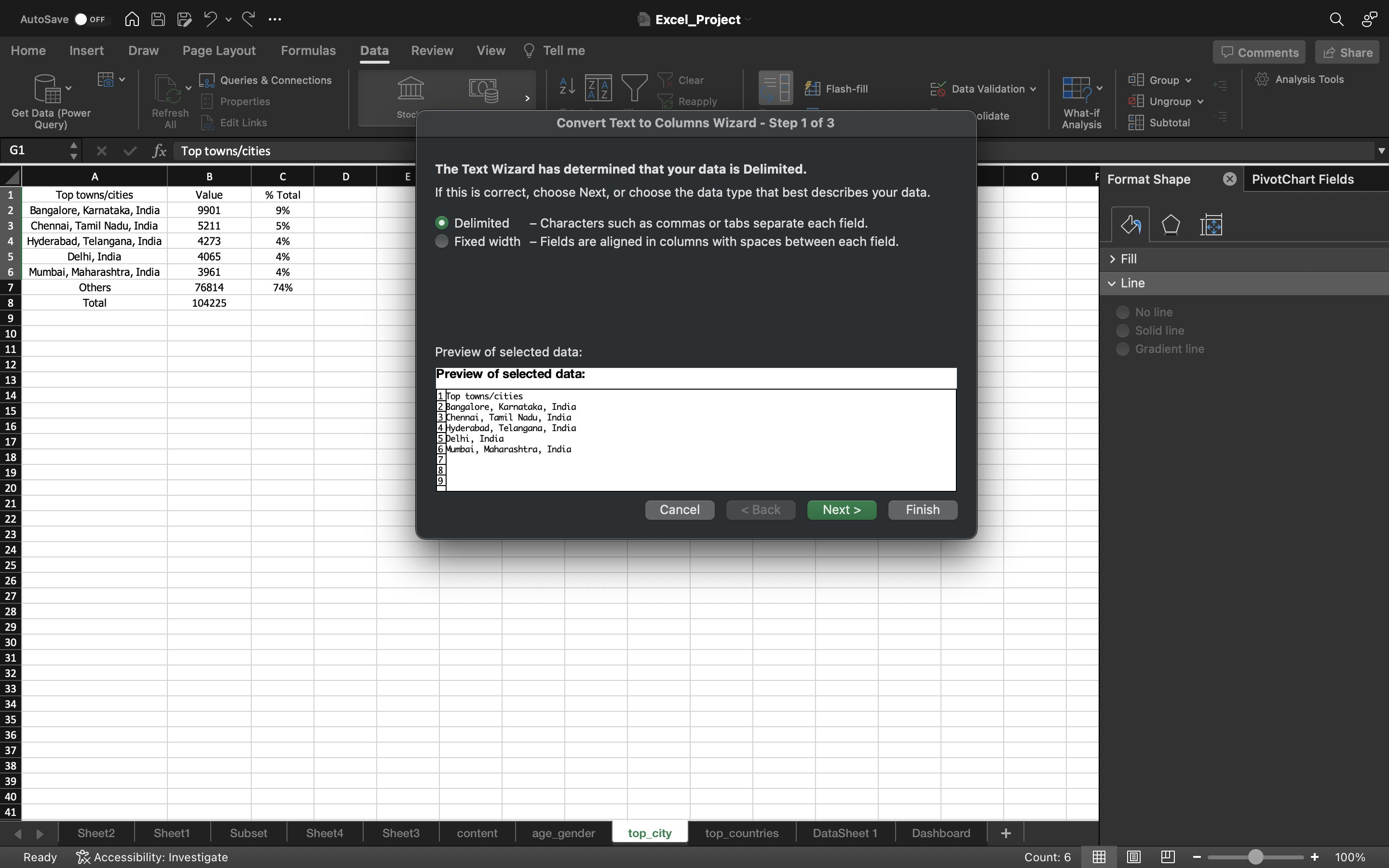
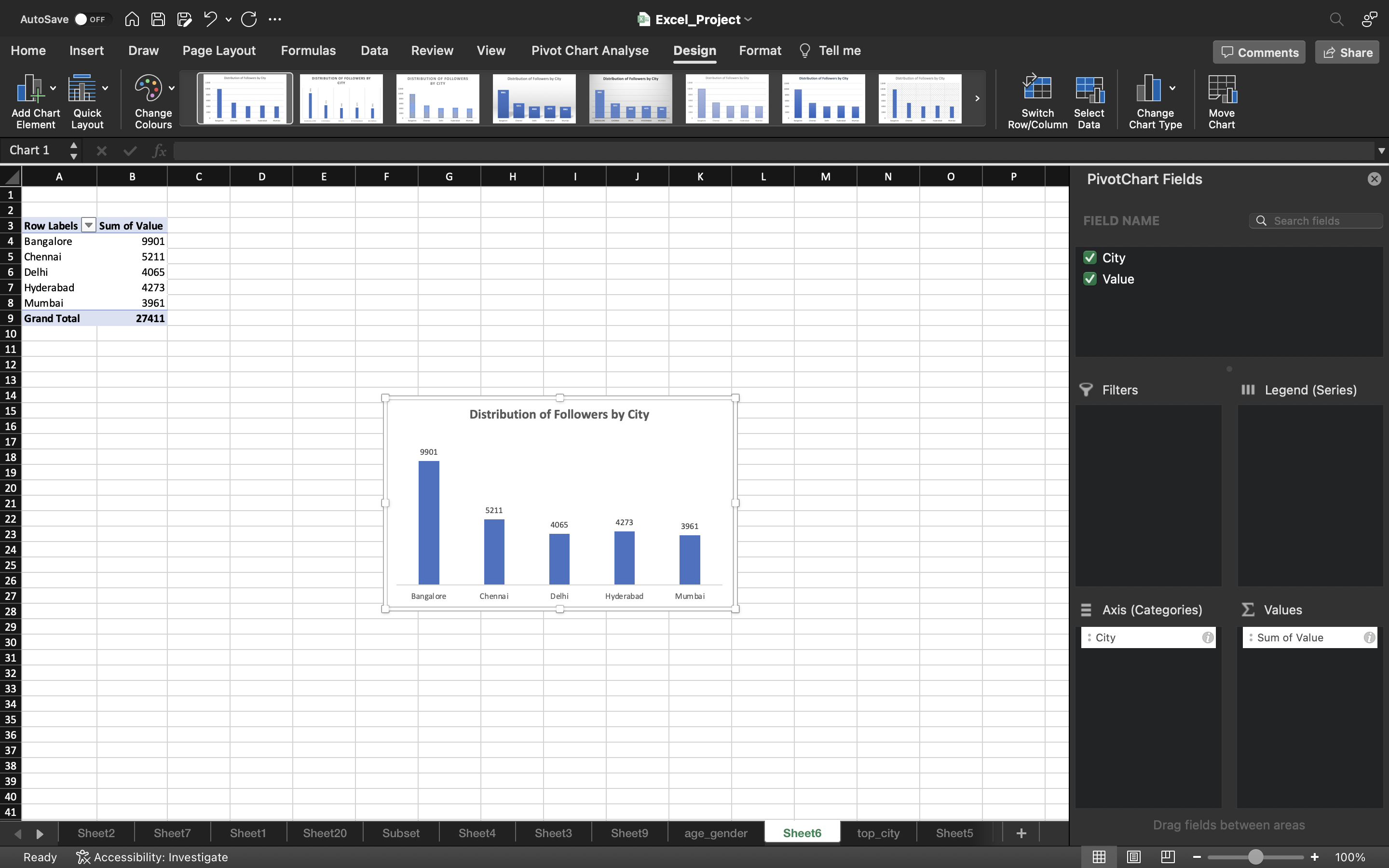
Now let’s create a pivot chart for top_cities.
- We omit the Others from top_cities as is not needed.
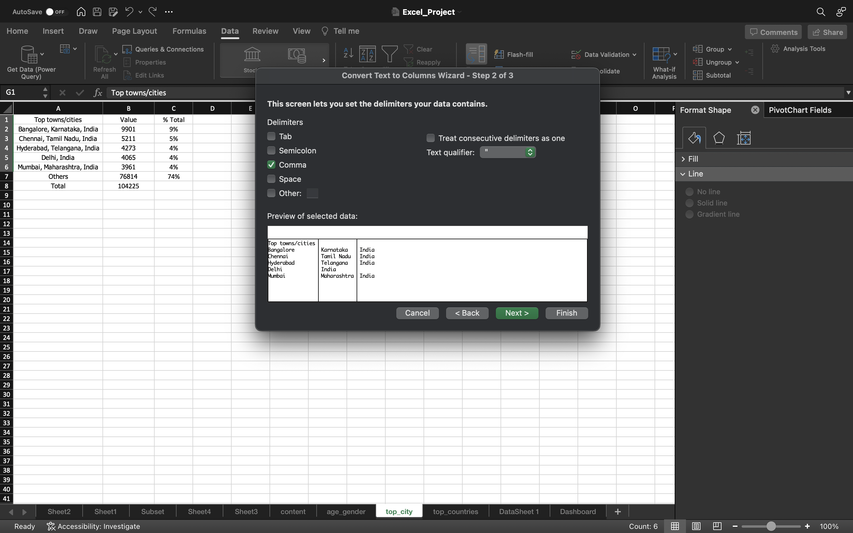
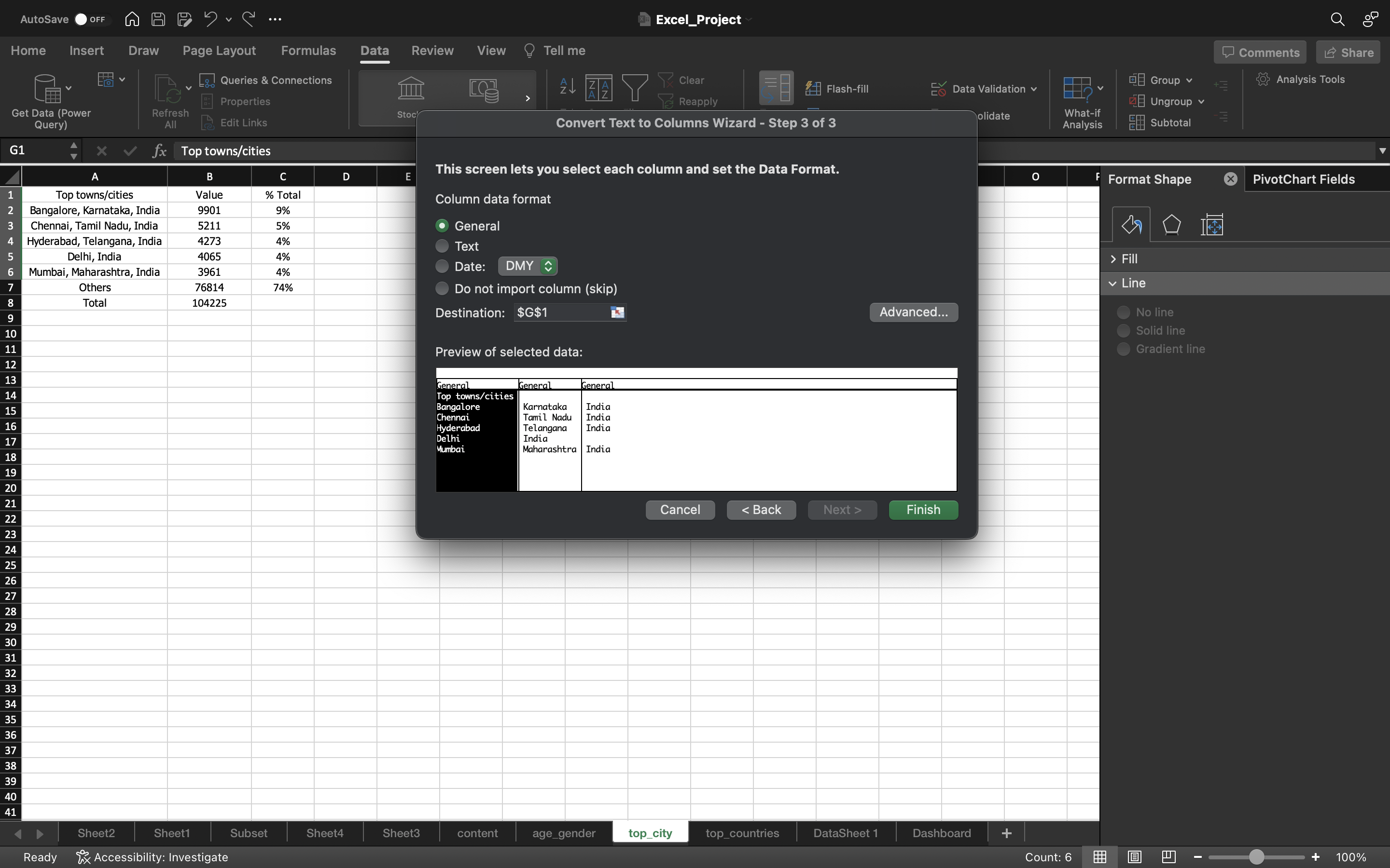
- Let’s split the data into three columns using delimiter.
- Go to Data tab, select Text to Columns. Select Delimited and click on Next. Select Delimiter as Comma and click on Next. Select column Data Format as General and click Finish.
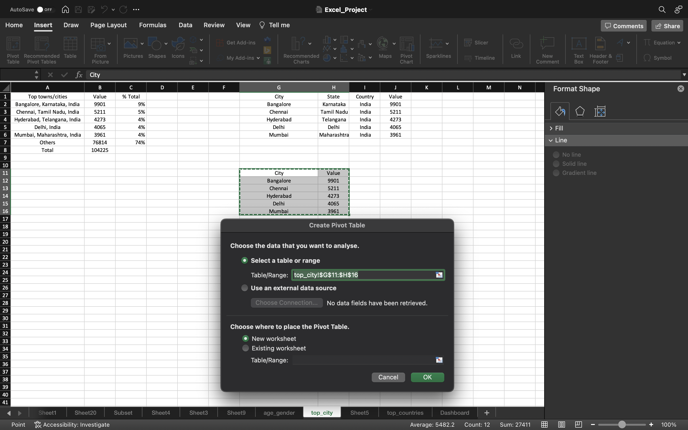
- Select all the data and go to Insert tab and click on pivot table.
- Select New_Worksheet and click ok.
- Drag the top_cities to the Axis area and value to the Values area.
- select the whole pivot table and go to **Pivot table Analyse” and click “Pivot Chart”.
- A Bar Chart is generated.
- Remove the gridlines by clicking on Add Chart Element under chart Design and select gridlines–> More Gridline Options and select No Outline.
- Under chart Design, click on Add Chart Element and select Data Labels —> Data Callout —> Outside End.
- Delete the column axis because we generated data labels and remove the Total icon on right side of the chart.
The output can be seen below:
Now let’s create a Line Chart for Cumulative Followers by Month.
It shows how the followers are growing over a period of time.
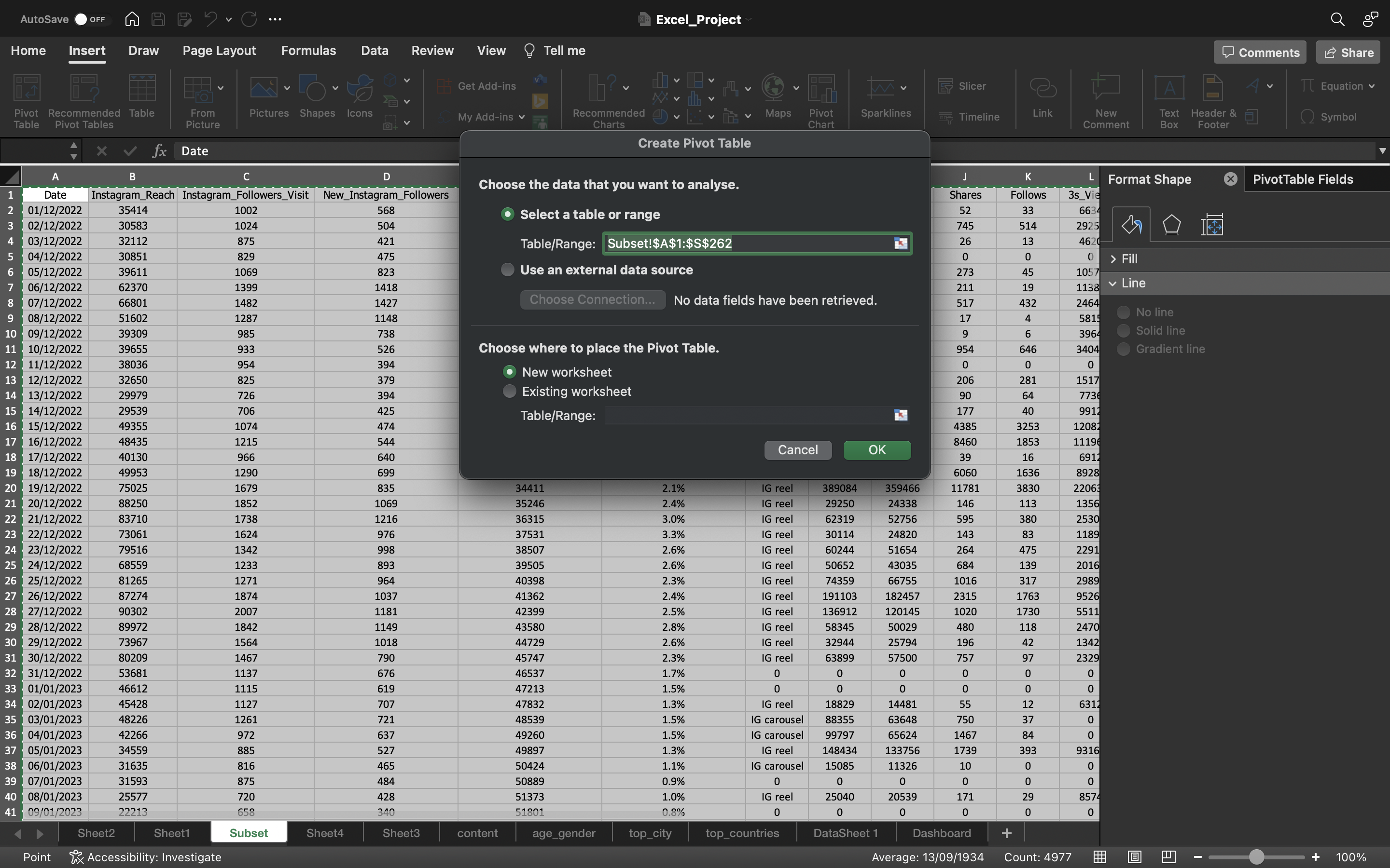
- Select all the data in Subset spreadsheet using CTRL+A.
- Go to Insert tab, click on Pivot Table and select New Worksheet and click ok.
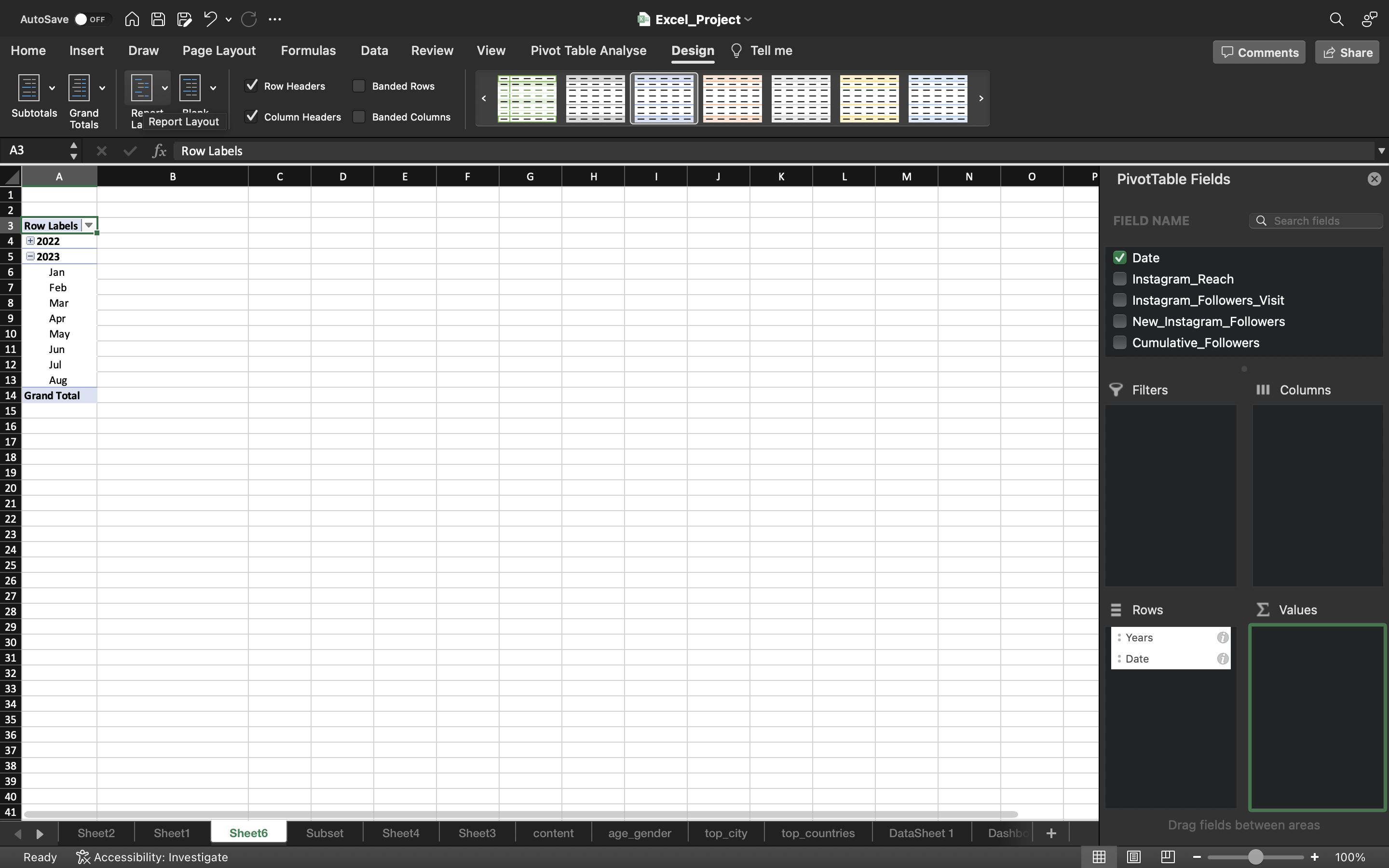
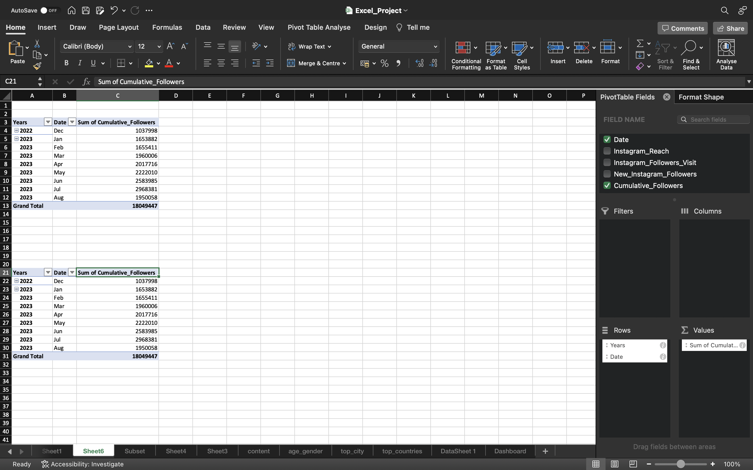
- Drag the Date column to the Rows area and Filter it by using Years/Month.
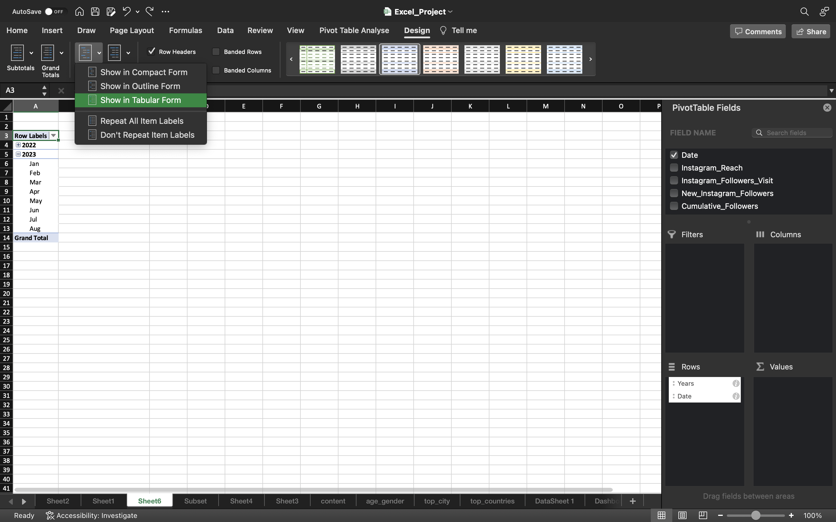
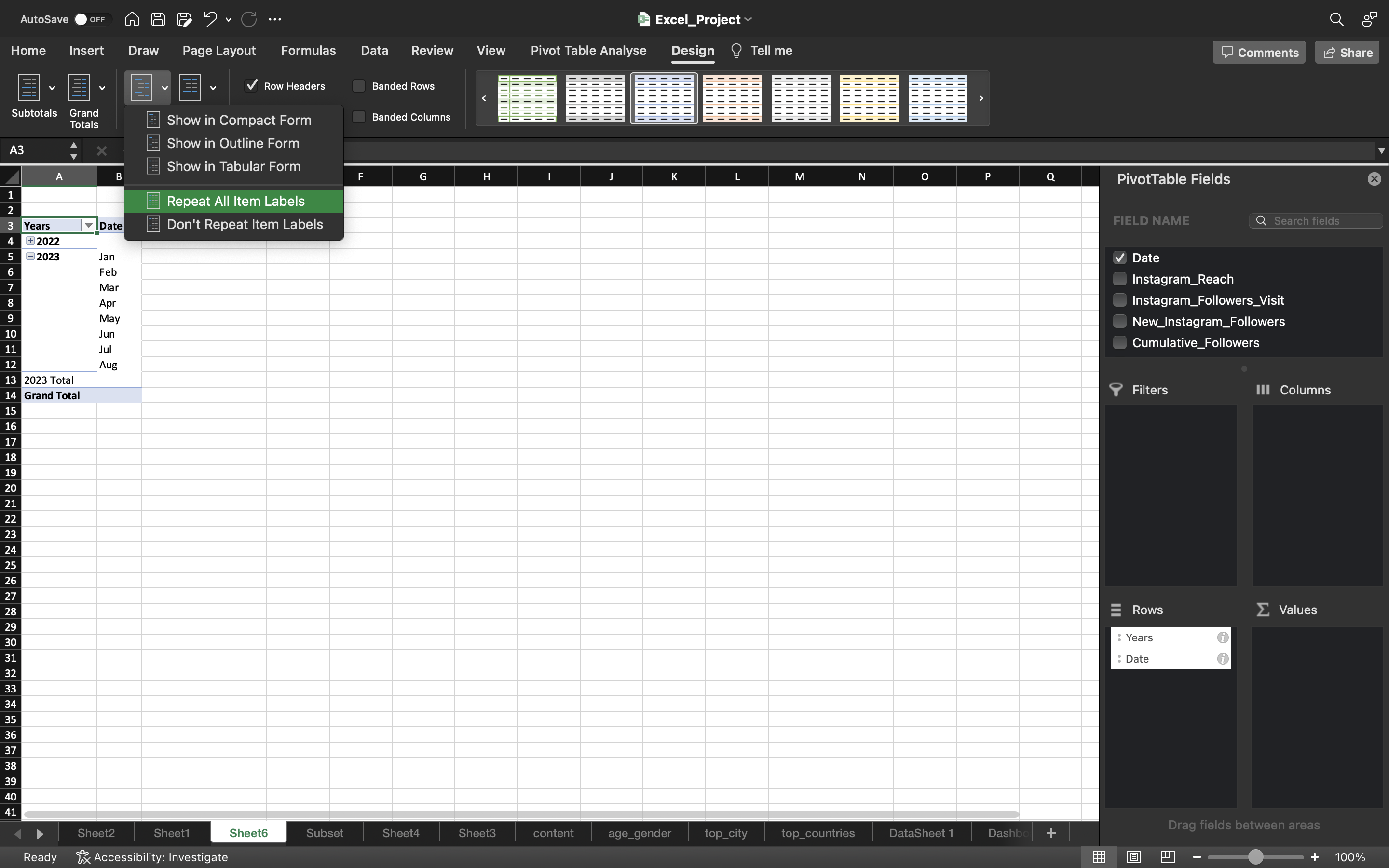
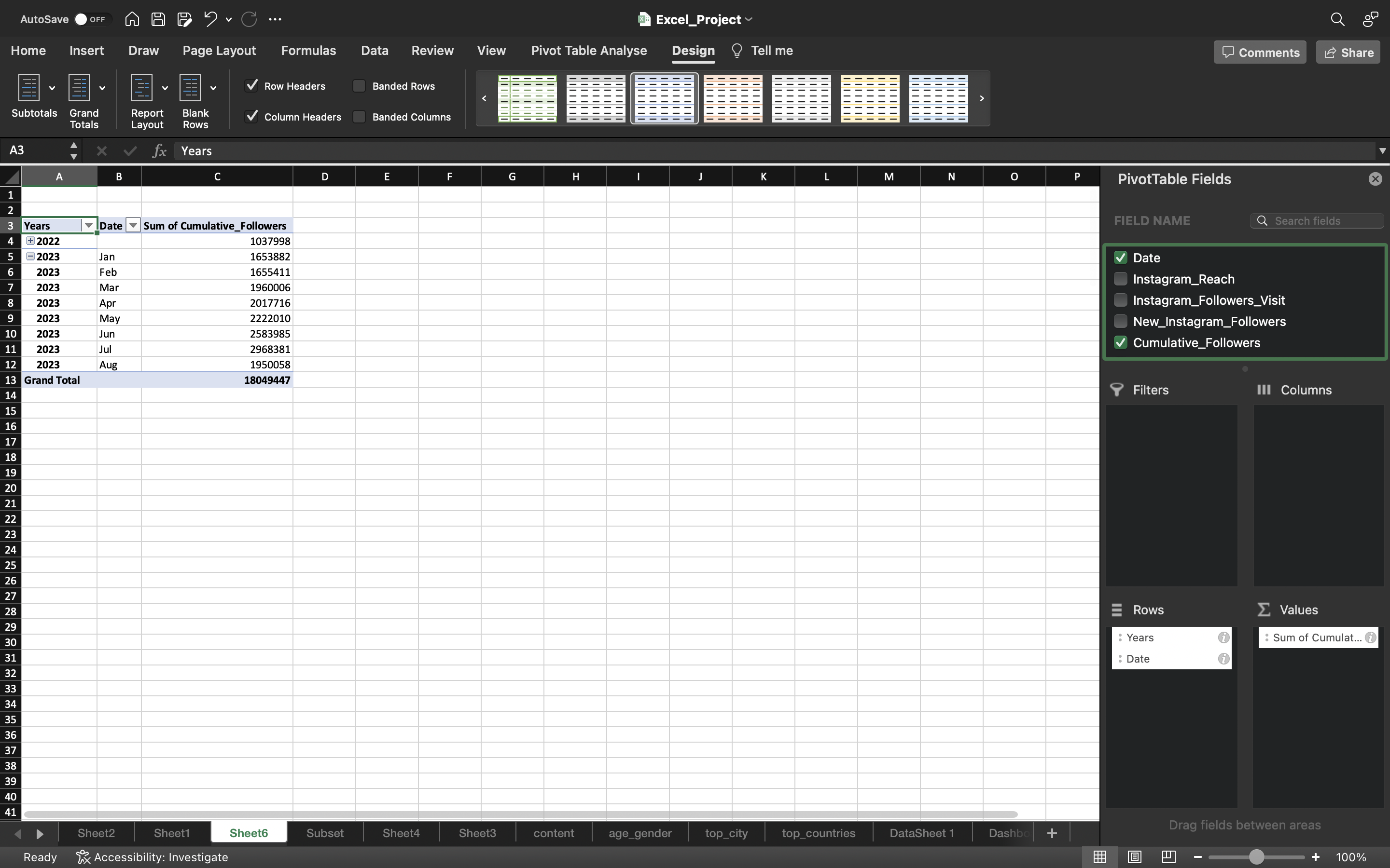
- Let’s convert the pivot table into tabular format by selecting Design tab —> Report Layout —> Show Tabular Form.
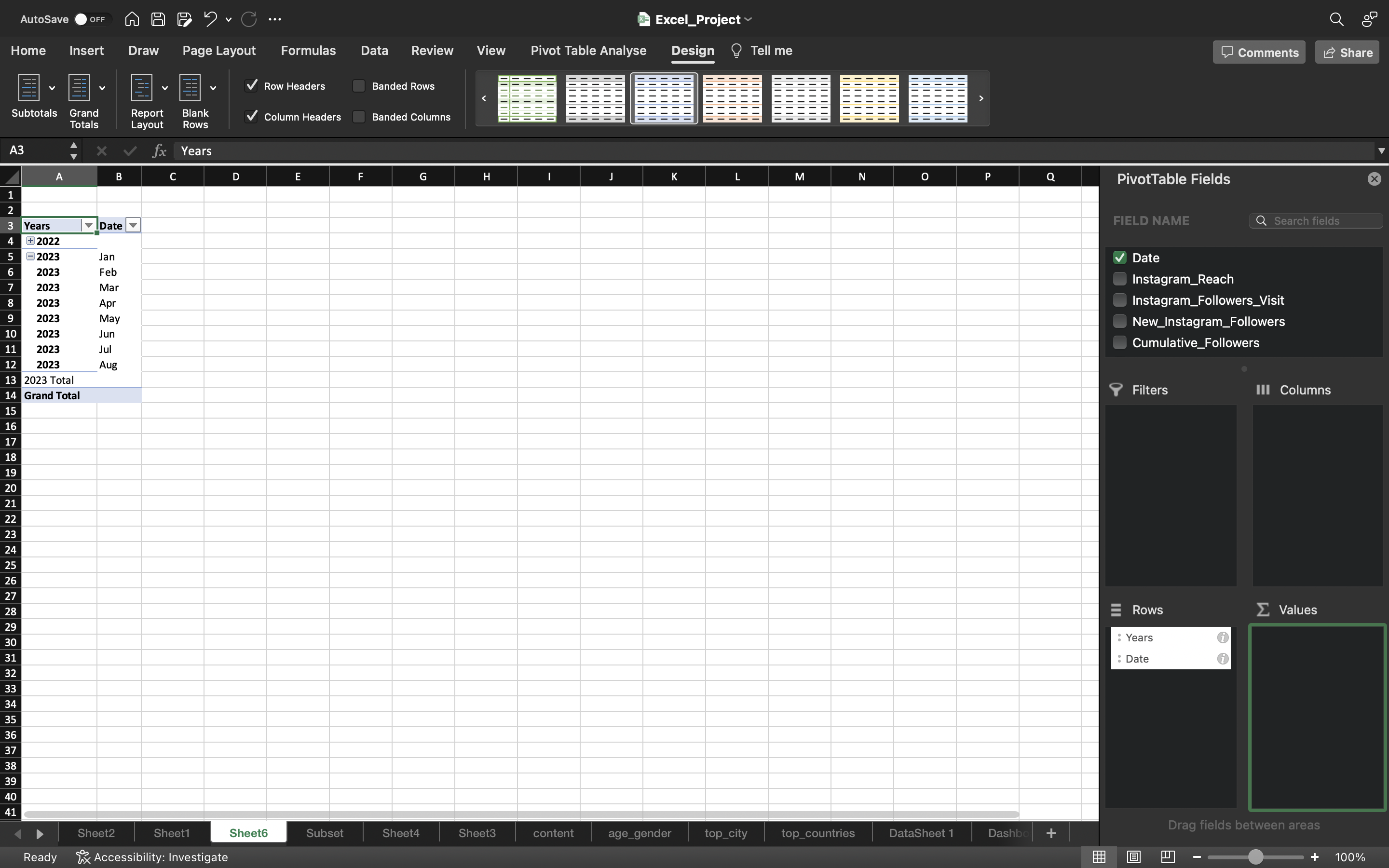
- Again select Report Layout —> Repeat all Item Labels.
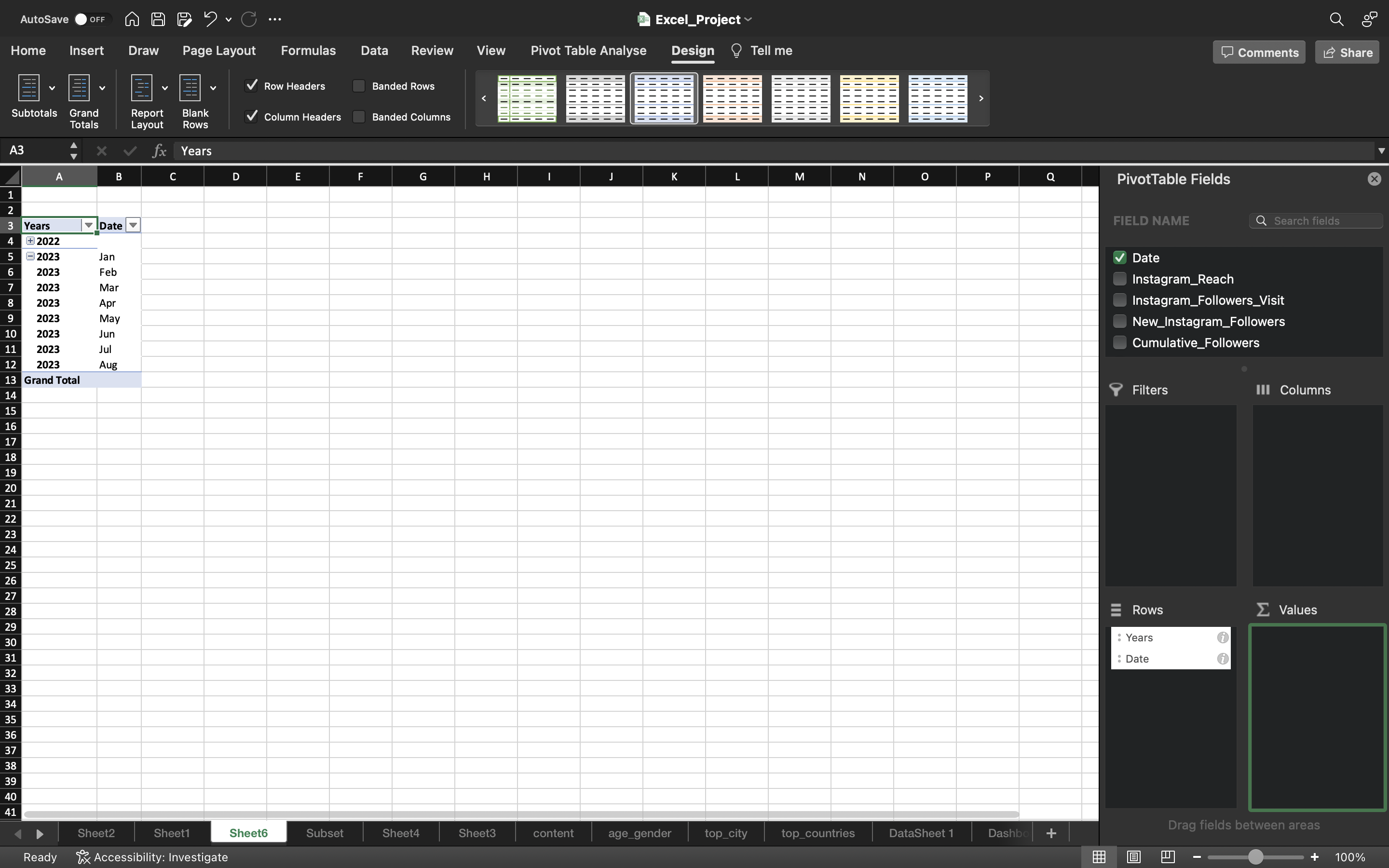
- Select Subtotals –> Don’t Show Subtotals.
- Add Cumulative Followers to the Values area.
- Select the whole data in pivot table and go to tab Pivot Chart Analyse and click Pivot Chart.
You can see the output below:
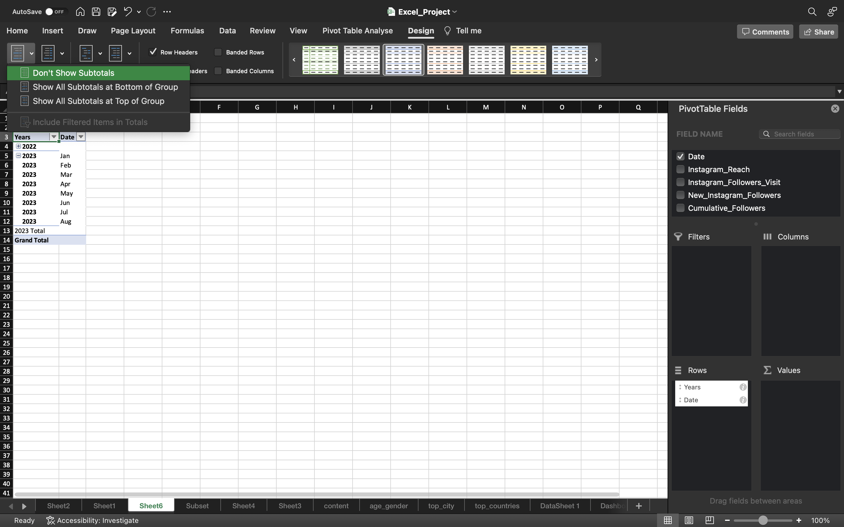
We can see the 2023 Total which is the subtotal which got removed in the below output.
You can see the below output:
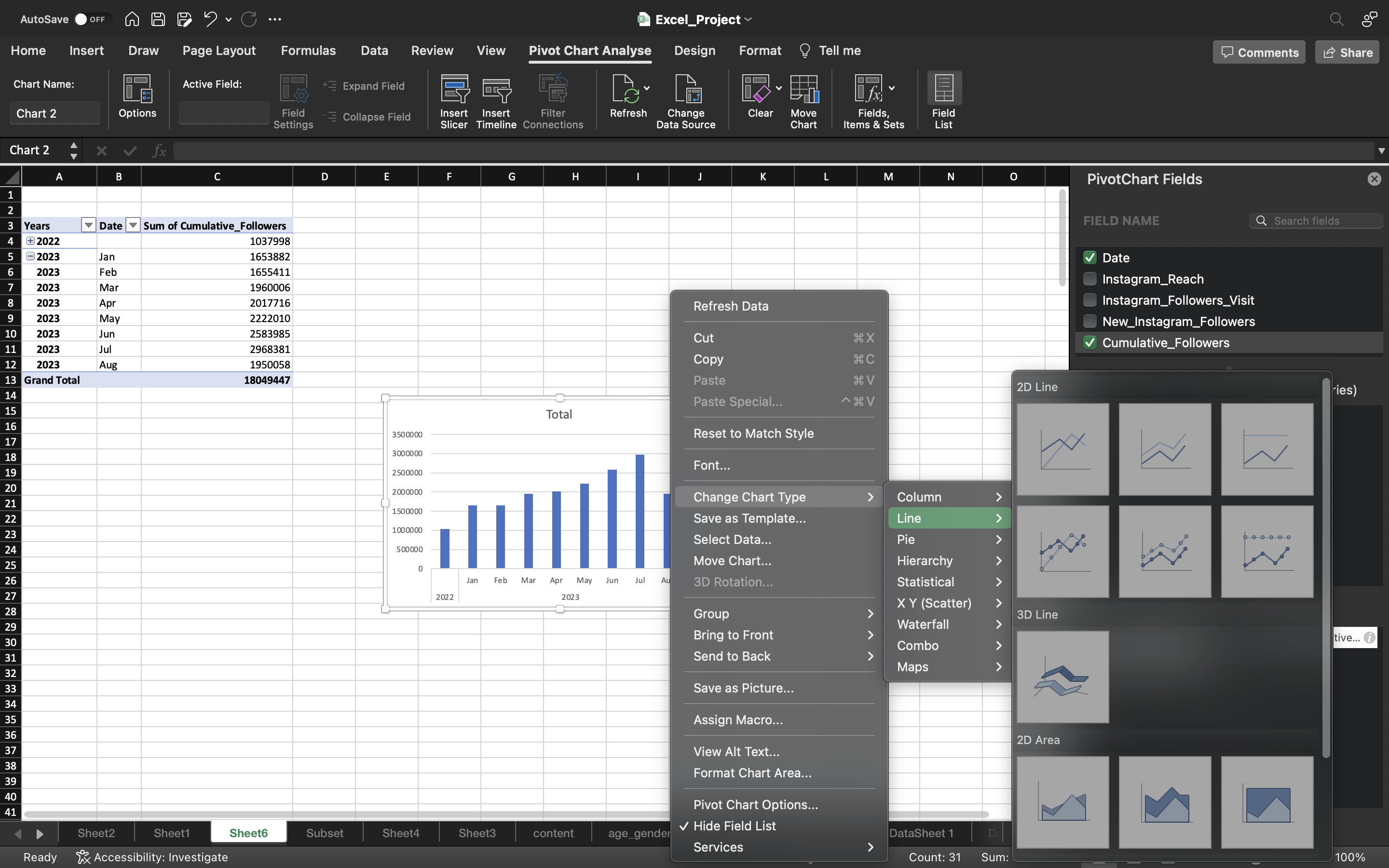
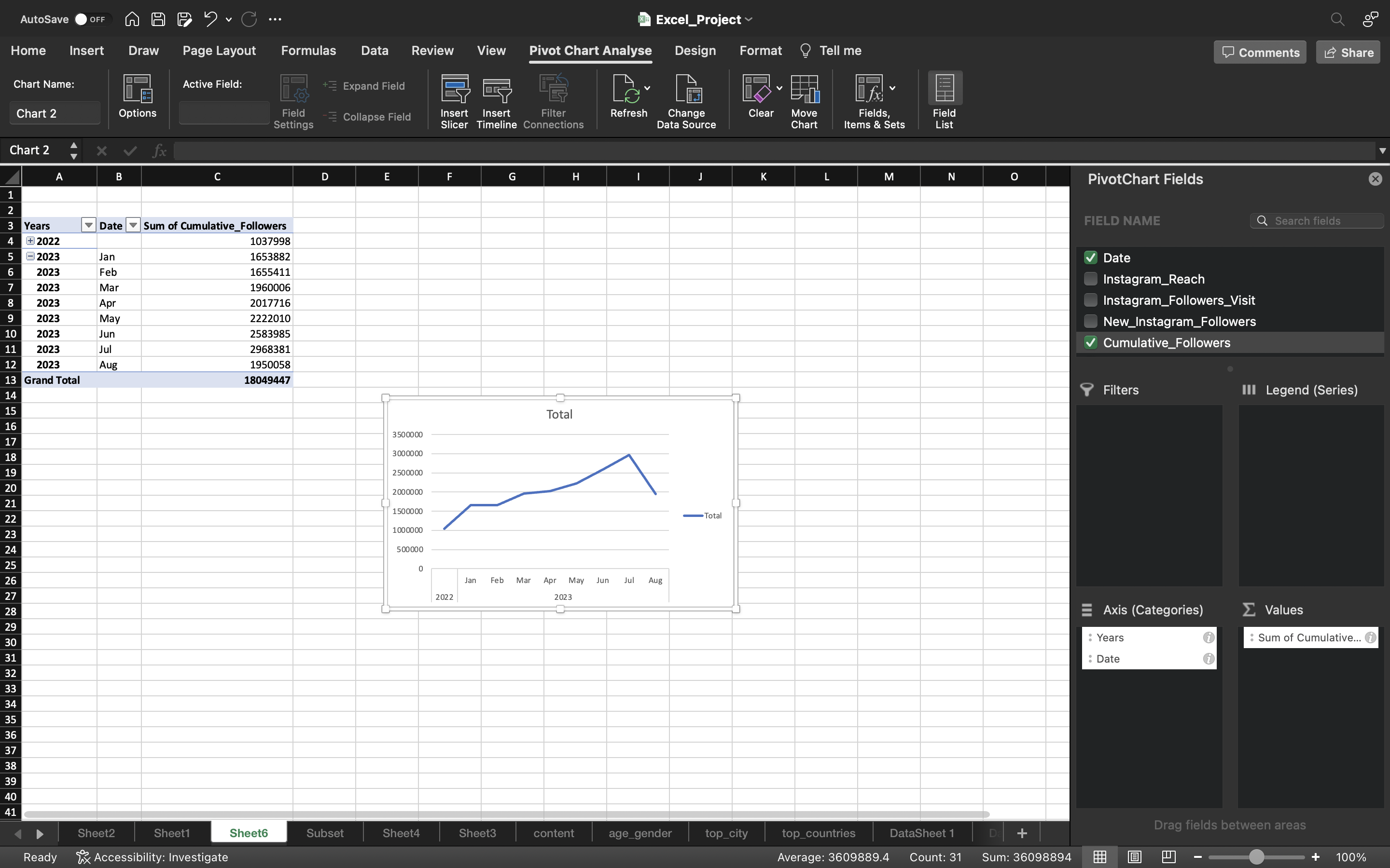
- Remove the gridlines by clicking on Add Chart Element under chart Design and select gridlines–> More Gridline Options and select No Outline.
- Remove the Total icon on right side of the chart.
- Remove the vertical axis of the chart.
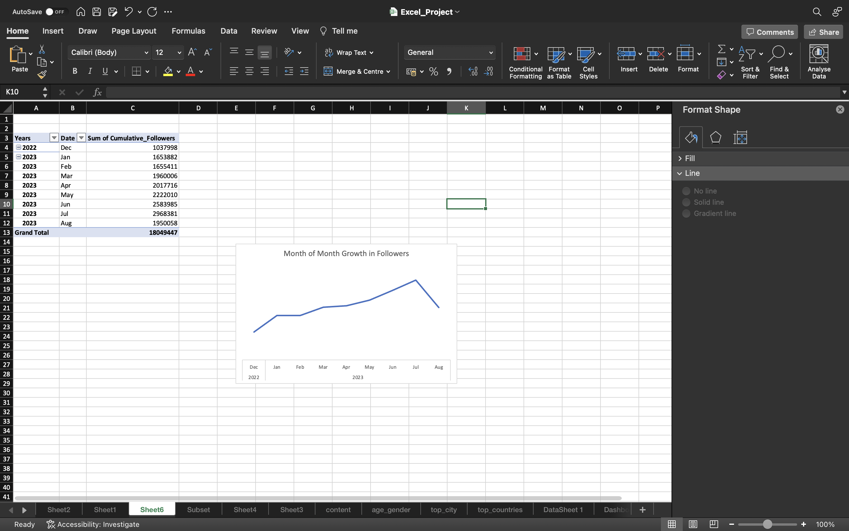
- Add the title as Month of Month Growth in Followers.
You can see the below output:
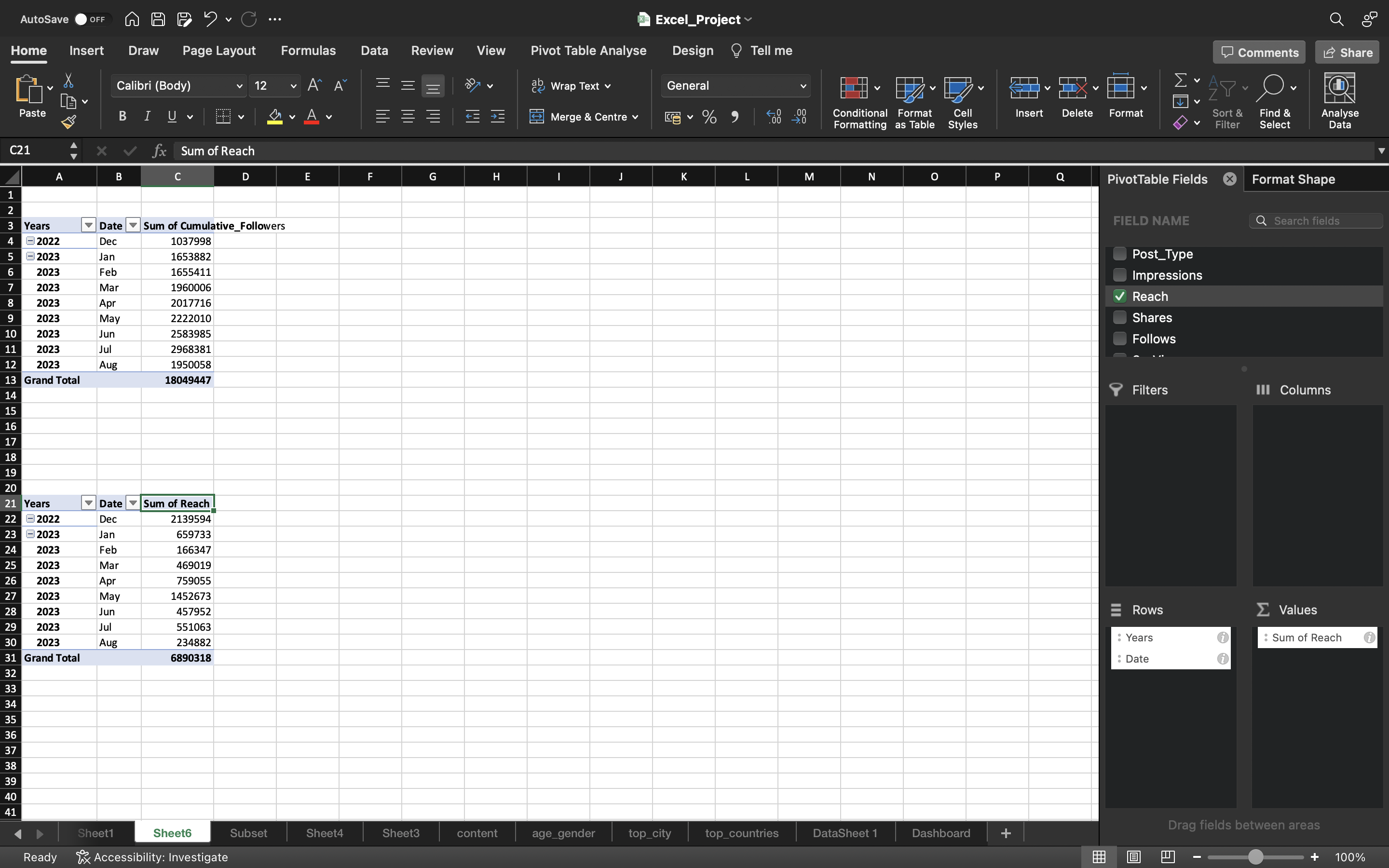
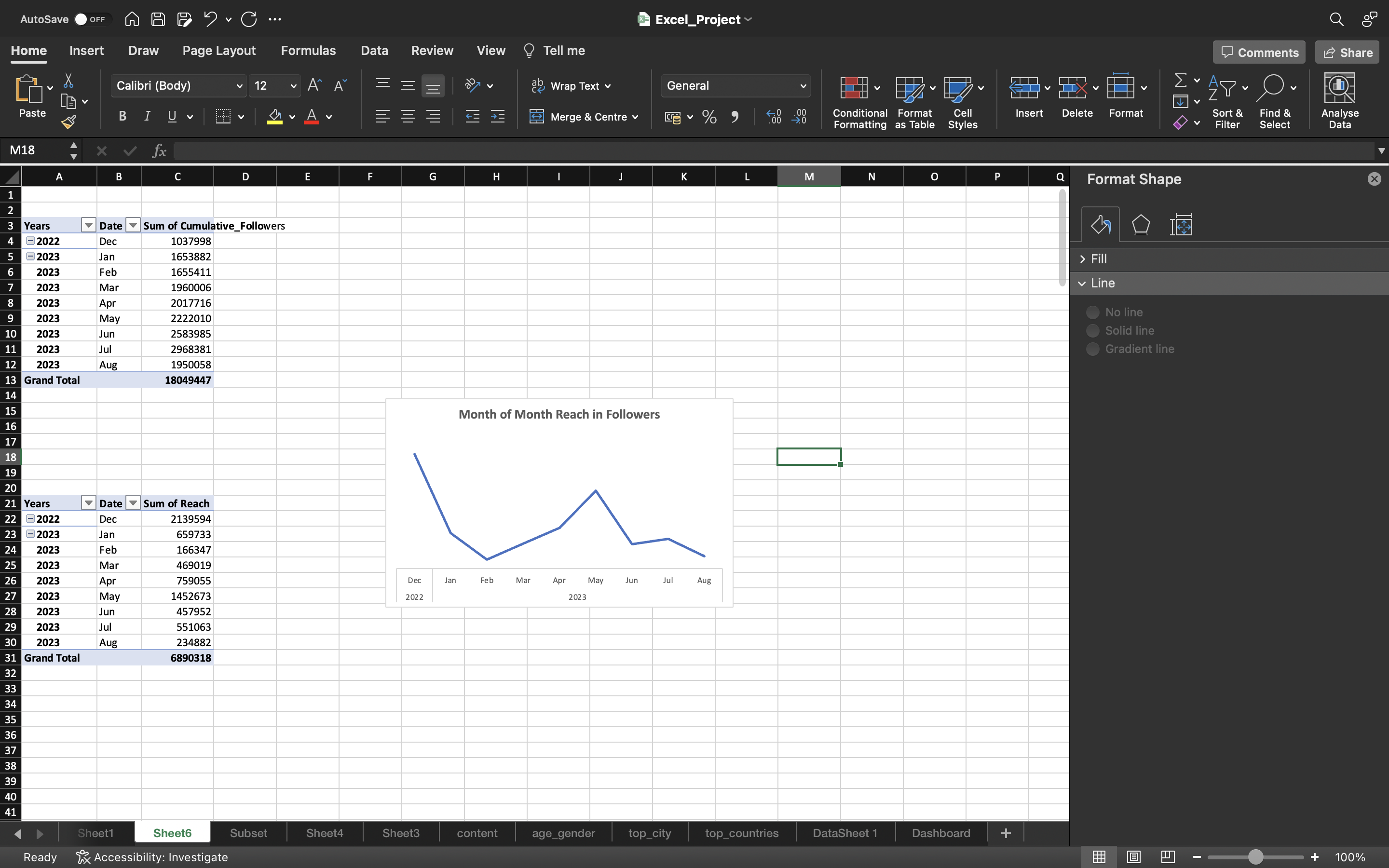
Now we can also create a Line Chart for Cumulative Reach by Month.
- Copy the pivot table we created for Cumulative_Followers.
- Remove the Cumulative_Followers and drag the Reach column into Values area.
Now just follow the same process which we did to create line chart for cumulative followers.
You can see the below output:
Let’s create a pivot chart for Duration_Bins vs Reach/Impressions/Likes/Comments/Saves
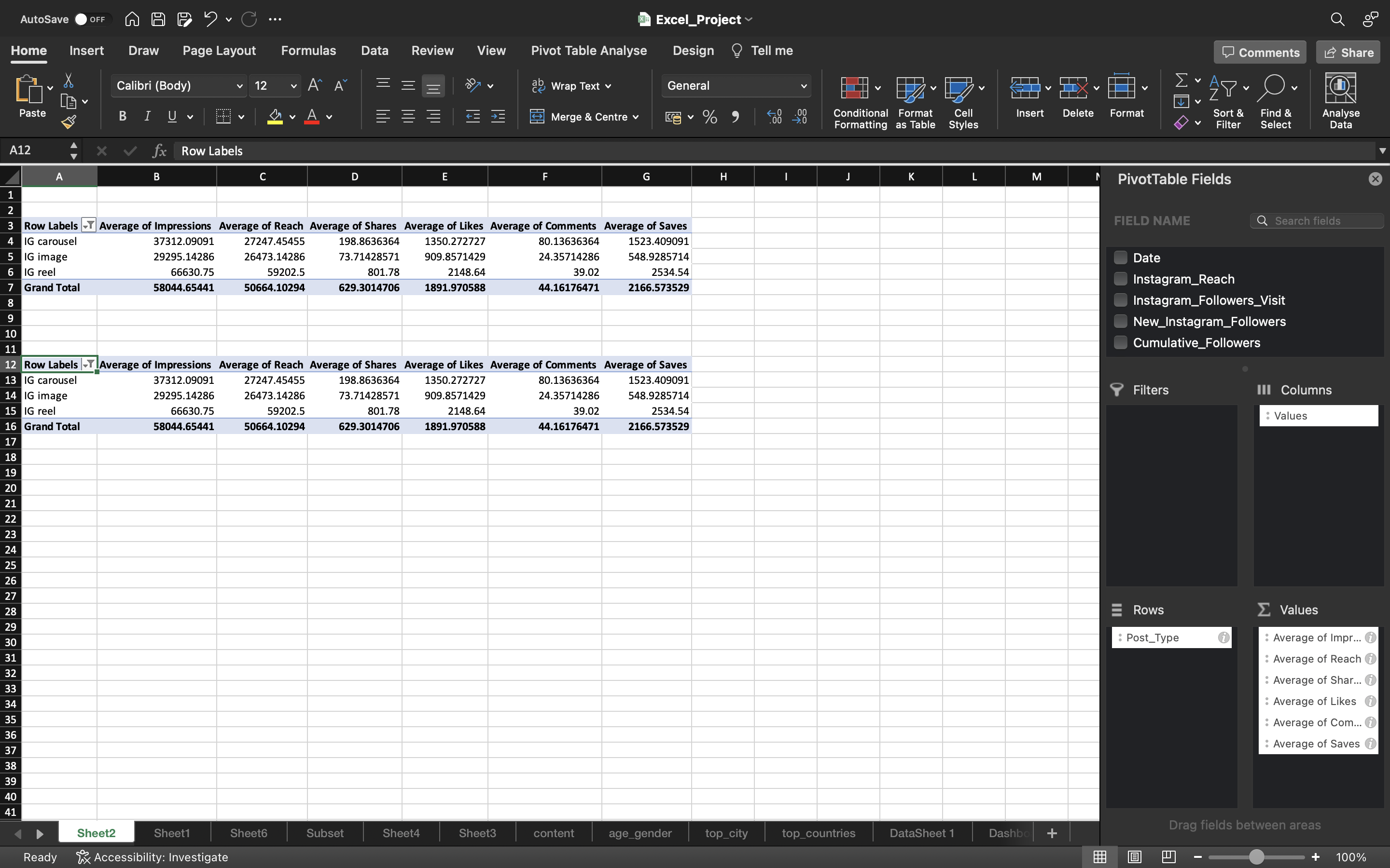
We already created a pivot table for engagement metrics(Reach/Impressions/Likes/Comments/Saves) by Post_Type in Exploratory Data Analysis Section.
- Copy the pivot table by using CTRL+C and paste it using CTRL+V and edit this copied table by removing IG Image & IG Carousel.
- Add Duration_Bins to the Rows Area.
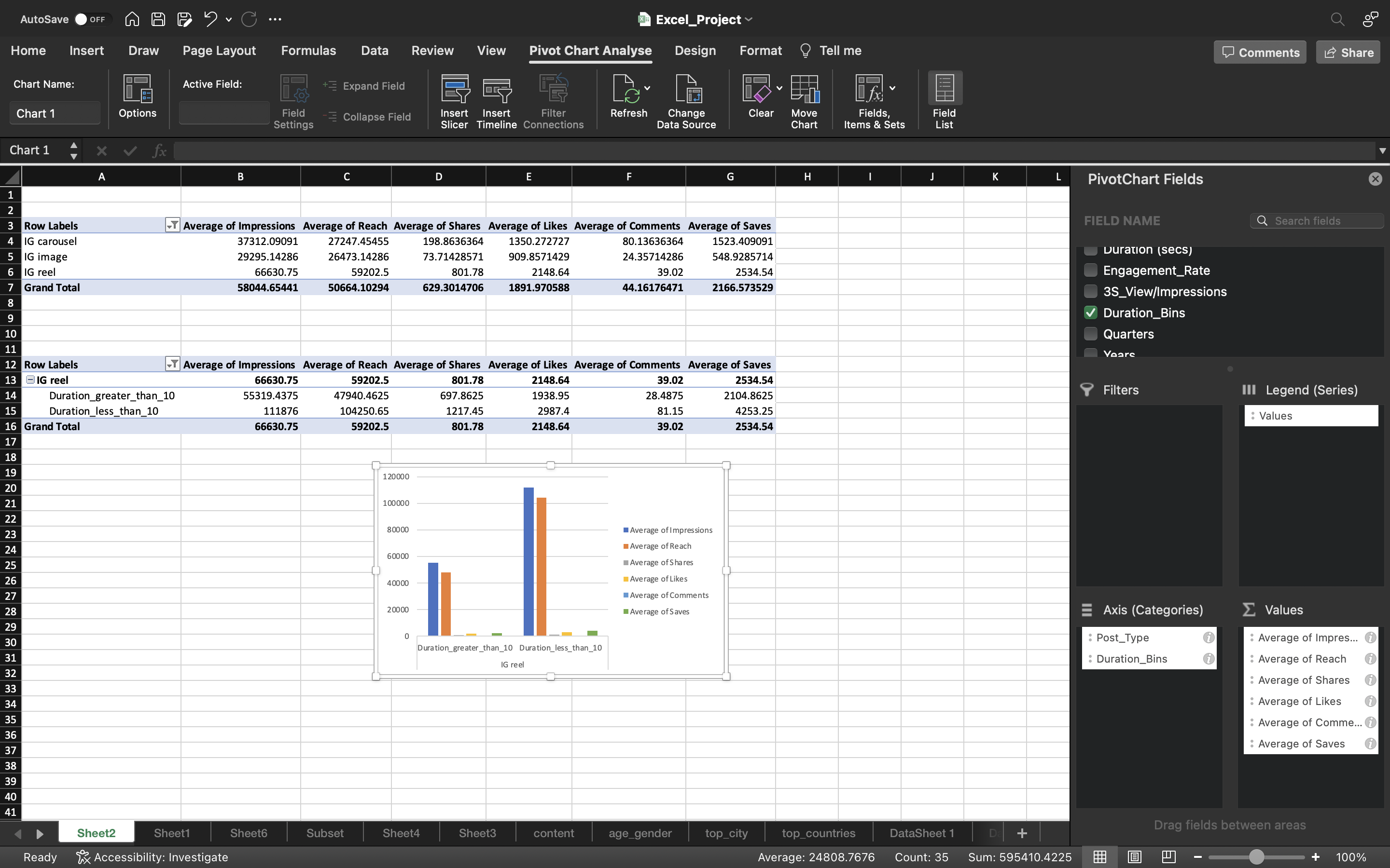
- Select the whole pivot table and go to Pivot Table Analyse and click on Pivot Chart.
Now just follow the same process which we did earlier to create/edit pivot chart.
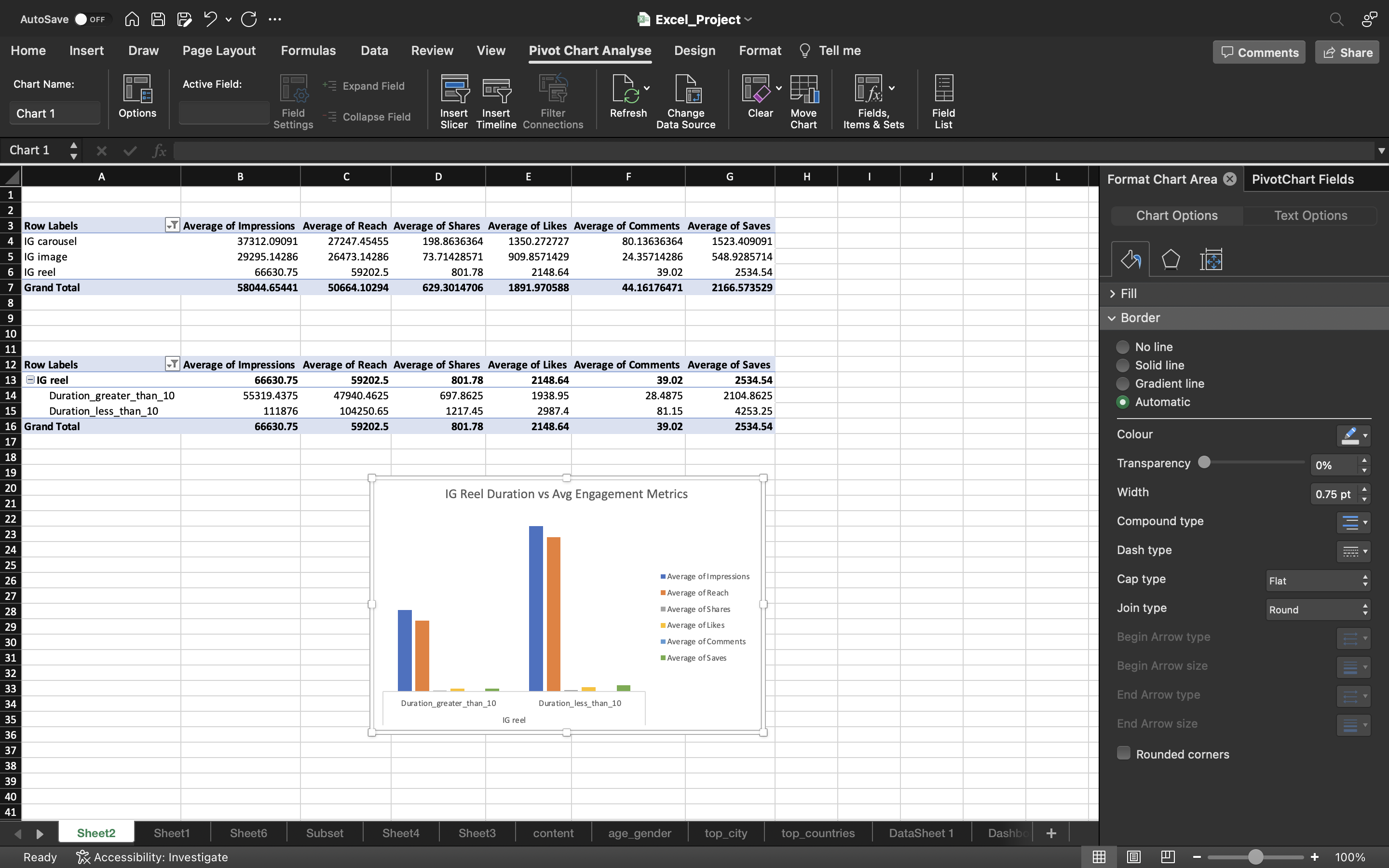
- Remove the gridlines by clicking on Add Chart Element under chart Design and select gridlines–> More Gridline Options and select No Outline.
- Remove the vertical axis of the chart.
- Add the title as IG Reel Duration vs Avg engagement metrics.
You can see the below output:
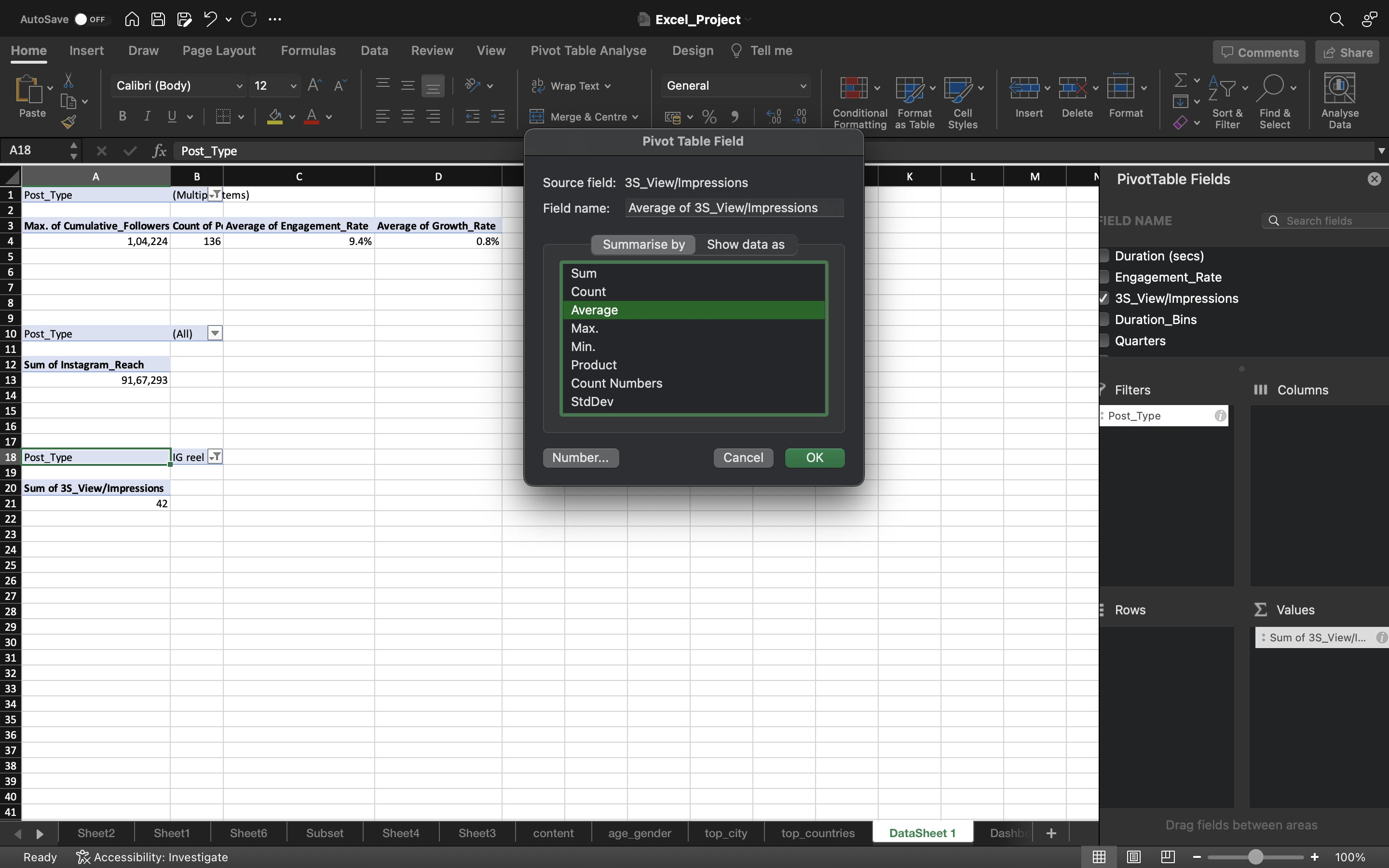
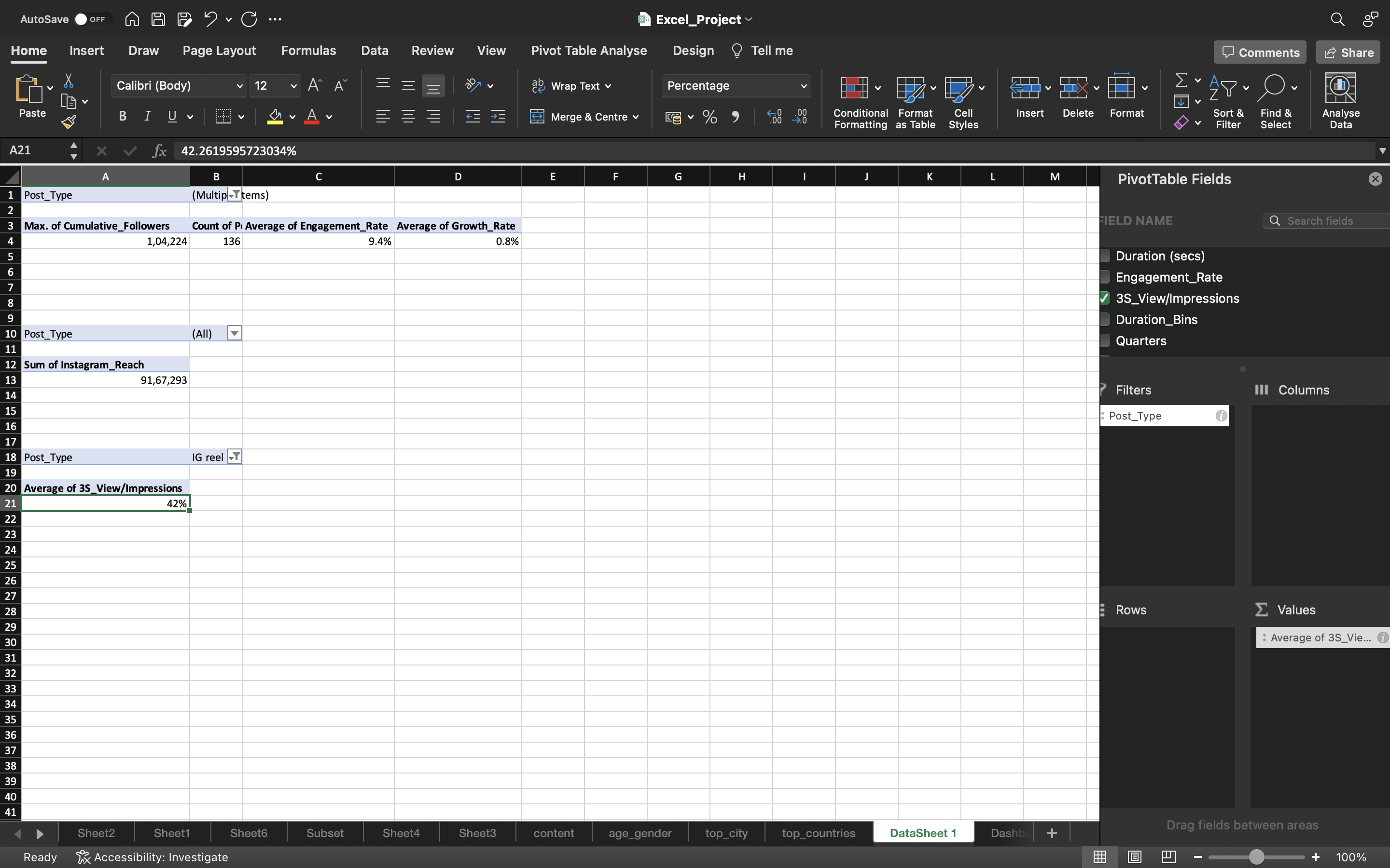
Now let’s create a pivot table for Average 3S_View/Impression.
- Copy the pivot table of Sum of Instagram Reach.
- Remove the Instagram Reach and grab 3S_View/Impressions column into the values area.
- We can see the average value as 42%.
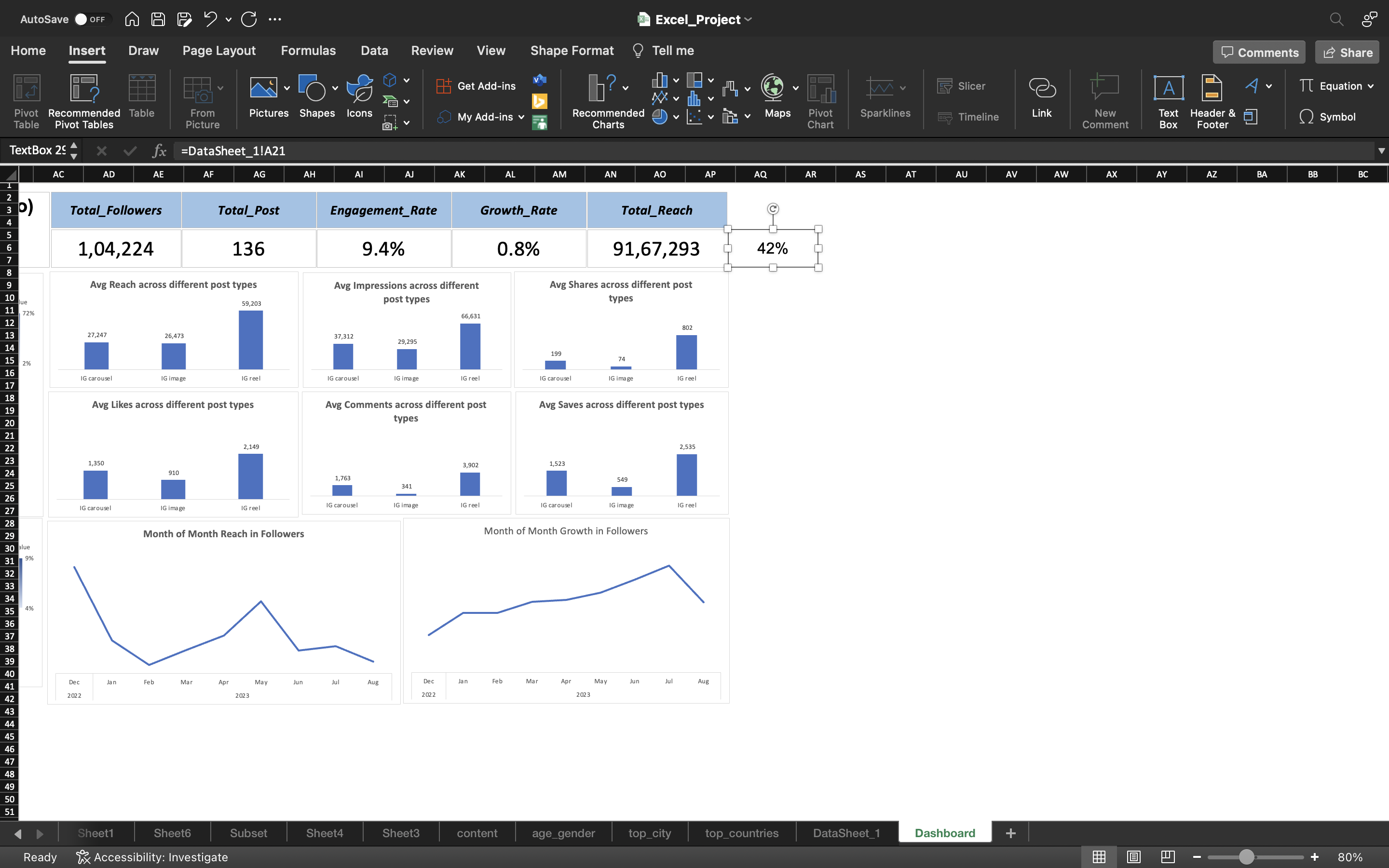
Finally we add a another card for Average 3S_View/Impressions in the Dashboard.
- Go to Insert Tab and select Text Box to create a card.
- Click on the Card and use the formula “=Sheetname!Cell_Number” to grab the average.
- Create another card to give a title as Avg 3S_Views/Impressions.
- Right click on Title Section and select regroup and add Avg 3S_Views/Impressions to the group and again select Group. Follow the same process to the Average value too.
Finally, let’s copy the charts created for top_cities & top_countries earlier and paste it in Dashboard Area.
You can see the below output:
Now let’s grab the charts of Distribution of Followers by Country, Distribution of Followers by City, Month of Month Growth in Followers, Month of Month Reach in Followers & IG Reel Duration vs Avg Engagement_Metrics which is created earlier and paste it in Dasboard area.
We have made changes to the font size of the headings and arranged the size and placing of the charts.
You can see the below output:
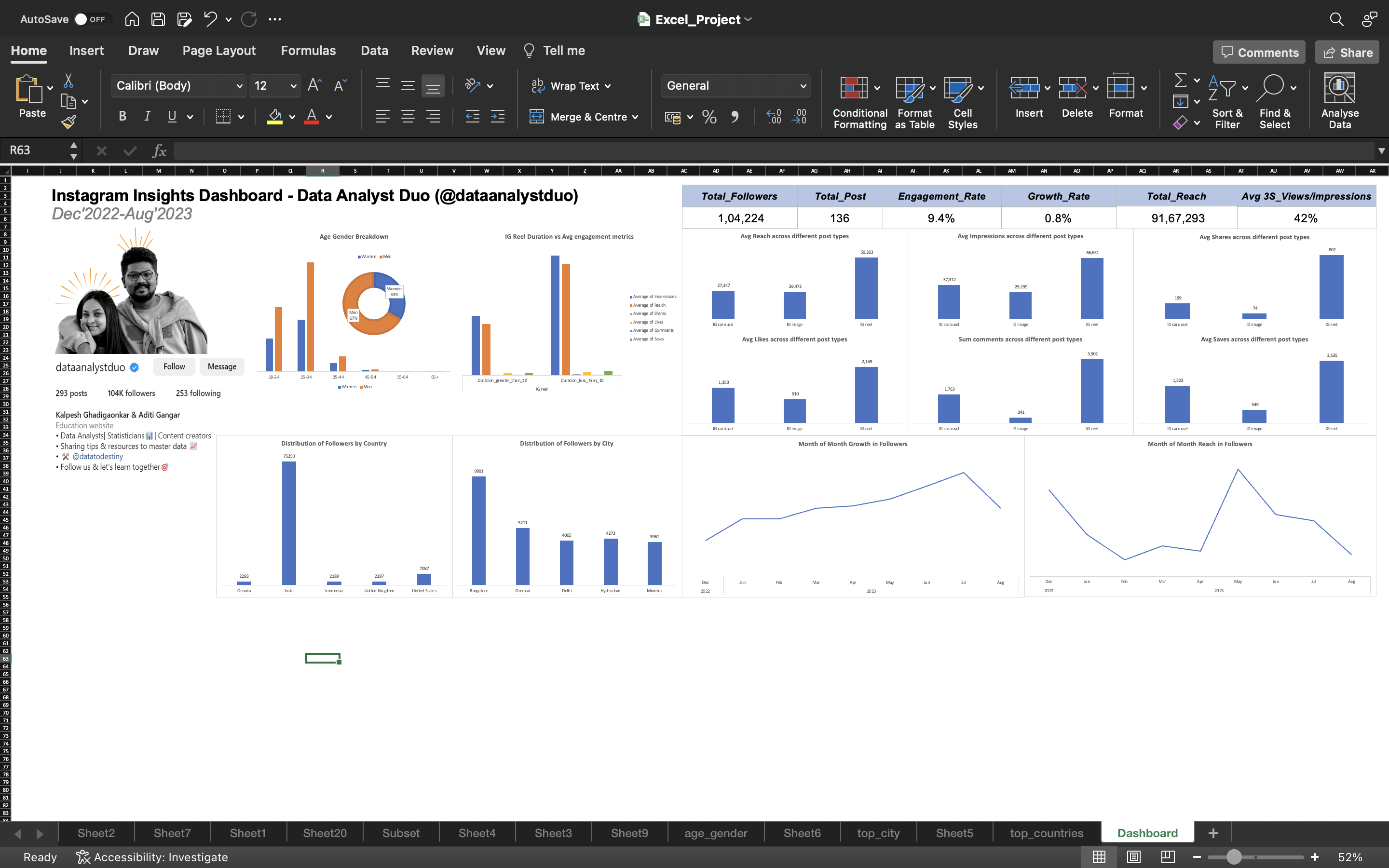
Our Final Dashboard is ready!!!
Extracting Observations
We will generate observations from the below dashboard.
Instagram Followers
- We had 22414 followers till December 1st 2022. Now we have reached 1,04,224 followers till August 19th 2023. During this period we had gained around 81k followers.
Total number of Posts
- We have posted 136 posts during the period 1st December 2022 - 19th August 2023.
Total Reach
- Total Reach says that the account(@𝒅𝒂𝒕𝒂𝒂𝒏𝒂𝒍𝒚𝒔𝒕𝒅𝒖𝒐) has reached to around 9 billion people and out of this only 1,04,224 people have followed our account.
Engagement Rate
- Engagement rate defines how people are engaging with your content. It is about people commenting, liking, saving & sharing posts. We have an average engagement rate of 9.4% for 136 posts for the period 1st December 2022 - 19th August 2023.
- However, for the last 3 months(June-July-August), the engagement rate is down to 3.2% which is concerning.
Growth Rate
- Growth_rate represents the growth of followers per day. We have an average growth rate of 0.8% meaning out of 1,04,224 followers, we are gaining around 800 followers.
- Although this value of 800 is not stable, meaning there are outliers. For example, in some cases i.e the follower count we are gaining per day increases/decreases depending on type of content posted,no post available during the day, how engaging the content is. So considering outliers, the average growth rate can be around 5-8%.
3S_Views/Impressions
- 3S_Views describe how many people watched the IG Reels for atleast 3 seconds.
- Impressions is about how many people watched the content multiple times.
- So the Average 3S_Views/Impressions is about 42% meaning 42% of the people have the tendency to watch the full reel or more than 3 seconds and rest 58% of the people skipped the content.
The 58% of the people who skipped the content can be due to the below mentioned reasons
- Not interested in the topic of the reel. Maybe people knows the topic or already have the information.
- The hook is not strong, meaning 3 second is what the hook game is. In 3 Seconds you say something like this that people actually
tend to watch it. This is what big creators do. If you see their video content, they try and you know say something in the first few seconds that make sure you watch the entire video. - probably the audience is not relevant. For example, when you scroll through instagram and you tend to follow that person because you liked a reel or a post from that person and then you forget about it. you don’t care about it anymore.
I would suggest the duo to focus on strengthening the hook i.e. make it more attractive/engaging the reel at the start to attract wider audience.
Average Engagement metrics vs post types
- We can see in the bar chart, the IG Reel/Video post type has the highest average values for most of the metrics including ‘Impressions’, ‘Likes’, ‘Reach’ and ‘Shares’ compared to ‘IG carousel’ and ‘IG image’ post types.
- It appears that ‘IG video’ posts are performing better in terms of engagement compared to ‘IG image’ and ‘IG carousel’ posts for Data Analyst Duo. If they consistently post IG videos, the duo would get good results.
- IG Carousel has highest average values for metrics such as likes,comments and saves compared to the IG Image.
With respect to Reach and Impressions, New followers can be gained if they put IG Videos but inorder to engage the existing audience of the page, data analyst duo should post IG carousel because of high number of Comments and Saves.
I would suggest the Duo to go with IG Videos followed by IG Carousel by posting consistently.
Month of Month Growth in Followers
- Based on the line chart, After december month, we can see it increases steadily with slight ups & downs and it decreased suddenly from july - August.
- Out of 19 Days in August month, the duo posted content only for 7 days. During the August month, they are not consistent in posting content that is why the growth of followers got impacted.
Month of Month Reach in Followers
- From the line chart, it was decreasing steadily till February and increased with ups & downs till April Month. From April to May
month, it increased suddenly. This is because out of 31 days of May month, the duo posted consistenly for 28 days. Maximum reach is happened during may month of around 2100000 people i.e the datanalystduo page has popped in the 2100000 accounts. - It got decreased from june 1st till August 19, out of 80 days the duo posted content only for 34 days.
This shows posting consistently would help the duo in wider reach of people.
Age-Gender
- Majority of the portion is from 18-34 age group and small portion of followers of from 35-44 age group and very less followers above age of 45.
- Our main audience is from age group 25-34 and majority of them are Males.
Reel Duration vs Avg Engagement metrics
- if we keep the duration less than 10 seconds, we can get high number of Average Reach, Impressions, Shares, Likes, Comments & Saves as you can see in the above dashboard.
- Reels will help the duo if they want to engage and attract wider audience.
Distribution of Followers by Country & City
- We can see the maximum followers are from India and second highest is United States
- Maximum number of followers is from Banglore city and second highest is from Chennai. The duo can plan a meet-up in Banglore.
Recommendations Based On Analysis
Based on the observations from the dashboard, below are the recommendations suggested to the duo.
- Focus on Strengthening the hook i.e making it attractive or engaging the IG-Video reels at the start and also give weightage on the topics/content for the reels such as “Python”, “Data Analytics”, “SQl”, “Statistics”, “Interview preparation & questions for SQL/Python/Analyst roles” because as per the observations of the data, it is found that 58% of the people skip the content within 3 seconds.
- Post IG-Videos consistently because it is found that it is performing well interms of engagement and also wider reach can be attained compared to IG Images & IG Carousel. With respect to Reach and Impressions, New followers can be gained if they put IG Videos but inorder to engage the existing audience of the page, the duo should post IG carousel because of high number of Comments and Saves. So go with IG Videos followed by IG Carousel by posting consistently.
Growth & Next Steps
Social media feeds (specifically what people/posts you see when you log on) are driven by an algorithm but these can change from time to time. For example, on LinkedIn, there was a time when polls got a huge amount of reach, then it became sharing PDF documents. The algorithm was being changed behind the scenes to up-weight or down-weight certain types of post type.
As of now IG videos/reels, act as better engagement widely in general.
In future, there might be possibilities that they may change the algorithm to favor image posts or some newly discovered post type which can act as better engagement for the users
So keeping this analysis up to date would help the duo keep close to what was working now rather than what worked several months ago.